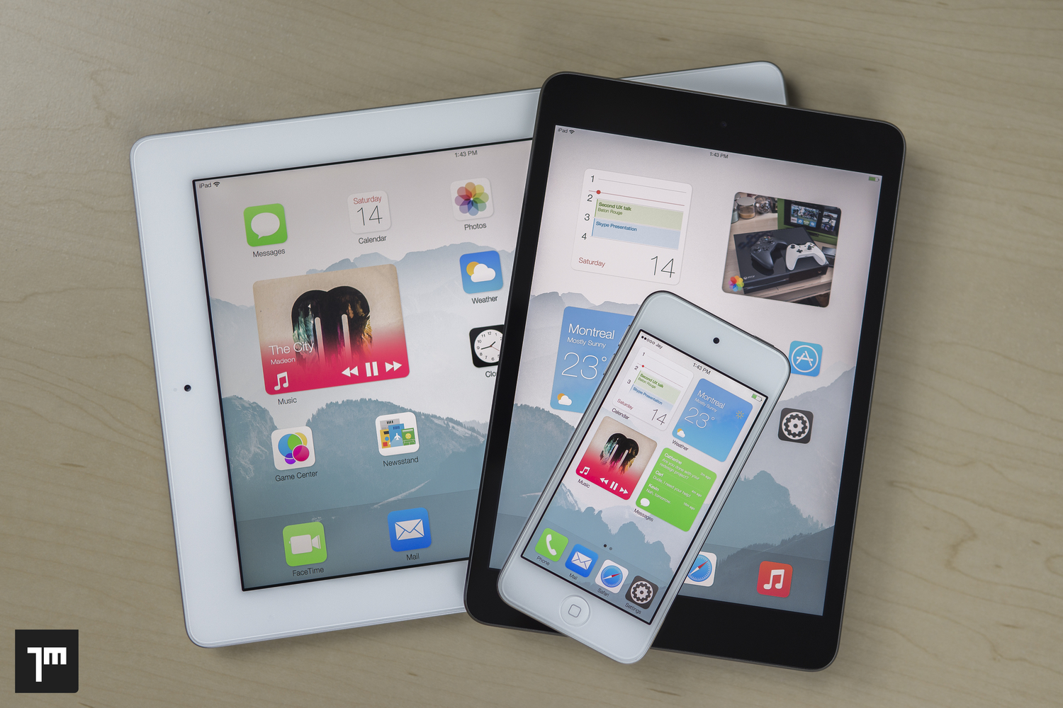
Last year, we posted information on a research paper and iOS concept called iOS Blocks. Jay Machalani (@technofou), the brains behind the concept, suggests that an interface that combines Windows Phone’s live tiles and Android’s widgets, would be a best-of-both-worlds-scenario for iOS users.
iOS Blocks would essentially allow users to have proper widgets on the iOS Home screen, but the concept is put together in a way that make it totally seamless and transparent to users who prefer to use iOS like they always have. The widgets would mix the uniformity and standardization enjoyed by Windows live tiles with the interaction of Android’s widget system. It’s a smart idea with hours of research and presentation. I highly recommend that you read the original post on Machalani’s blog.
Obviously, Apple didn’t bring any sort of Home screen widget system to iOS 8, but it did give us Notification Center widgets. As if it needs to be said, Notification Center widgets are a far cry from iOS Blocks—a feature that would add significant depth to the iOS Home screen experience.
So after a year, what’s been made of this project and its corresponding research? Well, I have some good news: It’s being developed into a real working tweak, according to this post on reddit by someone closely associated with the project.
iOS Blocks is coming by @_Matchstic @gabrielefilipp5 @technofou and me.
Stay Tuned! pic.twitter.com/2dUcwH3Az4
— aesign (@aesign_) February 28, 2015
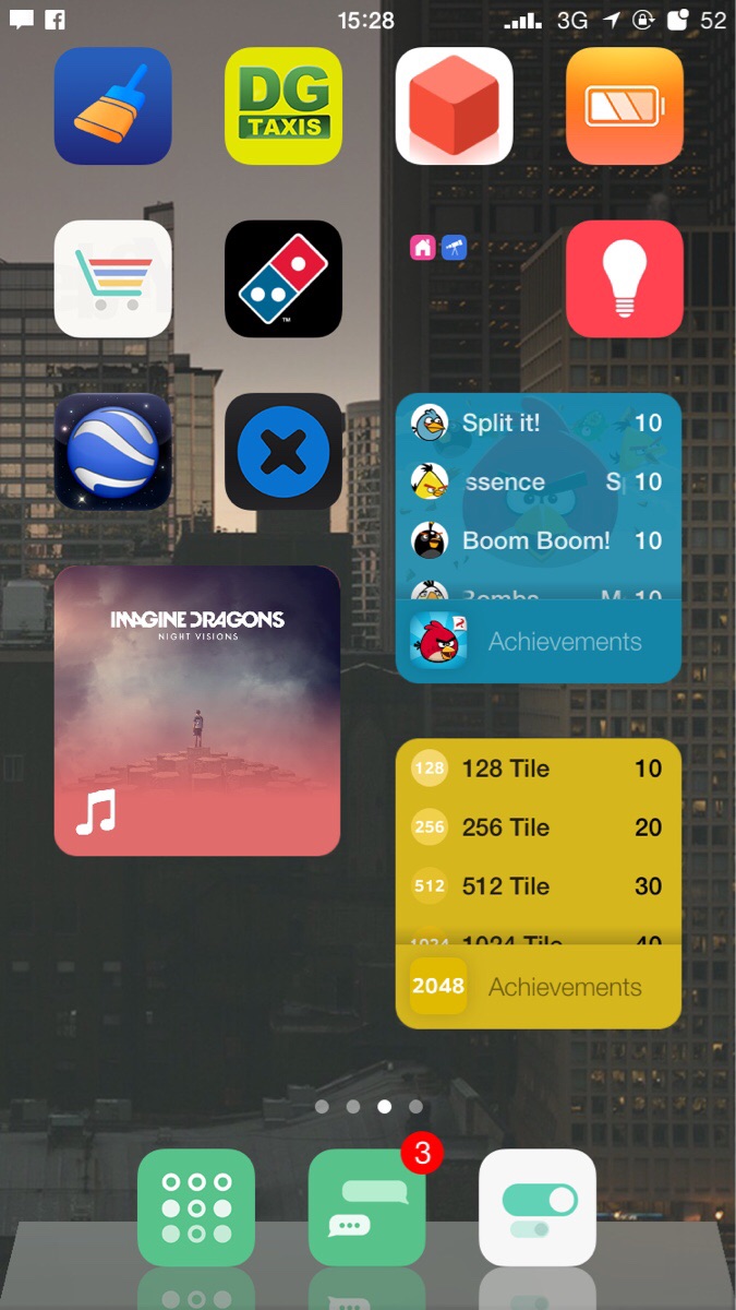
iOS Blocks will allow you to pinch on an app icon to expand it to a 2×2 block featuring interactivity. These blocks will stay at their expanded size until you decide to close them by using a pinch-to-close gesture. If you expand an icon into a block on a page where there is no room, the icons at the bottom of the page will be automatically shifted to the next page.
Again, this idea is all a part of Machalani’s ‘Pushing iOS’ narrative. Even if you don’t want to read the dissertation, I suggest that you watch this video where he explains why this concept is more streamlined than Android widgets and smarter than Windows Phone’s so-called live tiles.
…but if you don’t want to sit through that 9-minute video, at the very least, watch this video that shows iOS Blocks in action. Seriously, watch this, as this is what the iOS Blocks tweak is aiming to replicate:
The tweak, which was put into motion shortly after the original concept debuted, is deep into development by a team lead by Matt Clarke (@Matchstic). You may remember Matt from another popular tweak release called Convergance.
Other team members who are working on the project include Gabriele Filipponi (PreferenceTag, QuickMusic), and designer Aesign (Confero). Most exciting is the fact that Machalani, the original concept designer, is on board and is giving the project his blessing. He even put together a nice logo for the project:

Although there is currently no ETA or price for release, a lot has been accomplished, and the team, led by Clarke, must be confident enough to show their cards, so to speak. In fact, here’s an image of the tweak running on an iPhone:

Personally speaking, I don’t think that there’s any question that this tweak will be a tweak of epic proportions if they can properly deliver on Jay Machalani’s original concept.
I’m excited. What about you?


