Android has evolved over the years. It was once a nerdy tinker’s dream device with modding, overclocking, and custom ROMs. While that is still possible, the operating system has become a mature platform. Features we used to have to shoehorn into the phone have become standard options. Today, Android smartphones are overflowing with so many features that it’s easy to overlook them.
No Thanks, Keep Reading
I love the variety in the Android ecosystem, but with so many choices and Google’s allowance for OEMs to add brand-specific flair to devices, there are bound to be misses. I narrowed down the software features across the dozens of smartphones I’ve used that bug me the most. Some are limited to specific manufacturers. Others are common across all Android phones. Despite the annoyances’ broad or limited scope, I want them squashed before they become standard practice.
4 Long press menu
Consistency, please
Android introduced an app long press shortcut feature in 7.1 Nougat in 2016, and I use it nearly every day. Depending on the app icon you long press, you get different options. For example, if you long press chat apps like Messages, you get a list of recent conversations and a button to start a new one. With Spotify, I get a search option and a recent playlist.
The one I use the most is with the Google Play Store to check for app updates. I like to long press and tap My Apps to go to the update screen. Whether it is a quirk in a software version that removes some options like the My Apps or via an OEM choice, these long-press menus vary between phone brands.
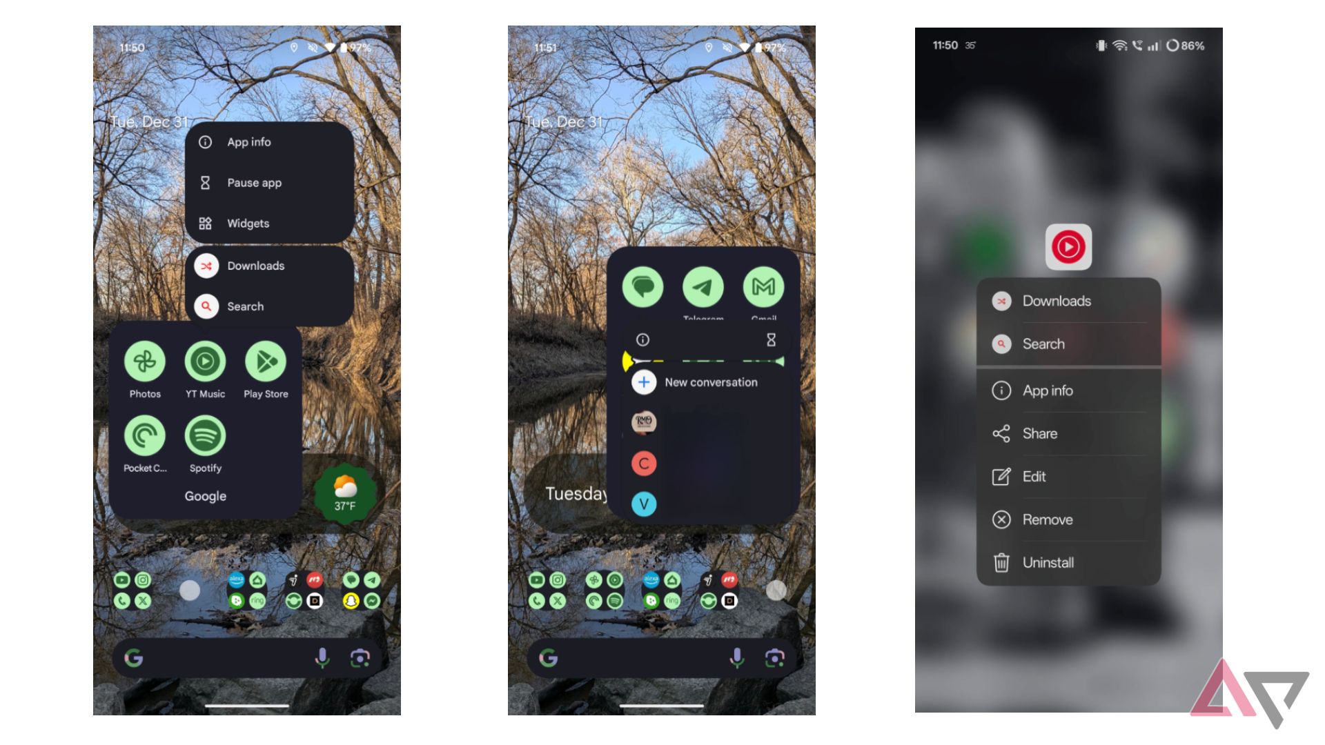
The inconsistency is frustrating. Even with my Google Pixel 9 Pro Fold, Google’s long-press menus differ across its apps. The number of variations grows when comparing device brands. The other long-press option I use more regularly than I’d like is the App Info. This is handy for jumping to that app’s settings menu to force close it if it acts up or to adjust permissions. However, some phone brands don’t have that option on the menu. My OnePlus Open didn’t have it until the Android 15 update.
No, the long-press menu isn’t a major feature, and many people probably don’t realize it’s there. But when you do and remember to use it, the feature becomes ingrained in your device usage habits. Google has tweaked the long-press menu since its launch, and that’s fine. Please standardize the menus and don’t ditch the feature.
3 Split notification shade
Please, no
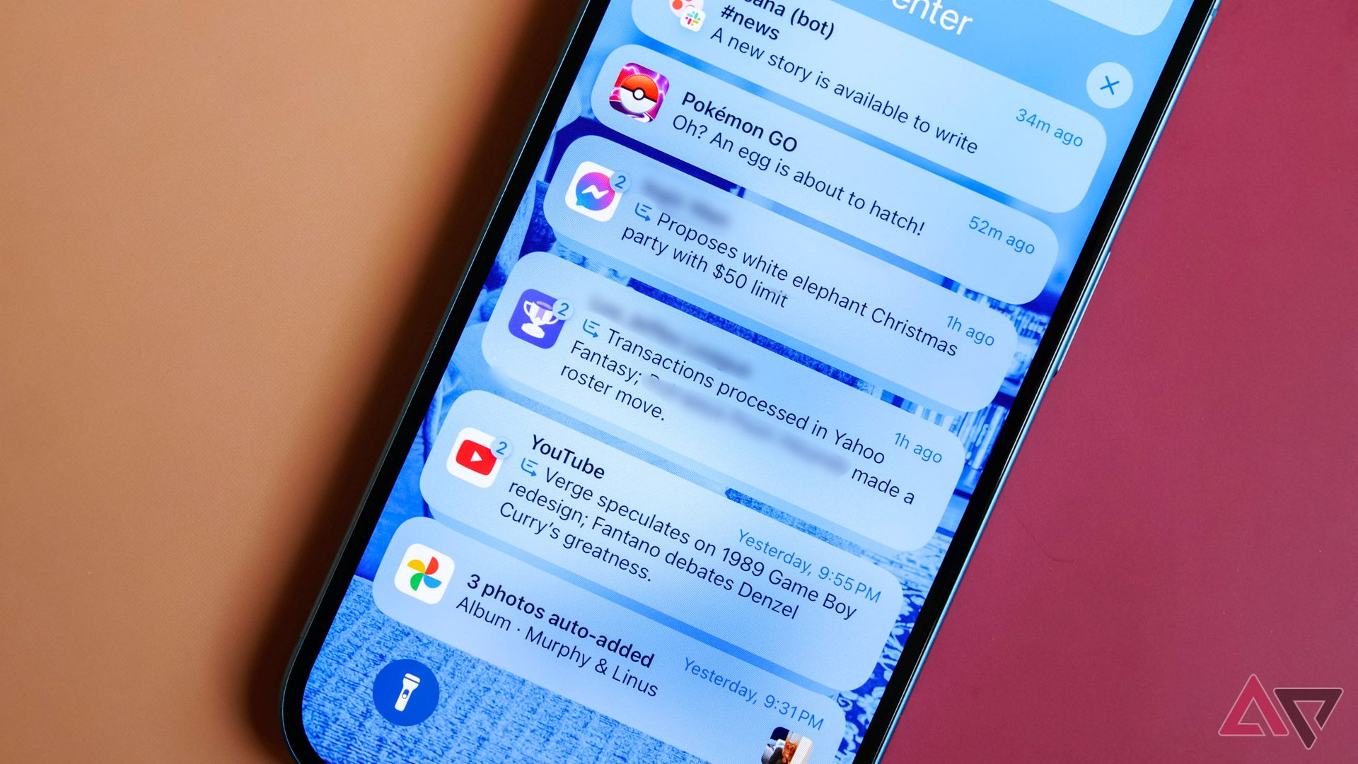
When I force myself to use an iPhone for a while, it’s an experiment to see if I can understand the draw. I don’t, and the most frustrating and annoying feature is the split notification shade. I don’t want to swipe on different parts of the screen to access what I want. The upper-left corner for notifications and the upper-right corner for quick controls or something like that.
Some Android brands are adopting this feature, and it needs to stop. Honor implemented it in its MagicOS, and OnePlus also introduced it. OnePlus allows you to stick with the standard, correct way of swiping down from the top that gets you everything or go with the split variation.
I can see how there can be a benefit to the split option, but I don’t think there is enough to justify its frustration. I’m sure that, like most anything else, if you use it enough times, you can train yourself to remember where to swipe automatically, but that isn’t something I’m interested in learning. So, stop this feature from growing, or take the OnePlus route and allow users to choose.
2 Apps on the homescreen
Stop making it an iPhone
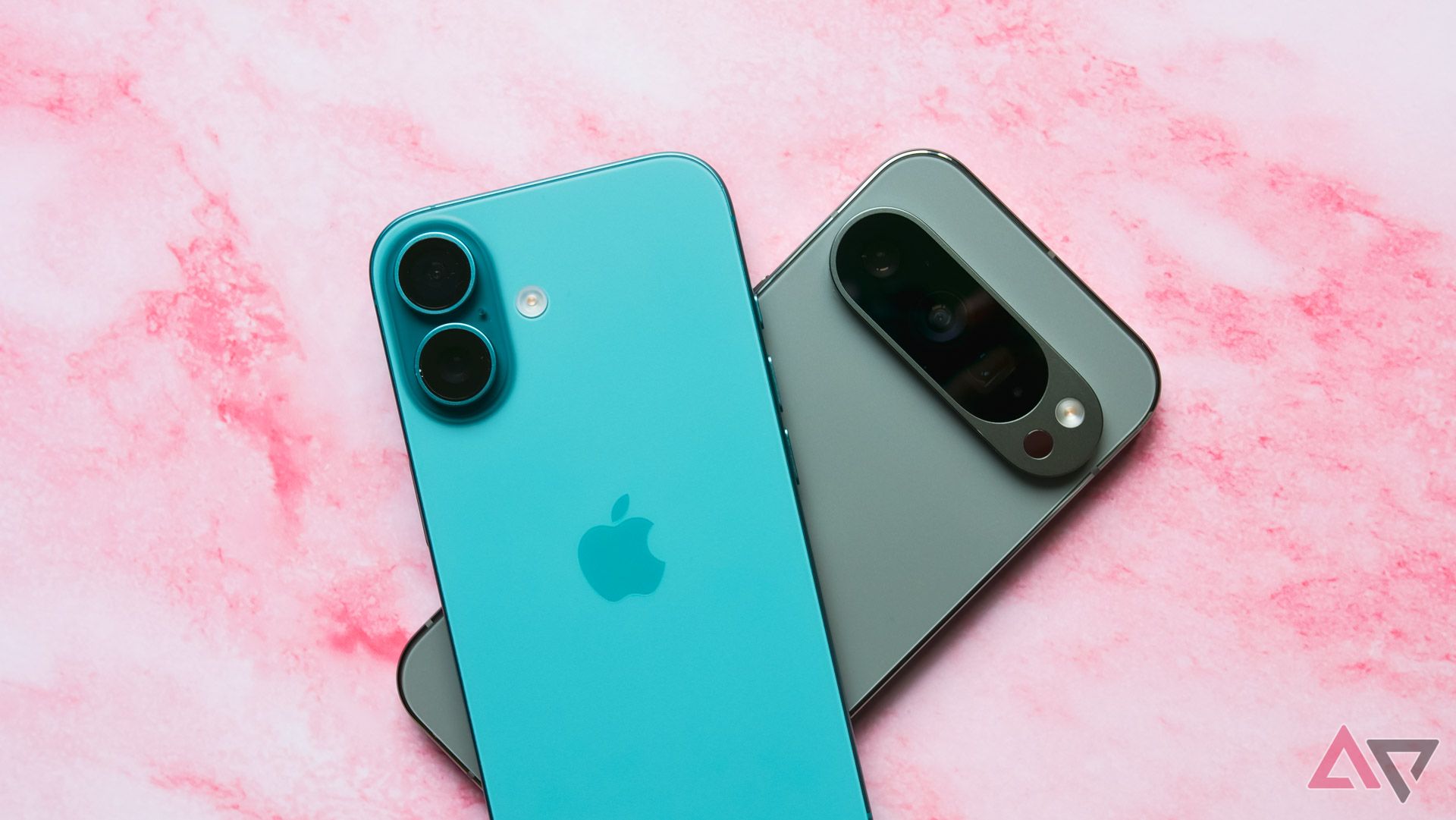
The app drawer is one of Android’s best and most longstanding features. Until iOS 18, iPhone users were stuck with pages of apps arranged in a grid, and you couldn’t choose where apps could be laid out in that grid. Today, iOS allows you to pick where in the predetermined grid size you can place your apps, and there is a makeshift app drawer to reduce clutter. Android OEMs are starting to bring some of that disorganized chaos to our beloved OS.
I’ve had a few phones that I had to reset. When I restored the devices, all the apps were in the drawer and on the homescreen. Maybe this was because I had done a restore, even though the apps weren’t originally on the homescreen. So, I reset and started from scratch. When I installed the apps, everything went to the homescreen. After clearing the data from the home launcher, the apps left the homescreen, and I had to deactivate new apps going to the homescreen. This practice is starting down a path I don’t like.
I love Android for its personalization across all aspects. This includes a clean homescreen if I want and allows me to put my apps where and how I want. The iOS-like approach some Android OEMs are taking is a cluttered one that I want to end.
1 App drawer navigation
It shouldn’t be so difficult
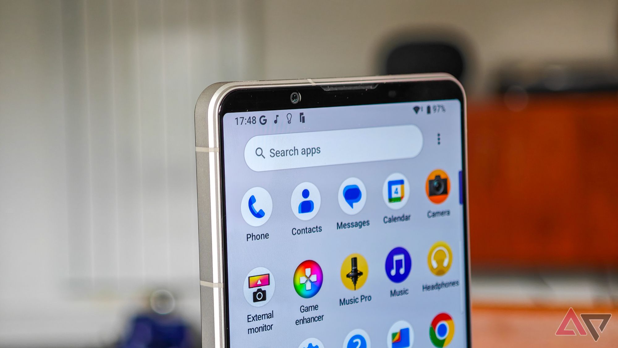
When I want to open an app I don’t have on my homescreen or in a folder, I want to find it in my phone’s app drawer quickly. Searching in the app drawer is nice, but sometimes, even that takes more taps than I like. Some Android phone brands, like OnePlus, put the alphabet along the right side of the app drawer so you can tap a letter and go to apps starting with it. This option isn’t too bad. But not all OEMs offer this.
Some phones offer a sort of smart app drawer that puts the apps it thinks you’ll want at the top of the drawer for quick access. However, it doesn’t always work well and isn’t on all Android devices. Google has become good at it, though. On Pixel devices, the app drawer has five frequently opened apps waiting for you at the top. In addition, when searching, it knows what apps you often use that have the letters you typed and brings those first.
In a perfect world, I’d want a combination of how Google and brands like OnePlus handle the app drawer. Bring the AI of the auto-app suggestions and the search on Pixel phones with the alphabet quick buttons of other brands.
Nitpicking because I care
None of these annoyances are dealbreakers and won’t make me leave Android, at least not yet. I love using my Android phone and experiencing products from different brands. I also recognize that many people pick up a phone and use it for a couple of years. Then, when it is time for a new phone, many stick with the same brand, so the usage experience is largely the same.
However, even with the same brand, the experience can change based on OS versions. However, the way you use a device can change between brands. Again, I’m all for individuality and choice, but these four Android quirks need some resolution.


