Related
One UI features that would make Pixel perfect
Tipster Ice Universe (via Jukanlosreve on X) leaked a video giving us a first look at One UI 7’s zippy animations and revamped Quick Panel. Samsung seems to be rethinking how notifications and quick settings are handled, and the clip focuses on the new quick settings layout.
One UI 7’s iOS-inspired makeover
This feels straight out of Apple’s playbook, splitting notifications on the lock screen from quick settings in the Control Center—a trend we’ve seen popping up in other Android skins lately.
The leaked video shows One UI 7’s quick settings getting an iOS-inspired bubble makeover. The top row highlights two prominent bubbles for easy Wi-Fi and Bluetooth toggling, while other options like airplane mode, location, and flashlight sit as unmarked icons in a rounded rectangle below. Customization seems to be in the mix, letting users add or remove controls.
Related
AI features could be missing at launch
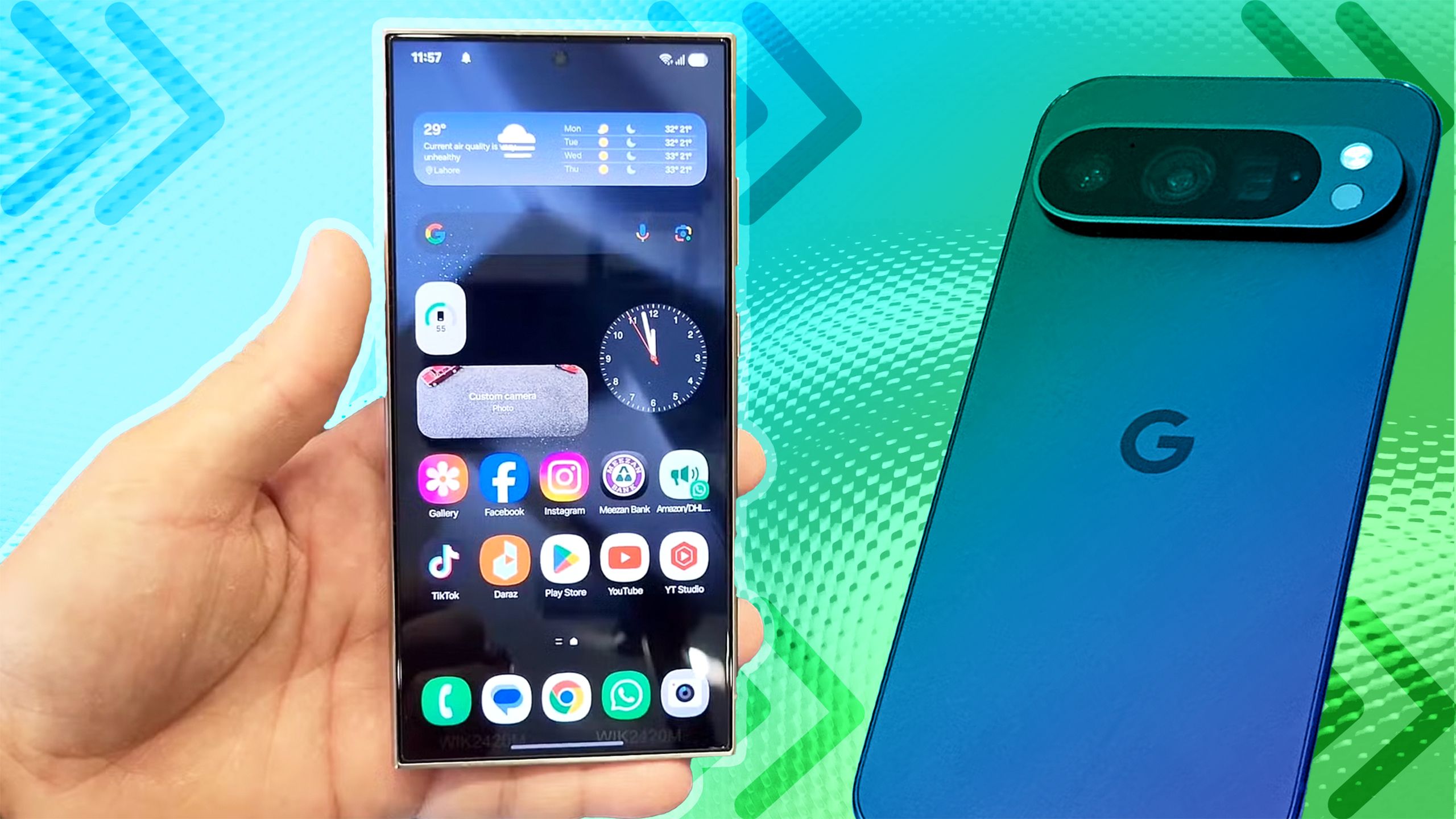
One UI 7 isn’t shy about borrowing iOS elements. Back in July, leaks showed off a few iOS 18-inspired tweaks, like the Gallery app getting a colorful, rainbow makeover that mirrors Apple’s Photos. There’s also talk of a Camera app redesign, with all settings moved to the bottom and tucked away in a drawer that pops up when you tap a button.
Of course, iOS and Android are far from being identical, but over time, they’ve started to share more features and design elements. While it can make phones feel a little too similar, it’s only natural after over 15 years of smartphones that things are arranged in ways people expect.


