I might not like it, you might not like it, but if you’re in the US, it’s time to face facts: the vast majority of smartphone shoppers around us are, at the very least, considering the iPhone these days. Whether it’s due to the peer pressure of iMessage-enrolled friends or the diminishing amount of Android-based alternatives available on the market, Apple’s advantages in North America continue to increase with each passing year.
No Thanks, Keep Reading
Simultaneously, though, the iPhone feels like it has reached a sort of crossroads. Changing market trends and political pressure in the EU alike have pushed iOS into all sorts of new directions, leading to the most Android-like iPhone experience we’ve seen yet. Months ago, I would’ve told you that was cause for concern, another nail in the coffin for any hope of a resurgence in Android’s US-based popularity. Having used the iPhone 16 Pro Max over the course of the last month, however, it paints an entirely different story.
Apple iPhone 16 Pro Max
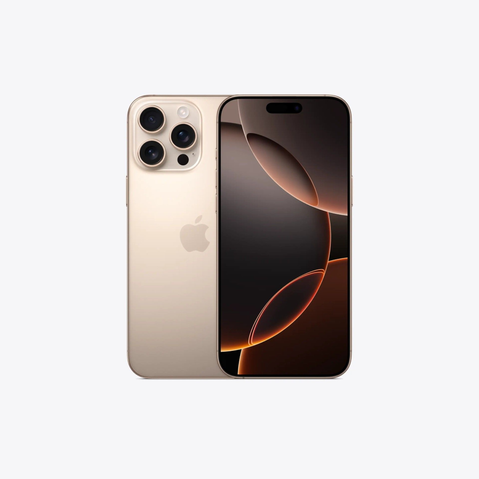
Apple’s iPhone 16 Pro Max is an impressive piece of smartphone hardware. With a massive 6.9-inch display, a beefy battery capable of lasting two days on a charge, and a flexible camera system, it gives the best of Android a run for its money. It’s just too bad iOS is on a downhill trajectory, and no amount of AI fluff seems ready to change that.
- Big, bright, colorful display
- Fantastic battery life
- Photographic Styles help bring life back to photos
- Apple’s hardware remains excellent as always
- iOS 18 is messy, buggy, and unfinished
- First group of Apple Intelligence tools is a letdown
- Photographic Styles are weirdly annoying to set up
- The first iPhone to truly feel a little too big
Pricing, availability, and specs
New year, same story
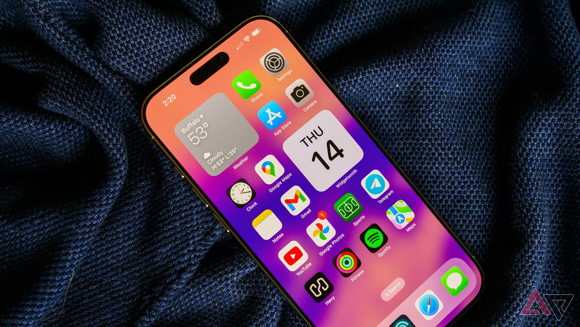
The iPhone 16 Pro Max starts at $1,200 for the 256GB model, with upgrades to 512GB or 1TB available for $1,400 and $1,600, respectively. It’s available on practically every carrier, including Verizon, AT&T, and T-Mobile, along with plenty of MVNOs. You can also pick one up through retailers like Best Buy and Apple’s own storefronts, both physical and online. It comes in four titanium-branded hues: black, white, natural, and an all-new desert shade.
Specifications
- SoC
- Apple A18 Pro
- Display type
- Super Retina XDR OLED
- Display dimensions
- 6.9-inch
- RAM
- 8GB
- Storage
- 256, 512GB or 1TB
- Battery
- 4,685mAh
- Charge speed
- 25W wired, 15W wireless, 4.5W reverse wireless
- Ports
- USB-C
- SIM support
- eSim
- Operating System
- iOS 18
- Front camera
- 12MP wide
- Rear camera
- 48MP wide, 12MP periscope, 48MP ultrawide
- Cellular connectivity
- 5G
- Bluetooth
- 5.3
- Weight
- 227g
- IP Rating
- IP68
- Colors
- Black, White, Natural, and Desert
- Price
- $1,200
Design and display
When does ‘big’ become ‘too big?’
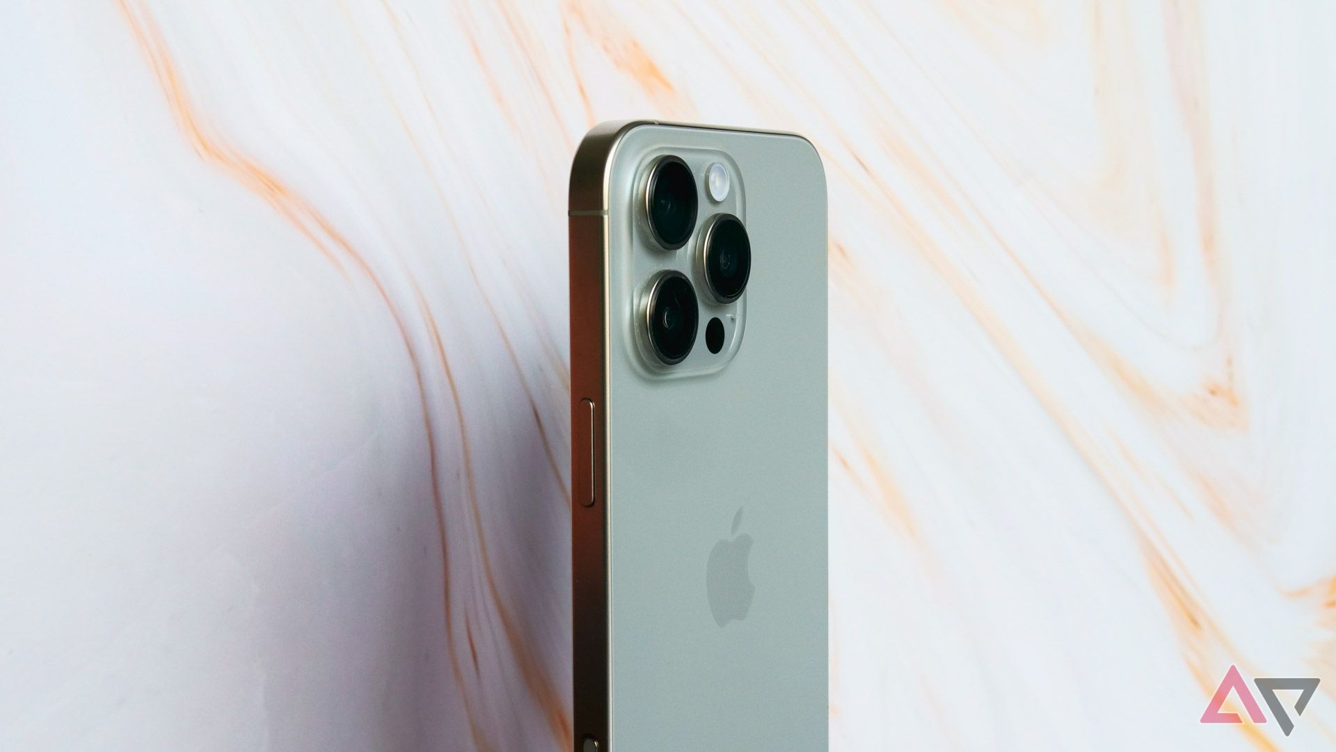
Outside the color options available, Apple made practically no changes to the core Pro Max design in this year’s iteration. You’ll find the same flat edges on every mainline iPhone since 2020, paired with the titanium chassis introduced last year. The iPhone 16 Pro Max is slightly longer and wider than its predecessor and, as a result, weighs around six grams heavier. At 8.25mm, though, it’s just as thick as last year’s phone — anyone hoping for a thinner device will need to watch for Apple’s rumored iPhone 17 Slim.
Like last year, I like Apple’s overall design, but it’s hard to feel particularly impressed when you’re on the fifth iterative upgrade. More than that, though, the iPhone 16 Pro Max’s larger display — the reason for the more expansive dimensions — actually makes the device feel too large in my hands. I had a similar problem with the Galaxy S24 Ultra; sometimes, some devices are just too big. Minimal bezels and curved corners aside, I never felt comfortable holding this phone.
In fact, unlike the iPhone 16 (and presumably, the similarly sized iPhone 16 Pro, though I don’t have that on hand), this phone feels too large and unwieldy to trust without a case. Throwing any level of acceptable protection on this $1,200 smartphone just makes it feel that much bigger, compounding the overall problem. Surprisingly, the taller, slightly wider build of the iPhone 16 Pro Max breaks what was otherwise a perfectly acceptable design just 12 months ago, but here we are.
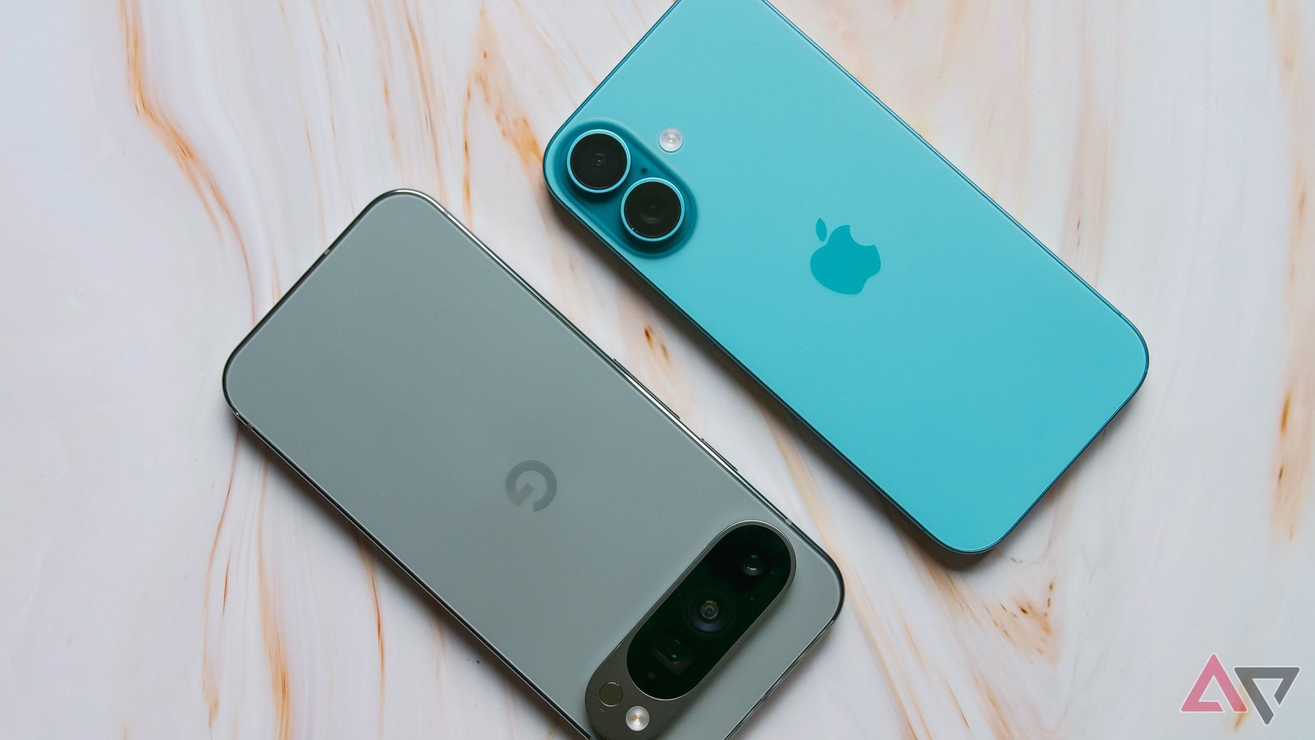
Oh, and a note on those colors. Having seen the iPhone 16 Pro Max in its new Desert Titanium colorway, I simply do not understand what Apple was thinking. Even Google supplies its Pro-branded phones with at least one semi-colorful colorway. The regular iPhone 16 looks stunning in its Teal and Ultramarine tones this year; can we please move past the idea that enthusiast consumers don’t want a splash of color?
Outside its size, I don’t have much to say about the iPhone 16 Pro Max’s 6.9-inch display. It’s massive, bright, and punchy without looking too oversaturated. The big change this year seems to come from its ability to drop down to 1 nit of brightness, whereas last year’s model stopped at around 2 nits. It’s a great display, but it’s not best-in-class — I still prefer the 6.3-inch Super Actua panel on the Pixel 9 Pro.
Other hardware and what’s in the box
Camera Control isn’t particularly good at, you know, controlling your camera
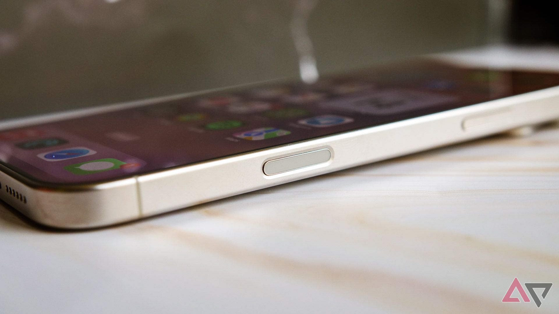
The Action button makes a return this year, and it’s as limited as it was in 2023. I have no idea why Apple has limited this particular shortcut to a single action when its other additional hardware button is trying to do so much. Still, maybe we’ll see some additional options for double or triple taps in iOS 19. For now, though, it remains my dedicated flashlight trigger.
That aforementioned “other button” is Camera Control, and outside of Apple Intelligence, it’s the most noteworthy change this year. It’s a hybrid mechanical-capacitive button that pulls triple duty as a camera shortcut (using a single tap if the screen is on; double tap if the screen is off), a shutter button, and a dial for swapping between modes and settings within the viewfinder. Put simply, it is the exact opposite of the Action button: convoluted to the point of actual madness.
During my time with both the iPhone 16 Pro Max and the smaller, cheaper iPhone 16, I’ve found myself using Camera Control on occasion. It does work well as a camera shortcut, even if it’s in a slightly awkward spot for quick presses. It’s also okay as a shutter button, though its firmness means the occasional blurry shot from pushing too hard, too quickly.
As far as sliding between camera settings goes, though, it’s far too frustrating in those situations. Muscle memory or not, it’s far faster to swipe between modes, zoom levels, or adjust your exposure just by using the on-screen controls. Considering how finicky those tools are with Camera Control — especially if you’re capturing in portrait — I’d say the most useful part of this button is the ability to press and hold to start a video recording. Even then, you already need to be in the viewfinder to start it.
Otherwise, this iPhone remains as excellent a piece of hardware as previous iPhones, though I’m not sure that’s as impressive as it used to be. Samsung caught up to the competition years ago as far as build quality is concerned, and I’d argue Google’s Pixel 9 Pro has met Apple’s bar as well. This is a rock-solid piece of hardware, but it’s just not enough to stand out anymore.
Still, there are a couple of spaces where I think Apple is ahead of the competition. The iPhone’s speakers remain second to none — this phone might be one of the very few where I don’t consistently notice a difference between the bottom-firing speaker and its earpiece-based sibling. Watching videos on the iPhone 16 Pro Max without headphones is a joy for this reason, so long as you can ignore the Dynamic Island’s frustrating placement.
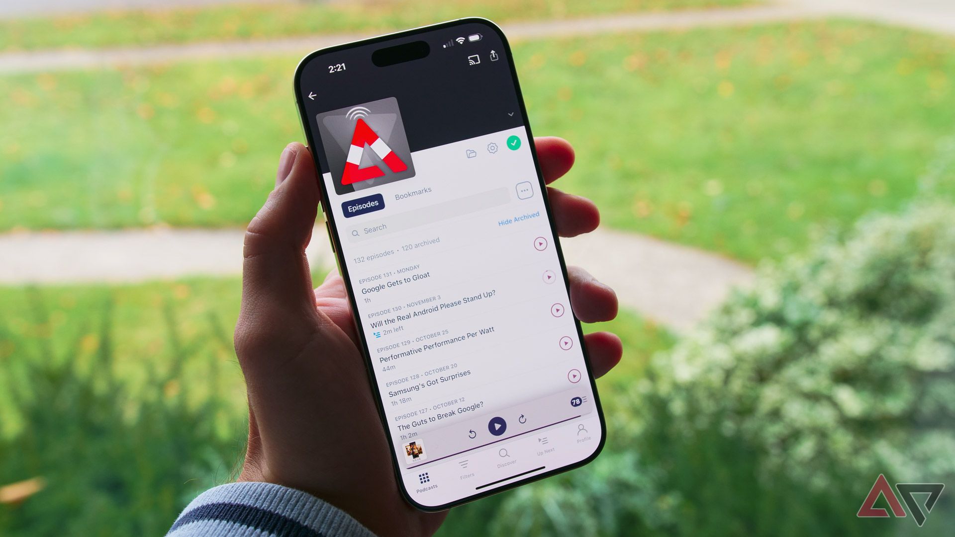
Second and far more niche is the iPhone’s new mic array. Apple’s used four microphones on its high-end iPhones for years now, but the tuning and overall quality continue to improve year over year. While I wouldn’t completely replace my mic setup for recording episodes of the Android Police podcast, it’s good to know that, whether on the road or out at a conference, I could make do with this device in a pinch.
In the box, you’ll find the iPhone 16 Pro Max, a USB-C cable, and the usual assortment of paperwork. Oh, you wanted something extra, like a charger or, I don’t know, an Apple sticker? Tell it to the company’s bottom line the environment.
Related
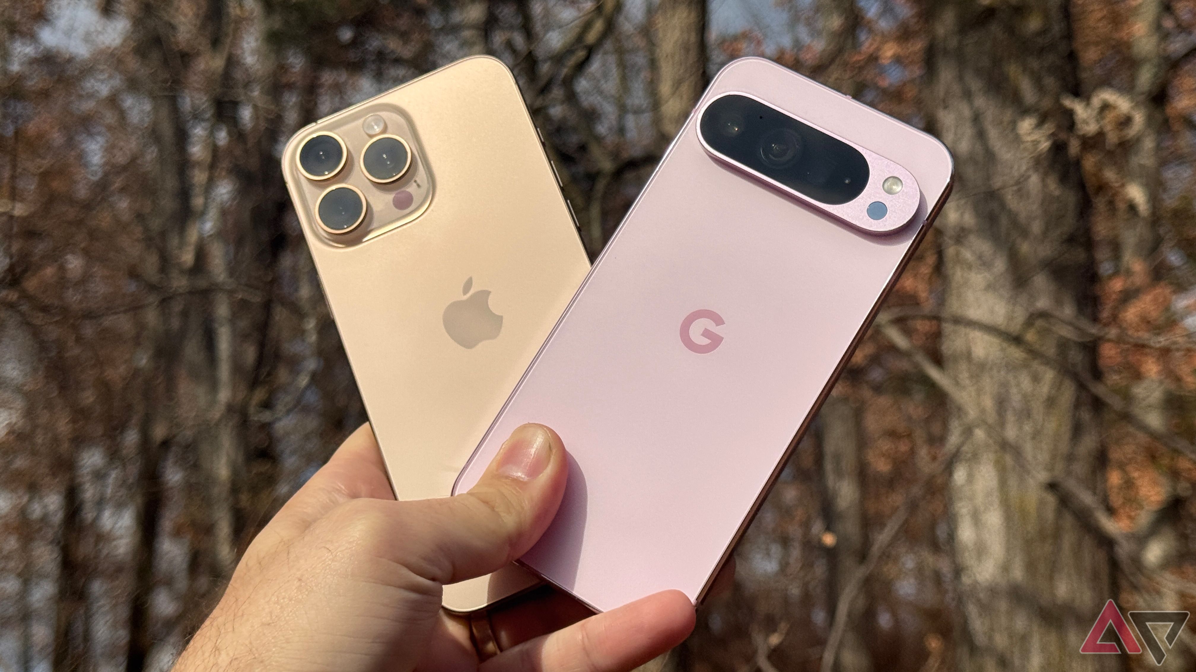
I used the Pixel 9 Pro XL and iPhone 16 Pro Max for a week: Here’s what I learned
Google’s put the work in
Software and performance
Believe it or not, I miss the iOS of years past
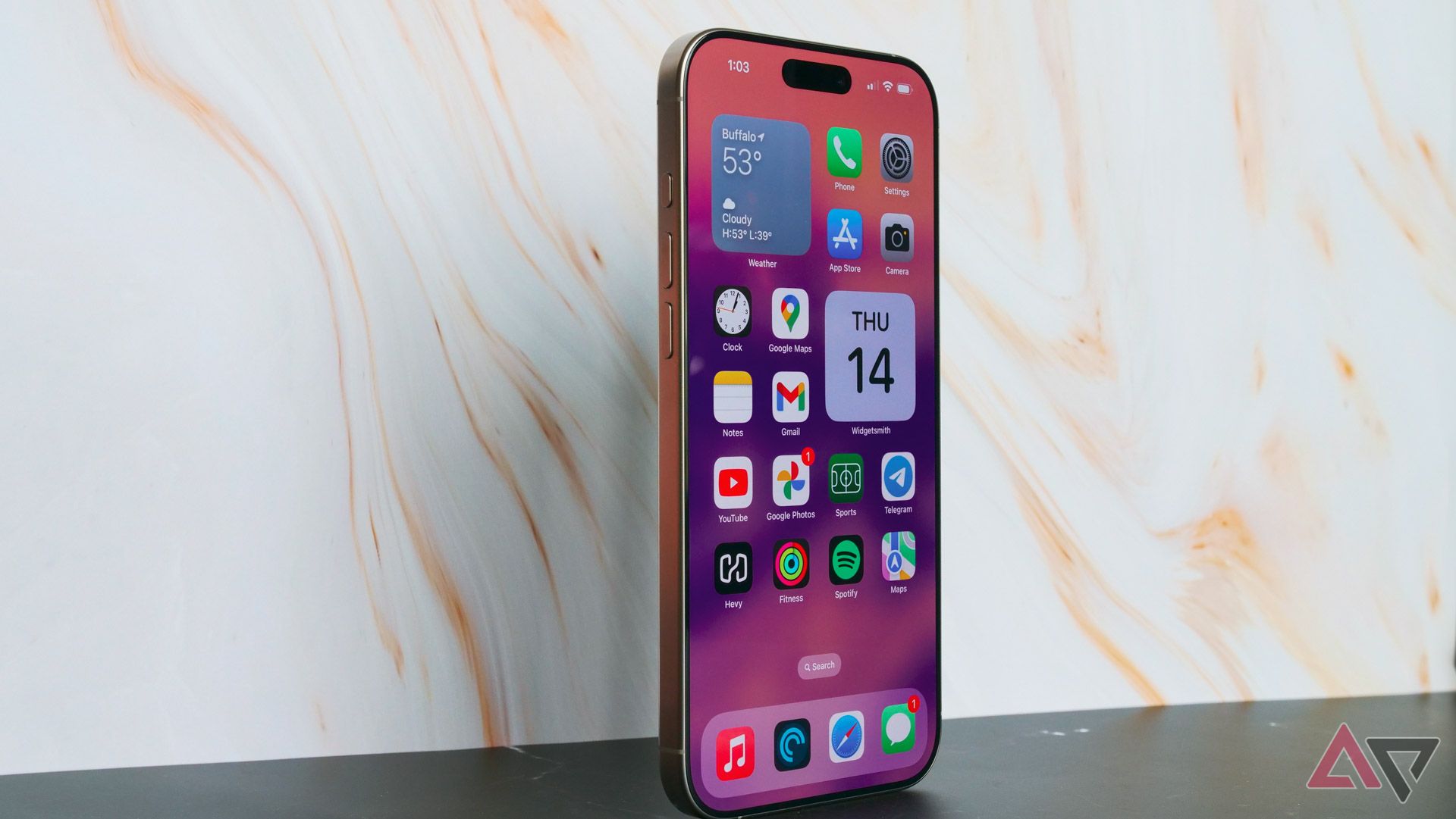
Despite writing for an Android-centric site, I’d like to think I’m about as operating system-agnostic as anyone can be. Sure, I have my preferences, but I’ve been quick to call out areas where I think Apple has outperformed the competition. From small utilities like the ability to quickly copy and delete screenshots to the new — and very cool — flashlight controls rolled out this year, I’ve been more than fair whenever I’ve discussed iOS as a platform.
With those priors established, please hear me out when I say iOS 18 is an absolute mess of a software update.
I’m not just talking about the very odd rollout for Apple Intelligence — those “features” will get their own subheading in a moment. I’m talking about the core identity of iOS. For years, this platform has been too limited and buried under too many restrictions. Apple has slowly allowed for more power user tools to pile up over the past few upgrades, and now, with iOS 18, it feels like the dam has burst. With iOS 18, the iPhone 16 Pro Max feels more like an Android phone than ever before, but somehow, these tools are far more overcomplicated than anything you’d find on our side of the fence.
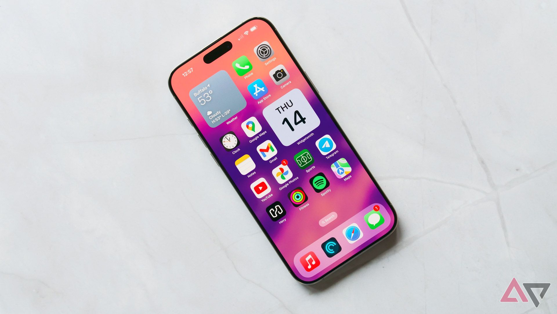
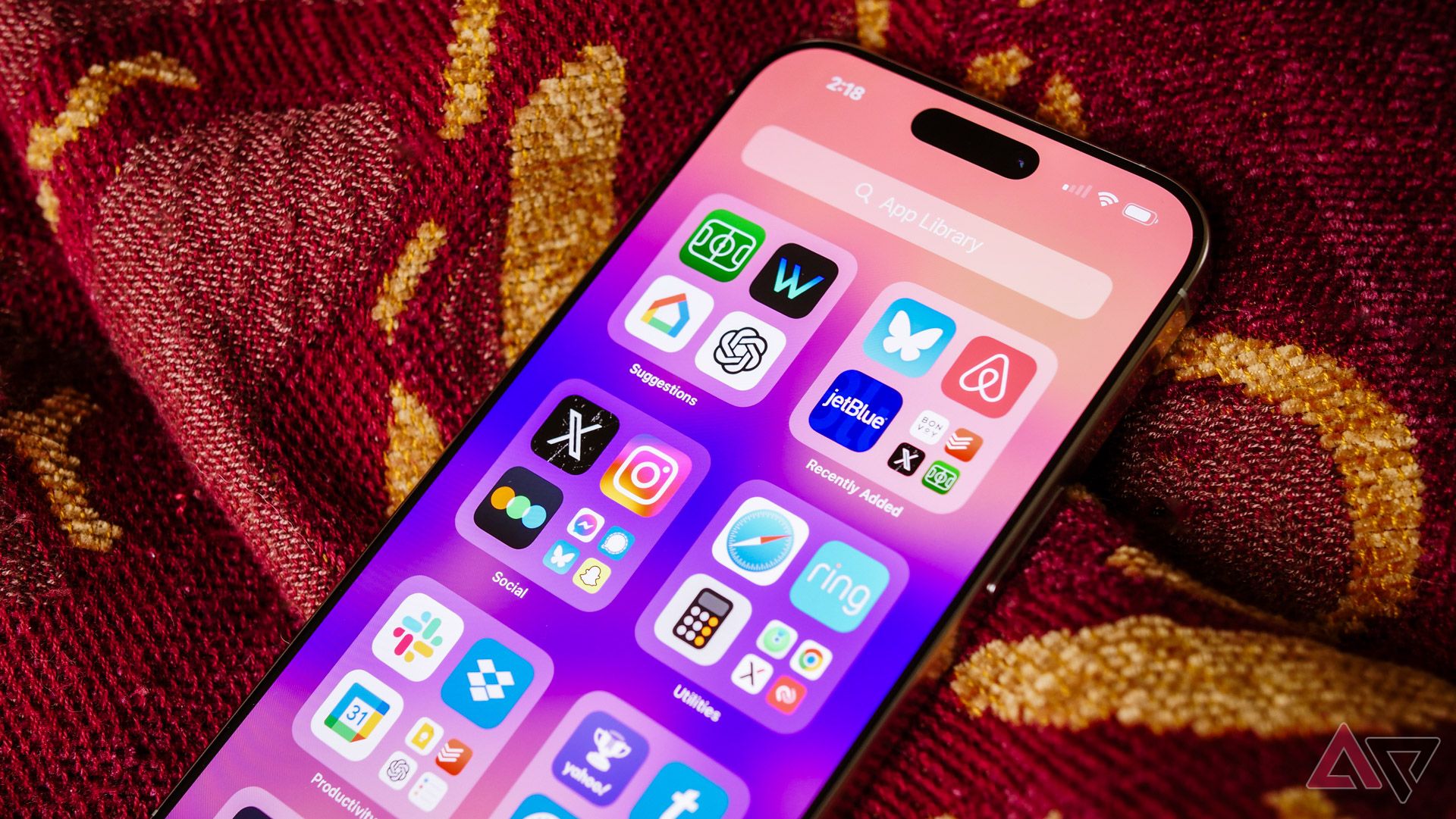
For the first time, you can truly customize your home screen, moving icons into empty spaces and using dynamic themes to employ creative splashes of colors. I hate literally everything about how Apple went about this change. I remember creating blank icons with Cydia on a jailbroken iPod touch 15 years ago and moving icons around the grid-based layout was easier then. Despite the ability to rearrange apps, Apple still auto-snaps your icons into place. You will be swearing at your screen in seconds if you have any familiarity with moving apps around on Android. It’s embarrassing for this to feel so broken on such an established device.
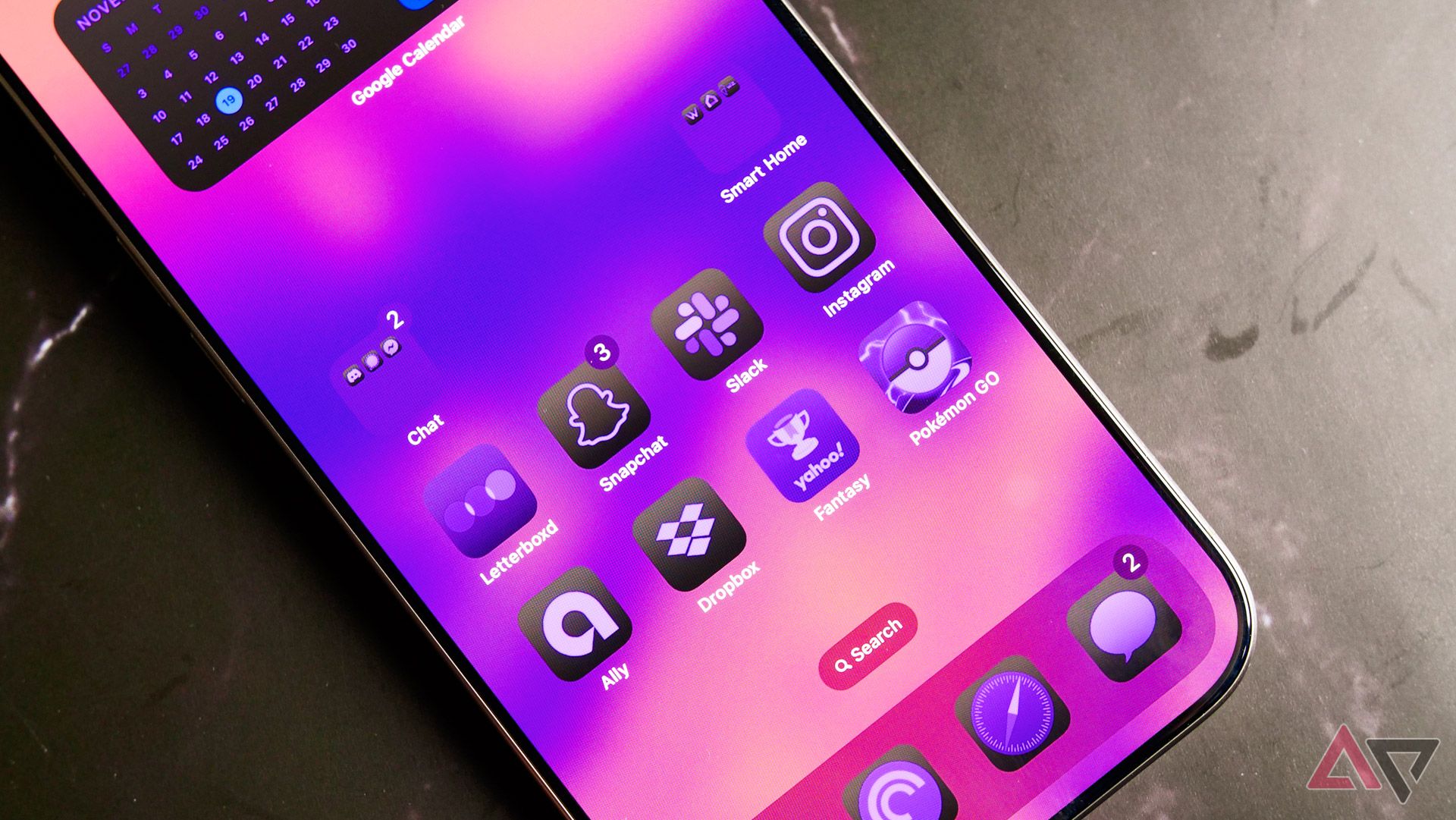
You can’t tell me that purple Pokémon Go icon looks good. You just can’t.
Those dynamic themes look similarly terrible. From the ugly dark mode gradients employed on apps like Notes and Health to the downright awful colorized tints, the only thing Apple has over the competition is an auto-forced theme for developers unwilling to play ball. I’m as frustrated as anyone at Google’s insistence on waiting for app makers to manually add support for Material You. Still, if the alternative looks like iOS 18, I’m fine dealing with Android’s half-busted system. If you’re buying this phone, stick to the pre-established look from older versions of iOS.
It doesn’t stop there. From the universally panned Photos redesign — a change that would bother me more if my entire collection didn’t live in Google Photos — to the continued messiness of Apple’s lock screen editor, I’m simply not impressed by the current state of iOS. It feels like the sort of platform iPhone fans would’ve been mocking a decade ago, despite plenty of solutions for its current slate of problems. And by the way, the autocorrect bug I complained about a year ago? It’s still here, unfixed and continuing to cause havoc with my messages.
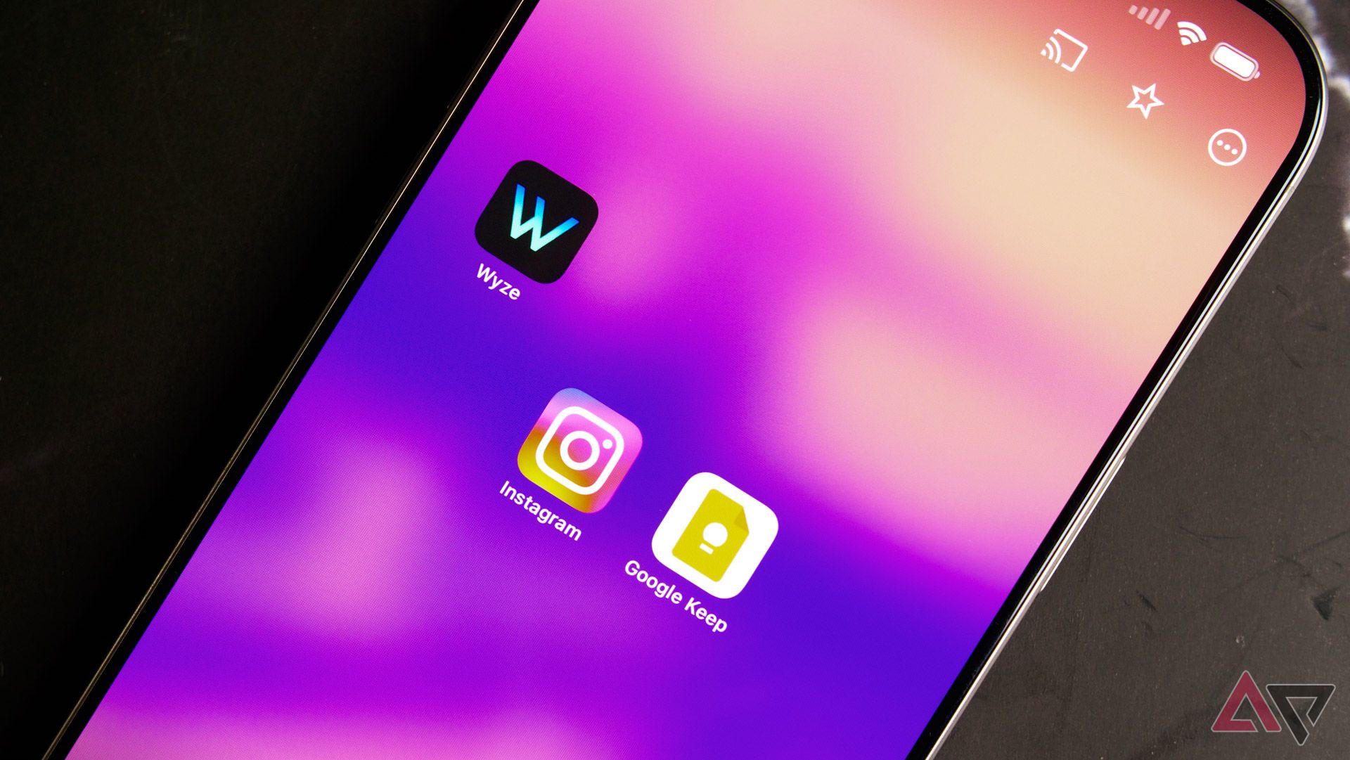
Still, it’s not all a mess. I’m happy to see RCS here — I know some iPhone users have ran into headaches with it, but in my experience, it worked seamlessly. Additions like message scheduling, customizable lock screen shortcuts, and Siri’s new look are all great, even if they should’ve been here years ago. And count me as a fan of the new customizable Control Center. Considering every Android OEM on the planet seems intent on stealing inspiration from iOS 18 here, I guess it’s a good thing I like it.
As far as performance goes, well, it’s a modern iPhone. I wouldn’t say I pushed this device particularly hard during testing — Apple’s dream of AAA gaming going mainstream seems to be floundering — but in my day-to-day, I didn’t catch a hitch in scrolling. Likewise, multitasking works better than ever, with apps staying alive in the background longer than usual. Perhaps a benefit from all of that extra RAM needed for Apple Intelligence, which I think it’s finally time to tackle.
Apple Intelligence
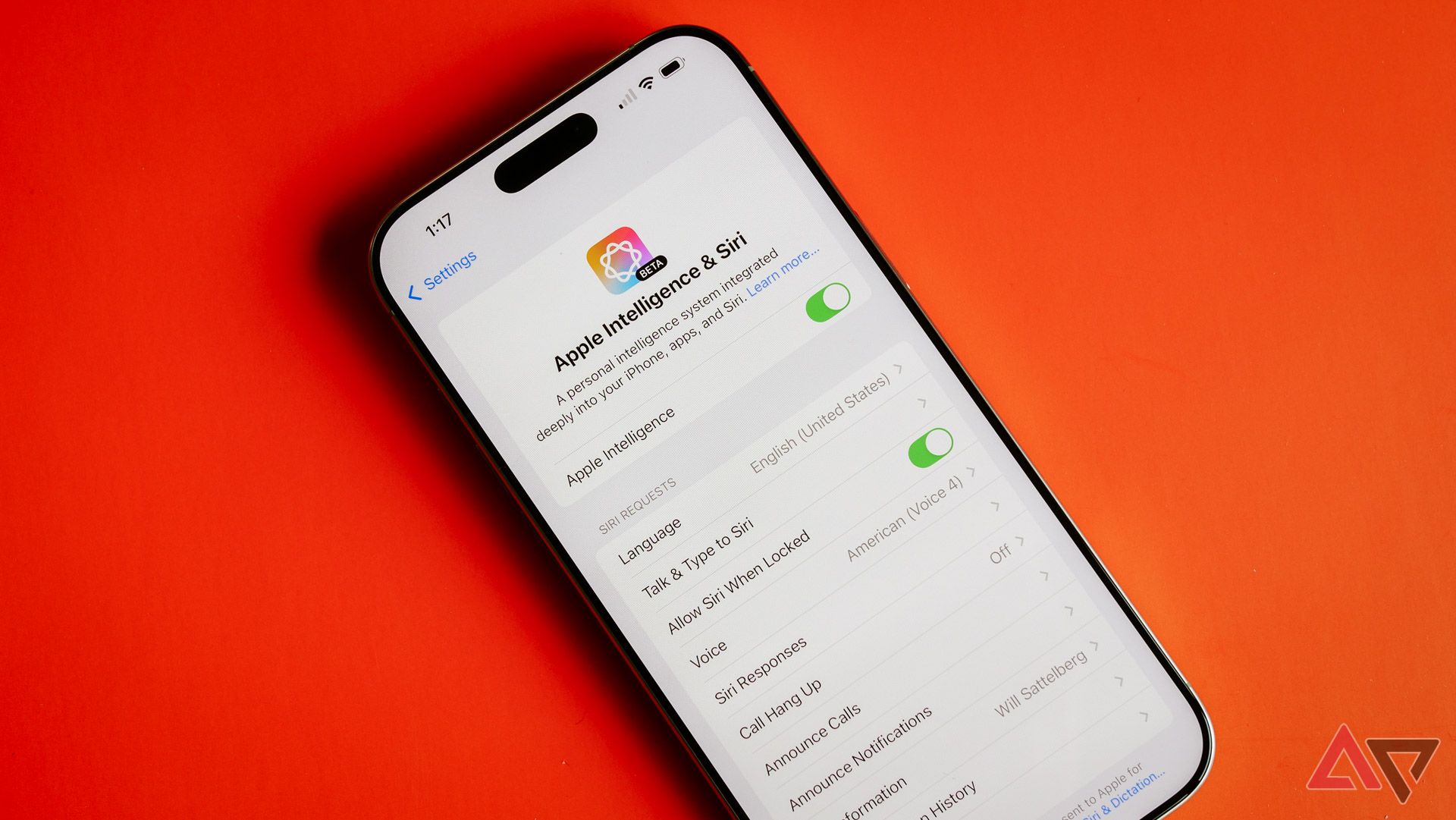
It took over a month after the iPhone 16 launched for Apple Intelligence to roll out to everyone. iOS 18.1 arrived in late October with the first batch of AI-focused features, and I can’t say I’m particularly impressed. It’s not that Apple is being outplayed by the competition — no OEM outside of Google has shipped any remotely interesting AI features, and even then, the Pixel’s toolset is one incredibly mixed bag. Rather, despite being late to the AI-themed party, Apple has failed to show any interesting or convenient concept, a rare miss for the “being late is better than being wrong” crowd.
If you’re just looking at Apple’s website, finding out what Apple Intelligence features are live in iOS 18.1 is surprisingly difficult. This is probably because this first group is such a nothing burger; the brand continues to push features that are months away from launch, hoping its user base will upgrade to new hardware purely based on a catchy ad campaign alone. I have to imagine those shoppers will find themselves pretty disappointed with their expensive new piece of hardware — only time will tell if this move does any reputational damage to the company moving forward.
So, what is included in this first batch? AI-generated notification summaries are the big one, though they’re disabled by default. These are, seemingly, Apple’s latest attempt to “fix” the terrible notification system employed by iOS, following in the footsteps of Scheduled Summaries in iOS 16. Whenever your phone receives multiple notifications from the same app, iOS will attempt to distill these alerts into a single, easily digestible blurb. It is the perfect example of a great idea being executed terribly, a victim of AI-based hallucinations that I doubt will ever be fully solved.
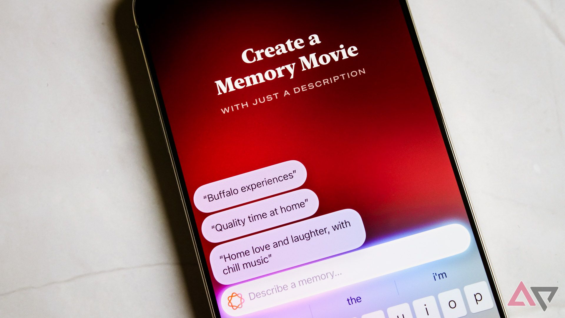
For every good summary (such as a perfect two-line notification detailing a conversation about the lack of small Android tablet offerings), there are five bad ones. The effect isn’t saving you time; it’s forcing you to double-check every notification to ensure you see the correct details. The only spot where these summaries are reliably accurate is duplicate notifications where you don’t need to see every incoming ping, like Ring’s motion alerts or Twitch streamers going live.
The vast majority of AI tools included in iOS 18.1 are pretty minor, and if you’re coming at this from the perspective of a Google user, you might not notice them at all. Smart Reply is available in Mail and Messages, for example, the former of which I don’t use (and I haven’t found the AI-generated replies in iMessage to be good enough to send even once). Clean Up and Create a Memory in Photos are fine if you’re using that (bad) app, but I’m not, and it’s the sort of thing Google’s been doing for a while.
While the real improvements to Siri are still months away, the ones that are already here are pretty disappointing. As I said, the visual overhaul is great, but Siri’s voice offerings sound less natural to me than ever, and it now feels particularly slow in settings like CarPlay. That makes firing off a message while driving particularly frustrating, to say the least.
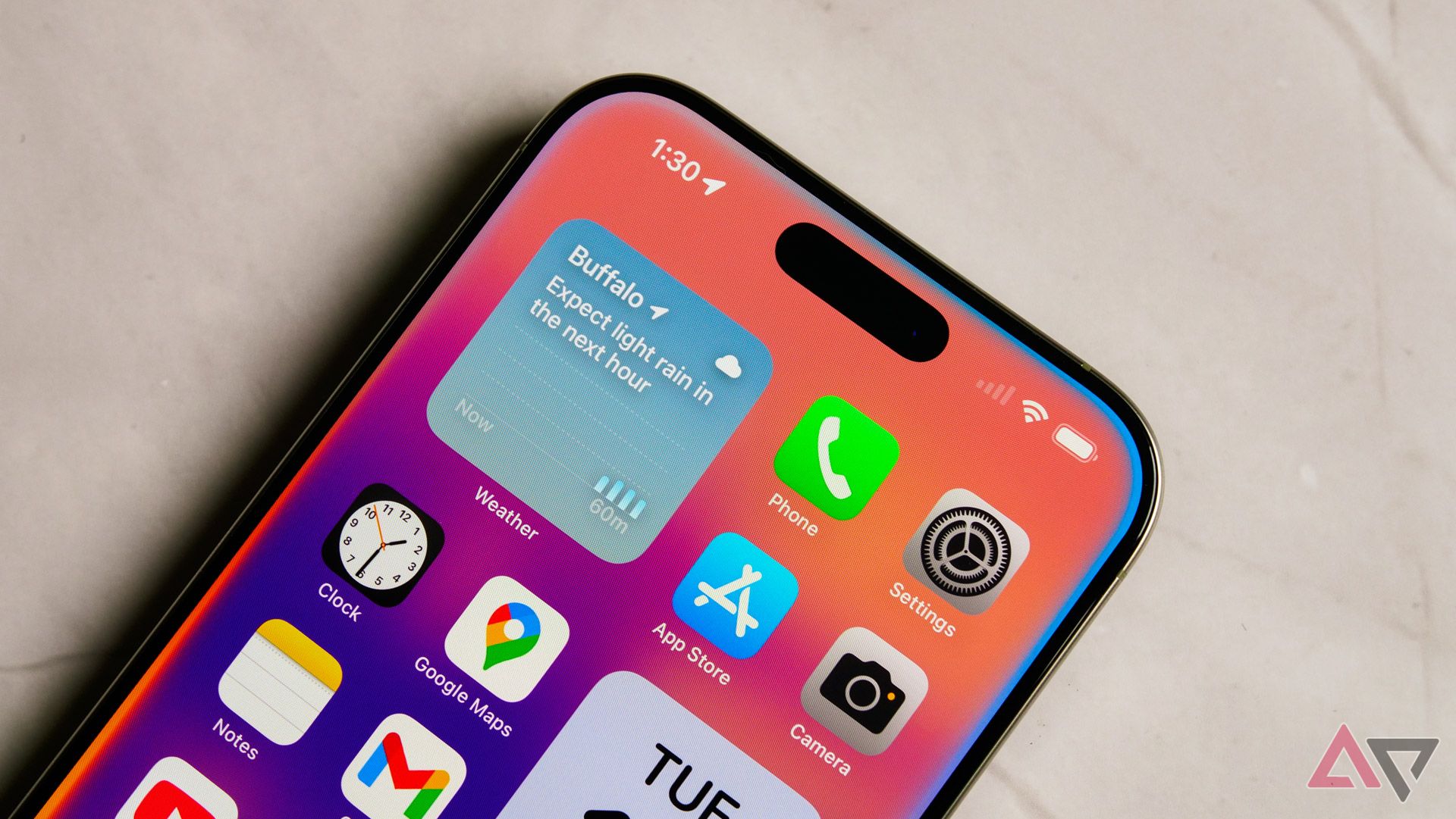
Siri now lives around the border of your screen. It’s a nice effect, but it doesn’t make the actual utility any better.
I’m willing to keep an open mind about future Apple Intelligence updates, but the fact of the matter is that this phone is shipping to customers unfinished and with a slate of tools that simply doesn’t impress, even outside comparisons to the competition. Put another way, the iPhone actually feels behind Samsung’s Galaxy AI suite of features in many ways, and if that doesn’t give you pause, I’m not sure what will.
Camera
Photographic Styles are the make-or-break of this camera system
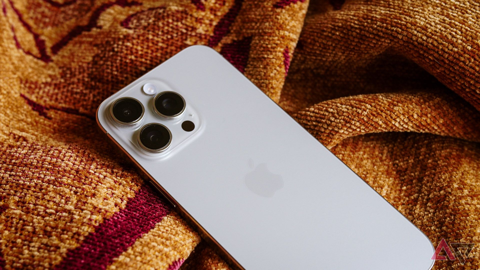
With my feelings on Camera Control already out of the way, how’s the rest of Apple’s latest camera system? Honestly, pretty good. I’m not sure I’ve been truly wowed by any of the shots I’ve taken over the past couple of weeks, but it’s a reliable shooter — assuming you’re willing to play around with Apple’s new Photographic Styles settings, that is.
Out of the box, the iPhone 16 Pro Max falls victim to the same problems I have with Google’s post-processing on the Pixel 9 Pro: a complete lack of contrast. In the era of HDR-everything, practically every OEM has decided anything surrounded in shadows or darkness should be “corrected” before the photo even saves to your gallery. The result is a boring collection of washed-out colors, the exact sort of thing driving budding enthusiasts to return to point-and-shoot cameras.
Inspired by Becca Farsace’s own iPhone 16 Pro takes shared on the Android Police podcast, I’ve been shooting practically everything with Apple’s Gold style applied, complete with maxed-out tone and color settings. Although I find the process of setting a specific shooting style to be overly confusing, once it’s done, it’s done, and all the samples you see here were shot with those color combinations. The result is something rare: a collection of photos with actual personality, without the need to adjust and edit later on.
These images remind me of my surprise favorite camera: the OnePlus Open. Like with that phone, these images are maybe a touch more saturated than the real world, and lean on the warmer side of things. The result — at least from the primary 48MP lens — is fantastic during the daytime. At night, I still think the Pixel 9 Pro has Apple beat, as everything looks a little too artificially bright for my liking. Not to mention, I captured a lot of blurry night shots with this thing — a situation only made worse any time I’d try to rely on the Camera Control button.
I’m a little more mixed on the iPhone 16 Pro Max’s other two lenses. The ultra-wide lens is one of the few hardware changes this year, featuring a bump up to 48MP. It looks fine in good lighting and is especially good at capturing macro images. The 5x lens is seemingly completely unchanged from last year’s model, and my complaints have gone similarly untouched. The Pixel 9 Pro trounces it in low-light and stabilization when zooming in on far-away subjects.
iPhone 16 Pro Max and Pixel 9 Pro photo samples, 0.5x, 1x, 2x, 5x, 25/30x.
Still, though, this phone is as good of proof as any that Google needs to rethink its approach to mobile photography, especially considering its recent reliance on HDR. While the Pixel 9 Pro remains my preferred camera system, I don’t want to feel like I need to tweak the saturation, contrast, and color temperature of every image I capture just to get the style I want. If I wanted that, I’d be shooting on a real camera, preferably in RAW. Look at the two photos below and tell me which you prefer.
iPhone 16 Pro Max vs. Pixel 9 Pro. While the red barn is a little more saturated than it was in reality, the iPhone’s photo is closer to the actual environmental lighting overall.
I don’t have much to say about this iPhone’s video capabilities other than to underline that Apple continues to run circles around the competition, specifically Google. This phone can record natively in 4K at 120FPS without the need to back everything up to the cloud for post-processing. Really, that’s all that matters.
Related
I took 100 photos with the iPhone 16 and Pixel 9: Here’s what I learned
The best compact flagships face off
Battery life and charging
All day long — and then some
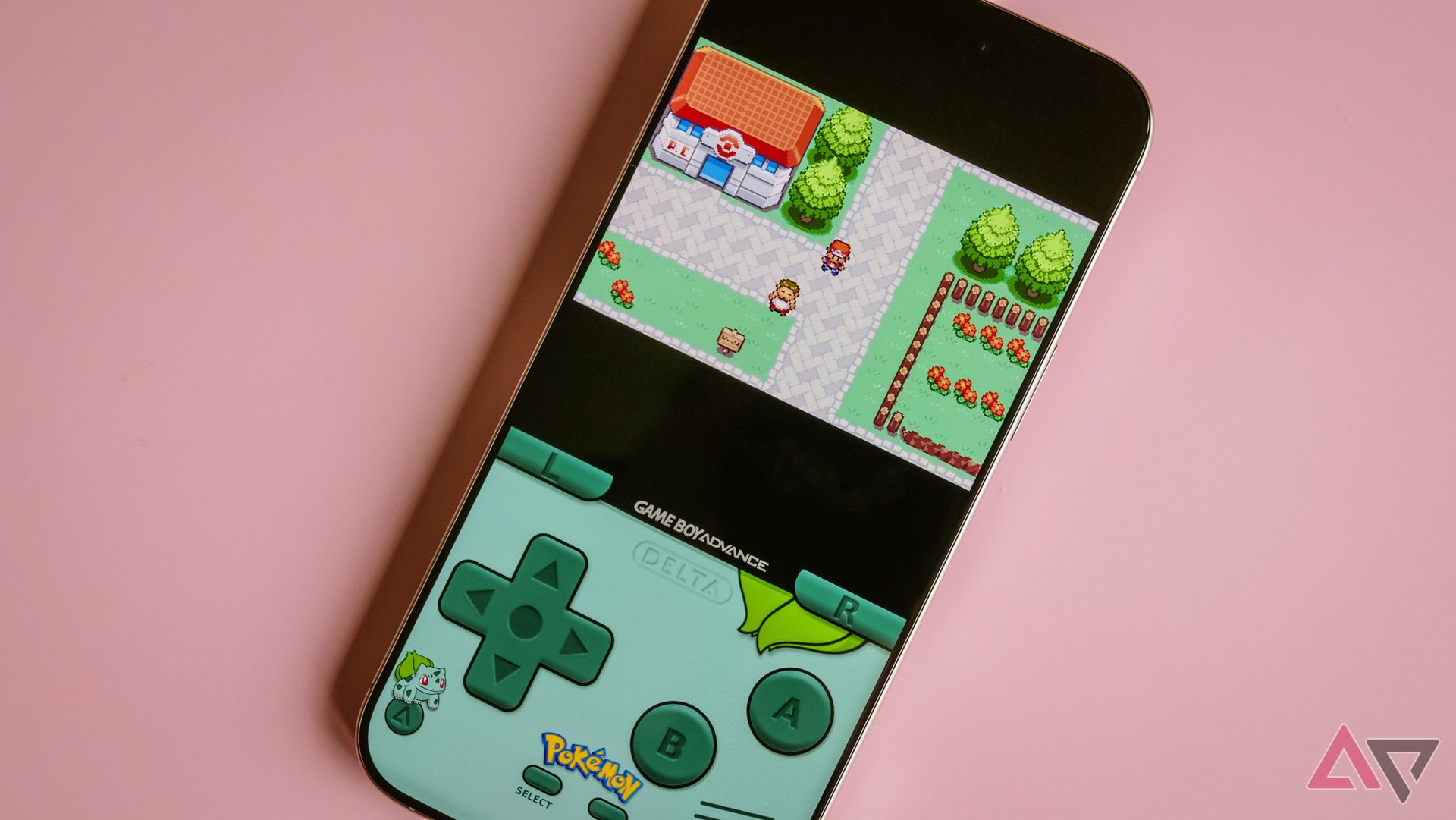
Although last year’s iPhone 15 Pro Max garnered some mixed reactions over battery expectations from those who made that phone their daily driver, I can’t say I ever experienced poor battery life during my own time with that phone. This year, though, Apple’s claiming improved battery longevity across the board, thanks to the A18 Pro’s improved efficiency. Like Qualcomm’s Snapdragon 8 Elite and MediaTek’s Dimensity 9400, this chip is manufactured using TSMC’s 2nd-gen 3nm nodes, resulting in a pretty impressive runtime on a single charge.
With light-to-mixed use, the iPhone 16 Pro Max lasts two days on a single charge without breaking a sweat. If you’re glued to your phone all day — or you’re on a sweet Balatro run — getting through a full day without looking for an outlet or a power bank shouldn’t be a problem.
This year, Apple gave a bit of a boost to the iPhone 16 Pro Max’s charging abilities. It can hit about 50 percent in 30 minutes with a compatible charger, with charging speeds slowing down past this point to prevent overheating or long-term damage to the cell. While I’m a huge fan of ultra-fast chargers from brands like OnePlus, as long as a device can hit 50 percent in about half an hour — a reasonable amount of time to, say, arrive home from work before getting ready to head out to dinner and drinks — I’m mostly satisfied.
Competition
Google’s coming for Apple’s lunch
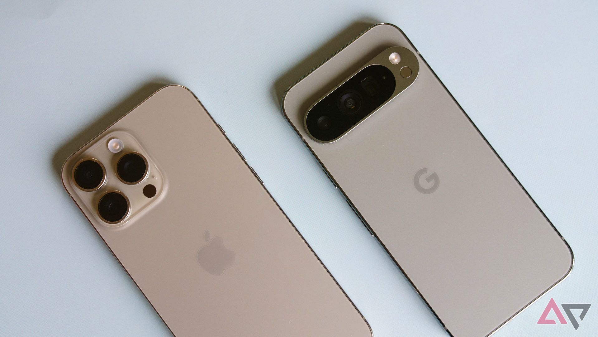
That’s the Pixel 9 Pro, not the Pro XL, but you get the idea.
Apple’s really in a league of its own, right? The vast majority of customers considering the iPhone 16 Pro Max are really only considering three other smartphones — that is, the rest of the iPhone 16 lineup. Still, on the Android side of the fence, there are two devices worth discussing; really, I’d argue, one more than the other.
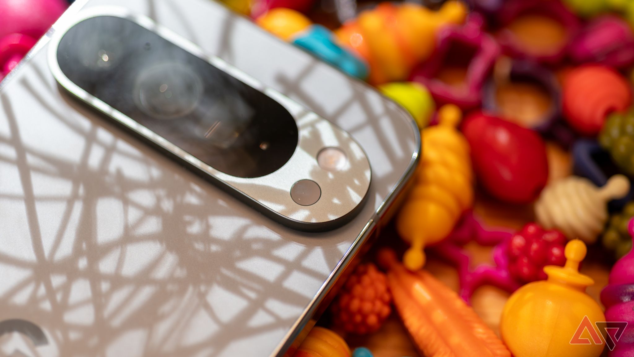
That main competitor is the Pixel 9 Pro XL. Google’s latest phablet is an impressive piece of hardware. It’s clearly inspired by Apple’s last few years of iPhone design, but the camera bar is a huge improvement over the triple camera grid seen here, both aesthetically and practically. Tensor G4 can’t quite compete with the A18 Pro on sheer performance — I don’t think Resident Evil Village would perform well on Google’s aging GPU — but I don’t think it’s supposed to. In daily performance (and, yes, when handling AI tasks), I would think these two phones are neck-in-neck where it counts: camera, display, and even battery life.
Read our review
Google Pixel 9 Pro XL review: The best big Android phone
Google’s big flagship earns its $100 price bump and then some
The Galaxy S24 Ultra is one other obvious comparison point. However, considering the Galaxy S25 Ultra is on the horizon, I’m not sure how many buyers would or could be convinced to go for Samsung’s 2024 flagship. Still, with an excellent (anti-glare!) display, an added stylus for productivity, and a matching use of titanium, it’s easy to imagine plenty of users opting for the S24 Ultra. It’s just a shame that Samsung’s photo quality is leagues behind that of both Apple and Google. Fingers crossed for 2025.
Should you buy it?
I have no doubt that the iPhone 16 Pro Max will, for some group of exhausted Android users, be the device that pulls them into the world of walled gardens and blue bubbles. However, despite some long-awaited changes finally reaching iOS, this device paints trouble for Apple’s mobile platform. The iPhone 16 Pro Max feels more like its Android peers than ever before, but that only highlights exactly where this device falls short.
Still, I hope Google — and other Android OEMs — take some lessons from the iPhone this year. Photographic Styles is a confusing mess of a tool, but once it’s set, it makes a big difference in bringing back vibrancy and a set of emotions to your photos. Likewise, while Apple’s extra buttons aren’t particularly well implemented, I’m all for adding additional hardware shortcuts to smartphones; let’s get weird with it. But if you’ve been sitting through iPhone 16 commercial after iPhone 16 commercial and wondering whether you’re missing out, I can safely say the iOS experience simply isn’t good enough to feel any sort of jealousy over.

Apple iPhone 16 Pro Max
The Apple iPhone 16 Pro Max sports the brand new A18 Pro chipset with 8GB of RAM, with impressive benchmarks for raw performance. The Pro Max model gets bigger this year, featuring a 6.9-inch Super Retina OLED display refreshing at 120Hz. Apple Intelligence has started to roll out, giving users added AI functionality like more natural Siri conversations and better searching in the Photos app.


