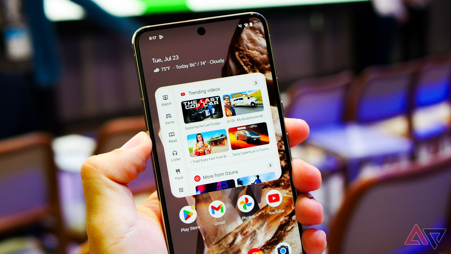
Back in July, Google invited myself and other members of the press to an event centered around the Play Store. In addition to showcasing its new Collections widget, much of the day was centered around showcasing how important “discoverability” was for Android apps. From AI-curated spaces for things like manga and cricket to better filters within the “For you” tab, Google made its goals clear. As Sam Bright, VP and general manager of Google Play, so eloquently put it, the Play Store needed to transform from a destination to download an app to an end-to-end experience built around discoverability.
Related
Google Play’s new Collections widget wants you to spend, consume, repeat
It’s launching in the US today
Nearly four months later, I don’t think I’m being hyperbolic in calling these goals a failure. The Play Store was, in the eyes of many, already racing towards a fundamentally poor place to find and download worthwhile apps and games, as bottom-of-the-barrel gacha titles and AI-focused spam rose to the top of practically every chart across the store. These days, though, the state of app discoverability is so bad on Android, I rarely bother to open the Play Store at all — and I doubt I’m alone.
The Play Store isn’t built for you — it’s built for big app developers
Finding a good app is like finding a needle in a haystack
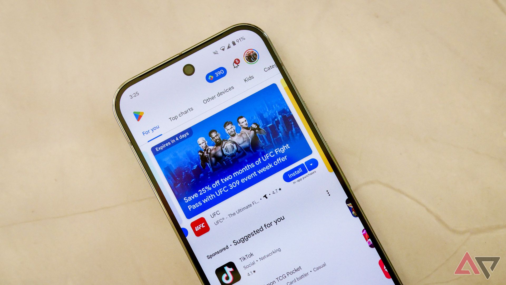
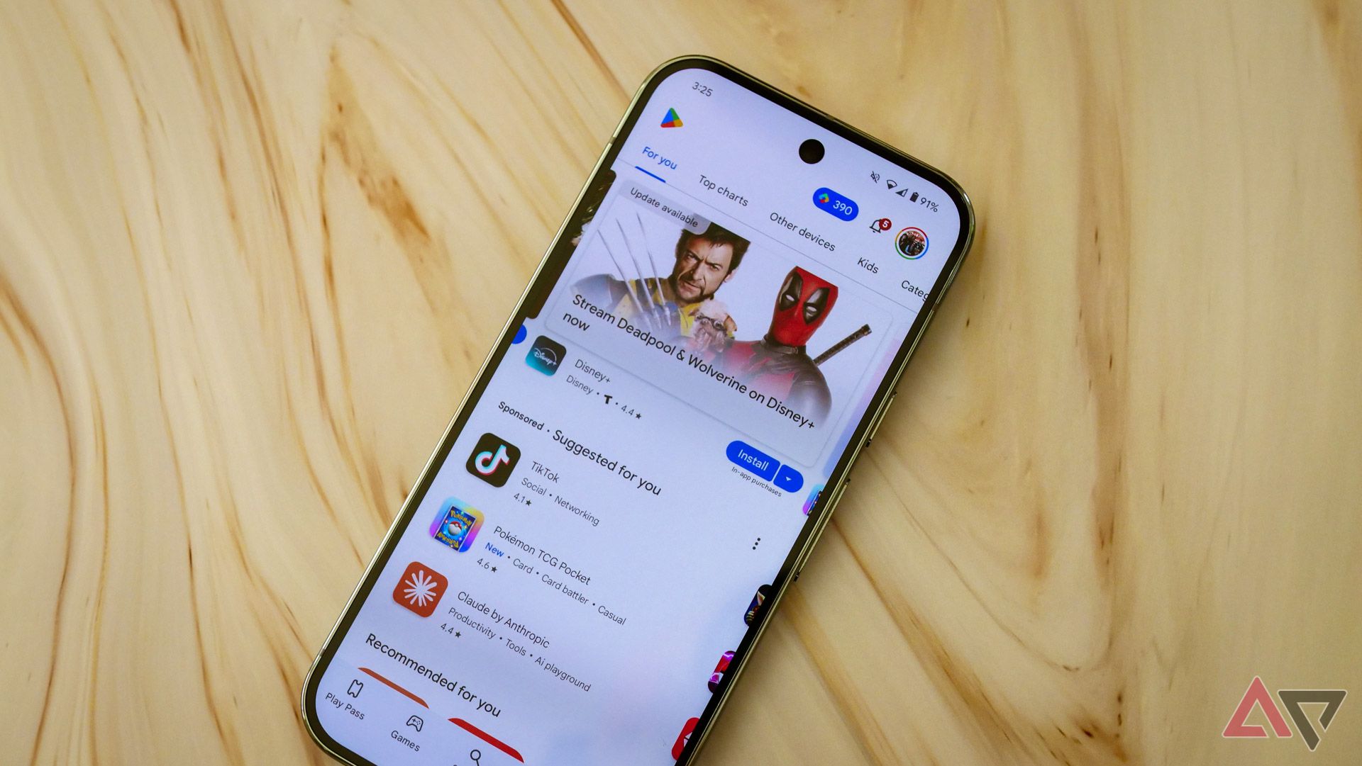
If Google wants people thinking about the Play Store as an app worth checking every day, it’s not doing a good job at it. The main two home pages within Google Play — Games and Apps — are virtually unusable these days, and it all starts with the sheer amount of sponsored content. No matter which tab you select, you’ll see your display filled up by the same two main elements: a rotating carousel in the top half of the screen, with a “Suggested for you” portion along the bottom.
Let’s take these one by one, starting with the Play Store’s carousel. These are filled with a combination of big name apps — Gemini, Max, and Disney+ fill my top spots as I write this — alongside selections “From the editors.” Sometimes those are full lists, like the “time-saving tablet apps” feature at the very end of my current group. It’s a good-enough piece of content that suggests a handful of note-taking apps, many of which I’ve never heard of, and it’s exactly what I would hope would appear in the Play Store. Of course, I’m choosing to ignore that I’m viewing this on my Pixel 9 Pro — which is decidedly not a tablet — but regardless, it’s great to see.
Everything else here, though, is a waste of time, content that feels like undisclosed sponsors (like the UFC app, which the Play Store is thrilled to inform me currently offers two months worth of membership at a whopping 25 percent off discount) or whatever’s simply popular right now, like Deadpool & Wolverine coming to Disney+. It reminds me of the main carousel view on Google TV — designed for the broadest population possible, regardless of what you actually care about.
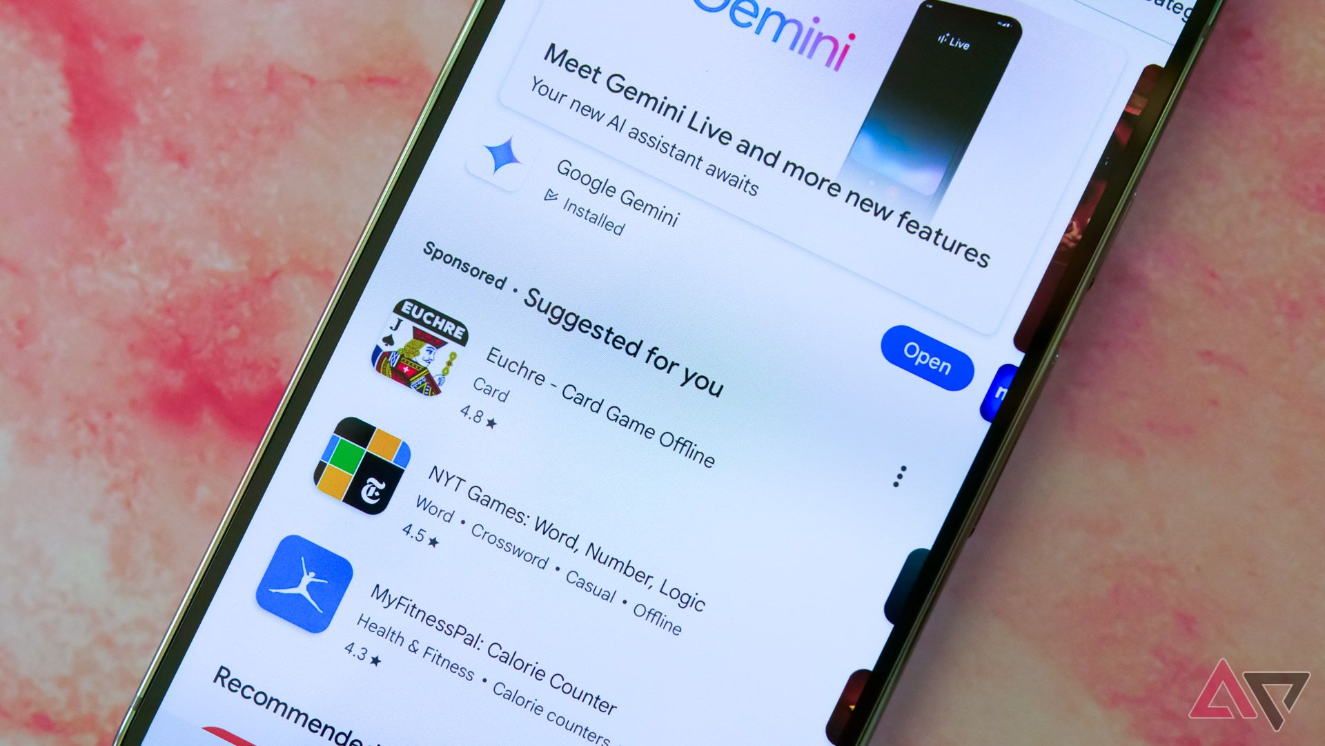
What about the “Suggested for you” section, though? Certainly personalized recommendations make for a worthwhile list of apps, right? Well, no, because these results are — for reasons I still do not understand — sponsored. This means it’s always the same collection of apps (like TikTok, which I swear has been my top “suggested” application for well over a year now) paired with whatever’s trending at the moment, like the new Pokemon TGC app, or Claude by Anthropic.
The most these results ever feel like true recommendations is whenever I spot something like Euchre, which feels specifically targeted to me thanks to my love of Balatro. Even then, it’s on the third page of apps (not games, not that the Play Store seems to really care about the difference anymore), and it’s still sponsored. Real recommendations wait further down the page, though not without a break every few categories filled with additional entries from a never-ending well of sponsored content.
Related
I’m taking back control of my Play Store experience by turning off this feature
You should, too, if you dislike targeted ads
Searching for an app feels actively hostile to users
Even if you know the app you’re looking for
These complaints alone really take the wind out of Google’s “discoverability” sails, but I’d argue it gets even worse. Earlier this year, the company rolled out a massive change to how you search for apps and games on the Play Store. Rather than tapping on a permanent search bar at the top of the home page, Google has relocated it to a tab at the bottom of your display, leaving a blank space in its place and quite literally lecturing you with a passive-aggressive pop-up should your muscle memory win out. Sure, Google could simply assume that you’re trying to search for something and navigate you to its new tab automatically, but that would feel just a little too easy, wouldn’t it?
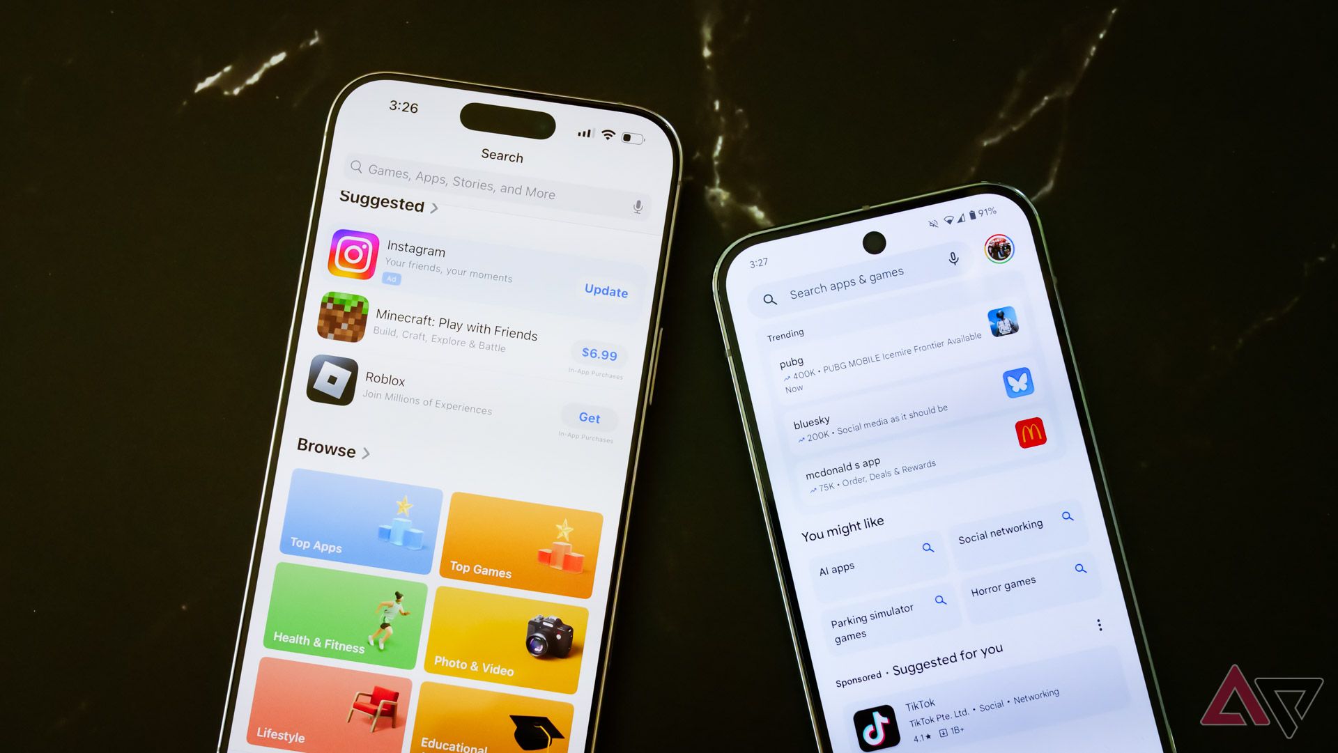
Once you do hit that search tab, you’ll still need to reach back up to the top of the display to actually activate the search bar. And as your thumb makes its way to the top of your phone’s massive screen, you’ll pass over “trending” topics, various search terms you “might like,” and, of course, sponsored suggestions. All to search for the title you’re actively looking for.
This is almost certainly pulling from Apple’s playbook, as the App Store on iOS functions nearly identically. That doesn’t make it a good design, of course — it just makes it the way Apple does it, and apparently, that’s good enough reason for Google to adopt the same sort of busy, tedious layout.
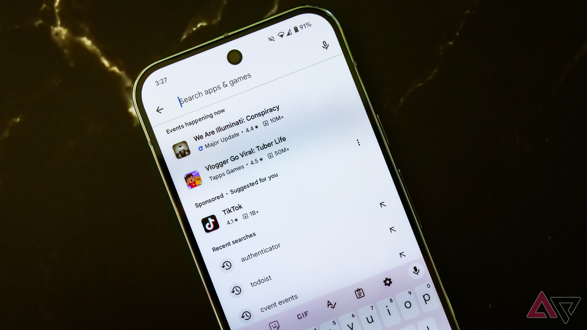
You can, I should note, skip right to the search box by double tapping on the Search tab (an action that, in my opinion, would actually warrant a pop-up). This doesn’t allow you to escape from sponsored recommendations, of course, which appear above your recently searched keywords, but it does make it a little less annoying once you know what to do.
The end result isn’t further exploration of the Play Store. I’ve never once clicked on one of these recommended searches — I think I know what results will appear under “Social networking,” but thanks, Google. I’ve never tapped on one of the trending topics, much to the presumed annoyance of whoever runs McDonald’s at this moment. All the current Play Store layout does is frustrate me any time I try to search for a new application or game, and in turn, I open the Play Store a whole lot less than I used to.
The Play Store is a mess right now
Here’s hoping some stiff competition makes it better
The changes made to Google Play over the last few years are actively hostile to users, putting some vague concept of “discoverability” over good design and clear, easy-to-read menus. Everything feels like an ad, whether it’s labeled as one or not, which leaves me far less curious to check out anything listed within the Play Store. And with most of the web’s resources for finding new apps and games practically destroyed thanks to changes from Google’s search algorithm, I’m stuck with the same handful of downloaded services I’ve had for years.
There’s no doubt I’ll continue to open the Play Store every so often — this job practically requires it. But any sense of curiosity, any hope for stumbling on an exciting new app or game, it’s completely dried up. It’s a worrying trend for users and developers alike, but one that I hope will change sooner rather than later. With a new era of third-party app stores likely (eventually) on the horizon for Android, I’m hoping the problems baked into the core of the Play Store will eventually be solved, either through alternatives or through increased competition. As it stands right now, though, I wouldn’t be surprised if I don’t download another new app for the rest of 2024.
Related
5 things the Google Play Store desperately needs to improve
Ads galore, poor quality control, and fake reviews make up a few of Google’s issues


