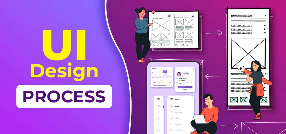
To create pixel-perfect designs, we start from scratch, or maybe with some rough sketches, and later we try to make pixel-perfect high-fidelity UI designs out of it. The process of creating amazing and aesthetic UI design is called the UI design process. The UI design process generally includes a few steps that make designing enjoyable. Having a perfect blend of great user experience and aesthetic user interfaces makes the product distinct and stand out.
For a beginner in the field, it is very important to know What is the process of UI Design? so create steps for this process of design and document each step aid to avoid any confusion for the whole team. In situations when the primary person of contact is not present or available, the rest of the team members can look into the document and take up the work.
6 Easy Steps of the UI Design Process
To make the interface more engaging to the user, a UI is much needed for a product and for that UI Design is important. UI Design is part of a Software Development Process that is created after deep research on Users by various teams of Designers and developers. Every designer has their own process of creating a UI Design but below we have discussed the blueprint of all the process that is considered by every designer.
Step 1: Concept Sketching
As the name suggests, it is purely focused to get started with the idea. Concept sketching includes rough sketches, rough screen flows, and drawings that really help to set up the design concept and foundation for an achievable solution. As humans we started with dotted alphabets to start writing, so we are quick in drawing out ideas on paper using pen/pencil. This way concept sketching helps to get high-level ideas from the top of your mind. Concept drawings in the UI design process are acceptable to be in the roughest form and don’t need to be pixel-perfect.
Drawing rough sketches and putting out ideas on paper has the highest flexibility to incorporate changes without hampering time and cost.
Things to be kept in mind to enhance understandability and encourage feedback:
To help cross-functional teams understand your concept sketches better try to use outlined boxes to represent screen layout. Mention each with a placeholder for images, text, and icons wherever needed.
Benefits of Concept Sketching:
- Helps start off with the design, and get the ideas on the table.
- Helps to visualize screens
- Encourage team collaboration, as everyone comes together to give out ideas.
- Clarify important features and requirements
- Understand most baseline tasks, and user needs
- Allows quick changes and iteration over design
- Very cost and time efficient
Step 2: Wireframing
After the concept sketching is done, the designer got some ideas around the solution. Now it’s time to start with wireframing. Wireframes are created before actually jumping on the final UI design. This step of the process focuses on giving shapes to the rough ideas we collected from concept sketching. While wireframing we add text, sample relatable images, and dummy content such as lorem ipsum. Can we effectively do it using the help of your design system wireframing kit, or any other kits to avoid doing everything from scratch? There are plenty of freely available UI kits in Figma that one could use.
Benefits of Wireframing:
- Helps refine ideas.
- Helps to visualize the layout and elements of the screen
- A fast and cost-efficient way of designing and getting feedback
- Helps in presenting ideas among stakeholders
- Encourages elimination of irrelevant components and ideas in design
Tools that can be used:
- Figma
- Existing UI kits
- Balsamiq tool
Step 3: Templatization
It includes creating components for multiple atomic elements like buttons etc. Templatization and component creation can be done on design tools for better sharing and collaboration within different cross-functional teams. It creates consistency among elements.
Component creation majorly deals with following thing:
- Designing CTAs, and their states such as hover, pressed, disabled, and normal state.
- Introduction complex elements like tables and lists that includes numbered list, bulleted list.
- Card, Menus, Forms and navigation drawers
All these components are created by adding images, graphics text, and other placeholders. Components have different variants as well, such as for a CTA button there can be variants like outlines CTA, ghosted CTA, and filled CTA.
Benefits of Templatization:
- Spread consistency across designs
- Helps to test the layout
- Encourages testing of product’s usability
- Helps discover usability and accessibility issues
- Helps in cross-functional team collaboration by taking engineering inputs on design
- Responsive problems can also be determined
- Allows sharing design
Tools that can be used:
- Figma
- Sketch
- Adobe XD etc
Also Read:
Step 4: Creating Flows
This step includes creating user flows and task flows. With this step, we decide on different tasks a user would do and how they would do them. Flow creation is all about matching the user’s mental model with the conceptual model of the product being created. We create conceptual models to ease users in performing a specific task. To perform that task, there are certain paths, containing touchpoints and sub-tasks through which the user crosses to accomplish the goal. At various touchpoints(screens) a user would interact and get some response on making some action. To verify whether the whole funnel makes sense to a user and whether the product is working as expected we create flows.
Things that designers should question themselves while laying out tasks and path to complete a task:
- What screens would the user be interacting with?
- What would happen if a user clicked?
- Where would they land after clicking?
This step is all about understanding users’ needs and their mental models. So basically taking wireframes and connecting them as a flow, would help complete a specific task. A designer would create task flow diagrams, and flow charts. To lay out different steps needed to complete a task in the most efficient manner without getting lost.
For example: To complete the purchase of shoes, screens that a user would probably interact with can be:
- Product page or Wishlist page
- Checkout Page
- Payment page
- Confirmation
Here all these screens are the interactions a user would interact with called the task flow, in order to complete a purchase that is a task.
Benefits of Creating Tasks:
- Helps visually complete user journey
- Helps test flow and screens that user would interact with
- Check click counts for reaching the end state
- Shows missing states and steps
- Shows a complete navigation scheme.
- The diagram helps map entry, exit, and decision-making points.
Step 5: Designing High-Fidelity Mockup
This step is to exactly design the screens as they would appear in the final product. Close to the pixel-perfect design, using all the work and data collected from previous steps. Here in this step, we add all the final text copies, graphics, icons, and images to the design. It is the step where all the colors, fonts, and aesthetics are added to the screens. Once designing is finished, screens are shown to the stakeholder to get their feedback. Any changes or a/b testing variants are decided based on the review. Final mockups are also used in usability testing. Another important thing in this step is that, as designs are finalized, assets like images, text or translations, icons, and illustrations, etc are shared with developers.
Benefits of High-fidelity Mockups:
- Creates design consistency
- Represents a brand
- Showcase the pixel-perfect aesthetics of interfaces
- Green signal to present your work in front of stakeholders
- Encourages feedback on the final product
Tools that can be used:
- Figma or Adobe XD for designing
- Slack or google meet for communication
- Google Drive or Dropbox for file sharing
Step 6: Prototyping
Called the No-code final version of the product. This step connects everything together, to mimic the final developed product. Adding interactions, transitions, and animations to the final static screens. Prototyping helps to check products’ overall look, feel, and behavior. This helps in testing the final product from both designer’s and developer’s perspectives. Prototyping includes adding action states, target points, and all important interactions needed in the product.
For example, Show buttons(target points), when clicked take the user to some screen.
It gives a semi-real simulated environment as all the flows and screens are linked together. Once a prototype is tested and has a green flag to go ahead, designs are handed over to the developers. Development work fires up to make the product live soon.
Benefits of Prototyping:
- Ensures everything works before starting with dev work
- Encourages cross-functional teams to sign off on the design
- Let the teams check the final behavior of the product
Tools that can be used:
- Figma or Adobe XD for prototyping
- Slack or google meet for communication
- Google Drive or Dropbox for file sharing
Conclusion
The UI Design process is a very important step in the make of a better product, always keep in mind that design is an iterative process so it is not necessary to follow the steps in an exact manner. Depending upon your product requirements and context, steps can be repeated and might be skipped as well. Everything is justified, and processes can be refined as per the need. It is always good to be well aware of steps that you might not even use while designing. Knowing all steps in the UI design process would make a designer more confident and comfortable in making tweaks and defining their own design process.
FAQs on UI Design Process
What is UI Design Process?
UI Design is a process of designing an user interface. And this process is divided these steps
- Concept Sketching
- Wireframing
- Templatization
- Creating Flows
- Designing High-Fidelity Mockup
- Prototyping
What are the top 3 most important things in a good UI design?
The three most important things you should consider for making a good UI design:
- Making UI consistent
- Easy interaction with the customer
- Reduce cognitive load
What is the design process of a UI designer?
The design process involves several steps from research and concept sketching to its Prototyping but all these steps are executed after deep research by different teams on the product and understanding the business requirement and keeping the brand identity in mind (style, color, graphics, fonts, etc).


