Overview
- A demonstration of statistical analytics by Integrating Python within Power BI
- Share the findings using dashboards and reports
Introduction
Power BI is Microsoft’s proprietary product for performing business intelligence tasks. Since 2018, integrating statistical and general-purpose software like R and Python has been made possible by Power BI.
How does it help you? If you are a business intelligence (BI) professional and want to perform certain data science tasks, you have to rely on the data science team. On the other hand, a Python developer needs to rely on the BI team to showcase their analysis in a presentable format, maybe in a dashboard. However, Power BI gets rid of this co-dependency as you can now run Python within an integrated environment.
It is imperative for the new age data scientist to understand the complete pipeline of solving complex business problems. Generally, this includes gathering, cleaning, exploring, transforming data to come up with predictions for future events. Finally, the analysis is presented in a dashboard or a report. Thus, the traditional roles of a business intelligence professional and predictive modeling expert are getting blurred.
This enhances the need for a comprehensive tool that will perform all the above-mentioned tasks in the analytical pipeline. If this tool comes from the makers of Excel, nothing like it. Thus, Power BI is the new talk of the town for performing embedded analytics.
In this tutorial, we will understand the integrating capabilities of Power BI and Python and go hands-on to perform certain tasks that a standalone system would not achieve easily.
Note: We assume you have used Power BI and Python. For a beginner-friendly introduction to Power BI, check out the blog:
Table of Contents
- Setup the integrated environment
- Import data using Python script
- Using Power Query to transform data
- Using Python’s statistical capabilities within Power BI
- Generating analytical reports
Setup the integrated environment
The first step is to get an integrated environment up and running. To do this, you should have a distribution of Python installed on your machine. For this purpose, I prefer the base distribution of Python. For all my coding related tasks, I use Anaconda. Nonetheless, integrating Anaconda with Power BI can be a complicated exercise.
Post-installation, the integrated environment requires you to install four Python packages. They are Pandas (for data manipulation and analysis), Matplotlib and Seaborn (for plotting), and Numpy (for scientific calculations).
You may use the pip command in your command-line tool to install these packages.
pip install pandas
pip install matplotlib
pip install numpy
pip install seaborn
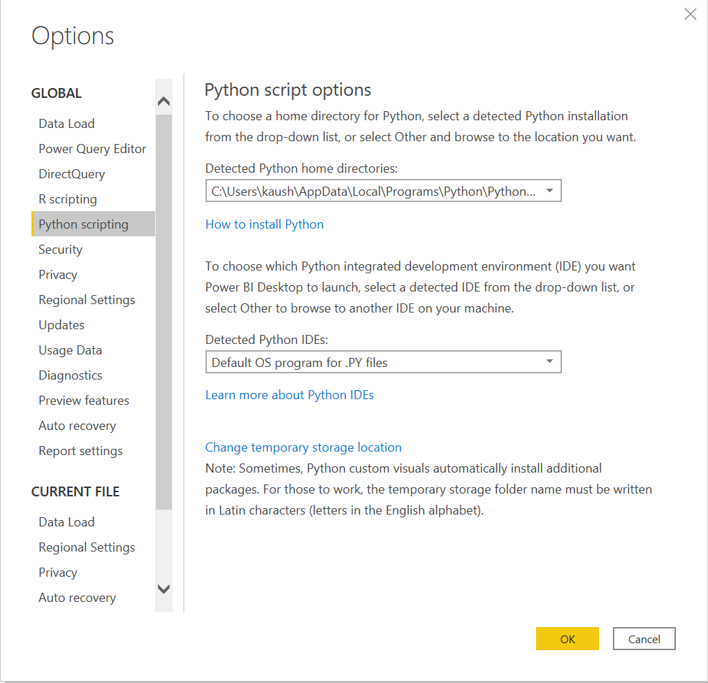
After installing these packages we have to enable Python Scripting in Power BI. You can open Power BI to check whether it automatically detects the Python distribution installed on your machine. Go to Files -> Options and Settings -> Options. Under Python Scripting you should see the Home Directory for Python installed on your machine.
Import Data using Python script
Now, you can run a quick test to check whether Python works within the Power BI stack. To begin with, you can import a small dataset in Power BI using Python script.
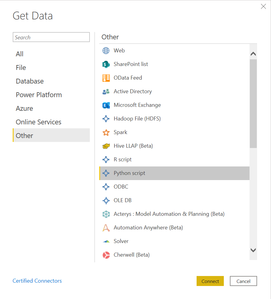
For this purpose, go to the Home ribbon, click on Get Data and select Other. This section allows you to import data from a varied list of sources, especially, Web, Hadoop Distributed File System (HDFS), Spark, etc. apart from using scripts like R or Python. Here, we will import the Churn Prediction dataset that is stored on my machine.
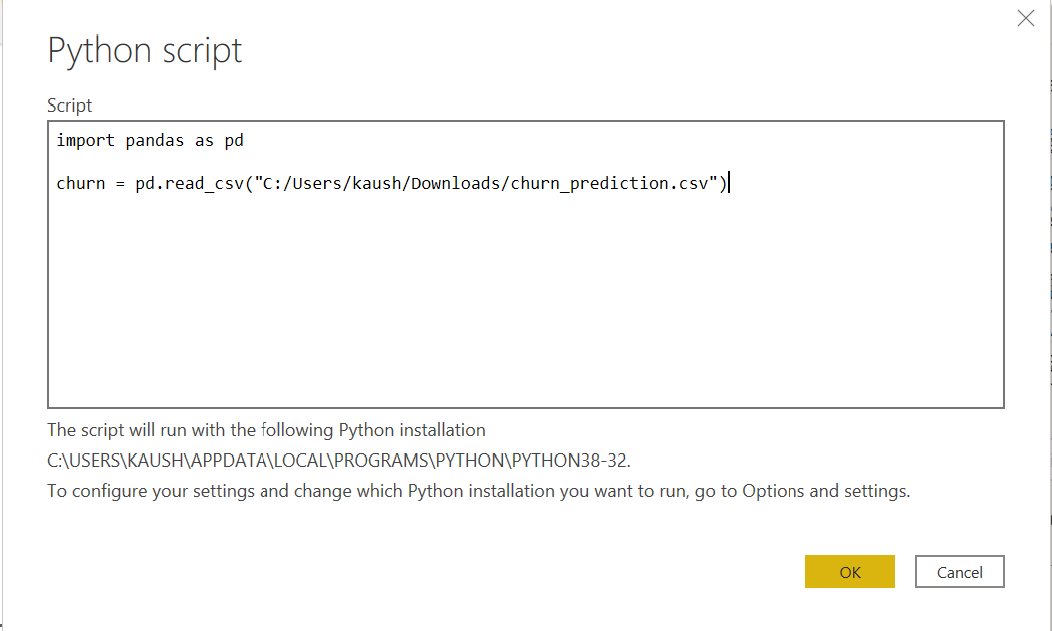
Click on Connect. It will open up a section where you can write the following Python script:
Clicking on OK will load the Navigator and it will ask you to select the churn data, then click on Load. You can go to the data view to check whether the data has been loaded. Now, you are ready to use Power Query to perform one-click data transformations.
Using Power Query to transform data
Those who have hiked the Python learning curve would recognize the fact that transforming data is more or less a straightforward activity, but it may not be as easy for a person just heading for their data science journey.
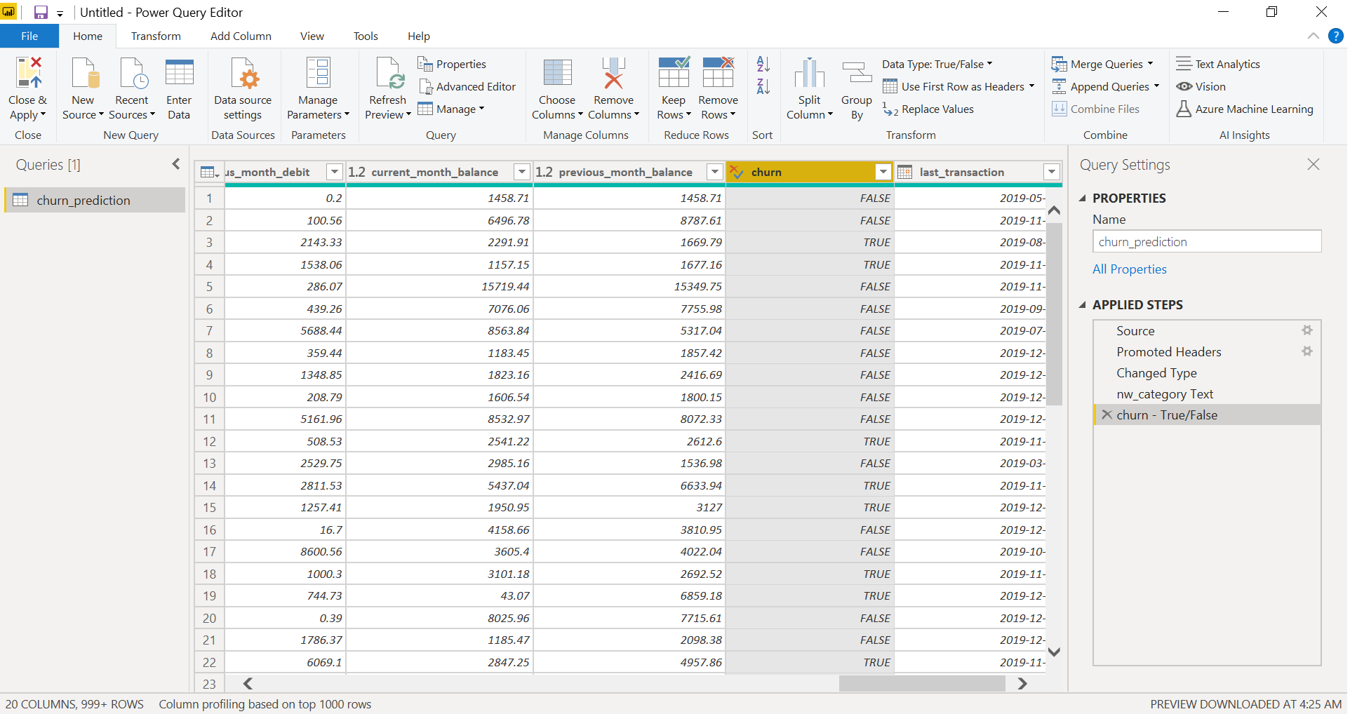
However, with Power Query Editor, we can shape and transform data with a single click. Not only that, but Power BI also keeps a record of all the operations that go into the pipeline of data transformation before any analysis. To demonstrate the easy data transformation capabilities, we will showcase how to use Power Query.
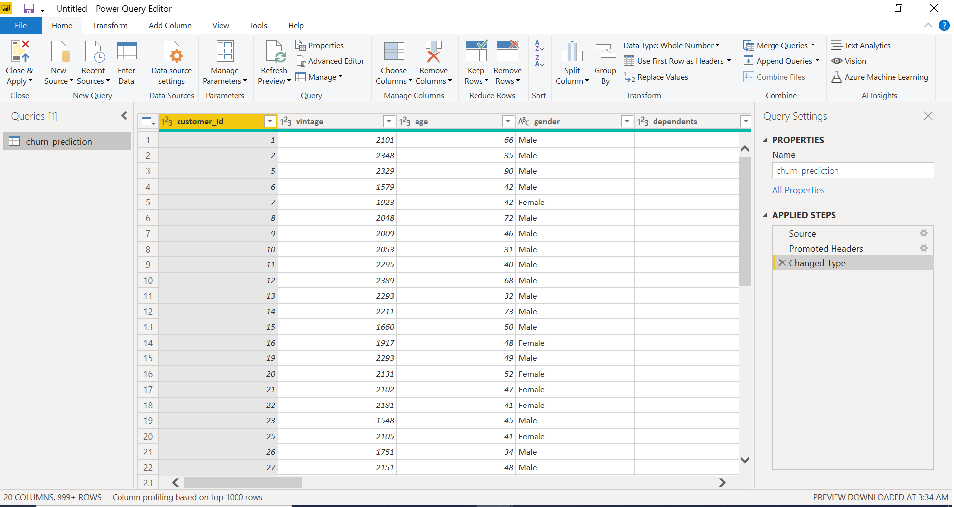
Once you have loaded the data in Power BI, click on Transform Data under the Home tab to open Query Editor.
This opens the Query Editor and gives you a lot of options to perform cleaning, reshaping, and transformation of data.
We will convert the customer_nw_category variable into a text field as these represent the Customer Net Worth Category and it should not be used as a continuous variable.
To do this, we will select the column, go to Data Type, and change the data type to Text. Power Query records this step under the Applied Steps section. It is a good practice to rename this step, for easy recall. We will rename it to “nw_cat Text”. Similarly, we will transform the churn column into a logical variable, representing True for 1 (churned) and False for 0 (not churned) and rename the step to “churn – True/False”.
After you have completed the transformation step, click on Close & Apply (on the top left corner) to apply these transformations to the data.
Using Python’s statistical within Power BI
Although Power BI has a comprehensive library of visualization, it is not a trivial matter to create a correlation matrix in it. Yet, correlation matrix heatmap forms an integral component of data analysis reports.
In this section, we will demonstrate how to create a correlation matrix heatmap using Python’s correlation function. This heatmap will be displayed on the Report section in Power BI.
Head over to the Report section in Power BI and click on Python visual denoted by Py symbol under the Visualizations section. At the left, you will notice an empty Python visual appearing and a Python script Editor popping up at the bottom. In other words, Power BI gives you the option of creating visualizations with scripts.
You will notice that currently, the Values field is empty.
To illustrate the correlation heatmap, we will get all the continuous variables into the Values field, namely, age, all average monthly balance columns, current, and previous month balance and current and previous month transaction columns, a number of dependents, and vintage (the time of association). This is an important step. Otherwise, Power BI wouldn’t recognize these variables to be part of the visualization.
As we get the variables into the Values field, the Python script is automatically populated with the following codes:
# The following code to create a dataframe and remove duplicated rows is always executed and acts as a preamble for your script:

# dataset = pandas.DataFrame(age, average_monthly_balance_prevQ, average_monthly_balance_prevQ2, current_balance, current_month_balance, current_month_credit, current_month_debit, dependents, previous_month_balance, previous_month_credit, previous_month_end_balance, previous_month_debit, vintage)
# dataset = dataset.drop_duplicates()

# Paste or type your script code here:
We will write a short code in Python to create a correlation (Pearson coefficient) matrix heatmap using the seaborn package.
# import the charting libraries matplotlib and seaborn
import matplotlib.pyplot as plt
import seaborn as sns

# create the correlation matrix on the dataset
corr = dataset.corr()
# create a heatmap of the correlation matrix
sns.heatmap(corr, cmap="YlGnBu")
# show plot
plt.show()
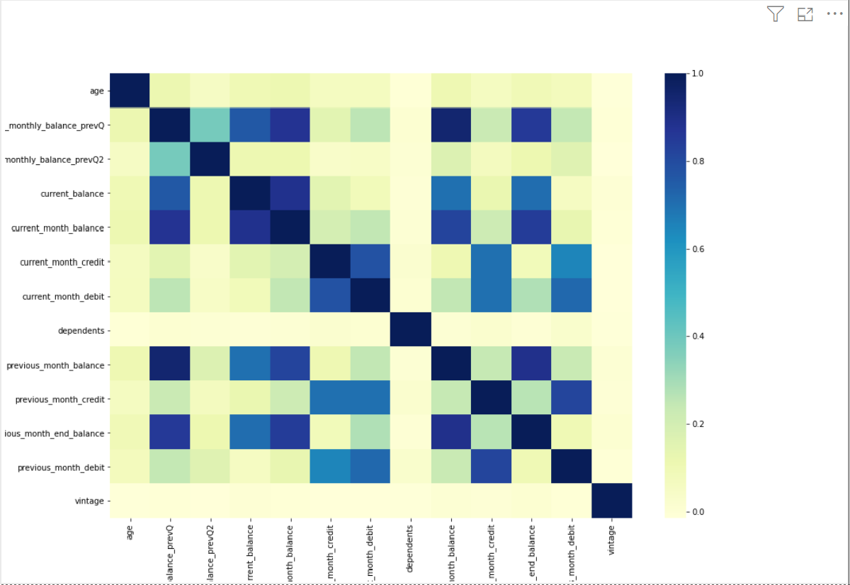
Finally, after running this script using the Run Script button, it produces a correlation matrix heatmap.
Generating analytical reports
- age and number of dependents have no correlation with the other variables
- average monthly balance in the last two quarters are moderately correlated
- average monthly balance in the last quarter is highly correlated with the current month balance and the previous month balance
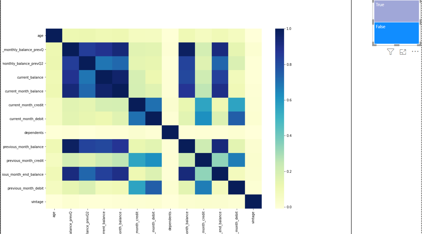
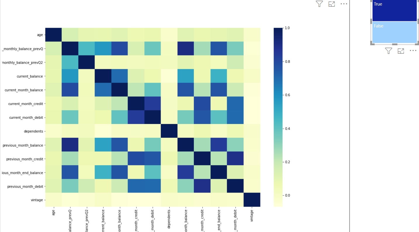
We can produce this heatmap for customers who have churned and compare it with those who have not. Thus, we apply a filter of churn = True or False using the blue boxes to observe the heatmap for the two groups of customers separately.
The below chart represents the picture for customers who have not churned. However, a different story emerges for these two types of customers. The customers who have not churned have a much higher correlation among the average monthly balance of the last two quarters and the current and previous months’ balance.
Whereas, for the churned customers, the average monthly balance in the last two quarters has a low to moderate correlation with current and previous months’ balance.
Therefore, this analysis demonstrates how we can draw some useful insights from analyzing the data to predict the behavior of churning customers.
End Notes
In this article, we learned about integrating Python within the Power BI distribution. We used the reporting capabilities of Power BI along with the analytical capabilities of Python to build an analytical report.
To conclude, this integrated environment gives more power into the hands of data scientists and business intelligence professionals. They can easily capitalize on the beneficial aspects of both of these tools.


