I’ve been covering jailbreak tweaks for a long time, and I’ve seen quite a few big releases in my time doing so. Tweaks like Octopus Keyboard, IntelliScreen X, Dashboard X, and most recently, Velox, come to mind.
But perhaps no tweak has been as anticipated this year as Auxo for iPad has. It is, of course, the big brother to the original Auxo tweak for the iPhone, which has proved to be extremely popular, and just as successful.
Needless to say, Auxo for iPad has some fairly big shoes to fill, and even bigger expectations. We all know how Auxo looks and feels on the small screen, but the question is this: can such a tweak be successfully translated to the iPad’s significantly larger screen? More importantly, will it provide users with a better overall experience when using their devices? Check out our full review inside, as I break down the ins and outs of this long anticipated jailbreak release.
Video walkthrough
The basics
At its core, Auxo is a replacement for the stock iOS app switcher. The app icons that normally appear in the app switcher are replaced with full screenshots to help you gain context. Multitouch gestures are incorporated into the experience to make it simple for users to kill running apps. Auxo also features redesigned music controls and toggles to help you quickly enable or disable certain features on your device.
If you’ve used the iPhone version of Auxo before, then you know exactly what to expect here. Auxo for iPad was built with the iPad in mind, and features a few differences, but the core experience is exactly the same as it is on the small screen. If you’ve yet to read our Auxo review for the iPhone, then I highly urge you to do so, as it’ll provide some great background information on the history of the tweak.
The iPad experience
Even if you’re familiar with Auxo on the iPhone, the iPad version is different enough in form and function. After a few seconds of usage, it becomes readily apparent that this wasn’t just some lazy port to provide iPad users with the tweak. Instead, an inordinate amount of time and resources was used to make the Auxo experience on the iPad one that’s suited for the larger screen.

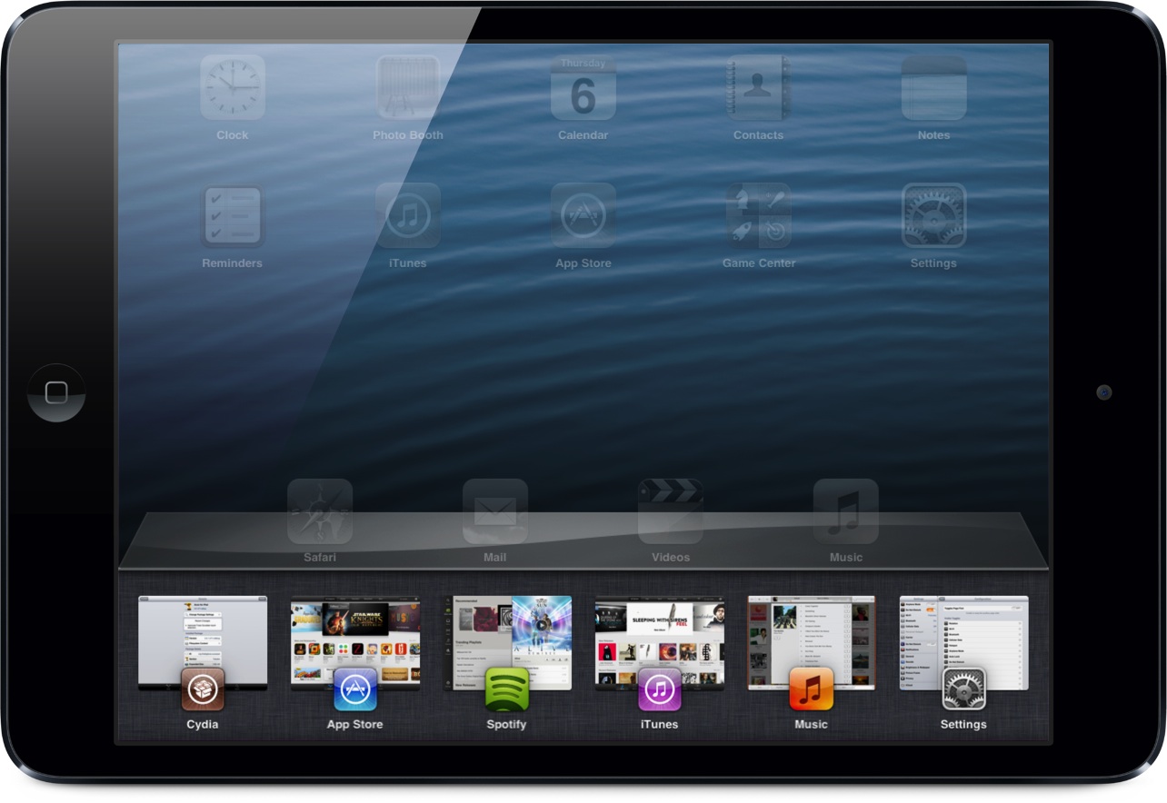
The first thing you’ll notice about Auxo for iPad is the bigger app snapshots in the app switcher. Auxo really benefits from the additional real estate, and this has resulted in much bigger app screenshot previews, which make it easier to gather the context of your running apps. The app icons, which sit beneath the screenshots for the running apps, are much bigger as well. This allows you to quickly identify a running app, even if its screenshot preview is a bit unfamiliar. Up to six different apps can be displayed in the app switcher, and that applies to both portrait and landscape mode.

As you’d expect, the music controls and toggle interface have been tweaked for the iPad version. For one thing, the music transport controls are visible when viewing the album art and track scrubber, as well as when viewing the toggles. That’s because instead of placing the toggles on their own page, the album art and scrubber share the same frame with the toggles. This allows you to swipe between the toggles and the music scrubber, while maintaining access to transport controls at all times.

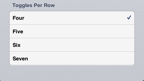
Up to seven toggles can be displayed at one time, and this can be adjusted down to as many as four per row in the tweak’s preferences. Speaking of toggles, Auxo for iPad is one of the first jailbreak tweaks to incorporate the new Flipswitch toggle framework. Flipswitch makes it easy for developers to implement standard functioning toggles with minimal code. The adoption of Flipswitch toggles is great, but it’s not without a bit of a sacrifice. Auxo for iPhone users will notice that the iPad version lacks the granular respring toggle controls found in its iPad counterpart.
Landscape support
One of the most exciting features about Auxo for iPad is its support for landscape mode. Yes, Auxo for iPad supports landscape mode, and for the most part, it works well. The transitions between portrait and landscape mode are super smooth on my iPad mini.
In landscape mode everything works just the same — swipe gestures, tap and hold gestures, music controls, and toggles. As mentioned, just as many apps (6) can fit into the landscape app switcher as they can in the portrait app switcher. That’s because the screenshot previews themselves are presented in a landscape mode, accommodating for the extra space found in the app switcher.

There is one small caveat with landscape mode, however. Due to a limitation with iOS’ snapshotting system, you’ll sometimes notice that portrait snapshots are showcased while in landscape mode. They’ll still be displayed in a wider view, but the snapshots themselves will be shown at a 90 degree portrait orientation. This issue occurs when opening the app switcher in landscape mode with apps that haven’t been viewed in landscape mode. The snapshot issue happens, because iOS hasn’t had the opportunity to generate a snapshot of the app running in landscape mode. The same is true in the reverse scenario — Auxo running in portrait mode, while the app has only been viewed in landscape mode. As a workaround of sorts for this, the last valid snapshot is cached to display when encountering this scenario.
Preferences
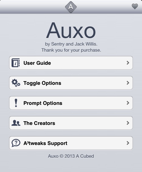
Like other aspects of Auxo, its preferences more or less mirror the iPhone version. You’ll find an in-depth user guide, which explains the ins and out of the tweak, toggle options for managing Auxo’s toggles, and Prompt options for managing the prompts to close apps.

The toggle options include the ability to enable the toggles page first, along with an option to show the media controls first if media is currently playing. You can also use the toggle page to change the amount of toggles displayed per row: four, five, six, or seven.

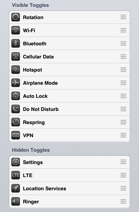
Auxo allows you to hide and show the various toggles depending on your preference. Using the grabber handles, you can move toggles between the hidden and visible sections, along with rearranging the display order in the app switcher.

The prompt options, found within its own dedicated section in the iPad version of Auxo, allow you to designate specific VIP apps that will remain open in varying circumstances. You can enable the “ask on remove all” feature to enable a prompt whenever the tap and hold kill gesture is used. You can designate the VIP apps and currently playing app to stay open on a remove all gesture, and to ask before removing them individually.
The final verdict
The original Auxo was arguably a groundbreaking tweak. It was extremely hyped before release, and if you ask me, it far surpassed those expectations. Now that we’ve been using Auxo for half a year, we’ve all grown used to it. I think it’s even safe to say that many, myself included, take the tweak for granted. I’ve been using this tweak for so long, that it’s become like a stock iOS feature to me.
With that in mind, it’s hard to get as excited about the iPad version of Auxo, when we’ve basically been using it day-in and day-out for the last six months. Yes, Auxo for iPad is an awesome new jailbreak tweak that will make a lot of folks happy, it’s just that some of the luster has been lost due to being overly familiar with the release. That said, I believe that Auxo for iPad will become the definitive version of the tweak in due time. Once a few of its 1.0 quibbles have been ironed out, (I experienced a crash or two during my intense hands-on testing, something that never happens to me when using the iPhone version) I don’t think that’ll even be up for debate.
Auxo was made for the large screen found on the iPad. The app screenshot previews are bigger, the app icons are easily identifiable, and the fact that it incorporates the new Flipswitch toggle framework bodes well for the future. Auxo won’t blow you away, just because we’ve all become so adapt to using it, but it’s a marvelous jailbreak tweak that’s certainly worth its asking price.
If you want to give Auxo for iPad a try, then head over to Cydia’s BigBoss repo and get to downloading today. Folks who’ve already purchased the iPhone version can take advantage of special upgrade pricing for only $0.99. If you’re new to Auxo, then you’ll be asked to pay a very reasonable $1.99.
What do you think about Auxo for iPad? Has it lived up to your expectations? Let me know what you think in the comment section below.


