This article was published as a part of the Data Science Blogathon
Introduction
I have been using Pandas with Python and Plotly to create some of the most stunning dashboards for my projects. In recent times, I have switched to learning Excel as it was a prerequisite in every company I had to apply to. I was not aware of the capabilities of this tool though I had only used it for normal budgeting and article tracking.
Excel is indeed a powerful tool that doesn’t require core coding (until you are not getting into VBAs). This means that any business or nontechnical individual can gather insights from data using Excel. A dashboard is a consolidated view of visual elements that convey knowledge about the dataset. It supports data validation in the form of filters and sorting methods.
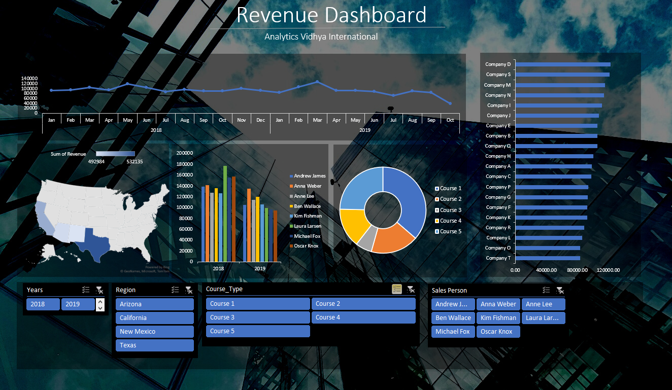
In this article, I will show you how to create an interactive and stunning dashboard in Excel. We will look at creating pivot tables, designing the dashboard layout, adding various charts to the dashboard, unifying the charts into one theme, and then adding slicers/filers that control all the charts. Here is the preview of what you will be able to build at the end of this article:
Dataset for the Dashboard
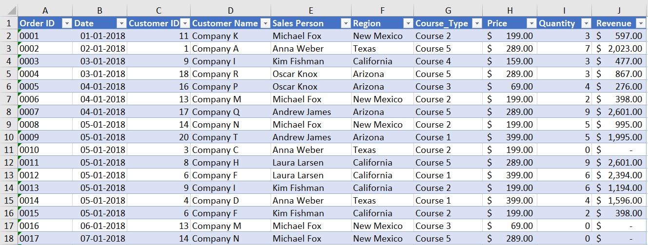
The problem statement we will be dealing with in this article is for the sales data of a hypothetical company. Let’s call this company “Analytics Vidhya International” that sells its courses worldwide. The following data is available with us: order number, purchase date, customer Id, customer name (companies in this case), salesperson, sales region, course type, price, quantity, and revenue. Here is the snapshot of the data:
Creating Visualizations for the Dashboard
For the given sales data, different types of plotting can be performed. We will create charts to analyze:
- Total sales per month in terms of revenue
- Total sales by region
- Sales by employee
- Course share
- Customer/Company spending
Note: For the first chart, I will explain the whole pivot table process and for later charts, I will directly jump into making visualizations.
Total Sales per month
The total sales of the company are given in the “Revenue” column which is a calculated column for the product of “Price” and “Quantity”. The “Date” column has the correct date format with a date range from 1st Jan 2018 to 16th Oct 2019.
To find the total sales per month, we need an aggregation of revenue for every month. Therefore, we will create a pivot table. A pivot table can be created by selecting the whole data range, navigating to the Insert tab, and then the PivotTable option on the left.
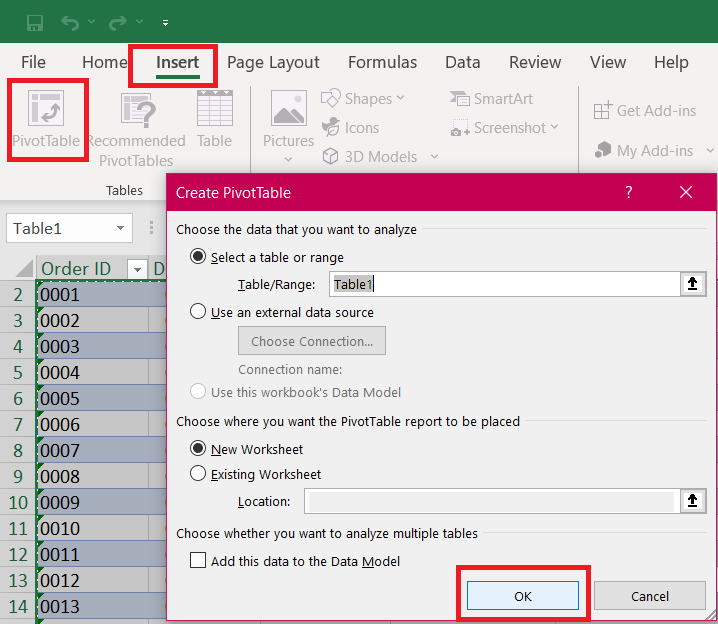
This will open up a new sheet with Pivot options on the right. Simply drag the “Dates” field into the rows section and the “Revenue” field into the values section. This will populate a table with aggregated revenue for each month of the given year. You can remove the quarter’s field from the dates field in the row section so that you get output for all months of the year. This will look like this:
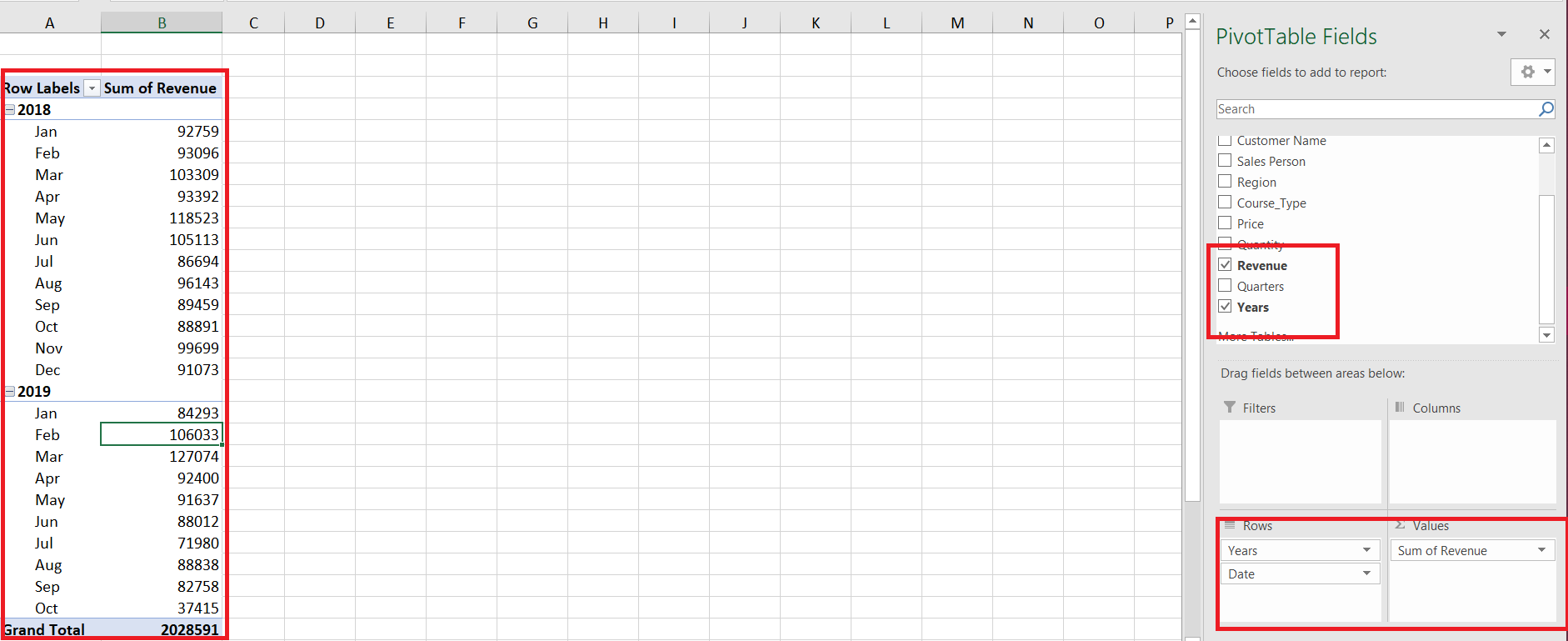
Now, let’s create a line plot or Pivot chart for this pivot table. Select the whole pivot table, navigate to the Insert tab and click on the charts option arrow. Here you can select any type of line plot.
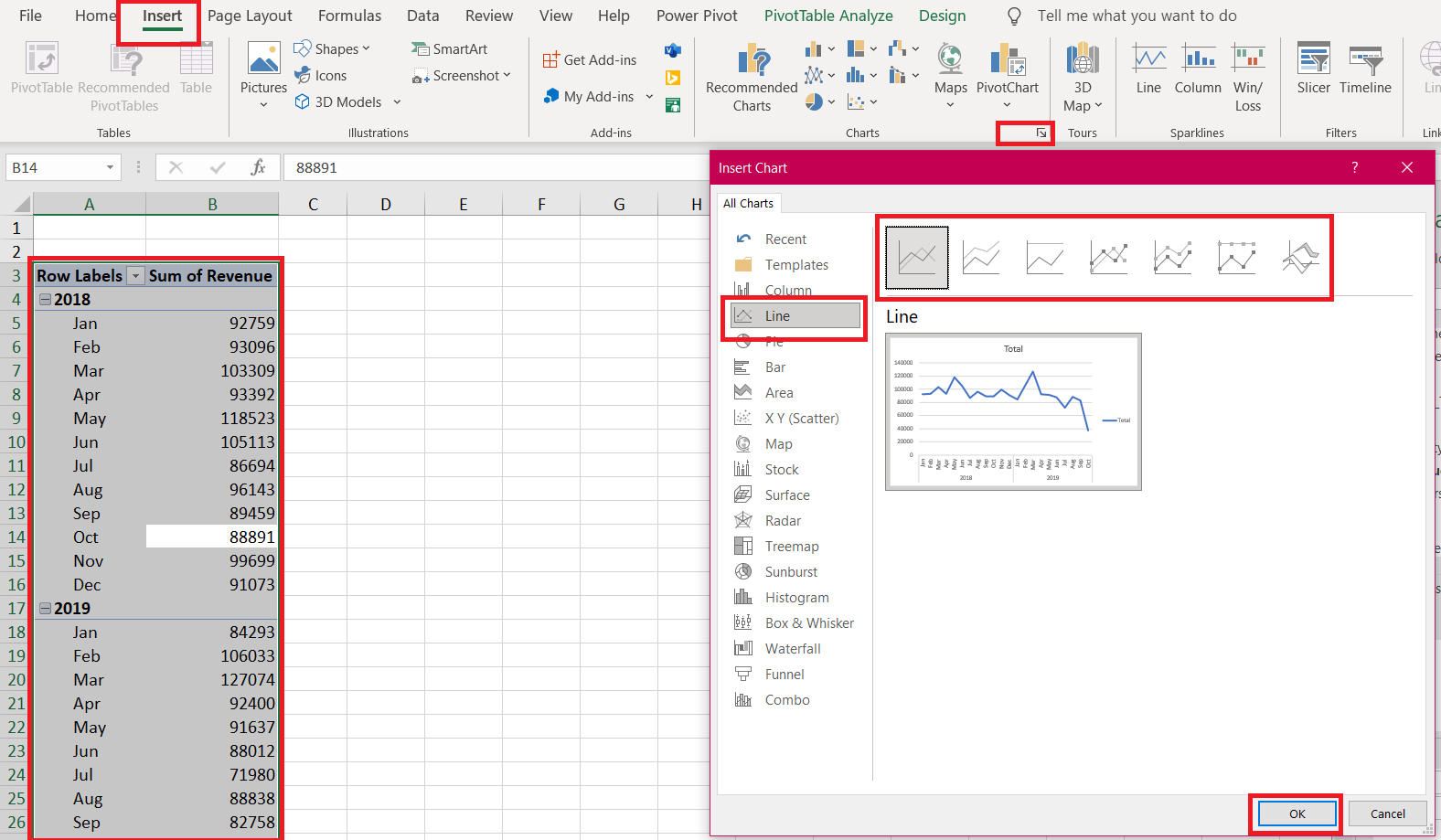
We just plotted our first visualization in Excel! We can customize all elements of this chart but, for now, let’s plot the remaining charts, and then we will unify them into one theme.
Total Sales per region
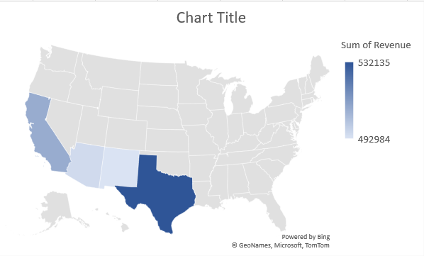
For every new plot, you need to create a new pivot table. Therefore, repeat the process of creating a pivot table and navigate to the new pivot table sheet. Now, for sales by region, a Map plot would convey more information about the actual region from the country.
The Map plot is only supported for newer versions of Excel, i.e, 2019 and office 365. Simply, drag the “Region” field into the column section and the “Revenue” field into the values section. For some reason, we cannot plot the Map plot directly from a Pivot table. Therefore, you need to copy the pivot table, paste it into the same sheet, and then create the reference of the values to the pivot table values.
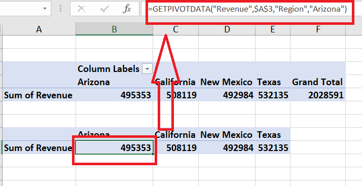
To create the Map plot from these values, simply select these values, navigate to the Insert tab and then click on the Map icon in the charts section.
Sales by Employees
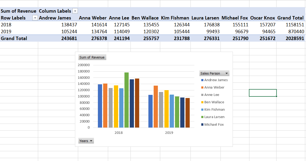
For this, we will create a Pivot table with columns as “Sales Person”, rows as “Date” year, and values as “Revenue”. Next, create a pivot bar chart for this table.
Course share
We want to know which course types are being purchased most by the company out of all the available ones. For this, we will plot a pie/donut chart. In the pivot table, drag “Course_Type” in the rows section and “Revenue” in values. To plot the donut plot, click on the pie icon in chart options and select the donut plot at the end.
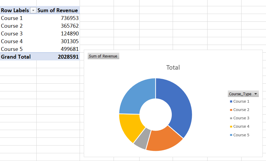
Tip: To control the size of the hole of the donut plot, right-click on any section of the donut, select the “Format Data Series” option, and then you get the slider for donut hole size.
Customer Spending
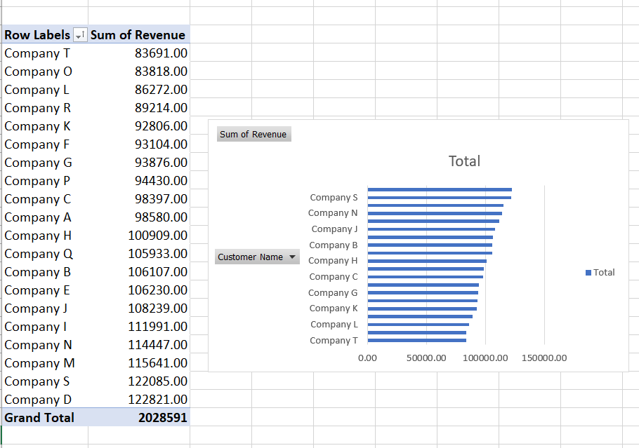
Now, we will plot a horizontal bar chart to analyze the customers (companies in our case) who are spending/purchasing more and more courses from the company. These customers should not churn in the upcoming quarters and they can be provided with some additional benefits sot that they continue to make transactions.
Drag the “Revenue” in the values section and “Customer Name” in the rows section. Also, sort the values in ascending order so that the horizontal bar looks good.
Designing the Dashboard in Excel
All the required visualizations are created and now we are ready to design the dashboard. Follow these steps:
- Create a new sheet in the workbook
- Goto to page layout, and under the sheet options, uncheck the Gridlines view checkbox.
- Next, click on Background and choose a background image. You can search for images on Unsplash or create a fresh dashboard layout in Canva.
- Now, you can add the title and subtitles to the report by going to the insert tab and selecting the text box option at the right. You can also change the font color, text, and other text properties as provided in the MS word too.
After adding the background and the title text, it’s time to create the titled view of our dashboard. Insert a rectangle, fill the color as black, make it 60-70% transparent and remove the border colors. These boxes/tiles will be the base for our charts. Place them in an ordered collage manner. It would look like this:
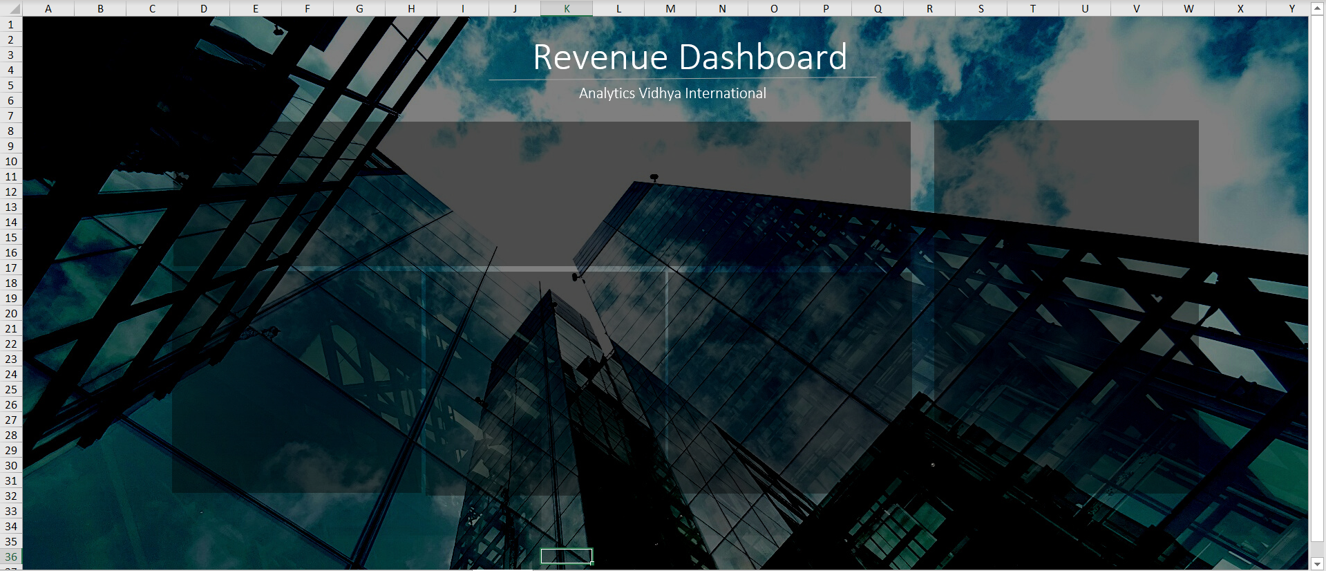
You can also add titles for all the tiles placed.
Adding Charts to Dashboard and Unifying theme
Now, to add the charts to their respective positions:
- Simply copy them from their pivot sheets and paste them into their tiles.
- You will need to adjust the size according to the tile size or modify the tile size to accommodate the charts.
For every chart to be in the same theme and immersive into the tiles made:
- You need to change the fill colour to none and the Border color to none. This can be done by navigating to the format tab.
- Change all text colors to white.
- Remove the unnecessary field buttons from charts by going to the PivotChart Analyse tab and then to the Field Buttons option to the right. Deselect all the choices there or choose the Hide all option.
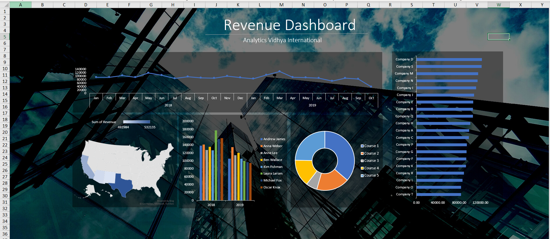
The dashboard with all the charts placed and customizations applied should look like this:
Adding Filters/Slicers to the Dashboard in Excel
Slicers are the select options that enable users to filter data by various categories. This is a very powerful way to show only the required data to the user. Now, we need to create such slicers such that selecting one option updates all the charts of the dashboard.
To achieve this, simply create a slicer for any of the charts placed.
- Select a chart
- Navigate to the Insert tab
- Click on the Slicers option in the Filters section
- Select the desired columns/fields for which you want to filter the data
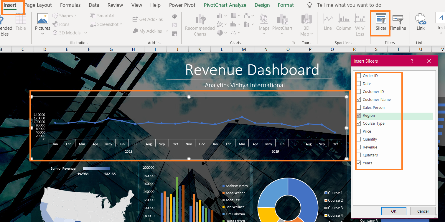
Now, for slicers to update other charts as well,
- Right-click on the slicer
- Select Report Connections
- Select/Check all the pivot tables checkboxes
Boom! Your slicer choice will update all the charts on the dashboard! Do this for all the other slicers as well. You can also apply styling to your slicers and place them at an appropriate location. I have placed them at the bottom and applied a dark theme.
Final Dashboard in Excel
And here we are at the end of this dashboard creation. Have a look at the GIF below for the final result:
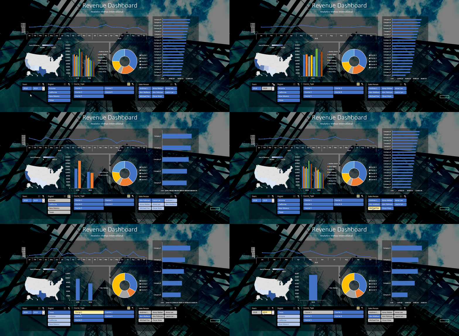
GIF by Author
The Excel file with the dashboard and dataset will be available on my GitHub repository.
Conclusion
In this article, I have explained how to create dashboards in excel. I discussed how to create pivot tables, insert charts into the sheets, create the layout of a dashboard, how to bring all charts together on the dashboard, make the charts beautiful and how to connect all these charts to common slicers.
Note: The dataset is originally obtained from excelfind.com
If you want to read/explore every article of mine, then head over to my master article list which gets updated every time I publish a new article on any platform!
For any doubts, queries, or potential opportunities, you can reach out to me via:
1. Linkedin — in/kaustubh-gupta/
2. Twitter — @Kaustubh1828
3. GitHub — kaustubhgupta
4. Medium — @kaustubhgupta1828


