Summary
- Google is testing a new homepage design for its search app, featuring colorful quick action buttons on the search bar.
- The redesign showcases a departure from Google’s usual monotone design approach, not aligning with the usual Material You principles.
- While the functionality of the redesigned buttons will likely remain the same, the redesign aims to make them more prominent for users.
While the Google Search app still hasn’t been updated to follow Material You colors, introduced all the way back in Android 12, the company behind the search engine is busy with another interface update for its core app. As spotted by AssembleDebug, some beta testers currently see a new homepage design with a revamped search bar and colorful quick action buttons.
The new design is a departure from Google’s usual monocolor approach to apps, mainly lending itself to the prevalence of the wallpaper-based Material You design across its apps. The general layout of the Google home screen remains the same, but the top part with the Google logo and search bar dons a bright blue background in the experiment. The search bar itself also grows taller, making space for four new colorful buttons below the familiar invitation to start a search: Gallery, Translate, Homework, and Sing.
AssembleDebug hasn’t shared what happens when you tap the buttons, and it’s not clear if they’re even fully functional in this early stage already. It’s clear that they are likely just a redesign of the currently available buttons below the search bar, with the colorful backgrounds drawing more attention to them than the old gray.
In the current version of the Google app, similarly named buttons lead to Google Lens, pulling up the respective dedicated filter to better find the information you’re looking to get from images. The exceptions here are “Identify song,” which pulls up a dedicated listening section in Google, and a “Shop for products” button that lets you search for things to buy in your screenshots. Interestingly, the latter option is nowhere to be found in the redesign.
The new look also puts the redesign buttons front and center. While the current design offers five options, you need to scroll left and right to access all of them. Since there is no visual indication that this is possible, it’s likely that a lot of people don’t even use the additional buttons.
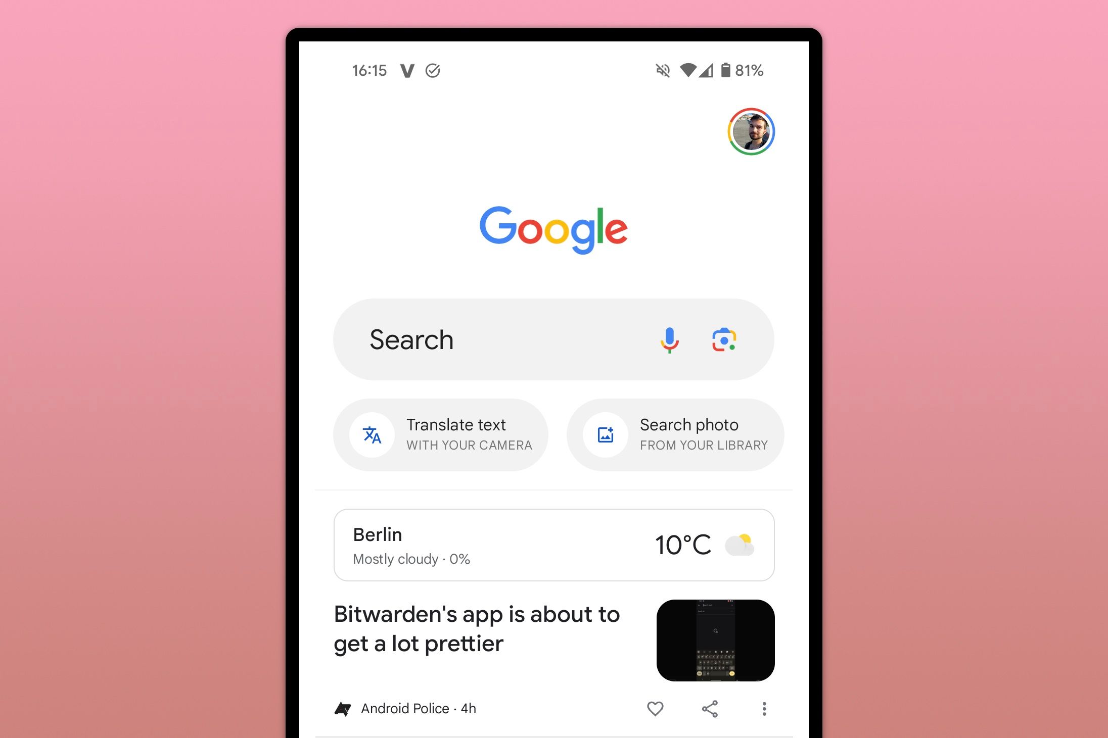
The current Google app home screen
This new design appears to be rolling out to a few people who are part of the Google app beta program, with AssembleDebug pointing to version 15.8.38.29.arm64. So far, we haven’t been able to replicate the appearance on our devices.
As with any such test, it’s possible that Google could unexpectedly pull it altogether or change it to something different in the course of the experiment. It’s certainly possible that this is an early glimpse at some form of post-Material You design strategy. After all, the Google search app is one of only a handful of actively developed Google apps that’s still missing Material Design 3 and its dynamic colors.


