Summary
- Smartphone design is becoming more homogenized, but button placement still varies greatly among different OEMs.
- Many users have strong opinions about their preferred button layout; Pixel users tend to prefer power above volume.
- While Samsung’s volume above power button layout is popular, some find it uncomfortable on ultra-large devices.
Smartphone design is pretty homogenized these days. Assuming you aren’t buying a foldable, your next Android device will likely look a lot like your current one: a tall, large piece of glass and metal with a camera bump on the back and a USB-C port on the bottom. Throw in a couple of speakers and you’re good to go. But there is one place where some OEMs still make their respective marks on smartphone design, and it’s the buttons along the side. And frankly, it’s surprising how strong some users’ opinions can be about their preferred order.
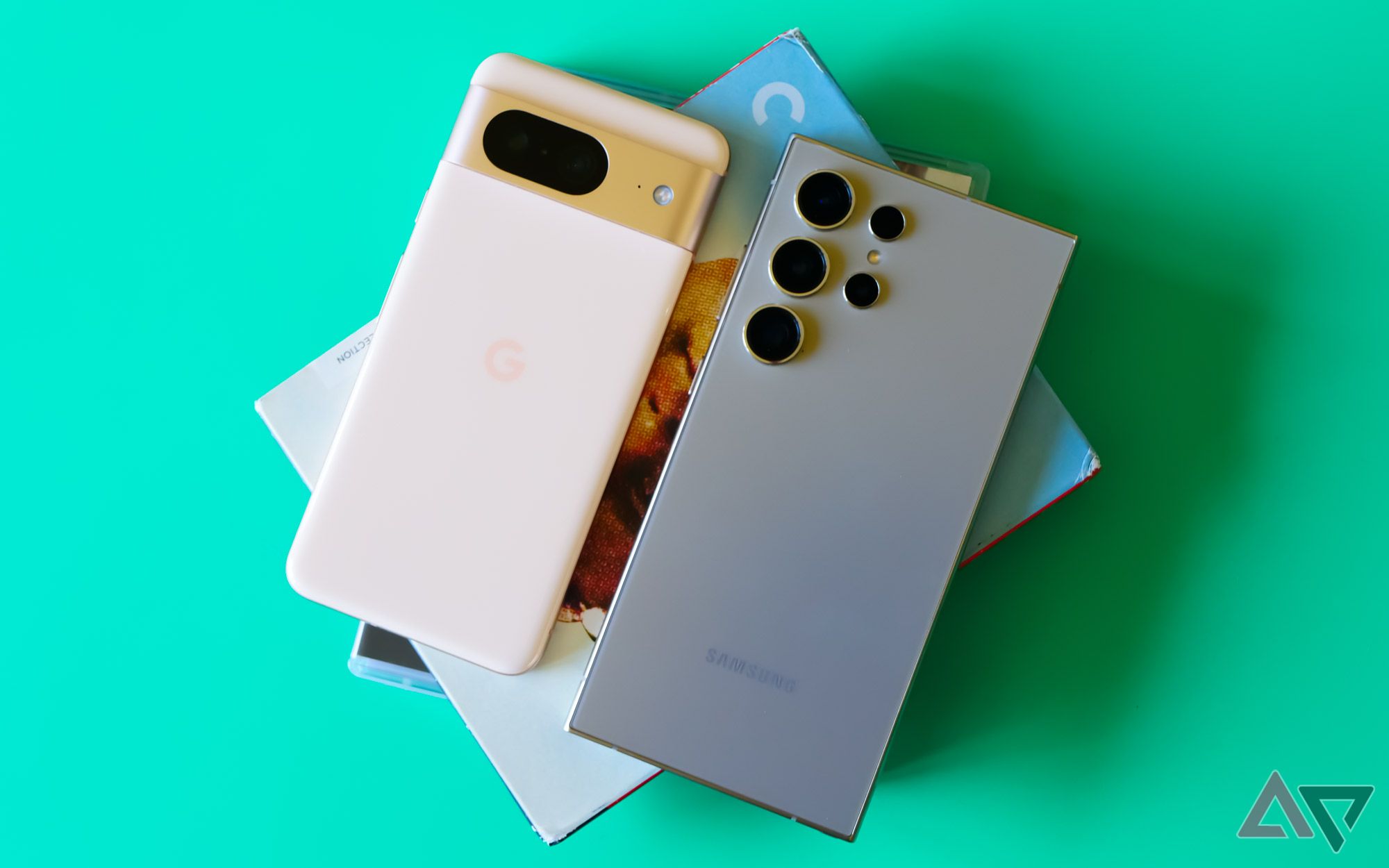
Count me in as one of them. As someone who swaps between smartphones a lot, unlearning my muscle memory is something I have to do a lot. But my default Android device tends to be a Pixel, no matter how frustrating the experience can be sometimes, and I’d be lying if I said it didn’t have a little to do with how Google orients its buttons. Don’t get me wrong — this isn’t a must-have in any way whatsoever — but I find the power button above the volume rocker to be just a little more comfortable than the alternatives, giving me immediate access to all three buttons without having to shift my hand.
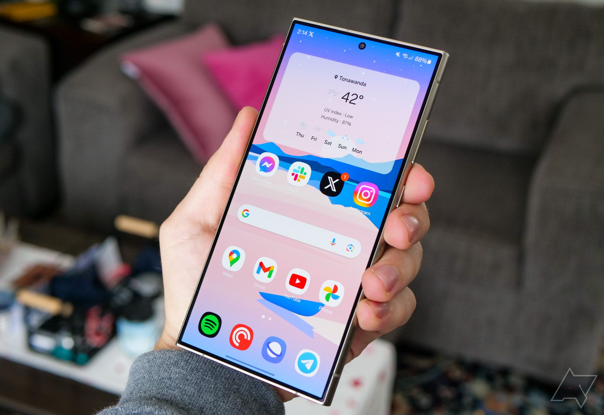
That said, most devices today have followed Samsung’s suit: volume rocker above the power button. I can see the case for it — it lowers the power button on particularly large phones, making it easier to tap with your thumb — but I find that it places the volume buttons too high up for comfort. This is especially true on ultra-large devices like the Galaxy S24 Ultra, where I have to physically shimmy my right hand up to adjust the volume. It’s something that would be a little easier to manage on smaller phones like the regular S24.
Pictured: the Galaxy S24 Ultra in my left hand, not my right.
And while I’m using Samsung as the main source for this design, it mostly comes down to the company’s popularity in the smartphone market. Motorola, Xiaomi, and so many other brands use this orientation that it’s practically default on Android, and I wouldn’t be surprised if that alone helps it take this week’s poll.

The Pixel 8 feels small after the Galaxy S24 Ultra, but I want a truly tiny phone
Google and Samsung have me convinced: smartphones are too big
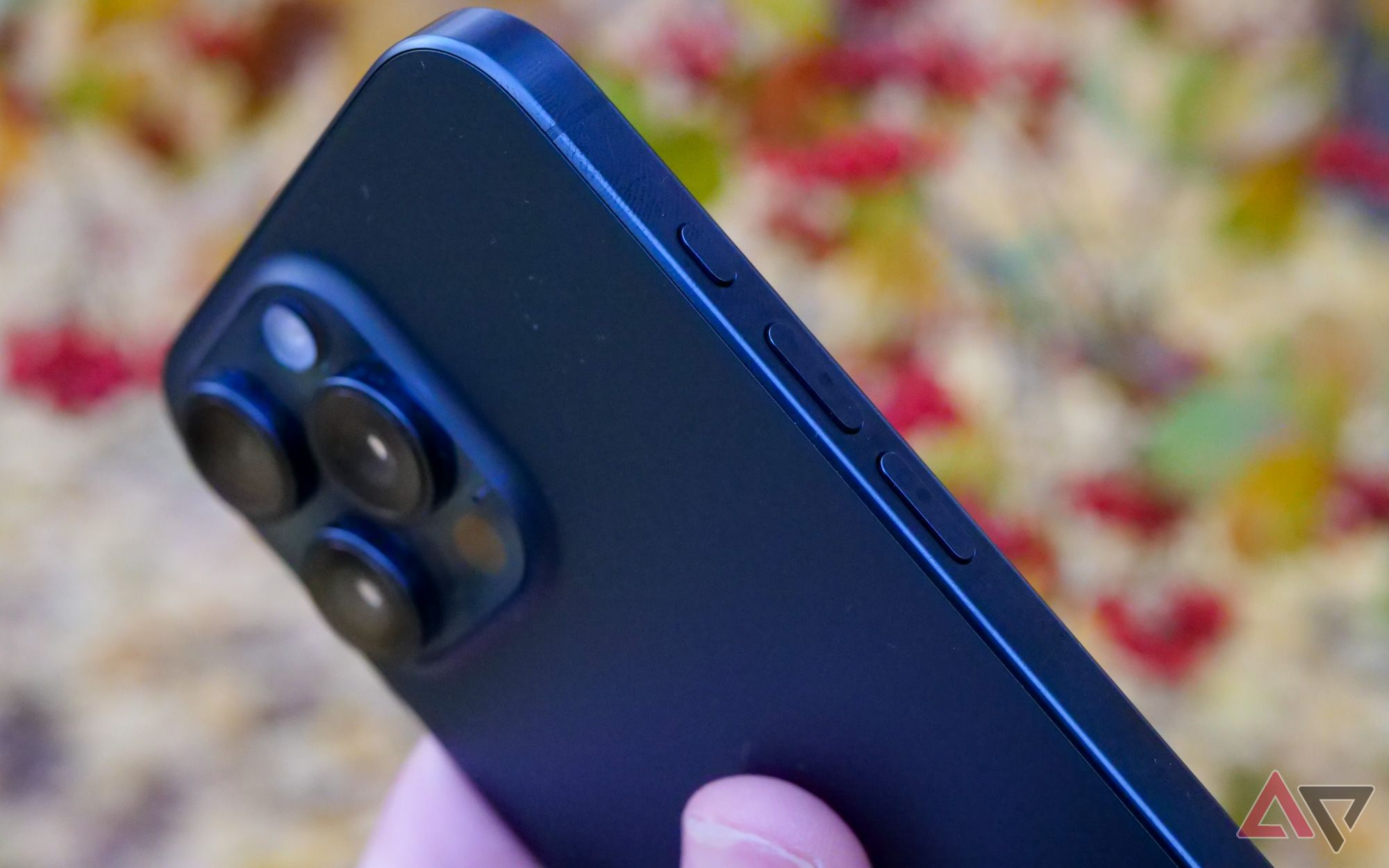
At the risk of inspiring a heated comments section, I’ll also call out Apple’s button layout, which places the volume controls on the opposite side from the power button. This is something we used to see a little more on Android, and I wouldn’t mind seeing it make a comeback. OnePlus used this layout through 2023, though it moved to a Samsung-esque style with the OnePlus Open and OnePlus 12, while Nothing has continued to keep it alive on the Phone 2 and Phone 2a.
While I’ll admit this order has a pretty obvious downside once your phone is in landscape mode (one button will always be facing down; it’s especially annoying on treadmills or ellipticals), it does make feeling for the volume buttons in your pocket a whole lot easier. However, Apple’s replacement for the mute switch with the iPhone 15 Pro actually sort of ruined this design, making it less immediately obvious where the buttons are when not looking at your device.
So, which is your preferred smartphone button layout? I’ve given all three options below, along with the most popular example for all three: Pixel, Samsung, and iPhone. If you don’t have a specific preference, that’s fine too. Or maybe you miss the days of power buttons being top-mounted — if so, let us know in the comments.


