


Summary
- Google Meet has been updated regularly with new features, making it easier to switch between input devices using a redesigned UI for meeting controls.
- A new floating menu for audio and video controls streamlines the process, offering drop-down menus to conveniently switch between connected speakers, cameras, and microphones.
- The Material Design emphasis with rounded corners in the new UI is a notable change, but unfortunately, it may be a limited A/B test for now.
Like most of our favorite video conferencing apps, Google Meet skyrocketed in popularity when the pandemic hit, especially among Workspace customers. In recent years, the company has kept up the cadence with a steady stream of new features and updates, such as a new Effects menu and hand-raise detection. Now, the rather fundamental controls for switching between connected input devices are becoming easier to access with a redesigned UI.
What is Google Meet?
Google Meet is an easy way to stay connected with family and friends wherever you go
For years now, Google Meet has allowed you to correctly configure and test audio and video settings before you hop into a meeting, but if anything happens mid-call, you need to dive into the overflow menu to access those settings again. This behavior is consistent across the Android app and the web UI, and that’s because the meeting controls only allow muting and unmuting yourself, or toggling your connected camera on or off.
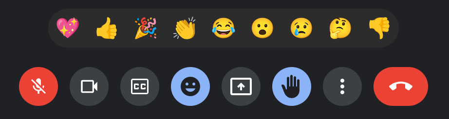
The old design for meeting controls features round toggles and buttons
However, I recently spotted a new design on Meet on the web, featuring a wider, pill-shaped mic and camera controls. They still function as one-click toggle switches, but Google has added a new arrow pointing upwards beside either toggle. Tapping the one beside the mic brings up a wide and floating pill-shaped menu with drop-down menus to switch between connected speakers and microphones.
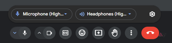
New floating menu for audio controls
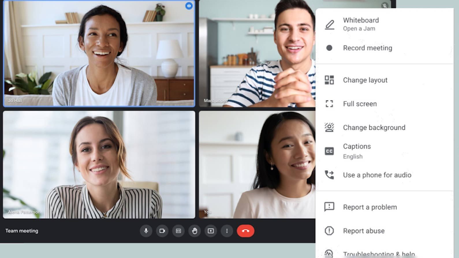
The floating menu beside the camera toggle in the meeting controls summons a similar wide, pill-shaped bar with a drop-down to choose the correct webcam. You also get a one-click shortcut to the Effects panel in Meet, where you can set up custom backgrounds and apply dynamic filters to your feed. Both floating menus feature a gear icon, which opens up the detailed Settings menu with all the controls for audio, video, captions, and reactions. I also appreciate Google’s emphasis on Material Design, evident from the liberal use of rounded corners in the floating menus.
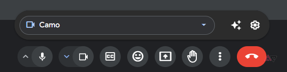
New floating menu for video controls
These new floating menus are a refreshing change because they could save you precious seconds spent switching between connected devices, saving you a visit to the Settings page in the overflow menu, and the plethora of options available there. Unfortunately, this seems to be a limited, server-side A/B test because none of my colleagues at AP are seeing the new pill-shaped toggles and their menu bars, and Google hasn’t published any documentation or announcement detailing this UI change either. We will keep an eye out for a wider rollout, but for now, most users must stick with the classic round toggles for mic and camera in the meeting controls.