Introduction
Pandas library offers a wide range of functions, making it an indispensable tool for data manipulation that caters to almost every task. One particularly handy feature, often employed for gaining quick insights into a dataset, is the pandas describe function. This function provides users with a descriptive statistical summary of all the features, helping them understand the data’s overall characteristics. However, for a more comprehensive analysis, an additional valuable tool in the Pandas ecosystem is the pandas profiling library.
Pandas profiling is the solution to this problem. It offers report generation for the dataset with lots of features and customizations for the report generated. In this article, we will explore this library, look at all the features provided, and some of the advanced use cases and integrations that can prove useful to create stunning reports out of the data frames!
This article was published as a part of the Data Science Blogathon.
Table of contents
Installation
Like every other python package, pandas profiling can be easily installed via the pip package manager:
pip install pandas-profilingIt can also be installed via Conda package manager too:
conda env create -n pandas-profiling
conda activate pandas-profiling
conda install -c conda-forge pandas-profiling
Dataset and Setup
Now it’s time to see how to start the pandas profiling library and generate the report out of the data frames. First things first, let’s import a dataset for which we will be generating reports. I am using the agriculture dataset which contains the State_name, District_name, Crop_year, Season, Crop, Area, and Production.
import pandas as pd
df = pd.read_csv("crops data.csv")
Before I discuss the pandas profiling, have a look at the pandas describe function output for the dataframe:
df.describe(include='all')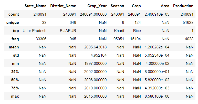
(Notice that I have used the include parameter of the describe function set to “all” which forces pandas to include all the data types of the dataset to be included in the summary. The string type values are accompanied by options such as unique, top, and frequency)
Let’s import the pandas profiling library:
from pandas_profiling import ProfileReportTo start profiling a dataframe, you have two ways:
- You can call the ‘.profile_report()’ function on pandas dataframe. This function is not part of the pandas API but as soon as you import the profiling library, it adds this function to dataframe objects.
- You can pass the dataframe object to the profiling function and then call the function object created to start the generation of the profile.
In either of the ways, you will get the same output report. I am using the 2nd method to generate the report for the agriculture dataset imported.
profile = ProfileReport(df)
profile
Animation Showing report generation
Sections of the Report
Now that the report is generated, let’s explore all the sections of the report one by one.
1. Overview
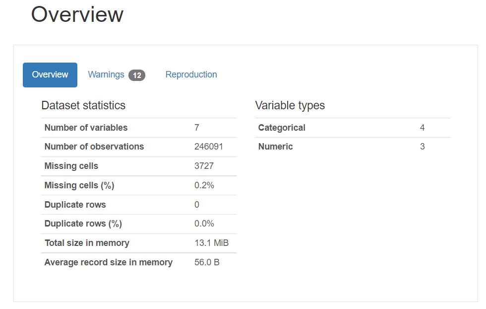
This section consists of the 3 tabs: Overview, Warnings, and Reproduction.
The Overview generated by pandas profiling provides a comprehensive dataset summary, encompassing various key statistics. It covers the fundamental characteristics such as the Number of variables (features or columns of the data frame) and the Number of observations (rows of the data frame). Additionally, it sheds light on data quality by revealing insights into Missing cells and their corresponding percentage, offering a quick assessment of the dataset’s completeness. The Duplicate rows section provides information on the presence of identical rows, including the percentage of duplicate rows. As a holistic touch, the Overview concludes with the Total size in memory, encapsulating the overall footprint of the dataset. Integrating pandas profiling seamlessly facilitates a profound understanding of these essential aspects, enhancing the efficiency of exploratory data analysis.
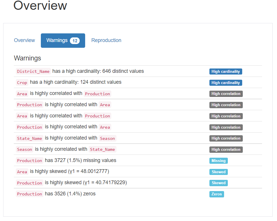
The warnings tab consists of any type of warnings related to cardinality, correlation with other variables, missing values, zeroes, skewness of the variables, and many others.
The reproduction tab simply displays information related to the report generation. It shows the start and ends the time of the analysis, the time taken to generate the report, the software version of pandas profiling, and a configuration download option.
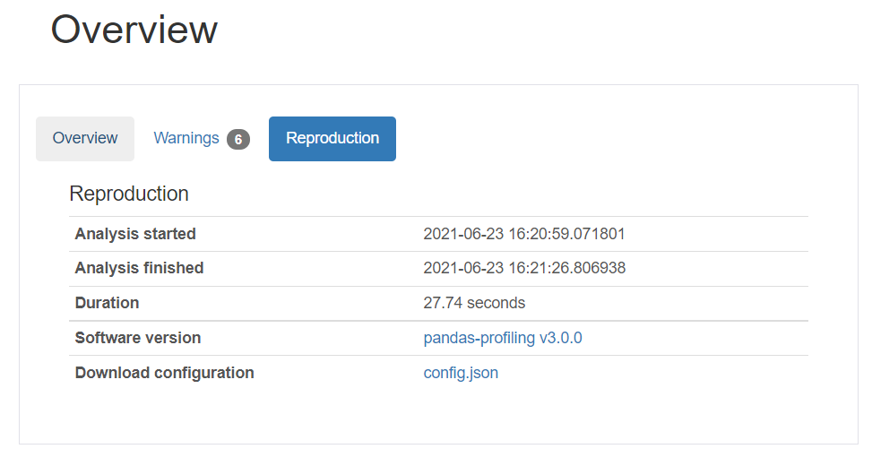
We will discuss the configuration file in the advanced use case section of this article.
2. Variables
This section of the report gives a detailed analysis of all the variables/columns/features of the dataset. The information presented varies depending upon the data type of variable. Let’s break it down.
Numeric Variables
For numeric data type features, you get information about the distinct values, missing values, min-max, mean, and negative values count. You also get small representation values in the form of a Histogram.
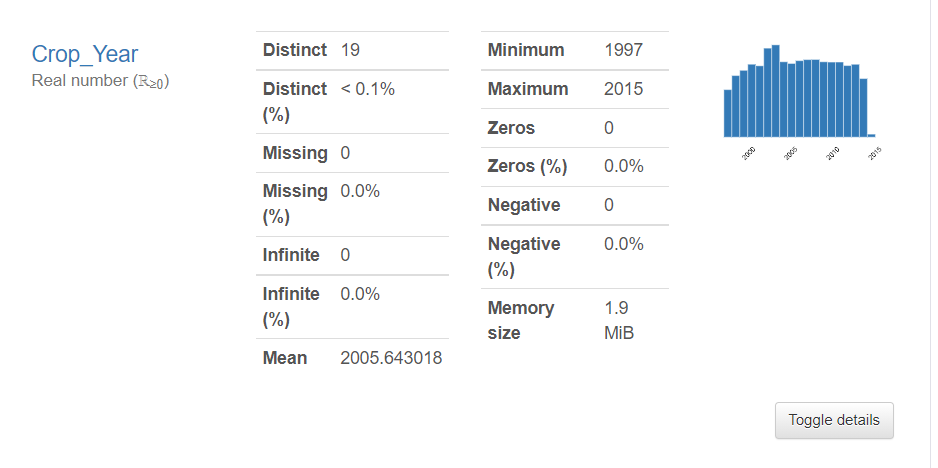
The toggle button expands to the Statistics, Histogram, Common values, Extreme values tab.
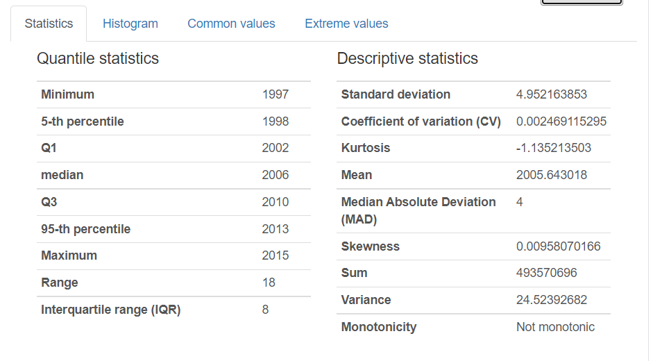
The statistics tab includes:
- Quantile statistics: Min-Max, percentiles, median, range, and IQR (Inter Quartile range)
- Descriptive statistics: Standard Deviation, Coefficient of variance, Kurtosis, mean, skewness, variance, and monotonicity.
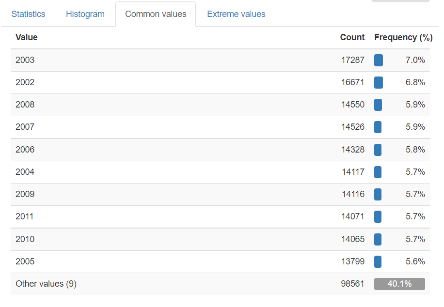
The histogram tab displays the frequency of variables or distribution of numeric data. The common values tab is basically value_counts of the variables presented as both counts and percentage frequency.
String Variables
For string type variables, you get Distinct (unique) values, distinct percentage, missing, missing percentage, memory size, and a horizontal bar presentation of all the unique values with count presentation.
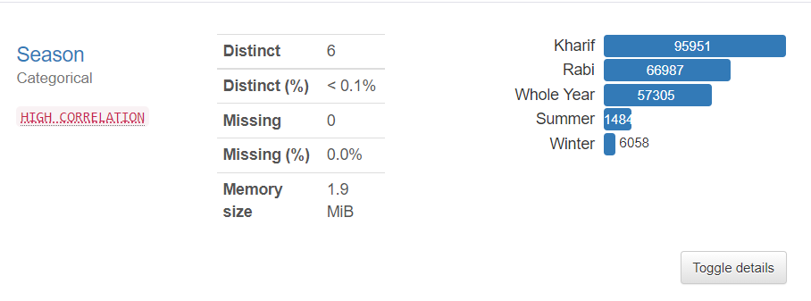
(It also reports any warnings associated with the variable irrespective of its data type)
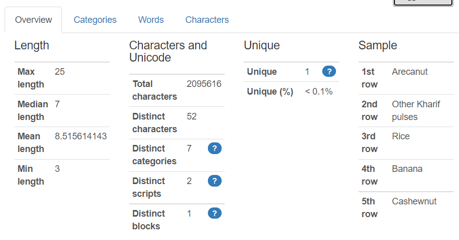
The toggle button expands to the Overview, Categories, Words, and Characters tab.
Overview tab in case of string type values displays max-min median mean length, total characters, distinct characters, distinct categories, unique, and sample from the dataset.
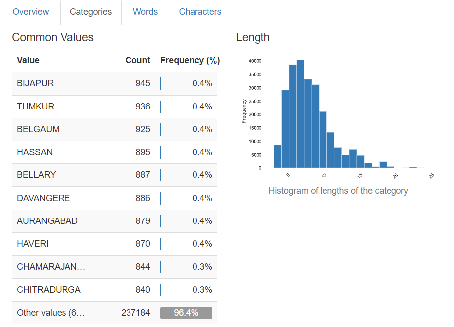
The categories tab displays a histogram and sometimes a pie chart of the value counts of the feature. The table contains the value, count, and percentage frequency.
The words and the characters tab does the same job as the categories tab in terms of the way of presenting the data in tabular and histogram format but it can go much deeper into the lower case, upper case, punctuation, special characters categories count too!
3. Correlations
Correlation is used to describe the degree to which two variables move in coordination with one another. In the pandas profiling report, you can access 5 types of correlation coefficients: Pearson’s r, Spearman’s ρ, Kendall’s τ, Phik (φk), and Cramér’s V (φc).
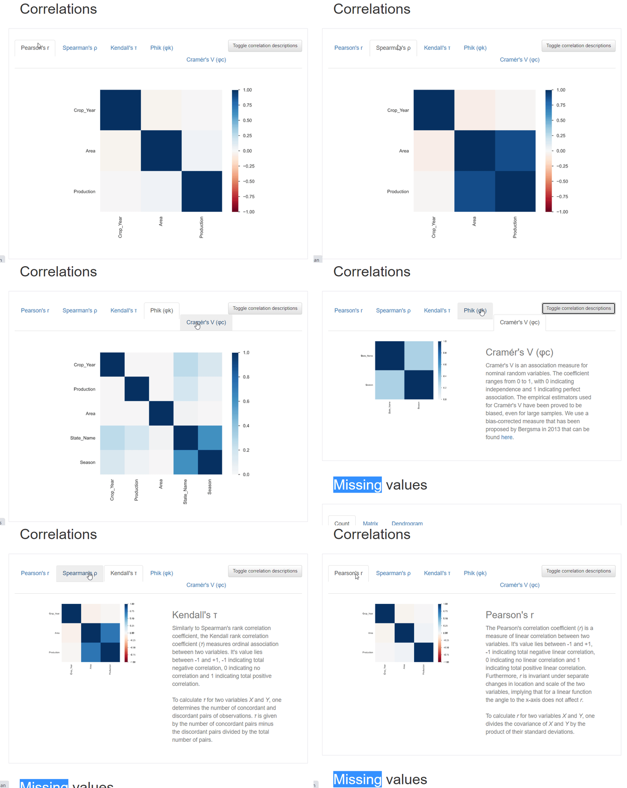
You can also click on the toggle button to get details about the various correlations coefficients.
4. Missing values
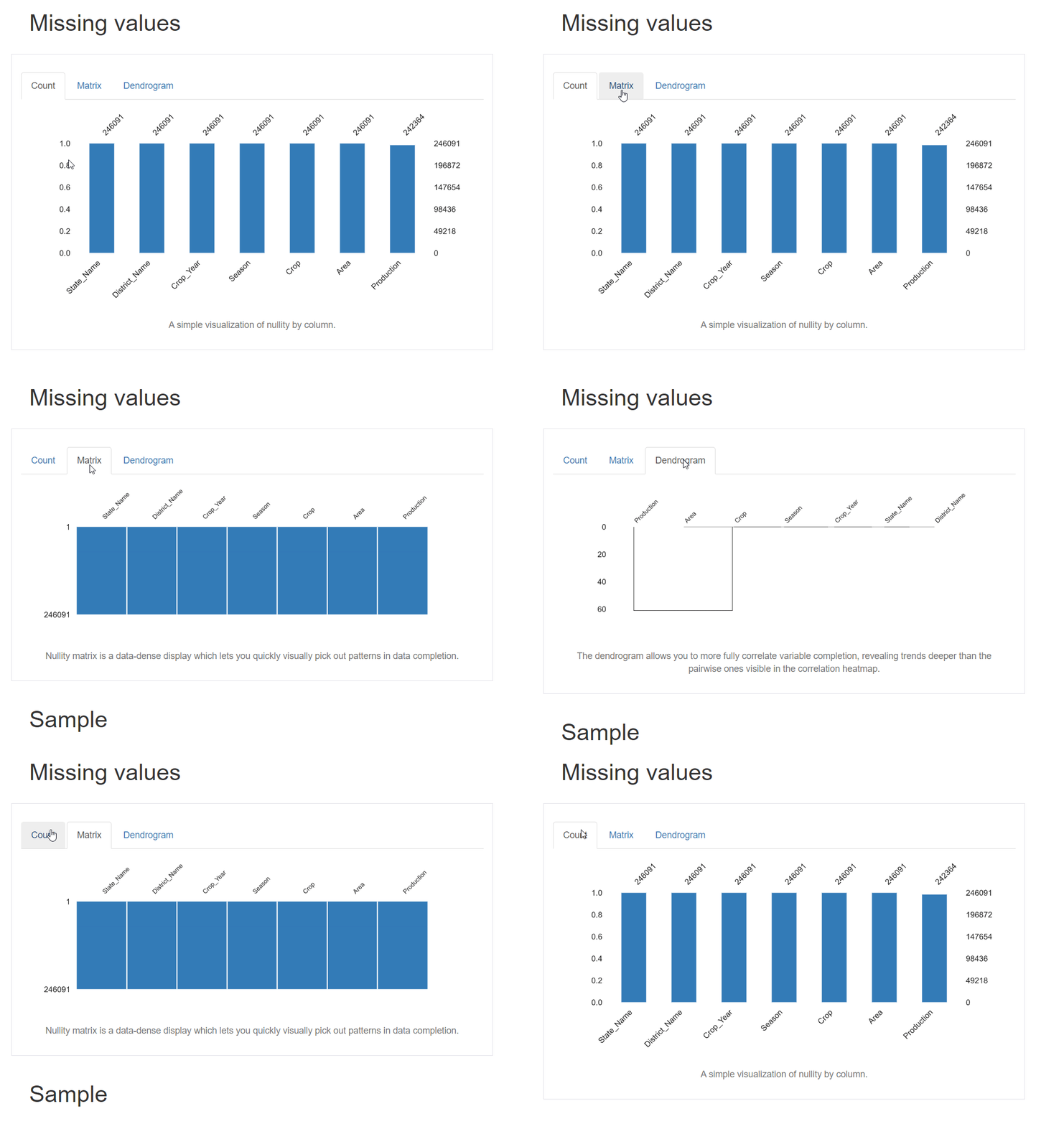
The report generated also contains the visualizations for the missing values present in the dataset. You get 3 types of plot: Count, matrix, and dendrogram. The count plot is a basic bar plot with an x-axis as column names and the length of the bar represents the number of values present (without null values). Similarly are the matrix and the dendrogram.
5. Sample
This section displays the first and last 10 rows of the dataset.
How to Save the Report?
So far, you’ve learned how to generate dataframe reports with a single line of code or function and explored the report’s included features. You may want to export this analysis to an external file for integration with other applications or web publishing
Guess what, you can save this report! You can save this report in –
- HTML format
- JSON format
The save function remains the same for any of the formats, just change the file extension while saving. To save the report, call the “.to_file()” function on the profile object:
profile.to_file("Analysis.html")
profile.to_file("Analysis.json")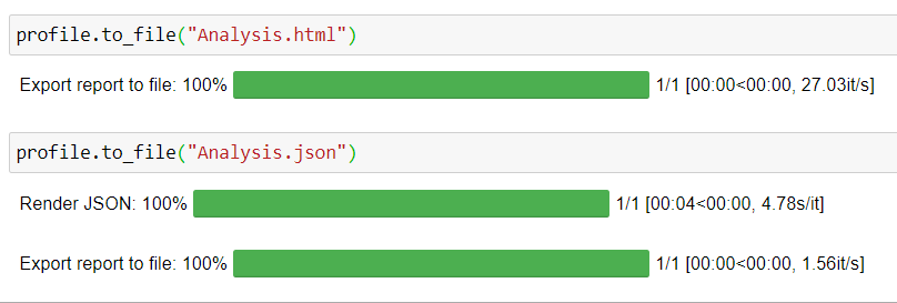
Advanced Usage
The report generated by Pandas profiling is a complete analysis without any input from the user except the dataframe object. All the elements of the report are chosen automatically and default values are preferred.
There might be some elements in the report that you don’t want to include or you need to add your own metadata for the final report. There comes the advanced usage of this library. You can control every aspect of your report by changing the default configurations.
Let’s see some of the ways in which you can customize your reports.
Add MetaData
You can add information such as “title”, “description”, “creator”, “author”, “URL”, “copyright_year”, and “copyright_holder”. This information will appear in the dataset overview section. For this metadata, a new tab called “dataset” will be created. To add this data to report, use dataset parameter in the ProfileReport function and pass this data as a dictionary:
profile = ProfileReport(df,
                        title="Agriculture Data",
        dataset={
        "description": "This profiling report was generated for Analytics Vidhya Blog",
        "copyright_holder": "Analytics Vidhya",
        "copyright_year": "2021",
        "url": "https://www.geeksforgeeks.org/blog/",
    },)
profile
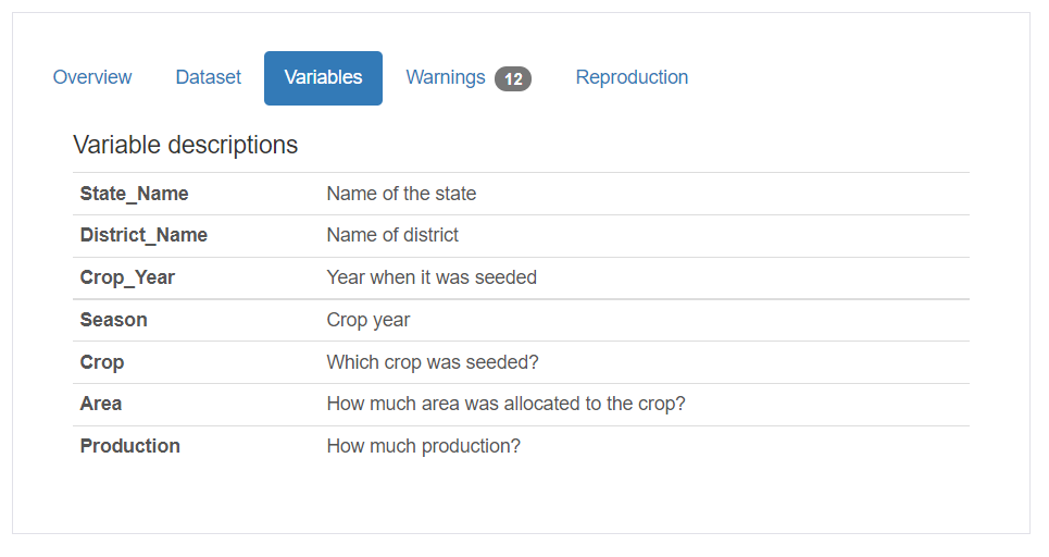
You can also add information about the variables used in the dataset using the variables parameter. This takes in the dictionary with descriptions as the key and value as another dictionary with key-value pair where the key is the variable name and value as the description of the variable.
variables={
        "descriptions": {
            "State_Name": "Name of the state",
            "District_Name": "Name of district",
            "Crop_Year": "Year when it was seeded",
            "Season": "Crop year",
            "Crop": "Which crop was seeded?",
            "Area": "How much area was allocated to the crop?",
            "Production": "How much production?",
        }
    }
When you add this to your ProfileReport function, a separate tab will be created named “Variables” under the overview section:
Controlling parameters of the Report
Suppose you don’t want to display all types of correlation coefficients. You can simply disable other coefficients by using the configuration for correlations. This is also a dictionary object and can be passed to the ProfileReport function:
profile = ProfileReport(df,
                        title="Agriculture Data",
                        correlations={
                                        "pearson": {"calculate": True},
                                        "spearman": {"calculate": False},
                                        "kendall": {"calculate": False},
                                        "phi_k": {"calculate": False},
    })
Similarly, you can customize every section of the report, the HTML format, plots, everything.
Check out this page of the documentation for details.
Integrations
After making your reports stunning by configuring every aspect of it, you might want to publish it anyhow. Possibly, you can export it to HTML format and upload it to the web. But there are some other methods to make your report stand out.
Widget in Jupyter notebook
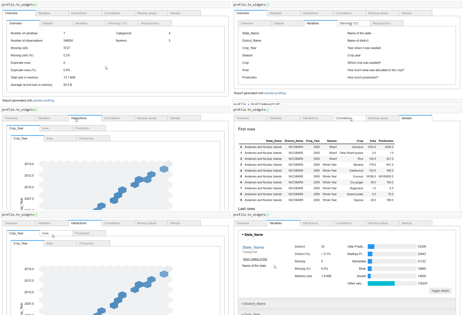
While running the panda profiling in your Jupyter notebooks, you will get the HTML rendered in the code cell only. This disturbs the experience of the user. You can make it act like a widget that is easily accessible and offers a compact view. To do this, simply call “.to_widgets()” on your profile object:
Streamlit app
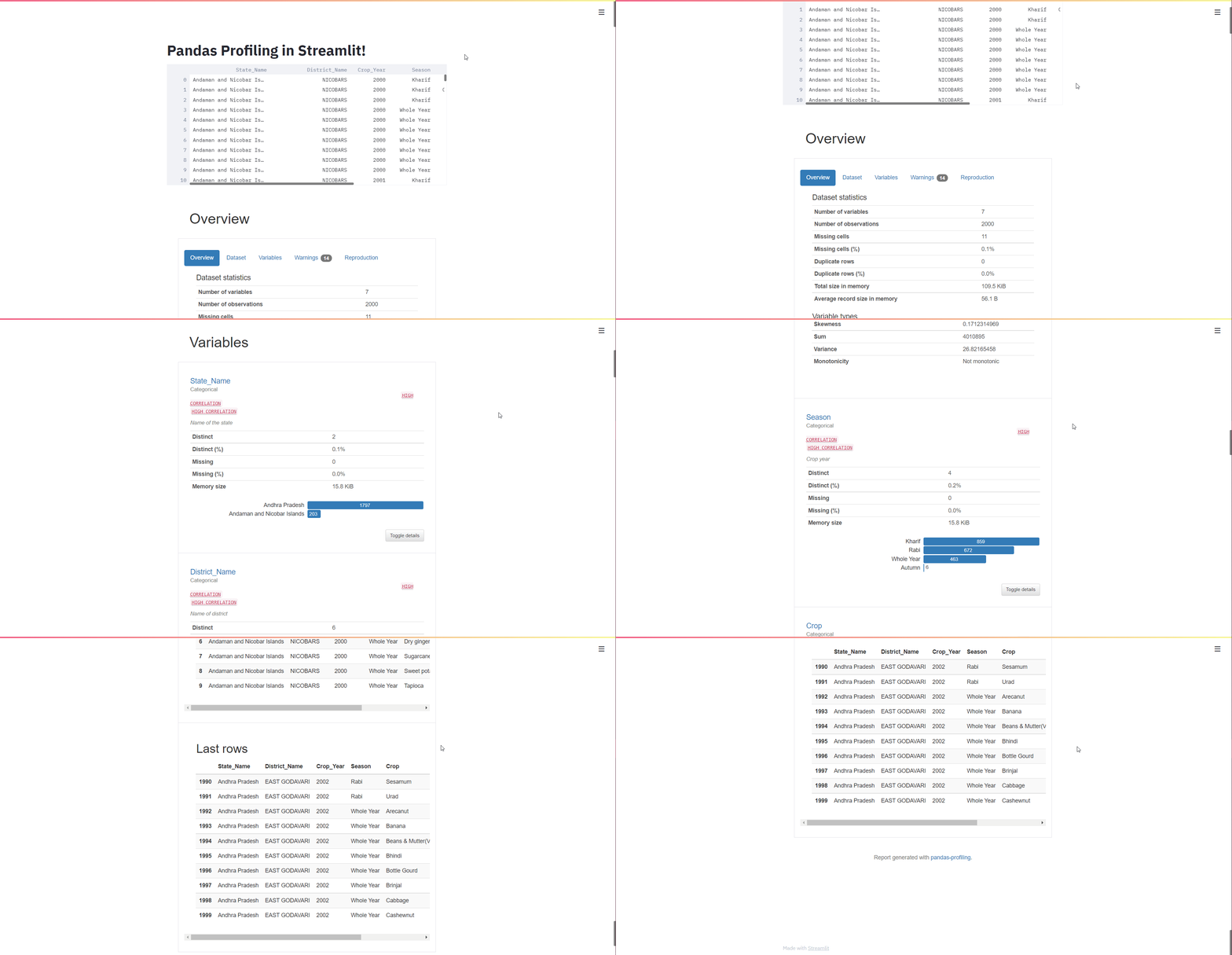
Yes! you can make this report as a part of a streamlit app too. Streamlit is a powerful package that enables GUI web app building with minimal code. The applications are interactive and compatible with almost every device. You can make your reports as a part of streamlit app by following this code:
Step 1: Install the streamlit_pandas_profiling
pip install streamlit-pandas-profilingStep 2: Create a Python file
Creare a python file and write code in this format:
import pandas as pd

import pandas_profiling

import streamlit as st

from streamlit_pandas_profiling import st_profile_report

from pandas_profiling import ProfileReport


df = pd.read_csv("crops data.csv", na_values=['='])


profile = ProfileReport(df,

                        title="Agriculture Data",

        dataset={

        "description": "This profiling report was generated for Analytics Vidhya Blog",

        "copyright_holder": "Analytics Vidhya",

        "copyright_year": "2021",

        "url": "https://www.geeksforgeeks.org/blog/",

    },

    variables={

        "descriptions": {

            "State_Name": "Name of the state",

            "District_Name": "Name of district",

            "Crop_Year": "Year when it was seeded",

            "Season": "Crop year",

            "Crop": "Which crop was seeded?",

            "Area": "How much area was allocated to the crop?",

            "Production": "How much production?",


        }

    }

)


st.title("Pandas Profiling in Streamlit!")

st.write(df)

st_profile_report(profile)
Step 3: Run your streamlit app
In terminal, type:
streamlit run .py
Conclusion
In this article, you got introduced to a new tool “Pandas Profiling” – one-stop solution for generating reports out of the pandas dataframe. We explored all the features of this tool, different sections, their content. Then we moved on to save the report generated and later on, we looked at some of the advanced use cases of this library and finally integrated the Streamlit app to make the reports more promising and interactive.
Frequently Asked Questions
A. To use pandas-profiling, you should first install it using pip. Then, import it into your Python script or Jupyter Notebook. Load your dataset with Pandas, create a ProfileReport object, and call its to_file() or to_widgets() methods to obtain a detailed analysis and visualization of your data.
A. Pandas profiling represents a Python library known as pandas-profiling that provides an automated and comprehensive summary of a DataFrame. It generates detailed statistics, data quality insights, and visualizations to help users quickly grasp the structure and characteristics of their data.
A. People use pandas-profiling because it simplifies data exploration and preprocessing by automating the generation of essential statistics, visualizations, and data quality checks. This tool saves time, helps users identify issues, and facilitates a deeper understanding of their dataset, making it a valuable tool for data analysis and cleaning.
A. While pandas-profiling is a popular choice, alternatives like Sweetviz and D-Tale offer similar functionality for data profiling and exploration. The choice depends on your specific needs, coding preferences, and integration with your existing data analysis workflow.
The media shown in this article are not owned by Analytics Vidhya and are used at the Author’s discretion.


