Summary
- YouTube’s redesigned watch page is now available to Premium subscribers in the form of an experiment.
- Plenty of YouTube users have criticized the new layout, as it radically rearranges some elements of the video viewing experience.
- YouTube says it will run this particular experiment until July 1, 2024.
YouTube is easily one of the most popular entertainment apps in the world. This means there are millions of people who use the platform regularly, either for work, study, or leisure. Given that it’s so ingrained into the everyday internet user’s life today, every small change the platform makes is closely scrutinized. Back in April, YouTube decided to roll out a redesigned watch page for the web, which subsequently received widespread criticism from users. The video streaming giant is now making this new-look watch page available to Premium users as an experiment.
YouTube Premium subscribers can try out this updated watch page by going to the Your Premium benefits tab in the menu accessible via the display image/avatar (top right of the homepage). Once enabled, the new layout will apply to any videos you watch on the web. Users can go back to the same tab to turn off this experiment, which will revert to the older watch page layout. This redesigned watch page experiment will last until July 1, according to YouTube, so there’s plenty of time to give it a try.
The criticism may be justified
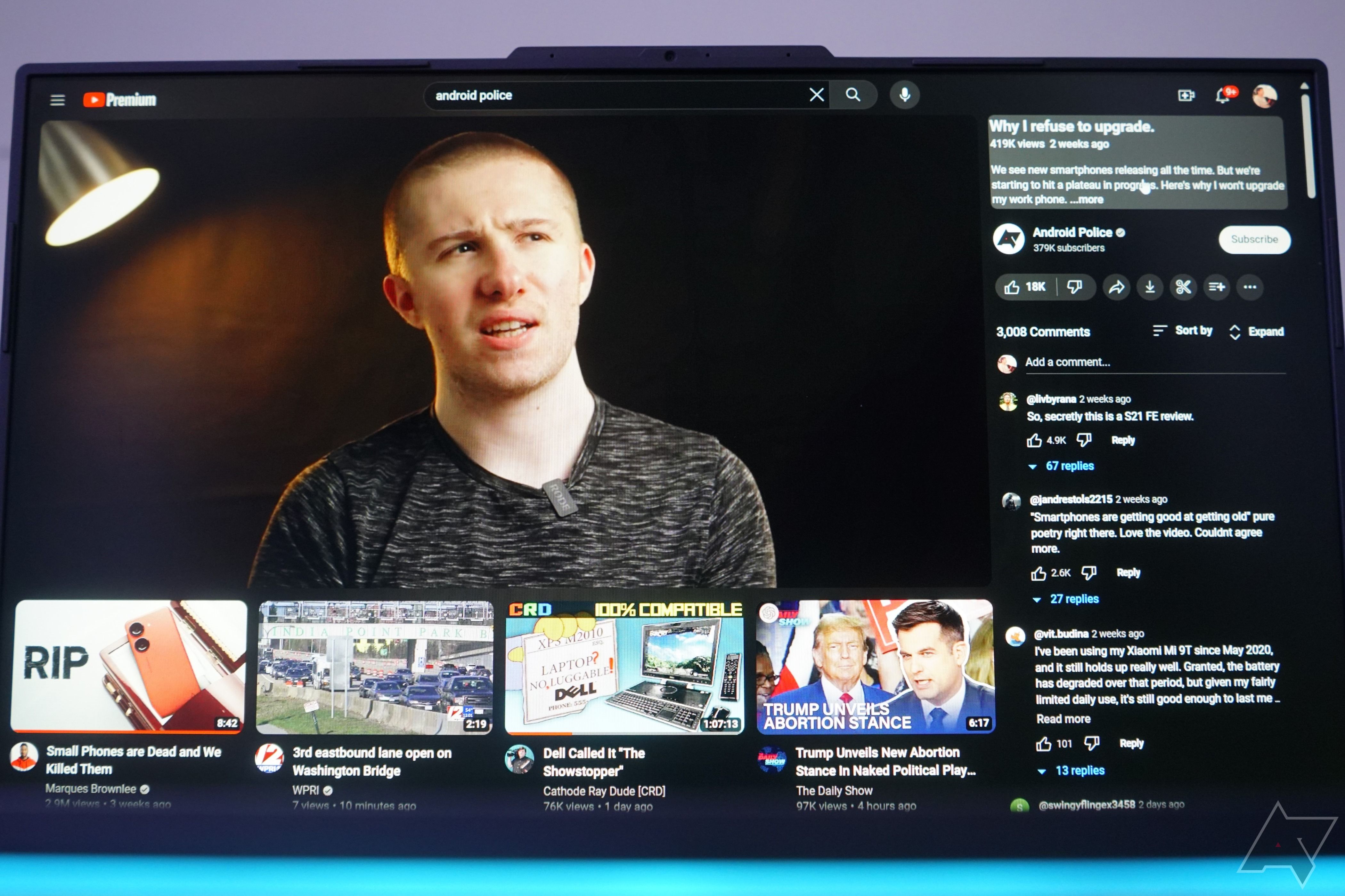
In my brief time since enabling this experiment, I’ve found that the recommendations are somewhat off, particularly with the last recommended video in the top row. While the first three videos in the suggestions row are generally related to my watch history, the third is usually irrelevant (sometimes in a different language).
This is likely a bug and could be fixed in the coming days. It didn’t exist during the early days of the redesigned watch page’s availability, as shown above. Meanwhile, other elements of this redesign, including the right-aligned video description and comments section, could take a bit of getting used to.
It’s worth noting that after initially making this available to some users back in April, YouTube pulled the plug on this redesign some days later. But as 9to5Google reports, the updated watch page design reappeared last month for some YouTube users. Does this mean this redesign is here to stay?
We can’t be sure yet, but since YouTube has been actively testing it over the past couple of months, coupled with the fact that it’s now letting users try it out voluntarily, indicates that this change is here to stay. YouTube has also unlocked some experiments for creators on its platforms recently, such as the AI-based Dream Screen feature we discussed earlier this week.


