Summary
- Netflix is testing a new TV app homepage redesign with interactive boxes for easier browsing and decision-making.
- The redesign will offer faster access to essential information about shows and movies, including ratings and previews.
- Navigation changes will move profile switching and search options to the top of the screen for quicker access and convenience.
Netflix is one of the most popular video streaming services in the world, with more than 82 million subscribers in the US and Canada alone, and it continues to improve while delivering top-notch entertainment and experiences on its various platforms. The latest improvement involves a massive homepage redesign for its TV app, which is currently in the testing stage, but it should soon be available for more users.

Max is raising prices on ad-free streaming plans again
Max becomes the ninth major video streaming platform to raise prices over the past one year
We might soon see some interesting changes in Netflix’s TV app, as the company is currently testing a new homepage redesign. Pat Flemming, Netflix’s senior director of product, told The Verge that the new homepage will include boxes that extend as soon as your remote lands on them. “We really wanted members to have an easier time figuring out if a title is right for them.”
How is this new homepage different from the one we have right now?
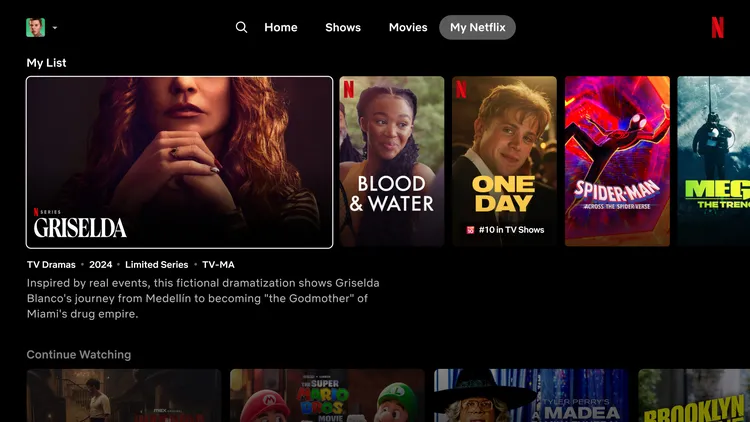
The current homepage offers static tiles containing custom recommendations of shows and movies for every user. Hovering your control or selecting any of these tiles gives users additional information about the show or movie, which includes a short trailer and additional information that’s meant to get you excited about what you’ll experience. The expected redesign will take all these elements and integrate them for a faster, more convenient way to see critical information.
Holding your selection of any box long enough will launch a short preview of the content, along with all the information about the title that you need, which includes the year it was released, number of seasons, episodes, and ratings.
Netflix will also remove the menu that pops from the left side of the homepage. This section normally lets you switch profiles, search for specific titles and categories, or helps you find what’s new and popular on the app. The new changes will move these options to the top of the screen, and to make navigation easier, you won’t have to scroll to the top of Netflix to access this new menu, as you will only have to press the back button on your remote.
Categories, New and Popular and My List tabs won’t be available on the new layout, but you will still be able to access My Netflix, which will provide recommendations that will be tailored to each person’s preferences and watch history. And you will still be able to access Categories, you’ll just head over to the search tab and fire away.
Now, these changes won’t become available for all users immediately, as the company is still testing these new changes along a small group of subscribers, but if everything goes well, we might see them expand to more members in the future. Or in Flemming’s words, “If this goes well, which we are enthusiastic and hope that it will, then we would love to share this with most of the member base in the coming months and quarters.”


