If you have used an Android phone since 2014, you’re already familiar with Google’s Material Design, its high-quality design system for websites, Android and iOS apps, and operating systems. It covers shapes, 3D effects, animations, lighting and shadows, colors, typography, fonts, transitions, layouts, and more. It’s most prominent on the best Google Pixel phones although Android phones from all manufacturers touch on it to some degree.
Over the years, Material Design has undergone three major iterations, culminating in the familiar digital experience we see today on Android 14, the latest OS for Android phones and tablets Whether you’re a budding developer or just looking to understand the background behind your Android app’s user interface design, this guide will serve as a primer on Material Design.
Why Google create Material Design?
Material Design’s guidelines help app developers create effective UX designs with minimal headaches. Drafting new designs is simple as Material Components (shapes for UI elements) are premade and ready to use.
Google’s design language is more than just a set of recommendations and guidelines; it’s a UI design ecosystem that can cover nearly every situation an app developer might encounter when creating an app’s UI. While this may seem restrictive, Material Design is highly flexible, allowing developers to implement their design how they like while keeping to a common theme.
Advantages and disadvantages of Material Design
Material Design balances form and function to create user-friendly UIs that do not hinder an app’s purpose. This has multiple advantages for users and developers:
- The consistent visual language of Material Design creates intuitive apps If you download a new app and are presented with a familiar UI, the “friction” of using it is significantly lessened, allowing you to use the app immediately rather than familiarizing yourself with a new set of icons.
- Material Design has a comprehensive set of rules Material Design has a flexible and comprehensive set of rules for most design situations. This makes designing an app’s UI straightforward and quick without forcing the developer to conform to rigid rules.
- Mobile-first design Material Design has expanded to web apps and ChromeOS, but its origination in mobile apps remains. Animations are emphasized across multiple UI elements, and the results of actions are immediate. This creates a user environment where actions and their impact are easily understood.
There are many more advantages behind Material You, including its emphasis on mimicking the real world to reduce user confusion and the subtle ways it helps the user experience. However, it’s not all perfect; disadvantages of Material You include:
- Deep brand association with Google Despite Material You’s prevalence among third-party developers today, we have become familiar with it through Google’s apps and services. This means we unintentionally associate any app designed with Material Design with Google. This is great for Google but bad for developers who find the impact of their branding lessened.
- Overly comprehensive design language The comprehensive design principles of Material Design are great for streamlining development and reducing user friction but bad for creativity. Problem-solving is practically non-existent when developing an app with Material Design, reducing the need for new and innovative solutions to UI problems.
- Overemphasis on icons Despite Material Design’s straightforward design, there’s an overemphasis on icons, either due to “mystery” icons (i.e., the “Home” button on an Android phone’s navigation bar that’s just a circle”) or by providing elements that don’t allow space for text. This creates confusing elements that aren’t easily circumvented.
These disadvantages are problematic for developers and users. However, when properly used, the Google design language helps users perform the actions they need quickly and easily in a cohesive environment.

Material You: What it is and what we love about it
The most personal design you could imagine, without lifting a finger
Material Design celebrates its tenth birthday
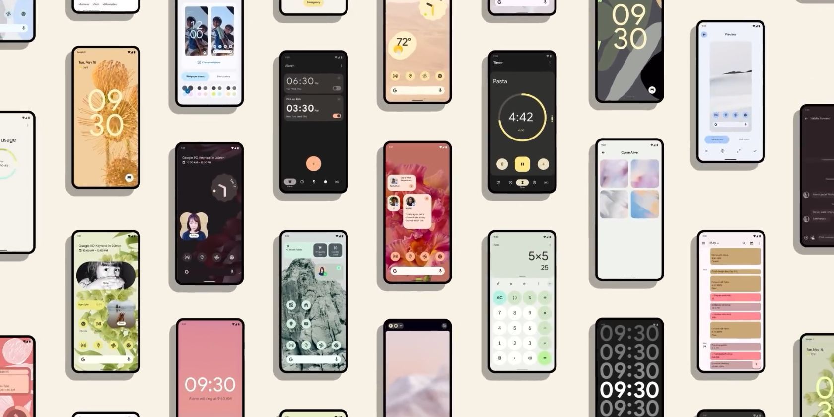
The latest version of Material Design was Material Design 3, also known as Material You. It debuted alongside the Pixel 6 and Pixel 6 Pro and emphasized bolder icons and dynamic color palettes. It allowed users to create custom themes for their phone’s UI and app icons based on their wallpaper while also improving user accessibility.


