Overview
Analytics Vidhya has long been at the forefront of imparting data science knowledge to its community. With the intent to make learning data science more engaging to the community, we began with our new initiative- “DataHour”.
DataHour is a series of webinars by top industry experts where they teach and democratize data science knowledge. On 31st May 2022, we were joined by Dr. Martin Henze for a DataHour session on “The DataHour: Create Effective Data Science Notebooks and Communication”.
Martin has a PhD in Astrophysics from Technical University Munich and currently works as a Data Scientist at YipitData. He has extensive experience in data wrangling, EDA, and data visualization in Python & R; and is passionate about storytelling and communication.
He is one of the top members of the Kaggle community as the first-ever Kernels Grandmaster, and former number 1 in the Notebooks ranking, with 23 gold medals to his name. His granular level documentation is well-lauded within the community. In addition, he is a Discussions Grandmaster with 108 Gold Medals.
Are you excited to dive deeper into the world of Data Science Notebooks and Communication? We got you covered. Let’s get started with the major highlights of this session: Create Effective Data Science Notebooks and Communication.
Introduction
Through this session, we’ll learn:
- Some tips and best practices for effective data science communication.
- How notebooks can play a powerful role at any step of the machine learning and data science workflow?
- How does it allow you to communicate and improve your work from data ingestion to the final model or actionable insights
Why is this session — a necessity?
We came up with this session because we saw communication as a data scientist or a machine learning practitioner is often underrated. Though it’s one of the most valuable required skill sets. How? In your daily working routine, you need to communicate your insights, process and findings – very clear and in an accessible way. Because in every step of your workflow you’re going to communicate to somebody who gives you data/who will use your results/you’ll communicate to your colleagues for some explanation and do some brainstorming and get more ideas. You might even be talking to an audience to try to summarize your findings and then depending on the audience.
You want to focus on different aspects of your work so communication is really one of the key aspects.
The communications part and the part of the notebook are very strongly related because nowadays data science and machine learning happen a lot in notebooks. This is because they are like a flexible and interactive lab book, essentially that is also reproducible. Hence it is reproducible you can kind of combine your code/documentation/ideas for future analysis.
Exploratory Data Science Notebooks
This is the part of your analysis where you are communicating with your data. So you want to analyze your data look at it from different points of view and won’t really understand what your data tells you. Because almost everything depends on the data and in order to
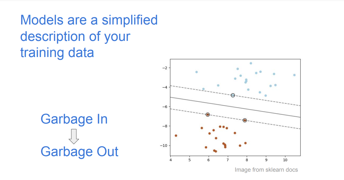
For example – in the sk9 docs where we want to distinguish between the red and the blue points. And we have a support vector machine here that allows us to draw a line and to draw a divider. Here comes the need for a model. The model looks at your data and then establishes generalizable rules. Whenever you use a model it’s important to keep in mind that models are always a simplified description of your trading data. And that’s what we want a model to do. We want the model to look at the data and learn from it; learn the kind of big picture ideas from it and not overfit. But that also means that if your training data is bad in some way or biased or there’s a lot of noise in it then your models will not be good.
Garbage in Garbage out
It’s a very fundamental concept. You can’t expect to get a great model performance if you don’t give it great data to learn from.
For example – U.S. 2016 election –> The way President Trump consistently outperformed all the polls that were taken in those key states which then later led the polls to realize that the way that they’re calling their kind of mythology was flawed/biased. There was a significant bias toward people not telling them how they would vote in the election if they would end up voting for Trump instead of Clinton. So everything was kind of shifted in a systematic way. Hence, there is this kind of systematic bias that is different from the statistical noise that you have and they are very crucial to keep in mind when you are designing a machine learning problem. Moreover, you want your data to be representative and this was not representative polling. So it couldn’t be relied on to predict the election outcome.
Beware of Biasness
This bias can come in many different ways like a computer vision model that you want to be able to predict like skin cancer.
You have to make sure that your model will be able to perform equally well on people with lighter skin where it might be easier to detect this melanoma, and also people with darker skin where you know it would be more challenging. Bias is important and when you think of bias you also always want to consider the ethical implications of your work. Hence bias is worth emphasizing and including here because your model is going to be used in real-world scenarios. And sometimes these real-world scenarios can have an ethical implications also.
Beware of Bias and consider the ethical implications of your work (Domain Expertise)
Ethical impact depends on whether there might be some bias in your model or not. These information about ethical impact comes a lot with domain expertise which is another avenue of communication. You want to communicate to people who know a little bit more about the problem than you do. Here our expertise is in data science and machine learning we know a lot about that but we might not necessarily be domain experts in a specific area.
But they are domain experts out there from whom we can learn a lot so it’s always very useful and valuable to start talking to these people right maybe have a first look that’s kind of unbiased at the data and make up your own mind but then bring in the expertise that’s out there because you know it’s available and people might have been looking at this problem for a great many number of years you know without machine learning but you know they build up a lot of expertise here that can be useful for machine learning.
Plot your data – Anscombe Quartet
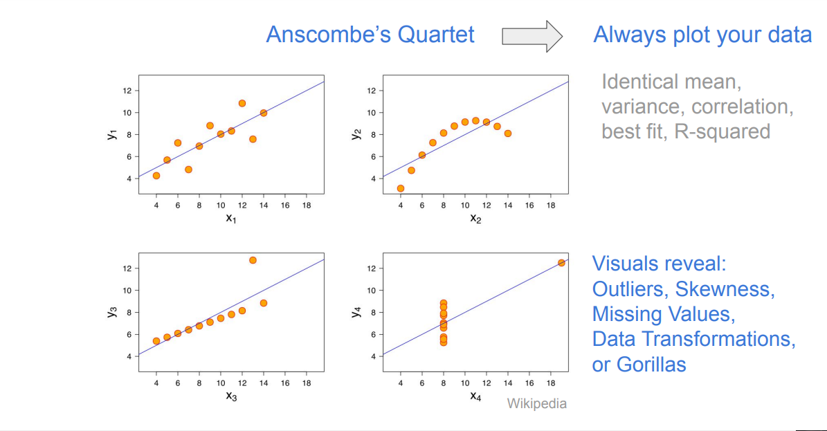
This is an example which is very famous in statistics circles. It’s famous for data scientists and machine learners and relevant for us too. We have four different plots of tabular data and two dimensions x and y. They look very different but if you look at the summary statistics you’ll find that all of these four panels have exactly the same mean, same variance, same correlations, same fit and same r squared. If you don’t know you wouldn’t be able to tell that they’re different just from looking at these summary things.
Do some sort of outlier detection for instance to check whether the data is good or bad. This will only look at whether the mean, variance falls within a specific range. One important thing here when it comes to this kind of validations and examinations is to always plot your data because that will allow you to reveal outliers, skewness, missing values, and data transformations.
Example
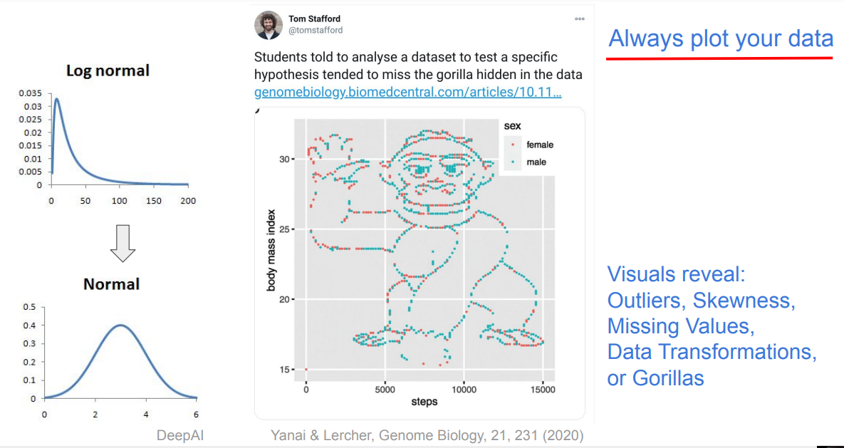
Gorilla — published in a genome bio paper where students were told to analyze the data set just to test the hypothesis. So there’s you know steps and body mass index and the variables and you know distinguished between male and female patients. And you can do a lot of model fitting with this immediately. But unless you actually plot the data and look at it the students wouldn’t have realized that there is a gorilla that’s actually waving out at them. So this is obviously something that the experimenter design to see whether students would plot the data or whether they would just start applying models without even having seen the data in its context.
This is a toy example. This is a specifically designed data set. You can never completely rule it out so it’s always best to check and it’s always best to plot your data to get a quick impression of how different features or variables are related. Whether there might be some obvious outliers of what the shapes in your data are.
Here many of these distribution questions can be reframed to NLP data as well to text data and if you extract features in a certain way they can also be relevant for image data. So you could quickly extract something like the average pixel value for your images and then plot that as a 1d distribution. And that should tell you whether there might be some images in your data that are significantly darker than others. Because they were taken at night and if you don’t account for that then your model might learn whether an image was taken at night or during the day rather than what the image actually shows. If you get a little bit creative when it comes to extraction and feature engineering. You can reframe a lot of these things that people have learned for tabular data to other types of data as well.
What to opt for when you have such type of query or distribution?
Whenever you see a distribution like this then the first thing that should come to your mind is what happens if I transform this data and this is very skewed. So what happens if I put on a log and I find that this log-normal transformation at this normal distribution through this transformation can then be changed to a normal distribution. So in log space, this is normally distributed and we like everything that’s normally distributed because that’s great statistical properties and it can be dealt with much ease.
It’s much easier to do some outlier detection and rejection on a normal distribution than it would be to do it on a log-normal distribution. It’s because where do you put the threshold for outliers here. This is a very long tail whereas here you know there are some standard accepted ideas on where to put the thresholds in a normal distribution and again plotting your data can help you do this. Then you know you can do your feature engineering transformations to make the problem easier for you and to make it easier for you all to find out what’s going on there and always plot your data in tabular form or using NLP.
Communication is a key
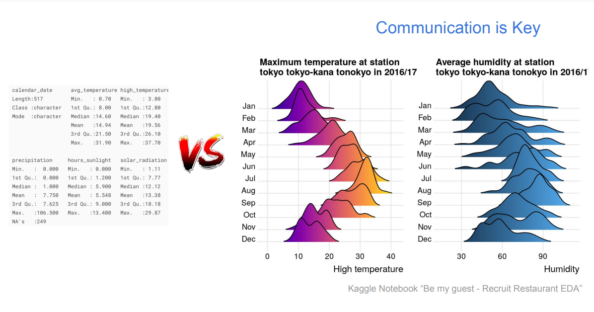
Till now we discussed how to communicate with your data to find out what are the strengths and weaknesses of your data. Now let’s talk about how to communicate with other people. So if you’re thinking about how to present a certain result then one way would be to put it in a table and then in an excel sheet or something like:
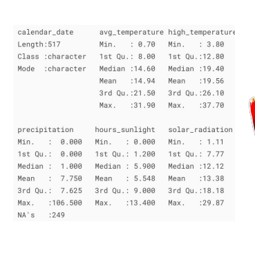
Of course these two things don’t exactly show the same thing. But we have kind of median temperatures here. So we can see the range of the temperatures but we can much nicer see the range of the temperatures in this case. This is an example from one of the presenter’s notebooks in kaggle that dealt with the temperature distributions over the year.
Visualization for a specific metro station unknown weather station in Tokyo in Japan. You see that in the summer in japan it gets it pretty warm and gets pretty humid. Although the humidity is less and shifting throughout the year it’s still shifting. And then you have the winter months – are colder. So if you want to just communicate that then the way to go through visualization is because it’s immediately accessible.
Communication in a project
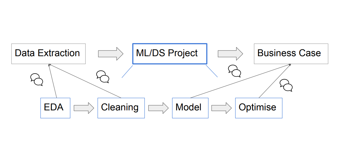
There’s always a lot of communication happening throughout your entire project so if we kind of think of a machine learning a data science project. Here’s a project and you’re getting data from somebody or maybe you’re even extracting the data yourself but you’re getting data from somewhere and then you’re building something extremely valuable. Then this will fit into. This project can be anything – a business case, academic paper, scientific project, etc. But somebody somehow will use the results of your model to do something. And then within your model, you have steps – EDA, data cleaning, building your model in the first place and then iterating and optimizing it.
There’s a lot of kind of back and forth and iterations between looking at the results of your model and finding out to do more EDA and etc. This is most cases for most of us and at each of these steps, there is a lot of value that you can get out of communicating. So talk to the people that give you your data if there are those people and maybe they can help you with the process too.
Moreover, at the end of your project, you want to talk to the people that will use your data. The type of model that you choose will be impacted by the type of business case or academic case that your model will be employed under and maybe the optimization will be impacted as well. Because the question is what to optimize for. We want to optimize for precision or recall.
So there’s a lot of communication happening here at each of these stages and it’s very important to do this. It’s very important to talk to people and when you’re talking to people you can use those skills of data visualization and data communication that you learned by communicating with the data to communicate the data to other people.
Four Principles so far:
- Garbage in garbage out –> If your data isn’t great then your model’s not going to be great either.
- Be aware of bias and biases related to how your model will be used and what you’re actually aiming for.
- Always plot your data or always look at your data at least in some shape or form don’t just immediately throw it into your your favorite deep learning tool but look at the data to see you know what could go wrong.
- Communication is key –>you want to figure out how to communicate your insights you want to figure out how to communicate your process in a kind of accessible and clear and reproducible way so that you can also communicate it to yourself like one year in the future or so.
Guidelines for Data Science Notebooks & Exploration
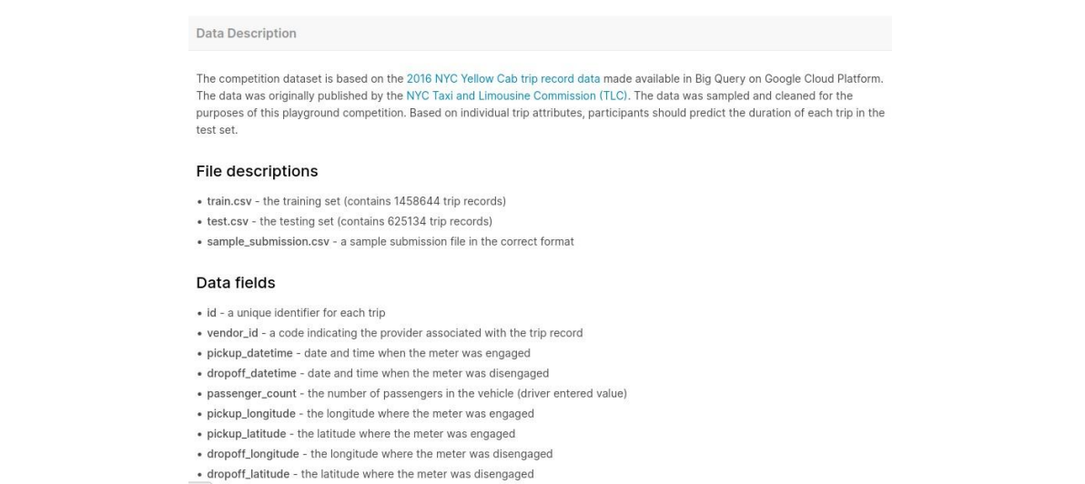
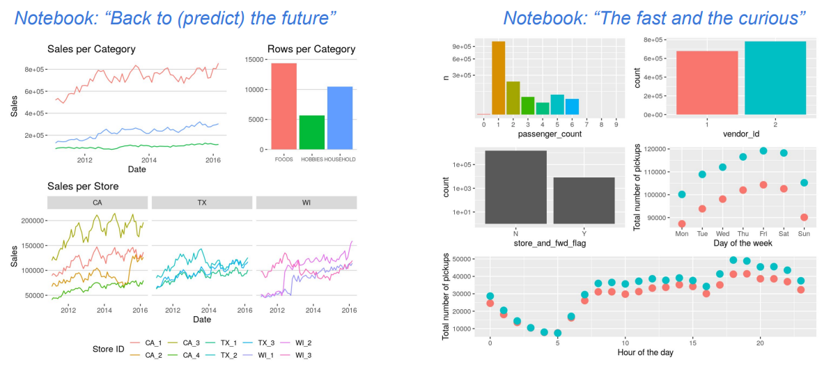
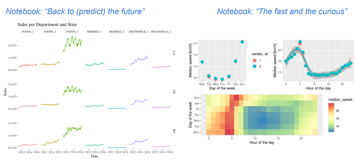
For this presenter is using two of his notebooks on – one is on the taxi trip competition the other one is on the on a sales forecasting. Even though the kind of the data sets are different we can follow roughly similar guidelines.
EDA Guideline 1: Understand your data context
Where does your data come from what are the features what do they mean. On kaggle the data is cleaned up and prepared for you and there’s always a description that tells you what the context is and just read everything that’s related to the to the data and in a business context. Because aim is to build something that really address the problem.
EDA Guideline 2: Look at your data
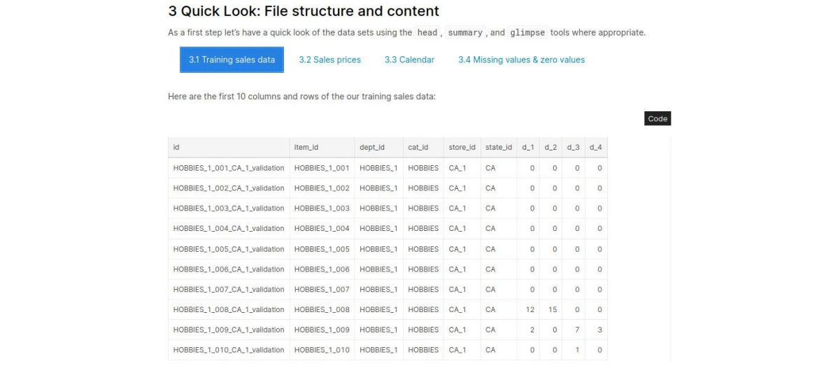
Look at your data. Just looking at the tables of the tables, at the text of the text, look at some sample images. Images get a kind of quick feel of what’s going on with the data like what does it look like, how is it structured.
EDA Guideline 3: Always plot your data
You can start with some simple line plots for sales that’s always good. Some kind of bar plots are good whenever you have categories. These are the two fundamental tools that can be used for continuous and for categorical features. And then you can get gradually more complex.
For example –plotting regions and customer accounts and loan amounts.
EDA Guideline 4: Gradually build up complexity
You can use kind of two dimensional facets to increase that to a grid. For example — you have california and texas and wisconsin here on the y-axis and then you have the different sales departments here on on the x-axis in a sense on the x-axis of the grid. So you have three categories and seven categories here. And you can build a grid and can take each of them apart and look at each of them separately and simultaneously.
You can increase the dimensionality of your 2d plot by two additional categorical dimensions by using these facet grids. The limitations here like if you have thousands of categorical values then you know it’s not going to work. but for this you can use these heat maps in order to combine some features that can be categorical. They can be ordinal. Example – hour of the day is is an integer feature essentially but it doesn’t take that many values so that makes it easier. But heat maps are a great way to figure out rsm like patterns in your data. Once you have these basics down you can start looking at things from different angles.
EDA Guidelines 5: Investigate your data from different angles
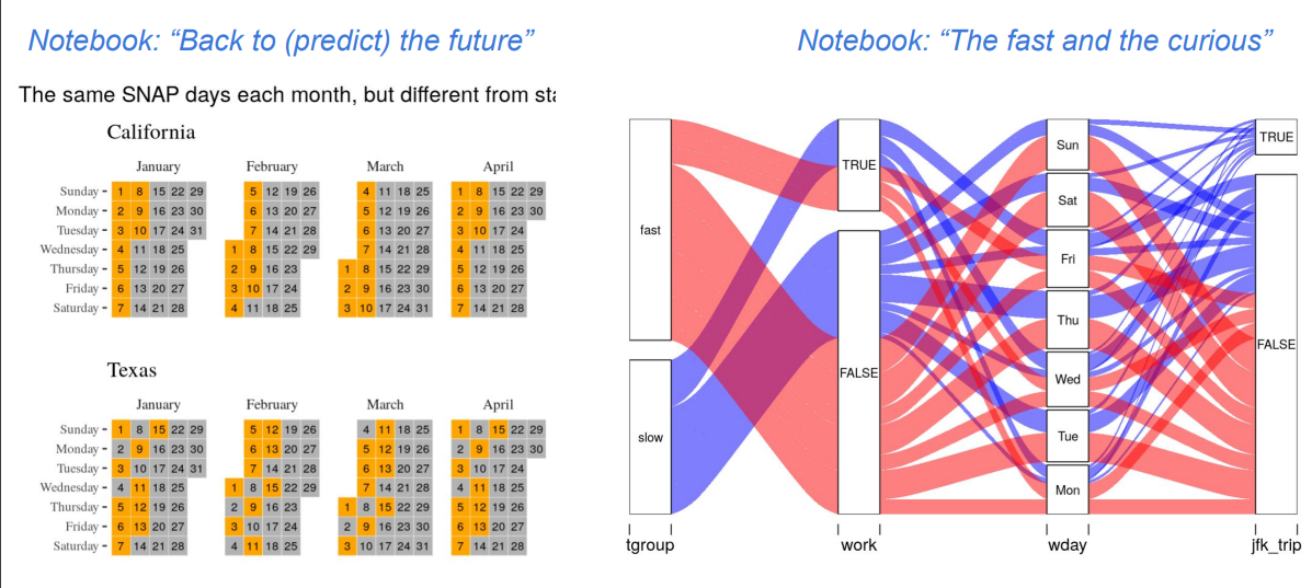
Notebook 1–Like instead of using a line plot for a time series you can plot things on a calendar because then you’ll see this range of dates is special for california but texas uses a different format-the orange days. It doesn’t really matter what they are here but the orange days are not all in a row but they are distributed like this. So there’s a difference happening here you can use the line plot to visualize that but it’s much nicer in this calendar view. Because it immediately becomes obvious of what’s going on.
Notebook 2–For other one – there was a continuous target that we were supposed to predict whether how fast something was going and the kind of shift and angle here was to look at it from a categorical point of view. In order to visualize something it can help to look at the regression problem from a classification point of view or maybe you can look at the classification problem from a regression point of view. This kind of shift in perspective can sometimes tell you something new about your data.
EDA Guidelines 6: Document your thoughts and ideas
Always write down your findings and ideas so that you know you don’t just have a large cell a kind of a large sequence of plots where you show all of the things. It’s because when you get back to three months later you have forgotten what most of the cool things are. But if you write down your each and every findings you can get insights from them anytime.
Notebooks best practices and inspiration from Kaggle Hidden Gems
If you want to get kind of inspiration of what nice notebooks look at the presenter have a series on kaggle. It’s called hidden gems where he look for notebooks that are great in one aspect or another like– data visualization, storytelling, etc. But they haven’t received much feedback and engagement from the community.
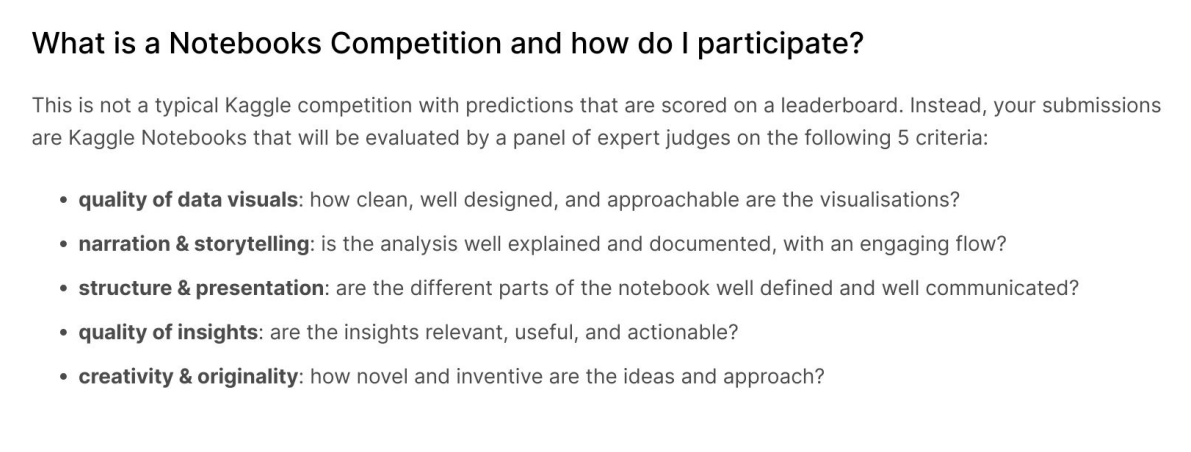
He had a competition on this. He invited people to write notebooks on this set of hidden gems. And the way that those notebooks were evaluated followed those criteria mentioned earlier.
And criteria of a great notebook:
- what are the main aspects of a great notebook – data visuals, narrative aspect, structure presentation, etc
- and what are the different parts of it.
- what are they aiming for.
- and quality of insights
Creativity and originality not always needed – for every business problem or paper. You need to come up with a completely new way of communicating something. It’s because when you come up with something different it helps to get the attention and interest of your audience.
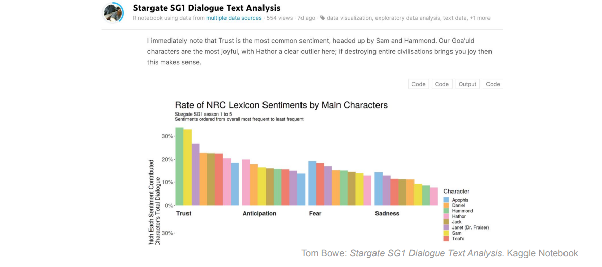
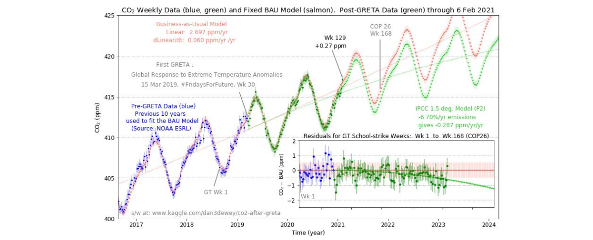
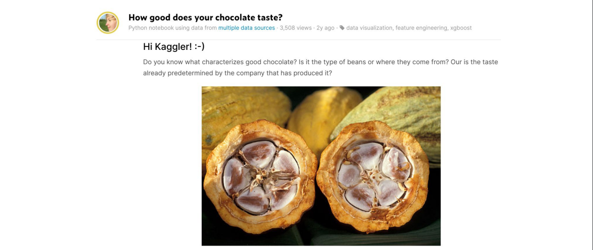
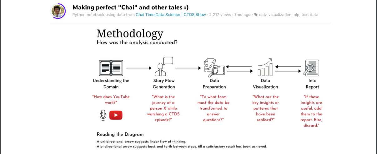
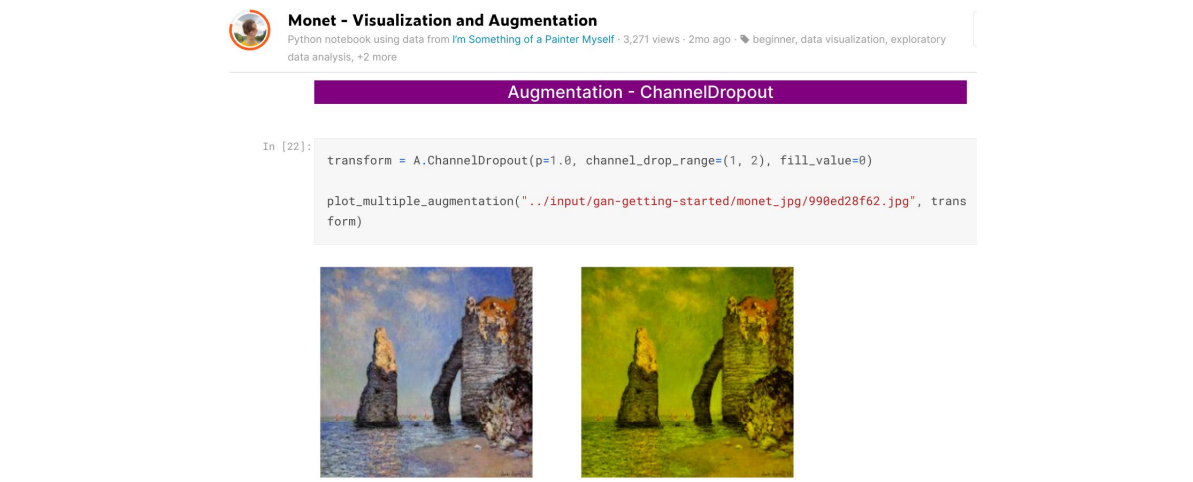
There’s a lot of inspiration there when it comes to write great narration and storytelling. How to craft engaging visuals that tell a story as well and communicate specific insights like there are some some plots in some of these notebooks that would not look out of place in a science or nature paper. Write an introduction put some images in there to make it interesting. How to make your results accessible you can even communicate your methodology through a kind of pictograms. Add some structure – basic elements – kind of chapters and sections in your notebook like r allows you to do that with these tabs.
Notebooks best practices and inspiration: narration, narration, narration
Notebooks best practices and inspiration: craft engaging visuals
Notebooks best practices and inspiration: introduce your work
Notebooks best practices and inspiration: explain your approach
Notebooks best practices and inspiration: structure your presentation
Notebooks best practices and inspiration: understand your model
You can find many more gems on Kaggle.
Conclusion
I hope you enjoyed the session on data science notebooks and communication and understood it very well.
Learnings so far:
- Some tips and best practices for effective data science communication
- How notebooks can play a powerful role at any step of the machine learning and data science workflow,
- and, how it allows you to communicate and improve your work from data ingestion to the actionable insights
- Few example for more clear understanding.
Image Source: All the images are taken from presenter’s presentation.


