


Summary
- Spotify’s Android app icon reverted back to its black bezel design after a week of strange saturation issues and cut-off bezel frustrations.
- Users experienced odd changes in Spotify’s icon appearance, with varying bezel sizes and issues with non-circular app shapes.
- You’ll need to make sure you’re running the latest version of Spotify to see these changes.
Last week, Android users across the web — myself included — discovered the Spotify app icon on Android had lost its black bezel. Taken at face value, it wasn’t a necessarily bad tweak, since the black bezel has long stuck out like a sore thumb compared to most other standard icons. But thanks to some strange saturation issues and a returning, cut-off bezel when using various app shapes, it frustrated a lot of Spotify subscribers. Today, it seems like the company has reverted back to its older style, but not without some weird remaining issues.
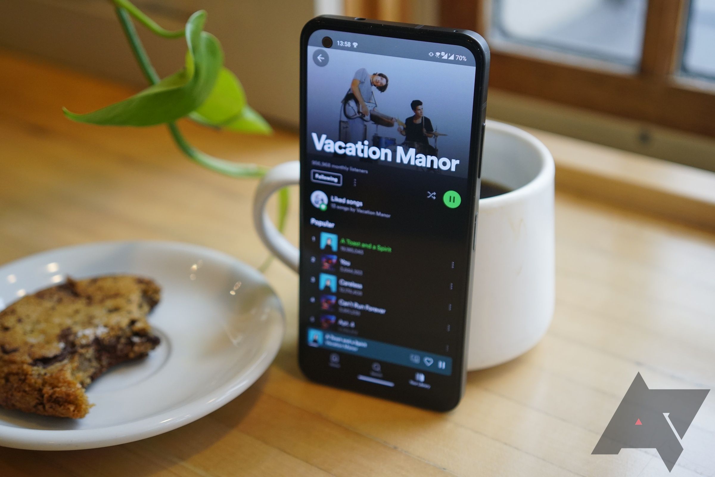
As of June 6th, I’m seeing the standard Spotify icon, black bezel and all, across numerous Android devices on app version 8.9.46.426. This comes after a patch on June 3rd, according to the Play Store’s changelog. With this latest update, the various problems some users faced with Spotify’s icon, including oversaturated colors and a reappearing bezel on certain icon shapes, seem to have reverted back to normal. On my Moto G Stylus, for example, swapping shapes on the home screen uses the correct bezel shape and size — a relief for customization fans everywhere.
Spotify’s logo is back to normal, both with circular icons and with odd shapes.
It’s been an odd week for Spotify’s icon, though. For example, fellow AP editor Taylor Kerns found his phone had updated to version 8.9.44.368, which — despite rocking the same patch notes on the Play Store — actually left his bezel larger, both with and without dynamic icon themes enabled. Over the weekend, I also noticed the Spotify icon on my Pixel 8a appeared for brief moments when opening and closing the app, before snapping back to the bezel-less update we saw last week.
Examples of Spotify’s logo bugged out over the past week.
I’m not really sure what to make of this week’s worth of changes, but I’m hoping this reversion sticks for the time being. I’m not against Spotify changing its app icon in theory — the Windows desktop version lacks the black border, for example, and it doesn’t stick out nearly as much along my taskbar. But the ever-changing shape of this icon just looked particularly bad and unfinished, as if my home screen was bugging out whenever I went to listen to music.
Yes, these are small things to complain about, but an app as popular and well-used as Spotify is bound to have earned a space across millions of Android home screens. For enthusiasts like myself — and the majority of Android Police readers, I would imagine — how our phones look and feel does matter. If Spotify decides to ditch its bezel in the future, I just hope it comes without the change looking so unfinished. I’m paying enough for that level of consistency, aren’t I?
As Spotify adds more AI cruft, all I want is better audio
Are randomized songs really too much to ask for?