This article was published as a part of the Data Science Blogathon
After my last article about spatial correlation, this time I am going to discuss spatial interpolation. In this case, we have a dataset of point features with spatial location. Below is the fictional data we will be using for this article.
"x","y","ET","Temp"
110.2334405,-7.98340299528,140,26.926553370148
110.248176644,-7.98410912332,145,26.5951008838198
110.262675107,-7.98457987466,138,25.6591343646793
110.276698211,-7.98505062547,130,24.5894583428044
110.291434354,-7.98528600067,130,24.5894583428044
110.308784974,-7.98575675066,125,23.9209108291326
110.322808078,-7.98622750011,145,29.5951008838198
110.341347097,-7.98905198542,138,26.6591343646793
110.341347097,-7.97681240806,140,28.926553370148
110.345387652,-7.96292475161,100,19.5781732607736
110.340158698,-7.95021360248,95,21.9096257471018
110.346338371,-7.93538343076,85,17.5725307197583
110.339207979,-7.92102354827,83,18.3051117142895
110.346100691,-7.90713400518,60,15.5
110.323521117,-7.97375245645,120,26.2523633154608
110.324471836,-7.96245397534,125,23.9209108291326
110.325422555,-7.95021360248,115,22.583815801789
110.326373274,-7.93491262289,95,20.9096257471018
110.325660235,-7.92149437203,78,16.6365642006177
110.32970079,-7.90525064128,82,18.1714022115552
110.308784974,-7.9735170746,132,24.8568773482731
110.310211053,-7.96292475161,130,27.5894583428044
110.309260334,-7.95044899771,130,24.5894583428044
110.311161771,-7.93538343076,120,26.2523633154608
110.313063209,-7.92361307231,100,22.5781732607736
110.313538569,-7.90360269081,90,19.24107823343
110.291909713,-7.97234016337,140,27.926553370148
110.292385073,-7.9612770323,145,25.5951008838198
110.294286511,-7.95139057729,135,26.2580058564762
110.295712589,-7.93514802689,130,24.5894583428044
110.296187949,-7.92196519526,110,23.9152682881172
110.296900988,-7.90313184662,100,20.5781732607736
110.278361969,-7.97304631052,145,29.5951008838198
110.279550368,-7.96198319853,150,29.2636483974916
110.280263407,-7.95044899771,140,27.926553370148
110.280501087,-7.93679585114,128,24.3220393373357
110.283115564,-7.92196519526,115,23.583815801789
110.284303962,-7.90525064128,102,20.8455922662424
110.263150466,-7.971634015,151,27.397357900226
110.264101185,-7.96057086485,168,30.6704194467101
110.265527264,-7.9492720202,155,26.9321959111634
110.267904061,-7.93679585114,135,25.2580058564762
110.267666381,-7.92078813618,110,22.9152682881172
110.26837942,-7.90430895611,103,21.9793017689767
110.247701284,-7.97069248194,125,26.9209108291326
110.249602722,-7.96010008587,150,28.2636483974916
110.250078081,-7.94833043576,150,30.2636483974916
110.252217199,-7.93561883449,142,25.1939723756167
110.252217199,-7.92125896022,122,26.5197823209295
110.253880957,-7.90525064128,118,21.9849443099921
110.232489782,-7.97069248194,135,26.2580058564762
110.233965056,-7.960051852,140,27.926553370148
110.23391586,-7.94597646522,135,27.2580058564762
110.235104259,-7.93255857545,130,27.5894583428044
110.236054977,-7.92008189912,120,24.2523633154608
110.236054977,-7.90595690375,119,25.1186538127265
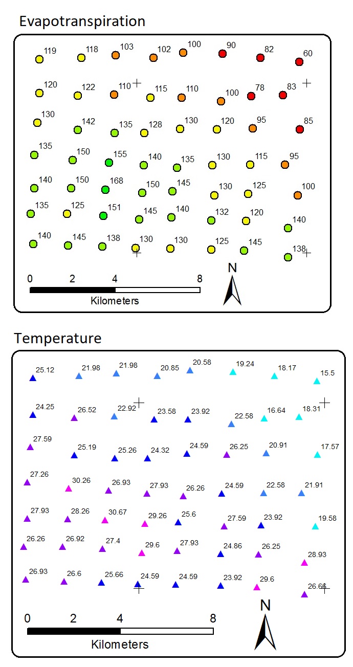
There are distributed 56 data points. Each point has evapotranspiration and temperature values. X and y are the location coordinates. Note that, once again, the data are fictional, NOT from real field measurement. There is a linear correlation between temperature and evapotranspiration. This means that we can apply linear regression or other regressors to predict evapotranspiration with temperature as the predictor. The result is a model or equation. Using the equation we can predict unknown evapotranspiration, but by requiring the predictor. This is a common Machine Learning task.
But, our task now is to predict the location in the white areas above so that they all have values. In other words, the task is to interpolate the data points into raster areas with evapotranspiration values. The white areas in the map above have no evapotranspiration and temperature information. Allocating more resources to collect more data in more detail spatial interval is a good idea, but acquiring field data may be costly and limited.
For instance, an Earth Scientist can have a few borehole data. Borehole data have the information on how depth every material or rock type is in vertical layers from the ground to the belowground at a point. The borehole data are acquired from drilling several locations. The data are expensive and the scientist cannot possibly request to drill the ground in every meter. The scientist has to interpolate and predict what is between every 2 or more borehole data. Another example is soil sampling. Soil scientist collects several soil samples for laboratory test.
The number of soil samples is limited to the budget. Even though the budget is unlimited, the soil scientist cannot take all the soil in his study area. The scientist has to generalize the soil type of his study area according to only a limited number of samples. This a common problem in spatial studies, like Geography, Geology, Meteorology, Soil Science, and so on.
Spatial interpolation is the solution for this task. Spatial interpolation fills the areas with no values according to the surrounding data points. We can interpolate the evapotranspiration data points into a raster. Later, we can also use temperature as the predictor to assist the interpolation process. This article focuses on describing the interpolation methods, but I will brief a little about evapotranspiration. Evapotranspiration is the combined process of evaporation and transpiration which emits water vapor to the atmosphere. This is a common topic in Hydrology.
Evaporation is the process of evaporating water bodies. The evaporation pan is an example of a field method for measuring the evaporation rate. An evaporation pan is a pan filled with water at a certain height and put in an open space. The water height will decrease in days or months due to evaporation. Then, the evaporation rate can be calculated with a coefficient. The transpiration rate is measured using the gravimetric tool. Transpiration is the process of plants releasing water vapor into the atmosphere.
Just like the cases of borehole data and soil sampling, we do not measure the evapotranspiration and temperature at every inch of our study area. It is not efficient. We can only install a limited number of tools at some location points.
Evapotranspiration rate is continuous in the spatial dimension. If there are two points with different evapotranspiration rates, the middle of the two points is likely to have the evapotranspiration rate between those of the points. This condition allows spatial interpolation. Other examples of continuous variables are elevation, water depth, rainfall, and so on. These variables can be interpolated spatially.
In the dataset, there is temperature as another variable. Temperature is also measured at every monitoring point. Temperature and evapotranspiration correlate linearly. Higher temperature affects higher evapotranspiration. This condition makes it possible to interpolate evapotranspiration using temperature as the predictor. We will practice this later as one of the interpolation methods.
Before we run the interpolation, we need to specify the spatial output extent. In GIS software, this step has been done by default. The output extent by default is a rectangle covering the minimum and maximum of both the x-axis and y-axis. In R, the output extent has to be defined by code. The output extent can be enlarged to cover more areas. Below is the code to import packages, load the data, and create the output extent.
# Import packages
library(dplyr)
library(xlsx)
library(raster)
library(sf)
library(sp)
library(terra)
library(Metrics)
# Interpolation packages
library(gstat)  # Nearest Neighbour, IDW, Kriging
library(fields) # TPS
library(mgcv)   # GAM
library(interp) # TIN
library(automap)# Automatic Kriging
# Load point data
ET_data <- read_excel("z:/OpenMarket_Supplier/07_CarbonAssesment_project/2021/05 May/hps/dat.xlsx", sheet="Sheet2")
# Output extent
ET_sf <- st_as_sf(ET_data, coords=c("x", "y"), crs="+proj=longlat +datum=WGS84")
boundary <- c(
  "xmin" = min(ET_data$x),
  "ymin" = min(ET_data$y),
  "xmax" = max(ET_data$x),
  "ymax" = max(ET_data$y)
)
extent_grid <- expand.grid(
  X = seq(from=boundary["xmin"], to=boundary["xmax"], by=0.002),
  Y = seq(from=boundary["ymin"], to=boundary["ymax"], by=0.002)
)
# Output extent to raster
extent_grid_raster <- extent_grid %>%
  dplyr::mutate(Z = 0) %>%
  raster::rasterFromXYZ(
    crs = "+proj=longlat +datum=WGS84")
Inverse Distance Weighted and Nearest Neighbour
After having the output extent, interpolation can be applied. The output of the interpolation will be put into the output extent. In this article, I will demonstrate 8 methods of interpolation. The last one is designed to use predictor(s). But, let’s start with the simplest method. It is the Inverse Distance Weighted (IDW). IDW predicts values of unknown locations based on the weighted average neighboring known values.
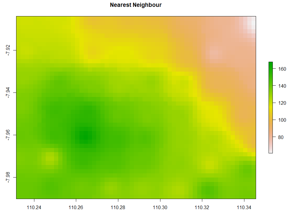
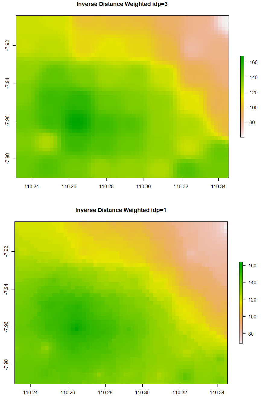
The simple form of IDW is called Nearest Neighbour. Below is the code to run Nearest Neighbor interpolation. The minimum and maximum number of data points to fit are set to be 5 and 8 respectively. The second and third IDW below is still similar, but the IDP is set to be 3 and 1 respectively. Examine that IDW with larger IDP tends to form a circular pattern around the knowns data points.
# 1. Nearest Neighbor
# Create gstat object
NN <- gstat(formula = ET ~ 1, data=ET_sf, nmax=8, nmin=5) # Number of neighbouring data points for fitting
# Interpolate
NN_intr <- interpolate(extent_grid_raster, model=NN)
# Visualize raster
plot(NN_intr, main = "Nearest Neighbour")
# 2a. Inverse Distance Weighted
IDW <- gstat(formula = ET ~ 1, data=ET_sf, nmax=8, nmin=5, set=list(idp=3)) # inverse distance power
IDW_intr <- interpolate(extent_grid_raster, model=IDW)
plot(IDW_intr, main = "Inverse Distance Weighted idp=3")
# 2b. Inverse Distance Weighted
IDW1 <- gstat(formula = ET ~ 1, data=ET_sf, nmax=8, nmin=5, set=list(idp=1)) # inverse distance power
IDW_intr1 <- interpolate(extent_grid_raster, model=IDW1)
plot(IDW_intr1, main = "Inverse Distance Weighted idp=1")
Thin Plate Spline Regression
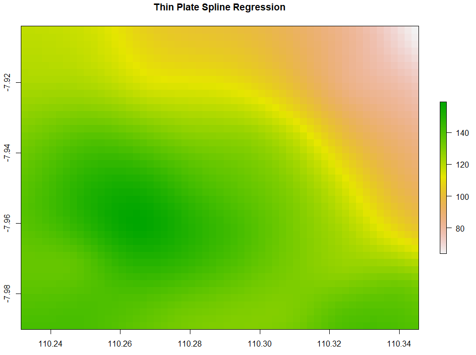
Thin Plate Spline Regression (TPS) interpolates the data points by creating a smoothened thin plate connecting all the data points. Below is the code to run TPS.
# 3. Thin Plate Spline Regression
TPS <- Tps(x = as.matrix(ET_data[, c("x", "y")]), Y=ET_data$ET, miles=FALSE)
TPS_intr <- interpolate(extent_grid_raster, model=TPS)
plot(TPS_intr, main = "Thin Plate Spline Regression")
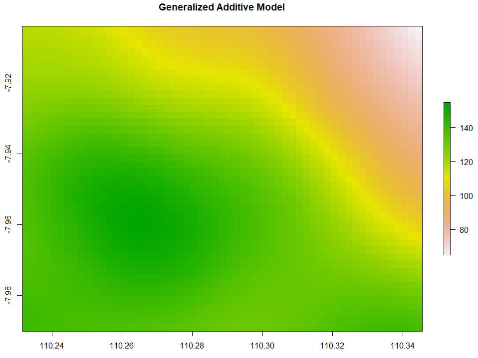
Generalized Additive Model
Generalized Additive Model (GAM) interpolation works with the following code.
# 4. Generalized Additive Model
GAM <- gam(ET ~ s(x, y), data=ET_data)
extent_grid_gam <- extent_grid
names(extent_grid_gam) <- c("x", "y")
GAM_intr <- extent_grid %>%
  mutate(Z = predict(GAM,extent_grid_gam)) %>%
  rasterFromXYZ(crs="+proj=longlat +datum=WGS84")
plot(GAM_intr, main="Generalized Additive Model")
Triangulated Irregular Network
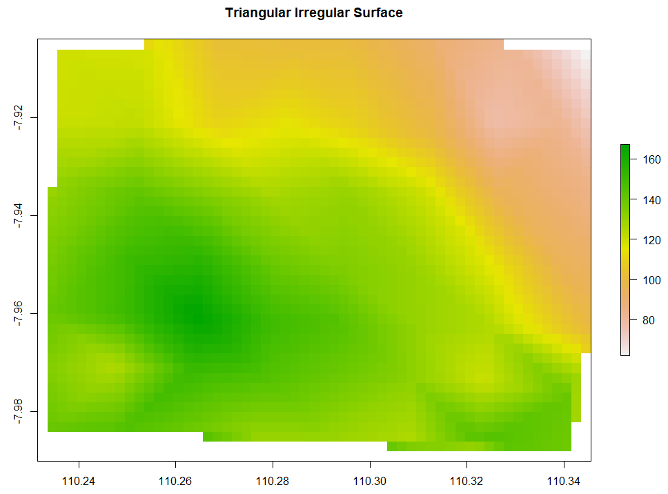
Triangulated Irregular Network (TIN) has the data points to create circumcircles. The intersections of those circumcircles form dots. Every dot is then connected to the neighboring 2 dots forming a triangular surface network. Below is the code to run TIN interpolation.
# 5. Triangular Irregular Network
TIN <- interp(x=ET_data$x, y=ET_data$y, z=ET_data$ET,
              xo = extent_grid$X, yo = extent_grid$Y,
              output = "points") %>% bind_cols()
TIN_intr <- rasterFromXYZ(TIN, crs="+proj=longlat +datum=WGS84")
plot(TIN_intr, main="Triangular Irregular Network")
Ordinary Kriging and AutoKriging
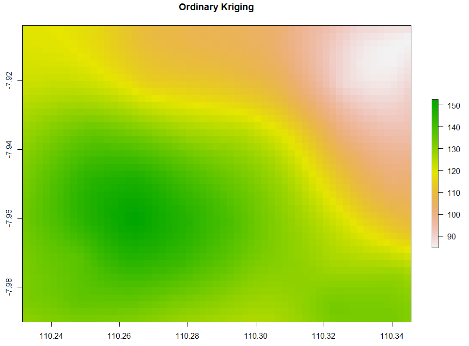
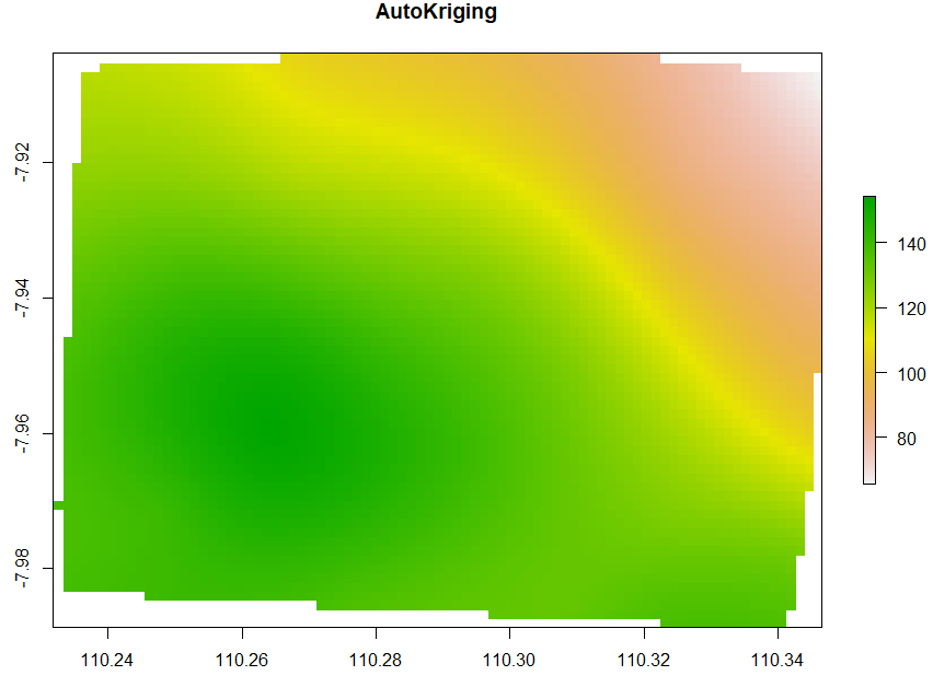
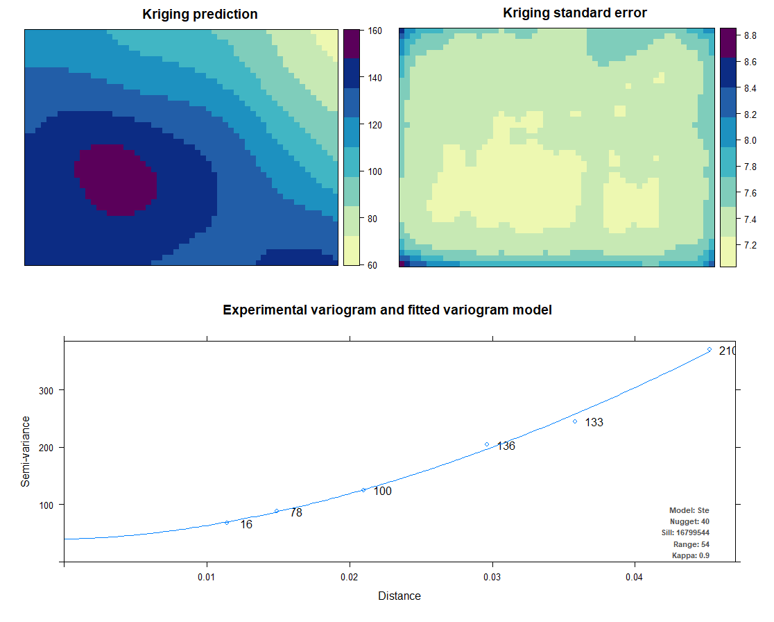
Kriging also uses the same package as IDW does. Kriging predicts interpolation by fitting a variogram. Another method is AutoKriging. AutoKriging can automatically fit the variogram model for the interpolation. The Autokriging results below provide the interpolation prediction result, standard error, and the variogram.
# 6. Ordinary kriging
var <- variogram(ET~1, ET_sf, cutoff=100) # Variogram
var_fit <- fit.variogram(var, vgm(1, "Sph", 5, 1))
Kriging <- gstat(NULL, "ET", ET~1, ET_sf, model=var_fit)
Kriging_intr <- interpolate(extent_grid_raster, Kriging)
plot(Kriging_intr, main = "Ordinary Kriging")
# 7. Automatic Kriging
# Create SpatialPointsDataFrame
ET_df <- as.data.frame(ET_data)
coordinates(ET_df) <- ~ x+y
# Create Spatial Pixels
extent_grid_pix <- extent_grid
gridded(extent_grid_pix) =~ X+Y
# run AutoKriging
AutoKriging = autoKrige(ET~1, ET_df, extent_grid_pix)
plot(AutoKriging)
AutoKriging_2 <- autoKrige(ET~1, ET_df) %>% .$krige_output  %>%  as.data.frame() %>% select(X = x1, Y = x2, Z = var1.pred)
AutoKriging_intr <- rasterFromXYZ(AutoKriging_2, crs="+proj=longlat +datum=WGS84")
extent(AutoKriging_intr) <- extent(Kriging_intr)
plot(AutoKriging_intr, main="AutoKriging")
Co-Kriging
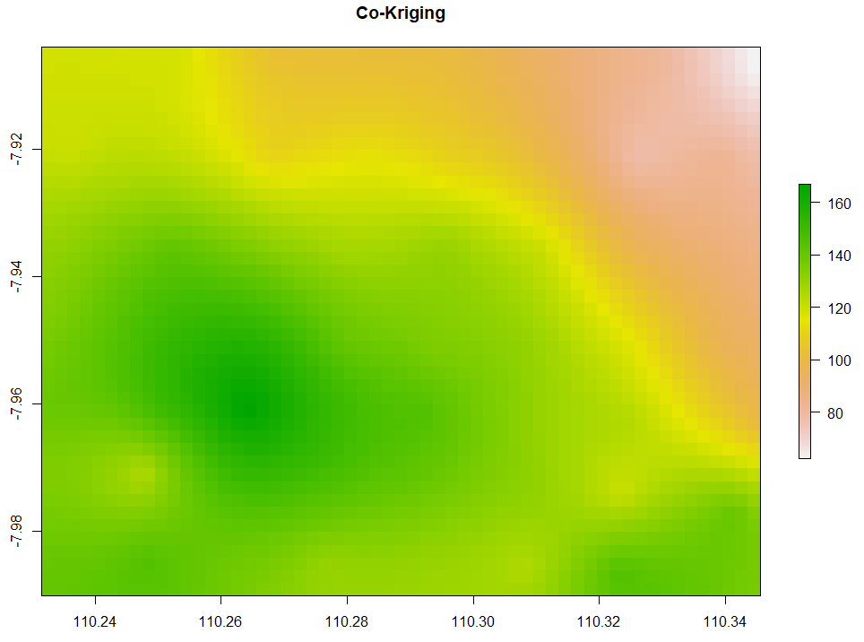
All of the above interpolation methods only rely on the target variable, in this case, is evapotranspiration. The last method we are discussing is co-Kriging which performs spatial interpolation by using predictor(s). Given that temperature affects evapotranspiration, we want to interpolate the evapotranspiration by accounting for temperature as the predictor too. Here is the code to do so.
# 8. Co-kriging
# Gstat for target and independent variables
coKriging <- gstat(NULL, 'ET', ET~1, ET_sf)
coKriging <- gstat(coKriging, 'Temp', Temp~1, ET_sf)
# Variogram
vario <- variogram(coKriging)
plot(vario, type='b', main='Co-variogram')
# Fitting
coKriging_fit <- fit.lmc(vario, coKriging, vgm(model='Sph', range=1000))
coKriging_fit
plot(vario, coKriging_fit, main='Co-variogram After Fitting')
# Interpolation
coKriging_intr <- interpolate(extent_grid_raster, coKriging_fit)
# Visualize
plot(coKriging_intr, main = "Co-Kriging")
Now that we have 9 interpolation results, we can check the Root Mean Squared Error (RMSE). The RMSE is used to compare how close the interpolation results to the recorded data points. The code below extracts each value from the 9 raster datasets where the recorded data points are located. Then, RMSE is computed to compare the extracted raster values with the true values of the data points. It seems that IDW with IDP=3 has the smallest RMSE.
# RMSE
# Stack the rasters and extrace the values
overlay <- stack(NN_intr, IDW_intr, IDW_intr1, TPS_intr,
                 GAM_intr, TIN_intr, Kriging_intr,
                 coKriging_intr)
pred <- as.data.frame(extract(overlay, ET_sf))
names(pred) <- c("NN", "IDW", "IDW1", "TPS", "GAM", "TIN", "Kriging", "coKriging")
pred2 <- as.data.frame(extract(AutoKriging_intr, ET_sf))
names(pred2) <- c("AutoKriging")
pred <- cbind(ET_data, pred, pred2)
sqrt(sum((pred$ET-pred$NN)^2, na.rm=TRUE)/nrow(pred)) # 0.1576134
sqrt(sum((pred$ET-pred$IDW)^2, na.rm=TRUE)/nrow(pred)) # 0.01212739
sqrt(sum((pred$ET-pred$IDW1)^2, na.rm=TRUE)/nrow(pred)) # 2.029118
sqrt(sum((pred$ET-pred$TPS)^2, na.rm=TRUE)/nrow(pred)) # 3.518021
sqrt(sum((pred$ET-pred$GAM)^2, na.rm=TRUE)/nrow(pred)) # 5.136027
sqrt(sum((pred$ET-pred$TIN)^2, na.rm=TRUE)/nrow(pred)) #2.060511
sqrt(sum((pred$ET-pred$Kriging)^2, na.rm=TRUE)/nrow(pred)) # 5.614179
sqrt(sum((pred$ET-pred$AutoKriging)^2, na.rm=TRUE)/nrow(pred)) # 4.947287
sqrt(sum((pred$ET-pred$coKriging)^2, na.rm=TRUE)/nrow(pred)) # 0.6766445
About Author
Connect with me here.
The media shown in this article are not owned by Analytics Vidhya and is used at the Author’s discretion.


