Looking for a $400 smartphone that strikes the balance between value and performance? These days, your options are few and far between. Android OEMs have pushed to bring cheaper devices to market, often with just a few too many cut corners to make for a reliable daily driver. Meanwhile, options like the Pixel 8a and OnePlus 12R are great, but at $500, it’s a big jump in asking price. If you have a hard cap on your next Android phone, it’s tough to find a worthwhile investment.
That’s the exact space Motorola is looking to target with its latest Moto G Stylus 5G. It takes a lot about what worked with last year’s phone and slaps it together in an all-new, much sleeker package. On paper, the 2024 rendition of the Moto G Stylus is shockingly well-rounded, but as with all Motorola phones, questionable software support hangs heavy over what should be an easy home run.

Moto G Stylus 5G (2024)
The latest Moto G Stylus is a piece of hardware that is so sleek that you might forget it’s a budget phone. But for all of its premium enhancements, Motorola simply can’t seem to get its software experience together, both on a day-to-day level and when it comes to future support.
- Premium-looking design
- Good display for the price
- Great battery life
- Some pretty big software flaws
- Only one OS upgrade over its lifetime
- Slow fingerprint sensor
Price, availability, and specs
This year’s Moto G Stylus 5G is available from Amazon, Best Buy, and Motorola.com starting today, May 30th, for $400 (or, through Motorola’s Canadian webstore, $500 CAD). It’s also ready for purchase on carriers like AT&T, Metro by T-Mobile, Consumer Cellular, and Google Fi right now, and it’s coming to Straight Talk, Total by Verizon, and Visible sometime in the coming weeks. It comes in Caramel Latte and Scarlet Wave.
As with most Motorola phones, the unlocked model available at major retailers should work reliably on any US carrier, though it’s always worth double-checking your bands.
Specifications
- SoC
- Qualcomm Snapdragon 6 Gen 1
What’s good about the Moto G Stylus 5G (2024)?
Motorola has leveled up its usual so-so budget hardware
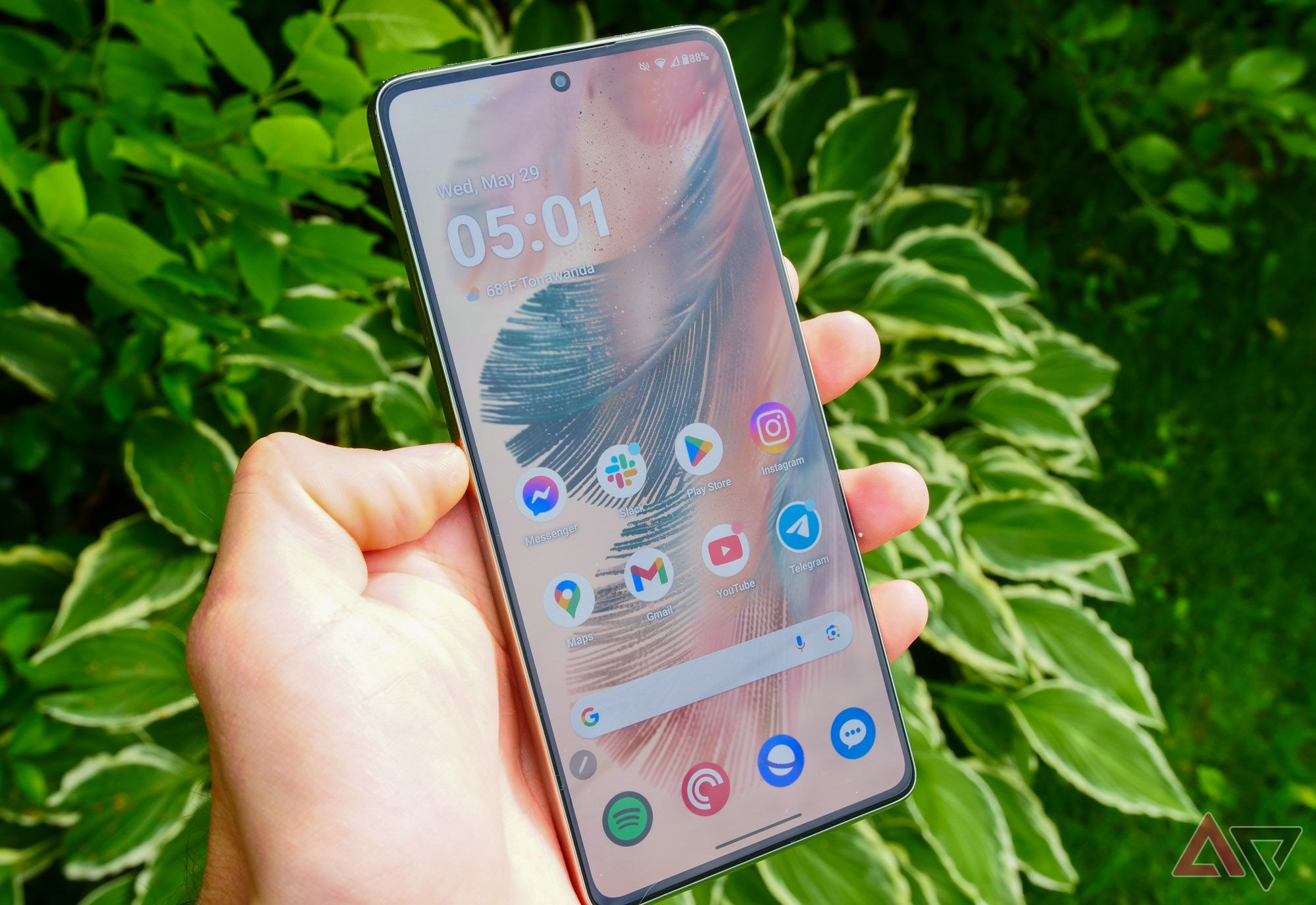
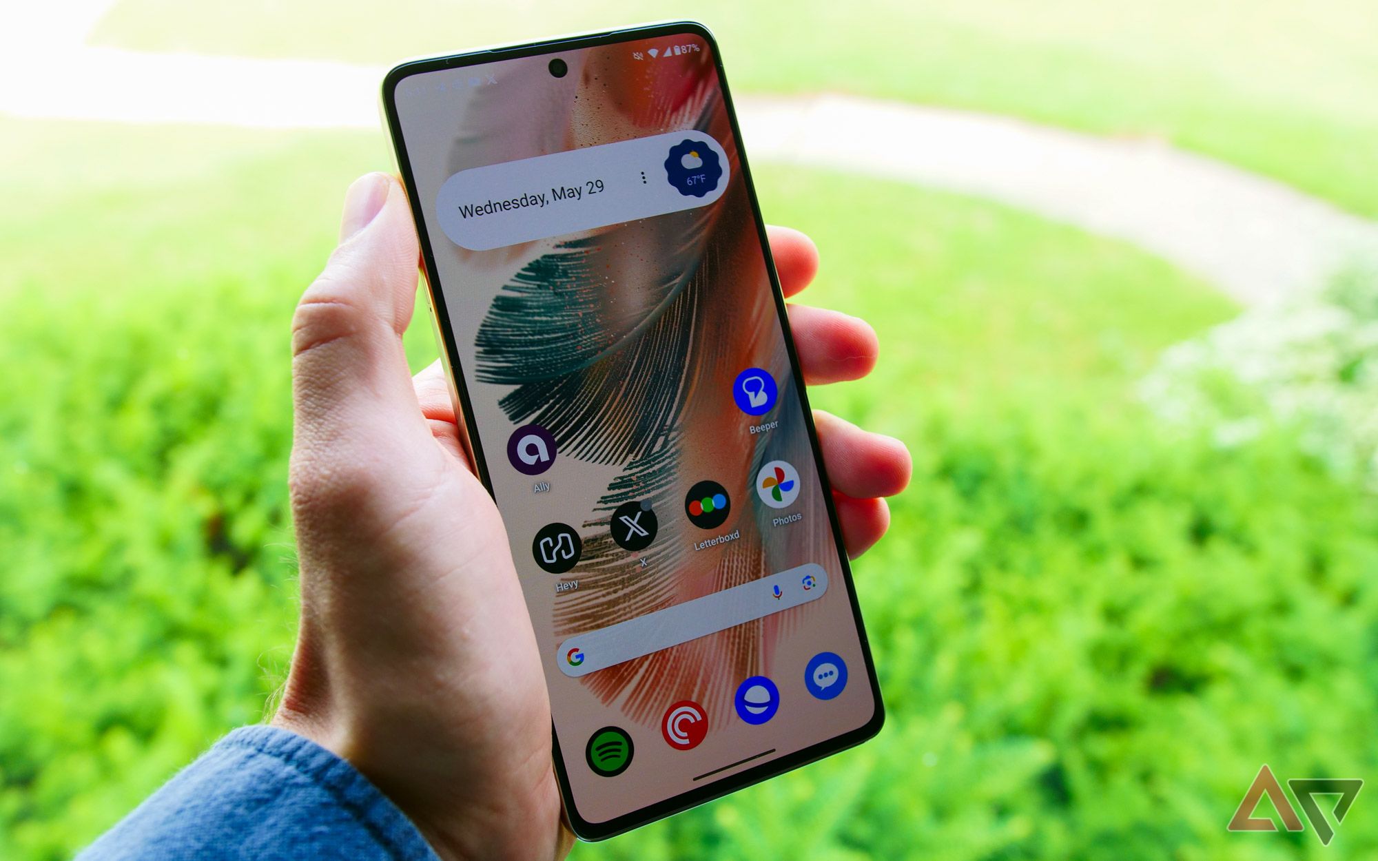
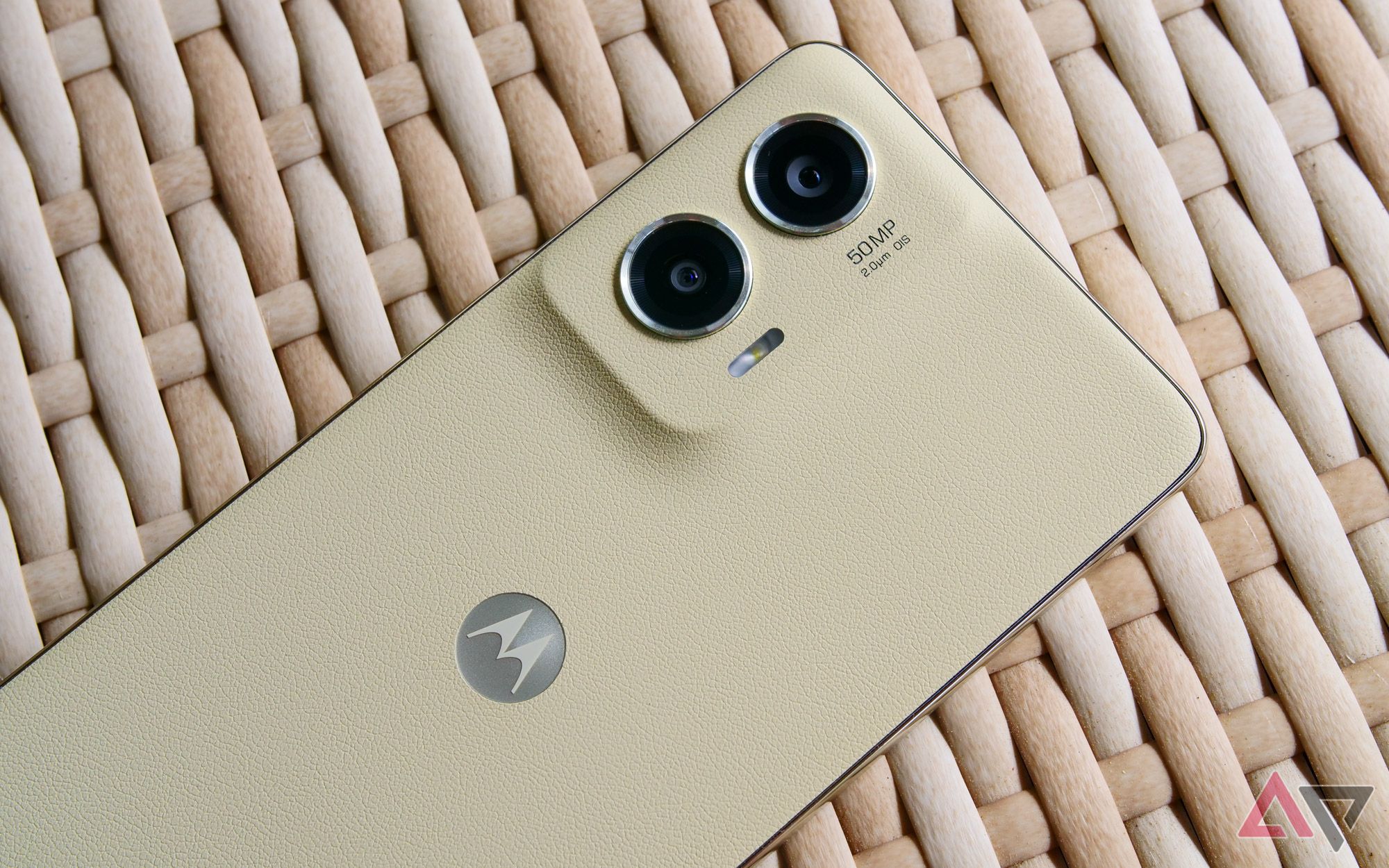
Unlike most budget hardware, the Moto G Stylus 5G might actually trick you into believing it’s a much more premium smartphone than it actually is. That all comes down to its new look, which pairs an S24 Ultra-inspired boxy design with a faux leather back. For the old-school Android fans in the house, it’s reminiscent of some of Samsung’s earliest Galaxy Note models, especially 2014’s Note 4, which paired a stitchless faux leather finish with an aluminum frame.
The G Stylus doesn’t actually use an aluminum frame, but it certainly hopes you think it does. The matte silver plastic doesn’t hold up to closer inspection, but at first glance, it helps to deliver that high-end look and feel. That goes double for the Stylus’s bezels, which are both slimmer and more proportional than what you’ll find on the more expensive Pixel 8a. It even sports fake chamfered edges, for crying out loud, and it all adds up to a good-looking smartphone.
Despite the improved fit and finish, the G Stylus keeps some of the features that are borderline exclusive to budget devices these days.
Despite the improved fit and finish, the G Stylus keeps some of the features that are borderline exclusive to budget devices these days. Alongside a SIM tray that pulls double duty for expandable storage, you’ll find a 3.5mm headphone jack along the bottom of the phone. Talk about a sight for sore eyes. Motorola could’ve used this redesign as an excuse to ditch both features, but I’m happy to report both are still here.
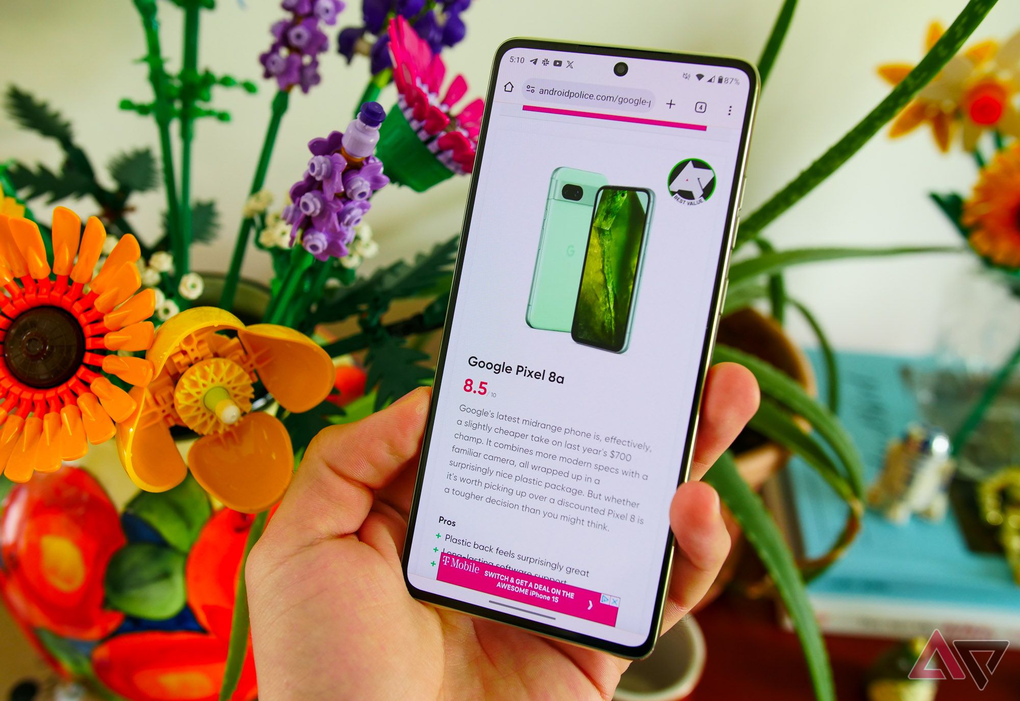
Power the phone on, and the surprises keep coming. Motorola has swapped out last year’s 120Hz LCD panel for a 6.7-inch 1080p OLED model, and considering how much pain the display on this year’s G Power caused me, I couldn’t be happier. I truly don’t have much to complain about with this panel. It has good viewing angles, reaches brightness levels just high enough for outdoor use, and lives up to its refresh rate promises. Sure, it’s not quite as vibrant as higher-end displays, but for $400, I’m not sure you could ask for much more.
Moto G Power 5G (2024) review: Ads nauseum
This phone makes me feel unwell in more ways than one
Motorola’s budget fare usually falters when it comes to the camera. While I wouldn’t call this one a total success, the main 50MP lens does take solid shots with enough light. Even in dimmer situations — say, a living room at night with a couple of lamps turned on — photos turned out perfectly usable, so long as I wasn’t utilizing digital zoom or taking shots of moving subjects. That might sound like a lot of caveats (it is!), but compared to previous G-series phones, it’s a big improvement. Just don’t think too much about the ultra-wide lens — it’s as unreliable as you might expect.
Some of these are okay, and some aren’t!
Battery life is, as usual, exceptional here. On days with mixed usage, I usually ended the day with around 50 percent battery remaining. That was after, on average, three hours of screen-on time and plenty of music or podcast playback in the background. This is an easy day-and-a-half smartphone, and while its 30W charging speeds aren’t the fastest around, it’s a good enough rating for quick top-ups when necessary. And — bonus — Moto’s included 15W wireless charging this year too.
What’s bad about the Moto G Stylus 5G (2024)?
Software remains Motorola’s Achilles heel
You knew the compromises were coming, right? As much as I’d love to see Motorola knock it out of the park and reclaim the budget crown it once rocked in the mid-2010s, I’m not sure this year’s G Stylus is there just yet. I have quite a few qualms with this phone, but the biggest ones all come from the same source: the software.
Usually, my complaints about Motorola’s take on Android boil down to its subpar upgrade promise. Make no mistake — that’s a problem here, too. Like most of Moto’s G-series hardware, the company promises just a single OS upgrade for the Moto G Stylus 5G, along with three years of bimonthly security promises. In as simple terms as possible, this is no longer acceptable for any Android phone, regardless of its price point. Samsung’s entire budget lineup — all the way down to the $200 Galaxy A15 — now delivers four OS upgrades. And for $100 more, the Pixel 8a gets you seven full years of support.
But it goes beyond our usual complaints surrounding Motorola phones. For whatever reason, the Moto G Stylus 5G ships with some unusual software enhancements compared to its usual near-stock build — hell, even compared to the experience I saw on the Moto G Power a couple of months ago. I have some serious questions about some of the design changes, like the transparent notification tray or the stark black-and-white settings menu that looks borderline unfinished.
It all screams change for the sake of change, and compared to devices from a year ago, I’m not sure where these decisions are coming from. In fact, the decision to overhaul a previously clean build of Android seems to have spiraled into a number of bad decisions.
For example, Motorola’s Peek Display — the company’s decade-old take on an always-on display that, frankly, has been crying out for a reinvention — is less useful than ever. Interacting with notifications automatically takes you to the lock screen rather than acting as a space for managing incoming pings. Despite losing its main feature, this still isn’t a true always-on display, requiring an interaction with the phone to turn it on. And to make matters worse, you can’t even customize Peek Display anymore. Although the company’s PR team told me settings for this feature still exist in the Moto app, I can’t find them.
These changes extended to some weird bugs, too. From missing notifications on the lock screen — a problem only solved by changing my notification style from “List” to “Chip” — to my home screen just randomly shrinking to half the normal size, my time with the Moto G Stylus hasn’t felt particularly stable.
While it’s not as in-your-face as on the cheaper Moto G Power, Glance makes another appearance here. For those unfamiliar, Glance is an ads-based lock screen experience designed to bring sponsored stories and other #content to your phone. I wasn’t prompted to enable it during my initial setup process, but I did receive a push notification to turn on Glance not long after. This is in addition to all sorts of sponsored suggested apps, including Booking.com and those pesky fake folders that “recommend” games and shopping apps.
Sponsored apps, Glance notifications, bugged home screens, and excellent battery life.
All of this is pretty easily ignored, but that just drives home how none of this needed to be here to begin with. Whether you’re making a phone for $200 or $2,000, software is everything in 2024. And with new flagship smartphones and foldables on the horizon, I’m begging the company to right the ship on its Android experience. As it stands, it’s nearly impossible to recommend over strong competition from Samsung and Google.
Motorola is making good smartphones again, and you should pay attention
Feeling bored by Samsung and Google? An alternative might’ve been under your nose this whole time
It’s easy to get hung up on the poor software here, but there are some hardware flaws worth highlighting, too. For as much as I like this design, the weight distribution just feels off. While I appreciate a 6.7-inch smartphone weighing under 200 grams, this particular device feels hollow, and the camera module means its upper-left corner is top-heavy.
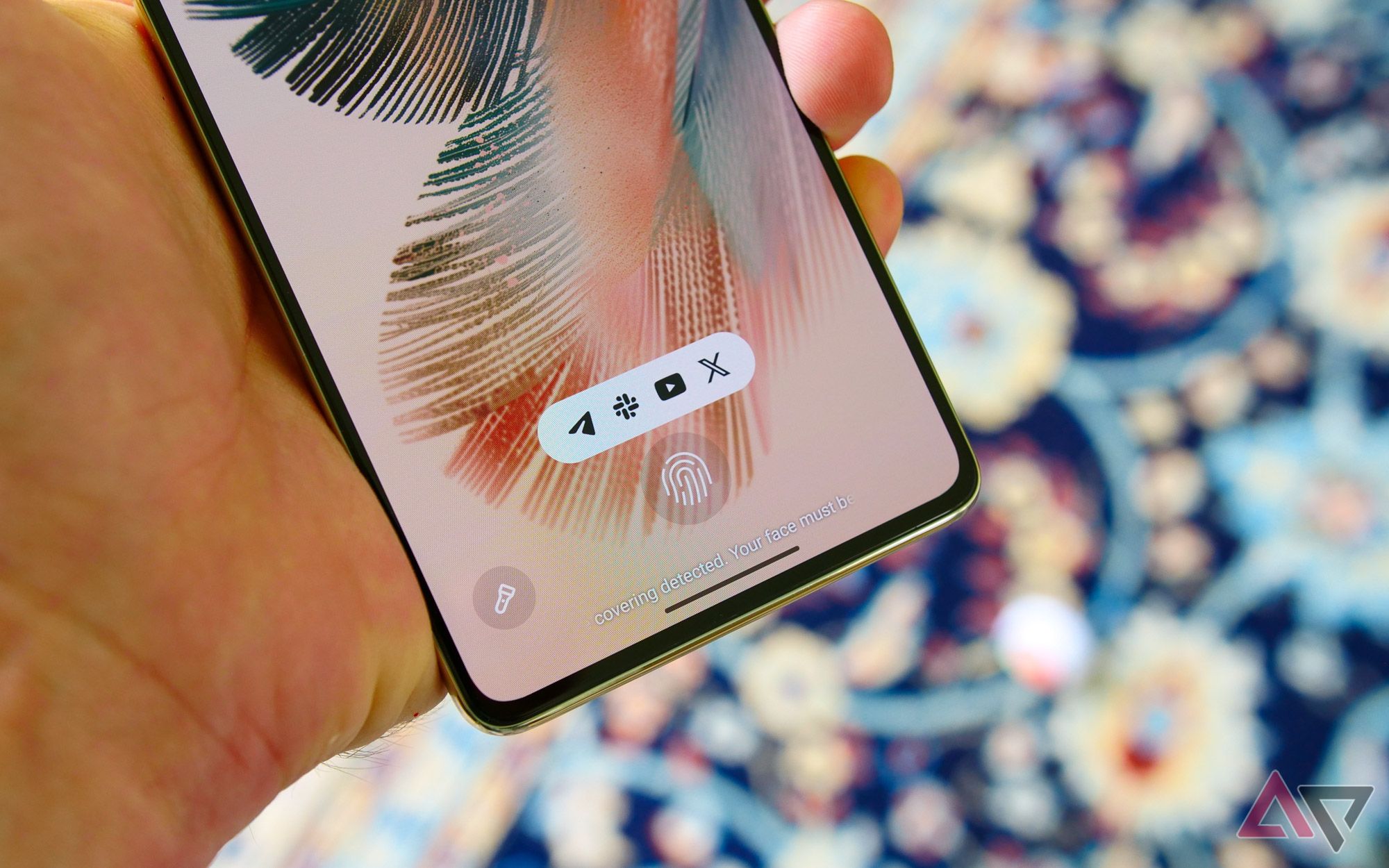
Despite Peek Display being absolutely nerfed, Motorola’s in-display fingerprint sensor remains mounted uncomfortably low on the phone. This made some sense with the older iteration of Moto’s AOD since you would slide your finger from the sensor to an interactive notification. On this phone, it’s just awkwardly low for no real reason. It’s also the slowest fingerprint sensor I’ve interacted with since the days of the Pixel 6, a headache only somewhat salved by Motorola, including face unlock with the selfie camera.
It’s easy to get hung up on the poor software here, but there are some hardware flaws worth highlighting, too.
I don’t have much praise for the stylus itself, frankly. The tip is a little too mushy for my taste, and the additional software, though functional, feels directly ripped from One UI. My biggest issue comes from the (apparent) lack of palm rejection. Any time I tried to jot down a few notes, I had to cautiously hold my hand off the display; otherwise, the edge of my hand would leave marks on the virtual page.
You’ll notice I haven’t said much about performance in this review. Motorola’s reusing the same Snapdragon 6 Gen 1 SoC from this device’s predecessor, newly paired with 8GB of RAM. The results are aggressively fine, keeping cool under pressure but not without the occasional random frame drops. These often arrived without much rhyme or reason, but never with enough frequency to really mar my overall time with the phone.
Finally, I’d be remiss if I didn’t mention this device’s pitiful IP52 water and dust resistance rating. Motorola calls this a water-repellent design, but it’s really only protected from occasional rain showers. Considering devices like Samsung’s Galaxy A35 rock IP67 certification, this is a must-improve in future releases.
Should you buy the Moto G Stylus 5G (2024)?
Only if you’re after an affordable stylus-equipped phone
It’s worth reiterating that, for $400, everything good I outlined above — the display, the design, the excellent battery life — is pretty great for the money. If you’re looking for a stylus-equipped phone that isn’tSamsung’s $1,300 Galaxy S24 Ultra and you’re willing to put up with all of the drawbacks that come with this sort of budget-focused Android experience, I think it’s a perfectly good-enough value buy. But there are some fundamental flaws that keep this from being the entry-level smartphone to get.
More than any other recent G-series device, I think the Moto G Stylus 5G really cements just how close Motorola is to getting smartphones right. But no matter how good the company’s hardware gets — no matter how right the price tag feels — until the software is reliable and updates are consistent and long-lasting, there will always be a better alternative. $100 may sound like a big gap between this and the Pixel 8a, but when you consider the latter as a phone that will see seven times as many OS upgrades, it’s a pretty small price to pay for something that will actually stand the test of time.

Moto G Stylus 5G (2024)
If you’re in the market for a phone with a stylus and you don’t want to break the bank, the Moto G Stylus 5G (2024) is going to be hard to beat. With an upgraded 120Hz OLED screen, up to 16GB of RAM, and as much as 256GB of storage, it’s got the specs slider maxed out at its $400 price point.

Best budget Android phones in 2024
These days, you don’t have to pay through the nose to get a decent phone


