This article was published as a part of the Data Science Blogathon.
Introduction
If we want to make a small application in Streamlit, it’s enough to make a single web page-based application. But when the application is large, we must consider splitting the contents into different web pages. This can be done using the st.selectbox or the st.radio widget of Streamlit. Recently Streamlit introduced a new technique for making a multipage application which is much more efficient than the mentioned two.
In this article, I will discuss everything about Streamlit Multipage functionality, how to use it, and its pros and cons. You are going to learn so many things from this article. So, just take a cup of tea and read on.
Project Structure in Streamlit
To make a multipage app in Streamlit, you must maintain a project structure. You have to make a directory named pages, and in this folder, you have to put all of your python files containing the code for designing the web pages for your streamlit website except for the main script. The image shown below will clear the matter more clearly.
my_app
├── my_app.py    <-- main script
└── pages
    ├── page_no_2.py       <-- page no 2!
    └── page_no_3.py       <-- page no 3!
For running the application, we have to run just the main script.
streamlit run my_app.py |
Now there is a question – How can I arrange the web pages? Streamlit will order your page according to the location of your python files in the pages directory. You can also specify the order of the pages by adding the page number with an underscore to the file’s name, just like below.
my_app
├── my_app.py    <-- Your main script
└── pages
    ├── 02_page_no_2.py       <-- New page 2!
    └── 03_page_no_3.py
Now, this is just an introduction. For better understanding, let’s make a Multi-page Streamlit App.
Let’s see a Demo!
Here I am making a dashboard for the analysis of dark chocolate. Follow this link if you want to see how the analysis was done. In this article, I only make the dashboard using Streamlit. Remember how we make a story in Tableau? We add worksheets or dashboards to a story and then navigate to them by clicking on the tab at the top of the visualization. Just see the GIF below; you will understand what I mean.

In Streamlit, we will make the same structure described in the GIF. Rather than adding worksheets or dashboards, here we will add python files. I am pretty sure that now you understand what I will build here. So, let’s get moving!
Before making the multipage Streamlit app, the directory will look like the below.
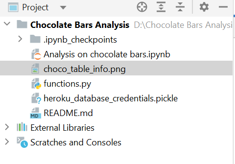
Now we have to make the main script and a directory named pages as I said earlier, for making a multipage Streamlit app. You can give the name of the main script as you wish but don’t change the name of the directory. Otherwise, streamlit will be unable to read that directory.

Now let’s create two files under the pages directory and run the blank application first to see if it works.
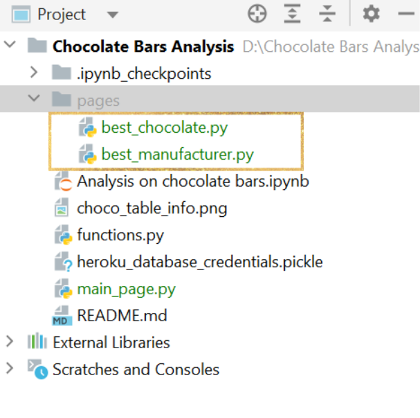
You can give the file’s name as your wish and after that, just run the main script by the below command:
streamlit run main_page.py
If the above command is executed successfully, you will see the output something like this.
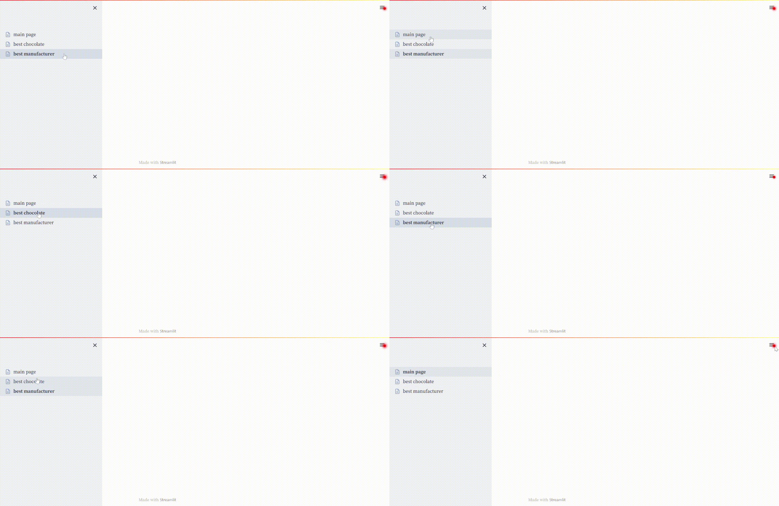
Do you find any similarity with Tableau? Of course, you do. We can see our findings by switching to different tabs in Tableau. In Streamlit, we can also do the same. But we have to do this thing from the side panel.
So, now we know that the application is worked. Let’s start building the website.
Creating the Main Page
Before seeing the visualization, everyone wants to know about the problem and what I achieved in my analysis. So, let them know this on the main page. Below is the code for the main_page.py file.
import streamlit as st
st.title("Finding the Best Chocolate 🍫")
st.write("""Here I am going to represent my findings by analyzing a
           dataset containing ratings of over 2500 plain dark chocolate
           bars collected from different countries. The dataset is collected from
           [here](http://flavorsofcacao.com/chocolate_database.html). """)
st.markdown(
    """
    ### 💾 The Data:
    **Column Name**|**Description**
    -----|-----
    |ref| id number of the review|
    |Company (Manufacturer)| Name of the bar manufacturer|
    |Company Location| Location of the manufacturer|
    |Review Date| From 2006 to 2021|
    |Country of Bean Origin| Country of origin of the cacao beans|
    |Specific Bean Origin or Bar Name| Name of the chocolate bar|
    |Cocoa Percentage| Cocoa content of the bar (%)|
    |Ingredients| B (Beans), S (Sugar), S* (Sweetener other than sugar or beet sugar), C(Cocoa Butter), (V) Vanilla, (L) Lecithin, (Sa) Salt
    |Most Memorable Characteristics| Summary of most memorable characteristics of the chocolate bar
    |Ratings| 1.0-1.9 Unpleasant, 2.0-2.9 Disappointing, 3.0-3.49 Recommended, 3.5-3.9 Highly Recommended, 4.0-5.0 Outstanding
    """
)
st.text("")
st.markdown(
    """
        ### 💪 Challenge:
        ##### Here I am creating a report to summarizing my research including:
         - What is the average rating by country of origin?
         - How many bars were reviewed for each of those countries?
         - Which chocolate got the good average rating?
         - Which manufacturer got good average rating?
         - How does cocoa content relate to rating? What is the average cocoa content for
           bars with higher ratings (above 3.5)?
         -  My research indicates that some consumers want to avoid bars with lecithin.
            Compare the average rating of bars with and without lecithin (L in the ingredients).
    """
)
st.set_page_config(page_title="Main Page", page_icon="🍫")
I used some emojis to make the website more attractive. I made this page according to my use case. Try to do it yourself rather than copying the whole code for better understanding. If you run the above code again, you will see the output below on the main page.
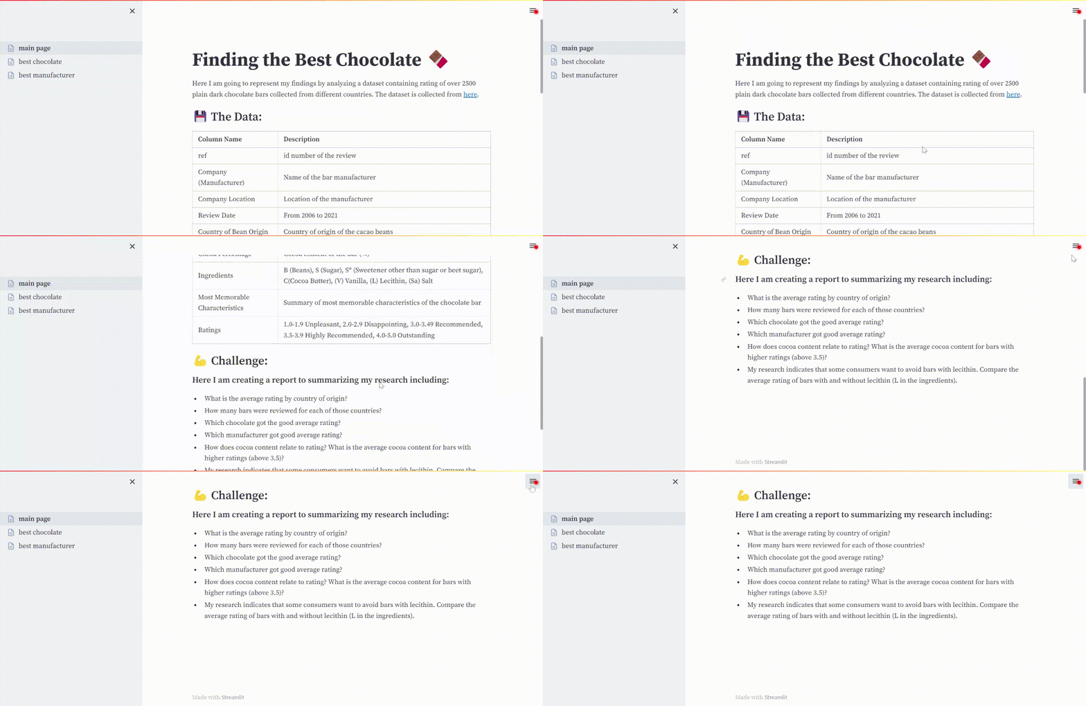
Looks awesome, isn’t it? Now let’s start making the dashboard.
Creating the Second Page
Now let’s create a dashboard on the second page. Here I am using the Plotly Python library for interactive visualization. You can also use other libraries like Matplotlib, But I suggest you use Plotly as this library makes the graph more attractive and makes those graphs much more customizable.
I do not include all codes on those pages. I made a separate file for visualization codes so that the code will look much cleaner, and we can do it easily when we have to edit. I am not explaining the visualization here as my main motive for this article is to explain multipage apps in Streamlit. If you want to know more, follow this link and see the code. I implemented every function here.
Below is the code for the second page.
import streamlit as st
from functions import FirstPageFuncs
st.set_page_config(layout='wide', page_title='Best Chocolate', page_icon='🤗')
st.title("Which chocolate has good average rating and what is the characteristic of that chocolate?")
st.write(
   """
   Here we find out that which chocolate bar got the best average rating among all of them. We also
   find out why this chocolate is so popular.
   """
)
col_0_0, col_0_1 = st.columns([1.25, 1])
col_1_0, col_1_1 = st.columns([1, 1])
fpf = FirstPageFuncs()
figure_1 = fpf.best_chocolates()
figure_2 = fpf.most_common_company_location()
figure_3 = fpf.most_commonly_used_ingredients()
figure_4 = fpf.most_memorable_taste()
col_0_0.plotly_chart(figure_1, use_container_width=True)
col_0_1.plotly_chart(figure_2, use_container_width=True)
col_1_0.plotly_chart(figure_3, use_container_width=True)
col_1_1.plotly_chart(figure_4, use_container_width=True)
st.markdown(
   """
   From the above results, we can clearly see that the chocolate named **Kokoa Kamili** got the highest average rating
   (Top Left). This chocolate mostly manufactured in **U.S.A.**(Top Right) and the most commonly used ingredients are
   **Beans, Sugar and Cocoa Butter**. Sometimes, **Cocoa Butter** is not used (Bottom Left). This chocolate is mostly
   popular for it's **fruity** taste (Bottom Right).
   """
)
From the above code, you can notice that I imported a file here in which the code for the visualization is written. If you rerun the app, you will see a nice visualization just like below.
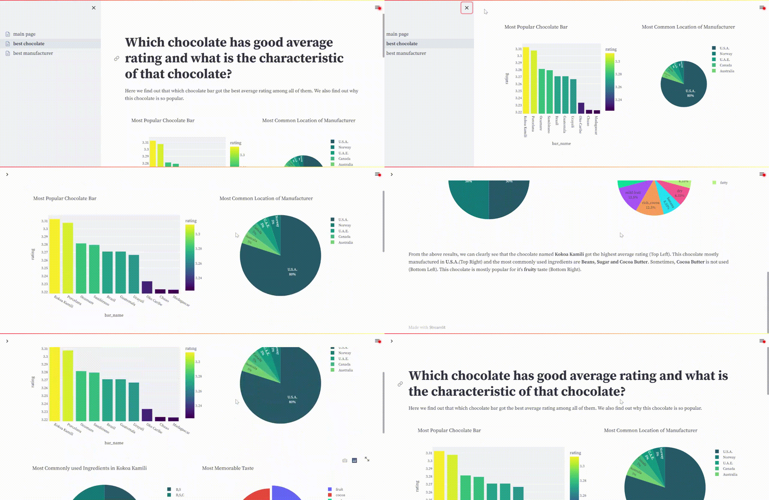
Great! It’s working. Now you will understand how this multi-paged application works in Streamlit. Just see how easy to make this type of application. To try the same code, visit this repo and download the data. After that, you can try those codes.
Streamlit: Pros
After introducing this feature in Streamlit,
-
We can easily make dashboards in Streamlit in a short period.
-
Those dashboards are much more customizable; there is no limitation in customization.
Streamlit: Cons
Navigation between dashboards with the buttons is still not introduced here. If this feature is introduced, the multi-paged application is much more user-friendly. We don’t have to open the side panel repeatedly to switch to different pages. Otherwise, everything is fine according to me. If you found any cons, you can tell me in the comments.
Conclusion
So, that’s all for today. In this article,
- We successfully created a multi-page application using Streamlit.
- Learned about the project structure needed for creating this type of application.
- Learned how to design those web pages so that those pages are more eye-catching and more user-friendly
If you want more customization, go for Streamlit. Otherwise, BI tools are enough for your needs. If you still face any issues, just let me know. For now, Goodbye🙋♂️.
The media shown in this article is not owned by Analytics Vidhya and is used at the Author’s discretion.


