Like plenty of Android users, I’ve never been able to help myself when it comes to tuning in for Apple events. It’s not just because of my job, either — Apple’s presentations, historically speaking, exist in their own little bubble, outside the trends other tech companies are chasing. While I’d argue this year’s developer conference doesn’t quite fall into that space thanks to an exhausting demo of AI-based features, the first hour was filled with some big improvements for devices like the iPhone. And more than ever, those changes are directly inspired by Android.
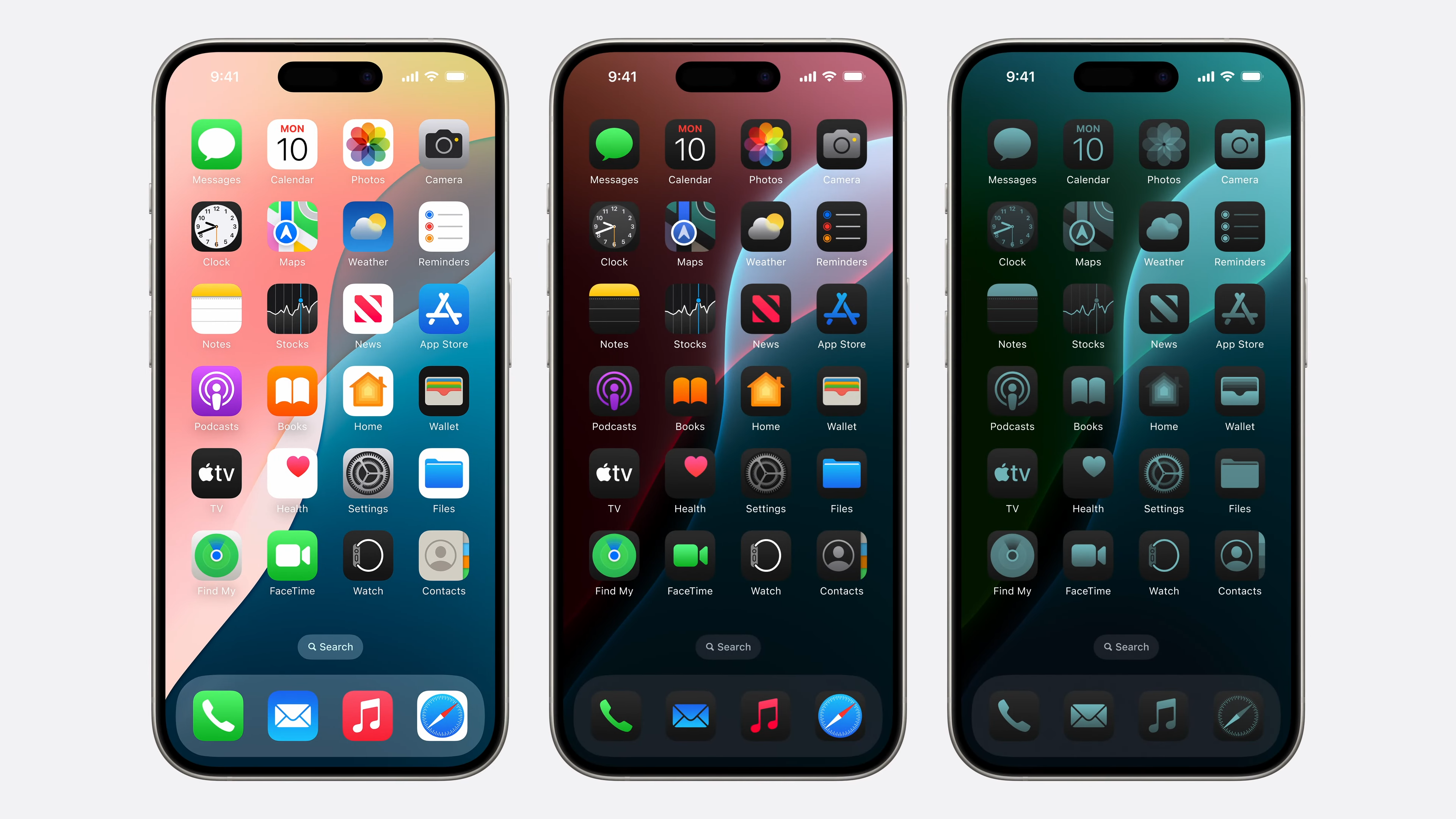
I want to focus on one new iOS 18 feature that feels specifically borrowed from Android devices, though, and that’s Apple’s new home screen customization initiative. Not only can you finally — finally — move icons wherever you want on screen, but you can also apply dark and monochrome filters to seemingly every application. This seems specifically built to get Android fans up in arms over Material You, Google’s dynamic theming engine. Material You simultaneously looks better and performs worse than what Apple showed off this year — and that’s the problem.
Apple’s new icon themes look terrible, but people are going to use them
You can’t say the same about Google’s Material You
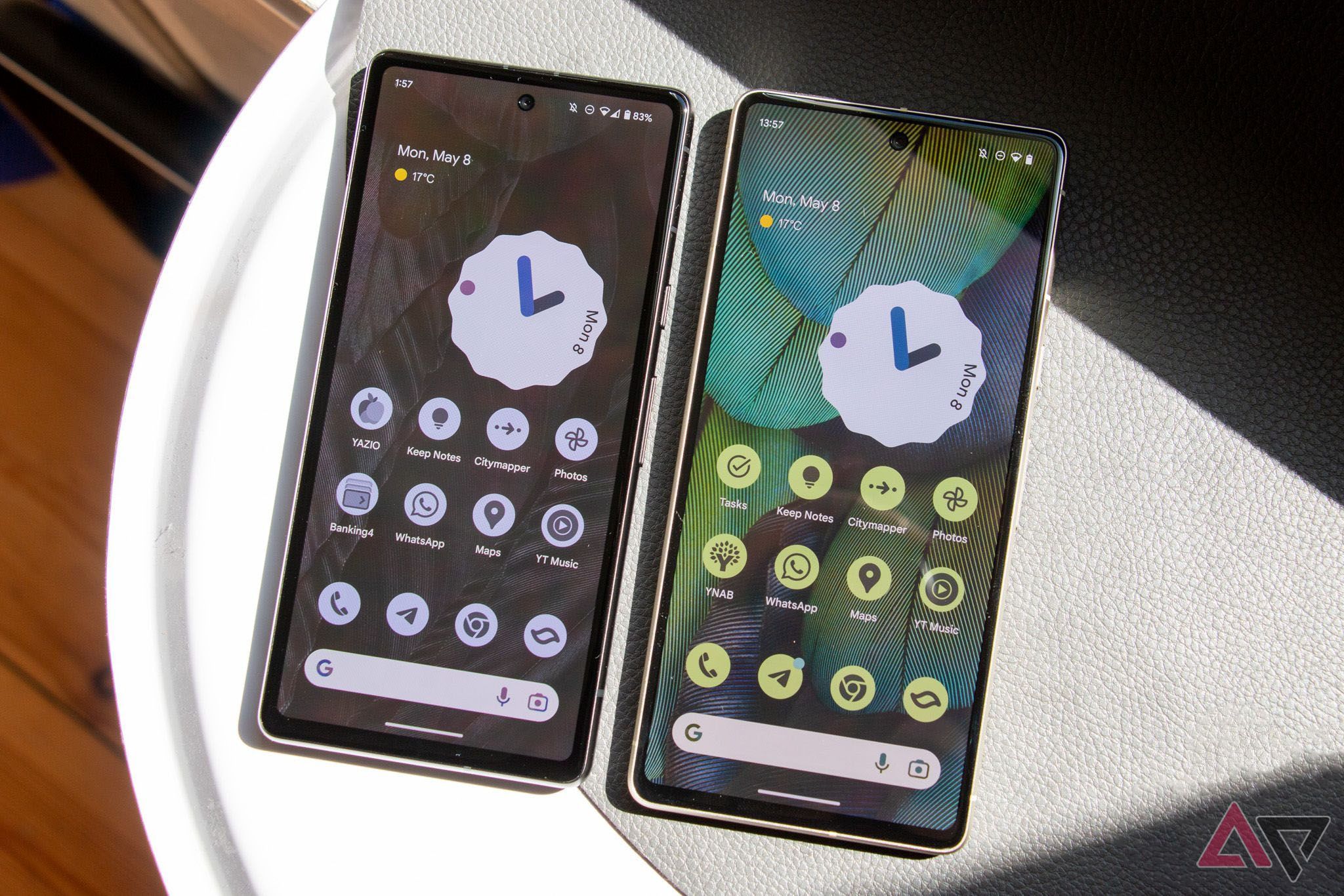
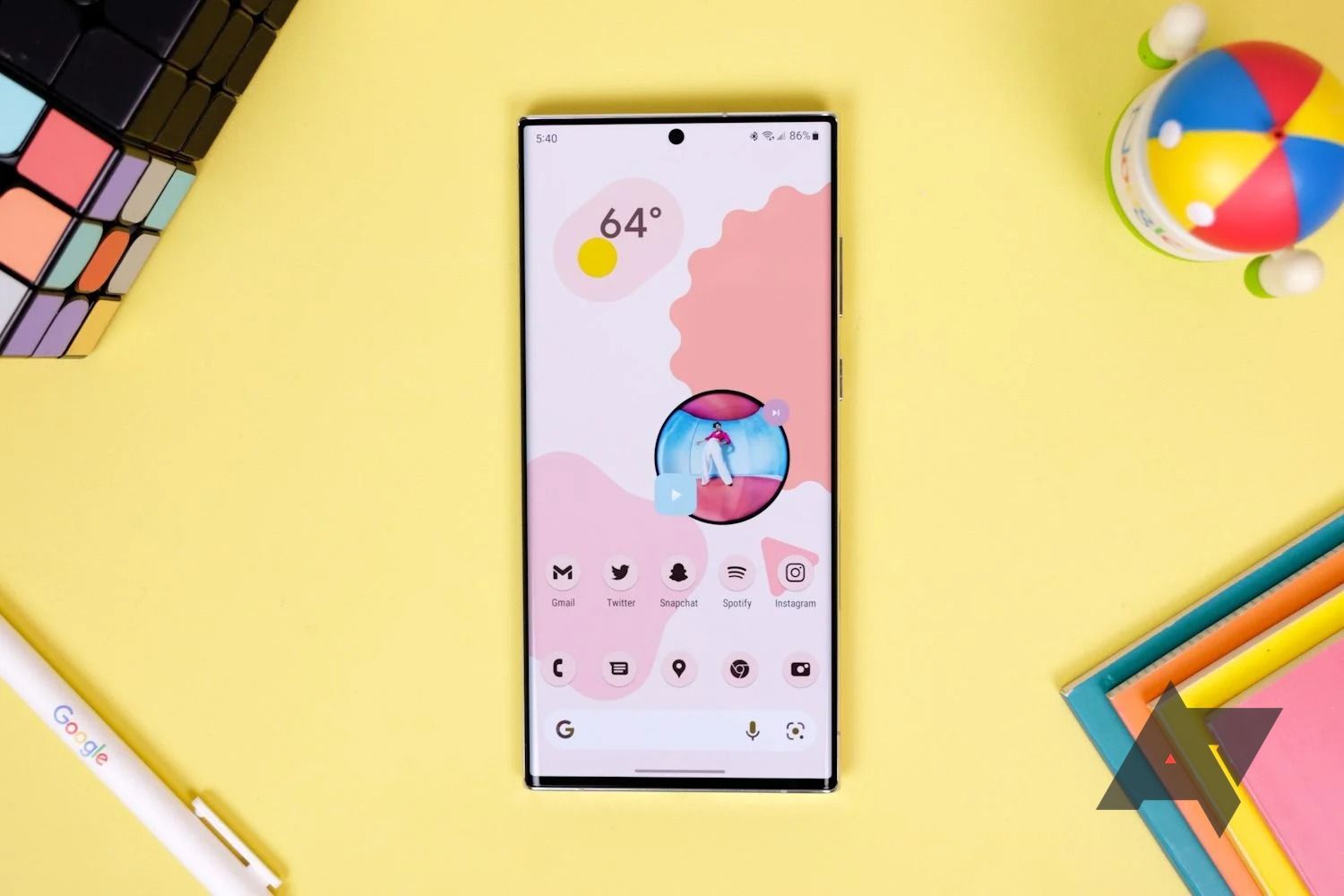
Material You (or dynamic theming, or whatever else you want to call it) arrived nearly three years ago with Android 12, with a more robust version offered in Android 13. Although it’s probably best known for bringing splashes of color to things like your keyboard and settings screen, Material You also delivered themed icons to your home screen. This feature launched in beta in 2021, a tag which, in classic Google style, it still sports to this day.
In theory, I love Material You’s icons. In a perfect world, Google would work in the background to automatically theme any app icon that doesn’t build in support for dynamic themes, allowing me to fix outliers on my home screen. In fact, Google was even experimenting with this a year ago, hiding a toggle to force dynamic icons behind a flag. That feature could’ve arrived in Android 14 — or even Android 15 later this year — but considering the radio silence on this front, it appears apps like Letterboxd will remain unthemed for the foreseeable future.
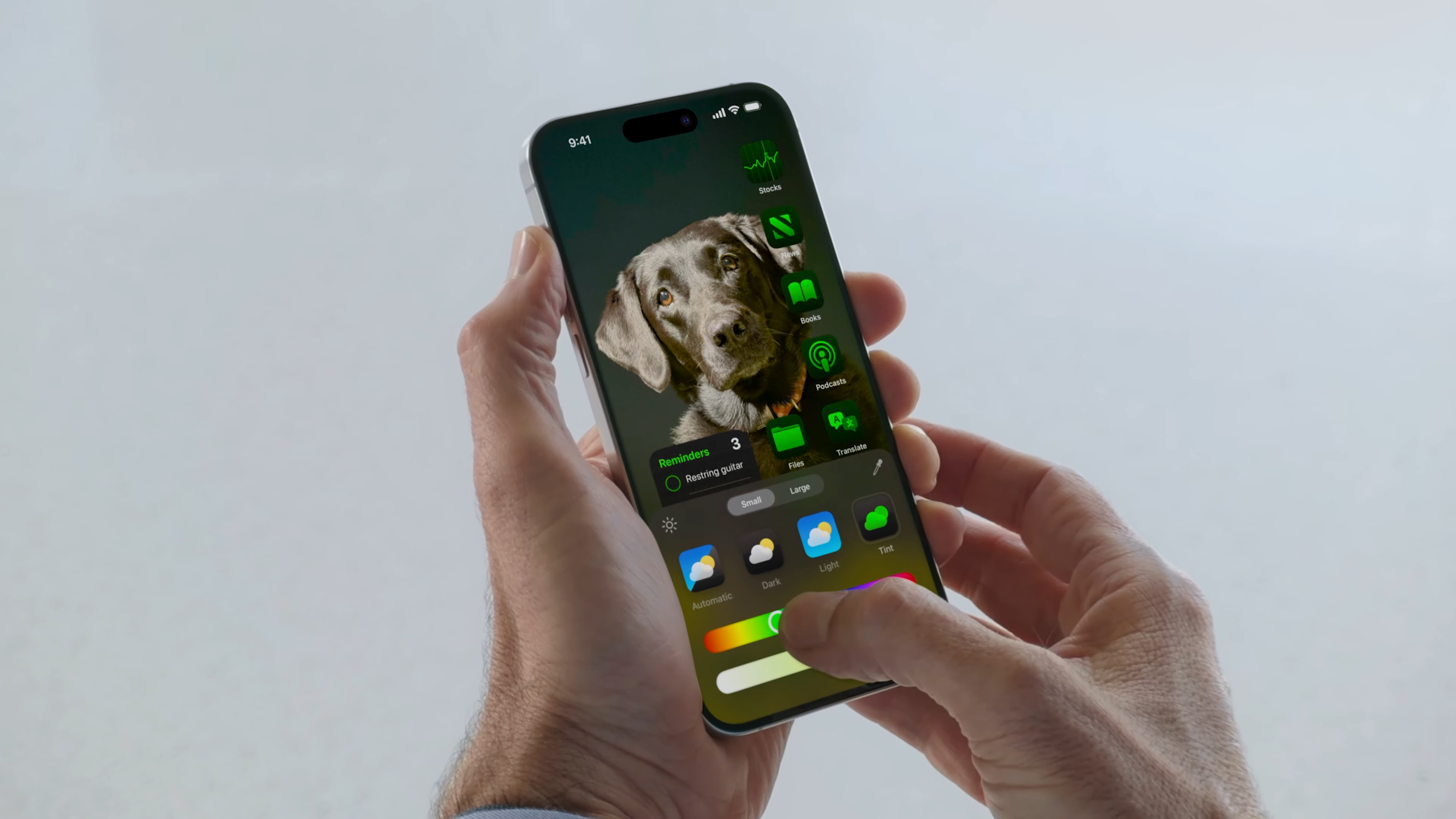
What I’m asking for from Google is, essentially, what Apple announced at WWDC 2024 today. No, these icons aren’t dynamic — you’re customizing them manually using sliders and toggles — but you’ll still get suggestions based on your background, proving Apple definitely wants its users to consider how app icons and wallpapers can echo each other.
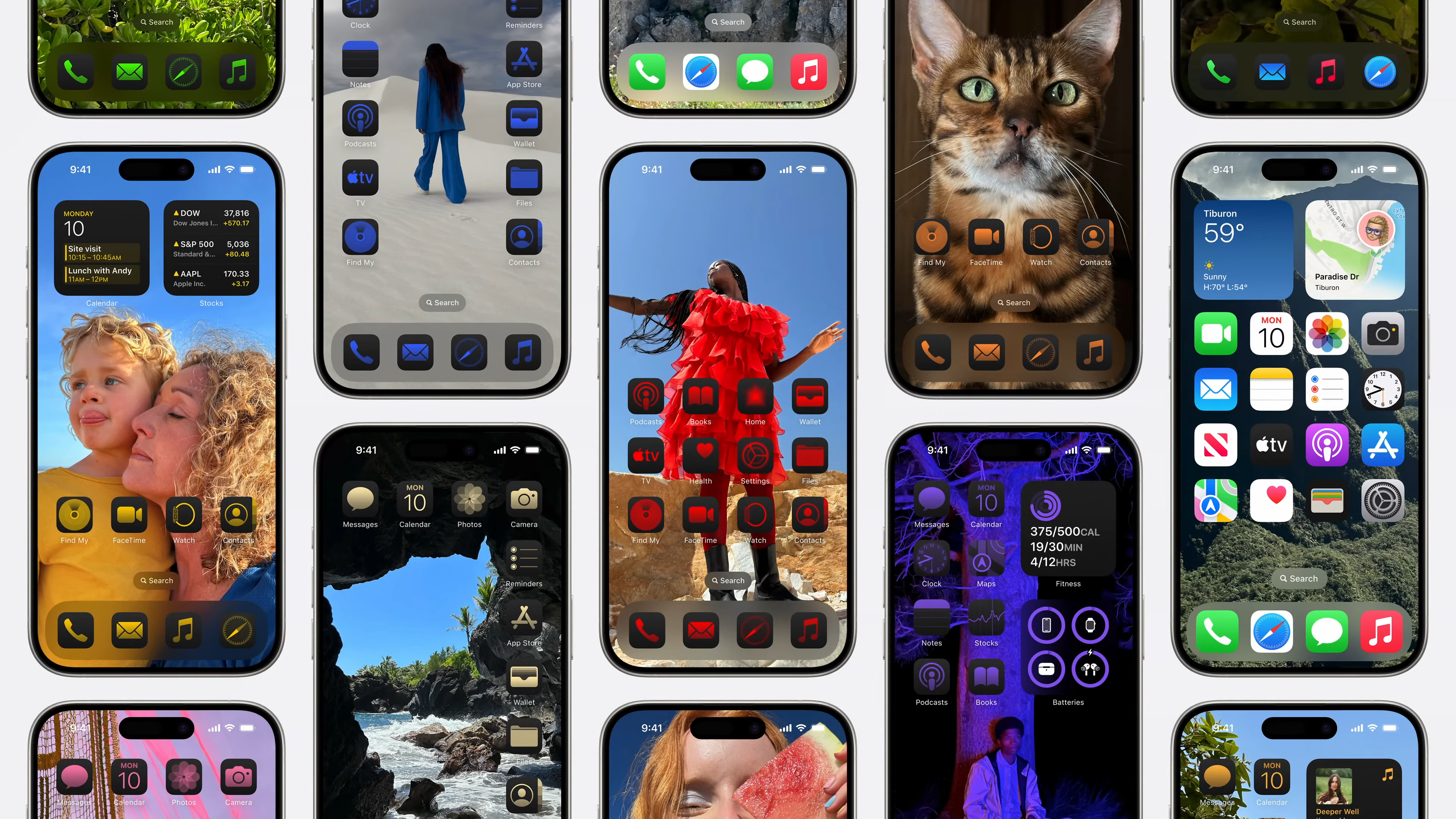
The result is something that, well, looks right out of the worst icon packs from the early 2010s. The red-on-black theme especially, one that Apple made sure to focus on both in its presentation and on its iOS preview site, looks custom-made for the HTC Droid Incredible. It looks, in every way, like baby’s first customization engine — which makes a lot of sense when you consider that, to most iOS users, it is baby’s first customization engine.
Google’s Pixel strategy is officially a mess, but I know how to fix it
The company’s strategy surrounding the 8a is downright awkward, but all is not lost
Google beat Apple to the punch here in nearly every way — and it still doesn’t matter
You moved too slow, Google
No matter how much I don’t care for this effect, I can’t escape the feeling that you’re going to see these colorized icons in use everywhere when iOS 18 launches this fall. It’s not just because iPhone fans are starved for a sense of personalization (though I’m sure that’s true, too); it’s because it works how it’s supposed to, decking out every app on the home screen and making a so-called “screen of shame” simply not necessary. All I can think is: why can’t Android be like this?
This is one of my biggest problems when it comes to how Google develops new features for its mobile OS. It doesn’t matter how good an idea is if it can’t get into the hands of users in a fully formed fashion, and Material You’s icons have simply never been fully formed. I appreciate the additional color packs Google has added to dynamic theming over the past couple of years, and I’m glad to see the company — at least for a moment — considered allowing users to force themes onto apps from unresponsive devs. But nearly three years into the Material You lifespan, and I’m sitting here watching Apple get it right on the first try.
Again, these visuals simply are not for me. I think the way Google does stylized, monochrome icons is the right way to go about it, a perfect combination of automated stylized effects, wallpaper contrast, and (limited) manual control. But looking over at iOS 18’s gaudy home screens, I can’t help but think Apple built the tools Google should’ve had from the start, and it did so without having to worry about developer support. The iOS 18 preview site says all apps and widgets can be tinted, and based on what I’m seeing from beta testers on Twitter right now, I have no reason to doubt it.
Finish your work, Google
Or Apple’s going to keep taking your best ideas
It’s no secret that Apple — especially in recent years — has used its annual iOS upgrades to lift some great ideas from Android, and that’s especially true this year. But rather than getting up in arms about how your Pixel has had RCS for years, or how your Galaxy Tab S9 came out of the box with a calculator installed, it’s time we start putting that effort towards insisting Google actually finishes some of its excellent ideas, rather than allowing them to languish in various states of half-finished development.
There is no reason why Material You’s themed icons should still be in beta after nearly three years, especially as Google seems less likely than ever to deliver the changes users are looking for. Likewise, the company’s decision to leave forced icons behind an unfinished flag should be called out by anyone who takes Android seriously. If Android enthusiasts are hellbent on calling out any and every example of Apple stealing Google’s best ideas for itself, then we need to be sure Google is actually implementing these concepts in complete, widely available ways. Otherwise, all Apple is truly guilty of is finishing the work another company started.
Top 15 icon packs for your Android launcher in 2024
Why stick with stock when there are so many beautiful choices out there?


