While your presentation shows up thoroughly on a laptop, TV, monitor, or projector, the default landscape orientation doesn’t play well on smartphones. If you plan to give a quick presentation on a smartphone or want to add a touch of novelty to stand out, use the steps below to use vertical orientation in Google Slides.
Apart from enhancing the mobile experience, vertical orientation simplifies the printing process, delivers a better flow of information, and makes your presentation stand out among other horizontal slides.
Although Google offers feature-rich Slides mobile apps on iPhone and
Android
, vertical orientation is only available on Google Slides for the web.
Use vertical orientation in Google Slides
You shouldn’t create and complete a presentation in landscape mode and change the orientation at the end. It may mess up the graphical elements of your presentation. Follow the steps below to use vertical orientation in Google Slides.
- Navigate to Google Slides on the web and open a presentation you want to edit.
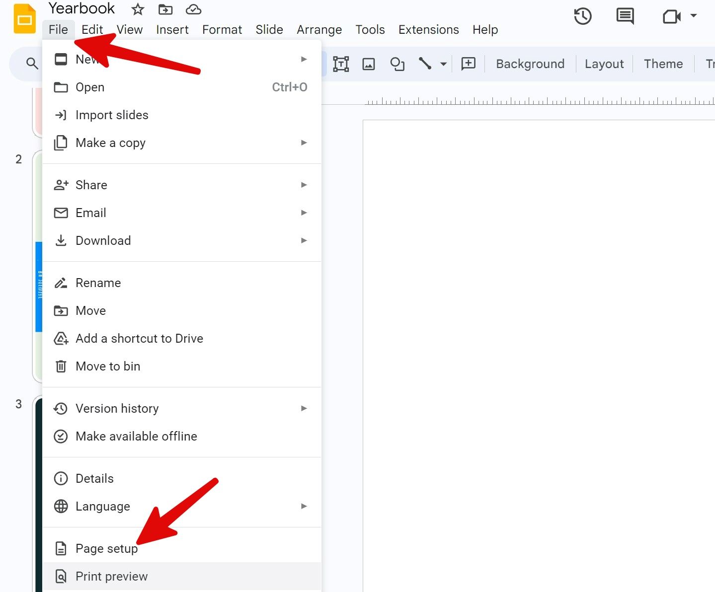
- Click File at the top and select Page setup.
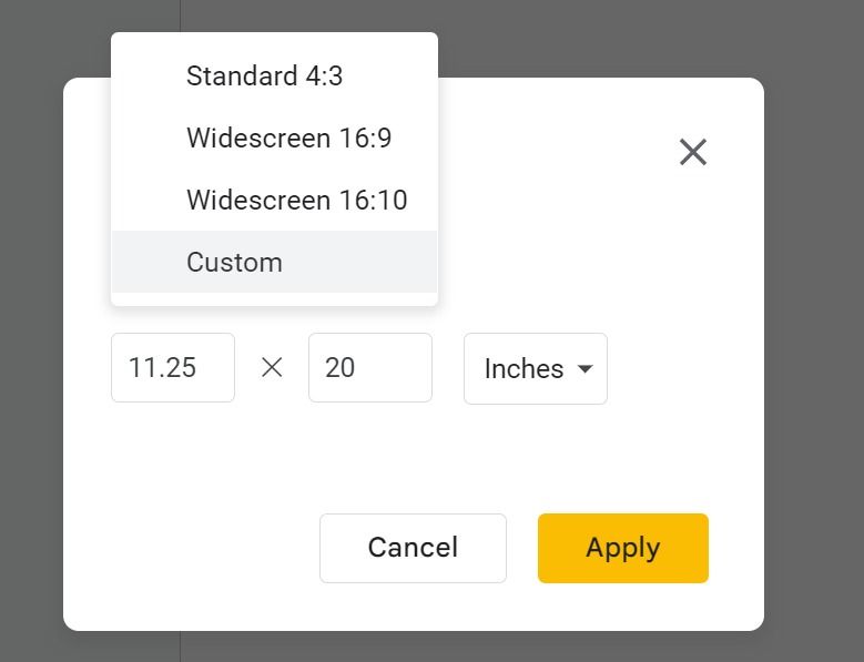
- Expand the top menu and find the default options. Standard 4:3 is ideal for viewing your presentation on a tablet. Widescreen 16:9 is suitable for viewing a slide on a TV, projector, or monitor. Widescreen 16:10 is the preferred dimension for viewing a presentation on modern laptops with taller displays.
- None of the default options offer vertical orientation. Select Custom.
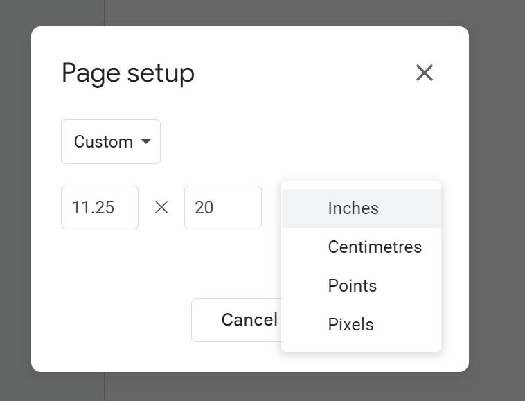
- Expand the side menu and select Inches, Centimeters, Points, or Pixels. Let’s select Inches.
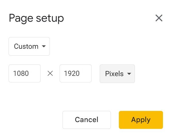
- Type 9 x 19.5 (preferred for modern smartphone displays) and select Apply. You can also select Pixels and type 1080 x 1920 (common on most Android phones).
- You can check the entire site in a vertical orientation.
Now, you can use Google Slides features to create an ideal presentation.

How to autoplay your Google Slides presentation
Deliver your upcoming presentation effortlessly
Popular portrait orientation dimensions
Whether you want to create a portrait presentation for printing or smartphones and smaller screens, glance over and memorize some common vertical slide sizes.
- A3: 29.7 x 42 cm
- A4: 21 x 29.7 cm
- US Letter: 8.5 x 11 inches (identical to A4 size)
- US Legal: 8.5 x 14 inches
Try the dimensions below to view a presentation on a smartphone or upload it to a social media network like Instagram, TikTok, or Snapchat.
- iPhone 15 Pro: 1179 x 2556 pixels
- Samsung Galaxy S24 Ultra: 1440 x 3120 pixels
- Google Pixel 8 Pro: 1344 x 2992 pixels
If you don’t want to deal with these unusual pixel numbers, use 1080 x 1920 pixels in the page setup menu for vertical slides.
When should you use vertical slides?
Vertical slides come with several benefits. You need to factor in your audience and the context of the presentation. Here are the top reasons for using a vertical orientation in Google Slides.
- Better mobile experience: A vertical orientation makes more sense if you plan to view your presentation on the phone. Scrolling on vertical slides feels more intuitive than tapping them.
- Seamless printing: Since a vertical layout is suitable with most standard paper sizes, you don’t need to make any major tweaks to fit the content on paper.
- Ideal for online presentations: Do you plan to share a presentation with your students or attendees over a video conference? Not everyone has a laptop to view your shared presentation. Use a vertical orientation that’s more user-friendly for your audience.
- Suitable for social media platforms: Go with a portrait ratio if you want to share a presentation during livestreaming on a social media platform like TikTok or YouTube.
- Novelty factor: Vertical slides add a unique touch to your presentation. When everyone else addresses the audience with the same horizontal slides, a vertical presentation adds a unique touch to your pitch.
Using vertical orientation in a presentation: Our observations
Before you apply a vertical orientation, keep the points below in mind.
- Google Slides doesn’t allow you to mix horizontal and vertical slides. The tweak applies to the entire presentation when you change the page setup.
- If you use a Google Slides template, adjust your designs accordingly. Most templates are designed for landscape orientation and don’t use flexible elements that automatically fit a vertical slide.

What’s the difference between Google Slides templates and themes?
Create an attractive presentation with a constant look
Optimize your presentation for mobile convenience
Whether you use a horizontal or portrait orientation, your presentation must hit the bull’s eye to catch your audience’s attention. Instead of creating a presentation from scratch and ending up with a bland one, use one of the top Google Slides templates to speed up the process.


