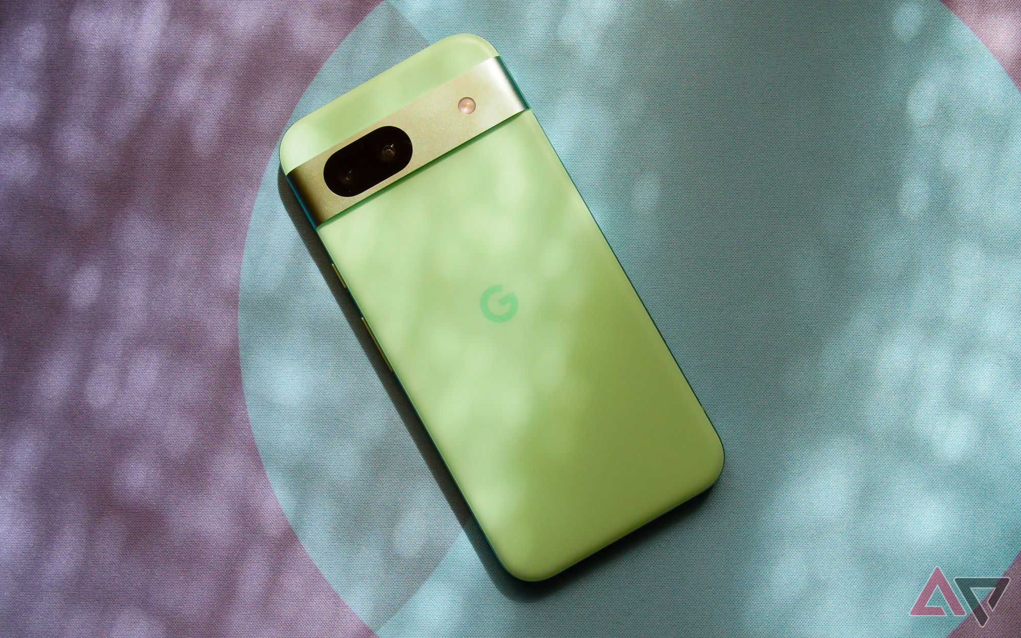
When you set out to buy the Pixel 8a, you know what you’re getting. Now in its sixth generation, Google has long since established what its A-series hardware represents, especially in the Tensor era: a complete package with just enough corners sanded off to bring the price down. For $200 less than the Pixel 8, the Pixel 8a is a remarkable similar phone; even the most knowledgeable among us would need their respective specs sheets side by side to spot the differences that really matter. It’s just a shame the same can’t be said for Google’s official Pixel 8a case.
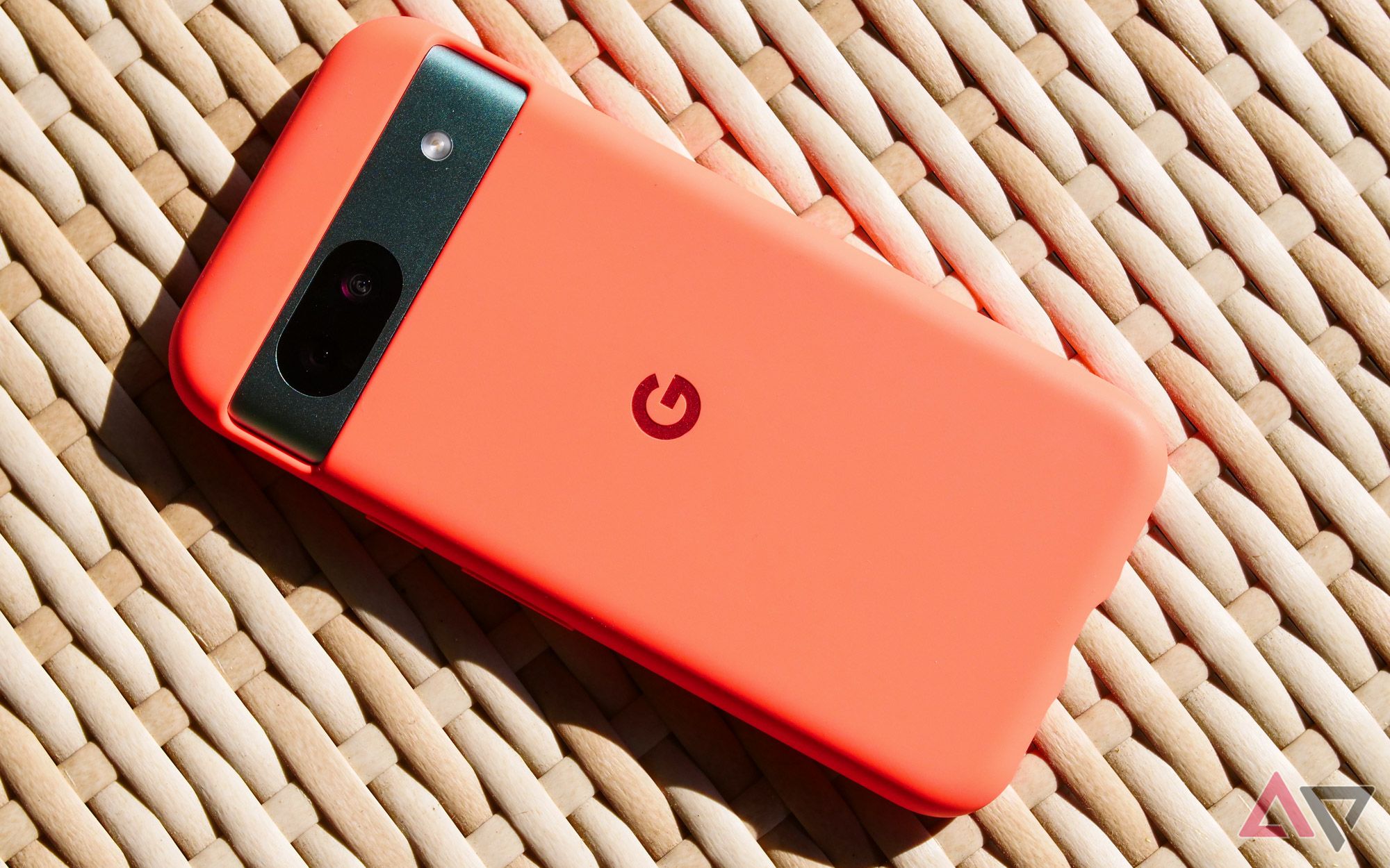
Alongside the company’s latest phone, I was sent an official Pixel 8a case for review. Google’s first-party cases have improved a lot over the last couple of years; my standard Pixel 8 rarely leaves its mint-shaded case for fear of collecting fingerprints. Between the dedicated buttons, the fabric liner, and a rubberized finish that feels grippy in your hand, it’s not a bad bargain for an extra $35 at checkout — so long as you can deal with it acting like a pocket lint magnet.
This article was produced in partnership with Supcase, but its contents were not shown to the company beforehand. All content is written independently
and meets Android Police’s stringent editorial
standards.
The Pixel 8a case, at first glance, looks nearly identical, and — much like the phone itself — it’s priced just a bit more affordable. First-party cases don’t typically stretch as low as $30, though, and once Google’s A-series accessory is in your hand, you start to realize why.
Google’s first-party Pixel 8a case isn’t worth $30
Too many cut corners — or in this case, cut edges
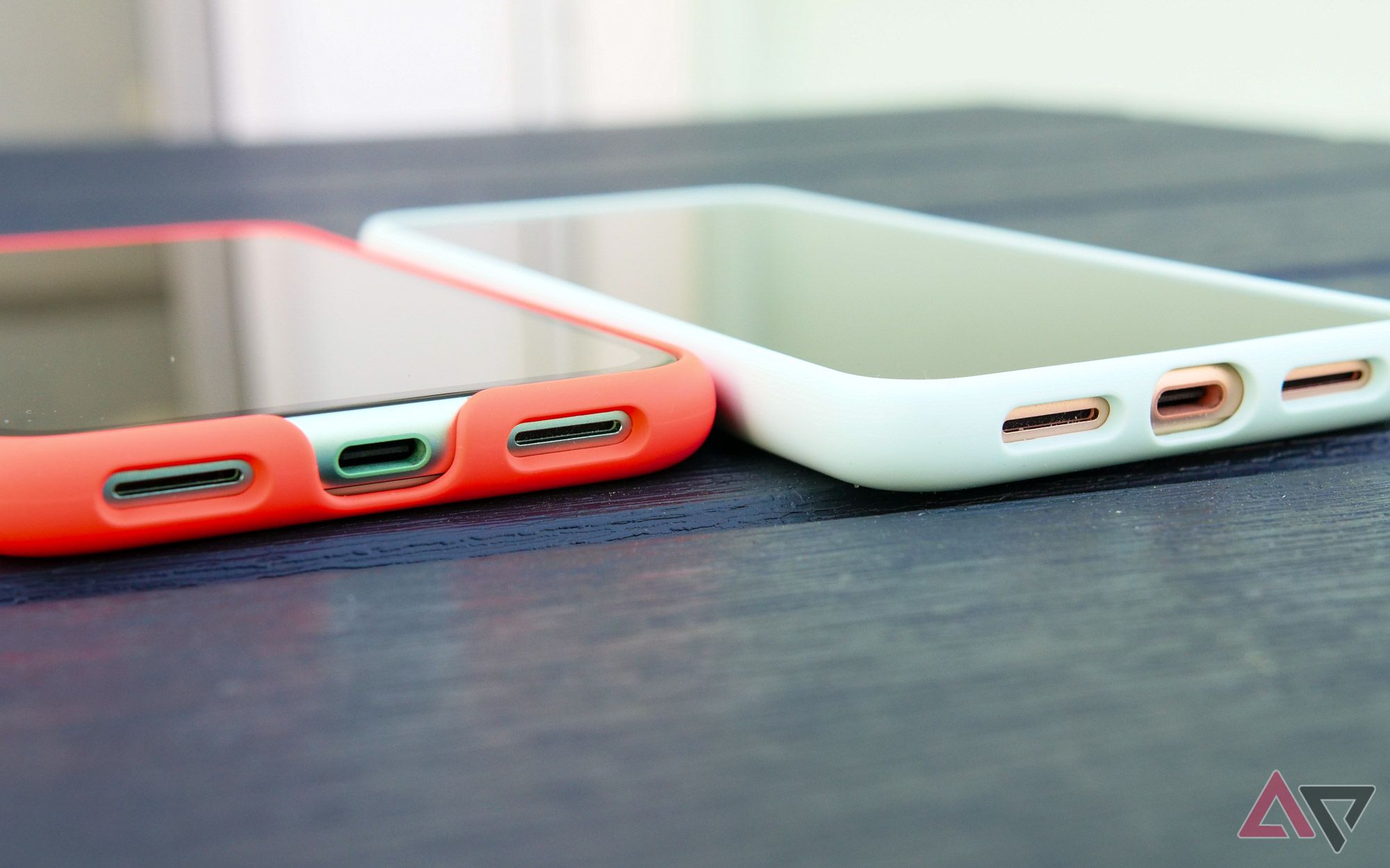
The biggest red flag, for me, can actually be spotted before you even add the case to your cart. Browse through Google’s listings for the Pixel 8a’s main accessory on both its own store page and on Amazon, and you’ll note the phone is never shown from the front. Google’s web store exclusively highlights it from the back, while Amazon includes a single profile image showcasing its buttons. This isn’t completely out of the norm for the company — the Pixel 8 Pro does a very similar thing — but in this example, that unseen angle actually hides a pretty ugly truth.
Google Pixel 8a review: A great phone that I’m not sure you should buy
Google’s hardware lineup is in a tricky spot, and the Pixel 8a only makes things more confusing
Google’s Pixel 8a case doesn’t fully wrap around the front of the phone, delivering a break around the charging cable that, in my opinion, isn’t just an eyesore, but a potential damage zone. By leaving so much of the display and surrounding bezel unguarded, you’re asking for trouble in a way that most other cases simply do not. I have no idea what cost-cutting measures allowed for this deal-breaking choice to be built into this accessory, but it’s truly baffling. And since Google’s marketing for this case doesn’t make its design clear to the buyer, you might not know how unprotected you are until you’ve already slapped your credit card down.
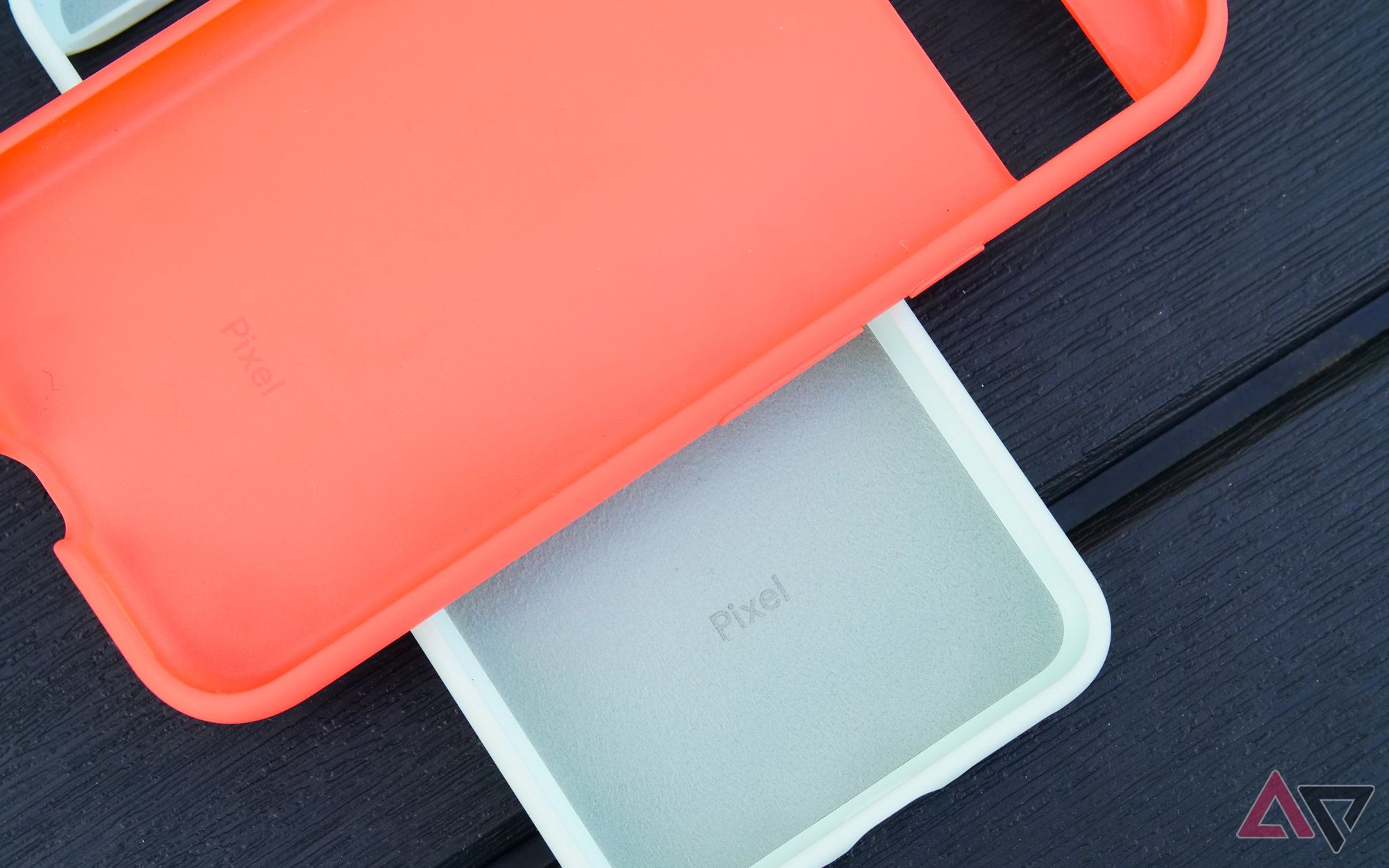
This missing space of material isn’t the only downgrade compared to the normal Pixel 8 and 8 Pro cases. The fabric liner is missing, leaving behind a standard plastic finish, and the dedicated metallic buttons have been swapped for standard rubber caps. Neither of these are bad enough to warrant attention on their own, but combined with the gap in protection — and for only $5 less than the normal flagship accessories — and it’s hard to see how this case is worth its $30 asking price.
Amazon is filled with cheaper, more protective Pixel 8a cases
Why not go with one of those?
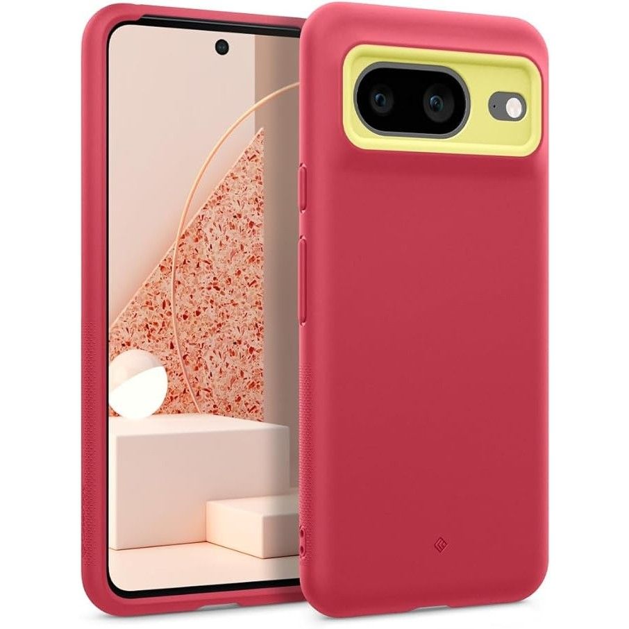
Especially when Google has a pretty robust offering of third-party case vendors. Sure, the Pixel series doesn’t get quite the attention Samsung’s annual Galaxy S-entry sees — let alone the robust ecosystem for Apple accessories — but there’s a lot of options to pick from on Amazon and beyond. Spigen and its Caseology sub-brand offer at least seven different designs total, and for most people, picking between one of those is probably good enough.
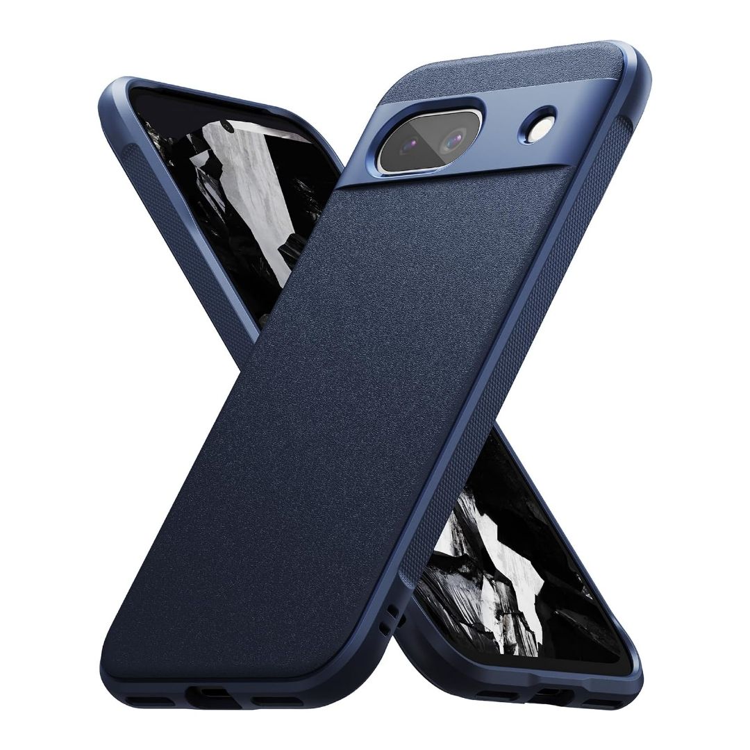
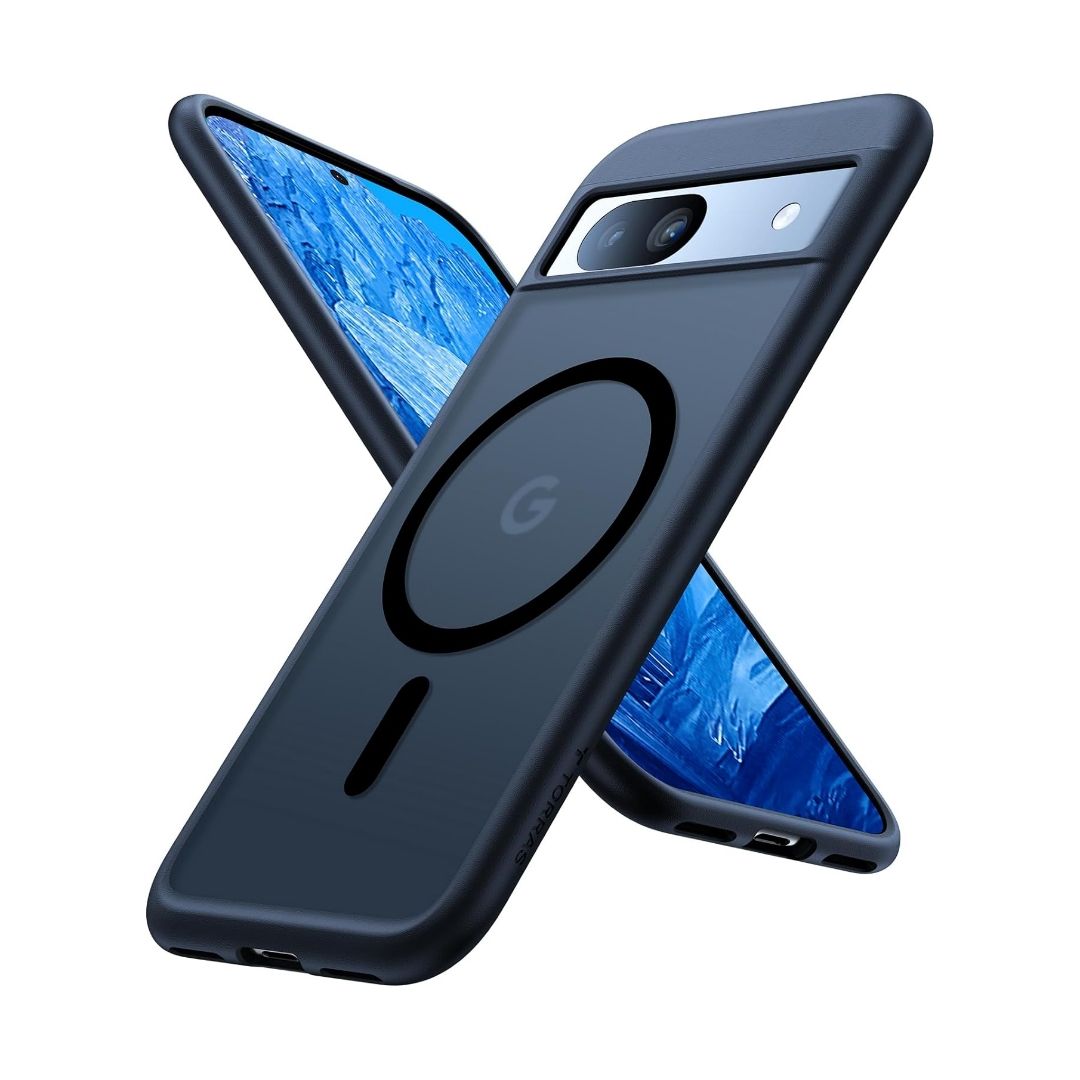
A couple of smaller brands — though no less familiar to those who spend hours perusing Amazon’s virtual shelves whenever a new gadget falls in their hands — are here too. Ringke’s Onyx case, which I’ve tried out on the Pixel 8, has a unique textured back you’ll either love or hate; either way, it does a good job sticking to your palm. Torras is here with a MagSafe-equipped ring for wirelessly charging your phone very, very slowly.
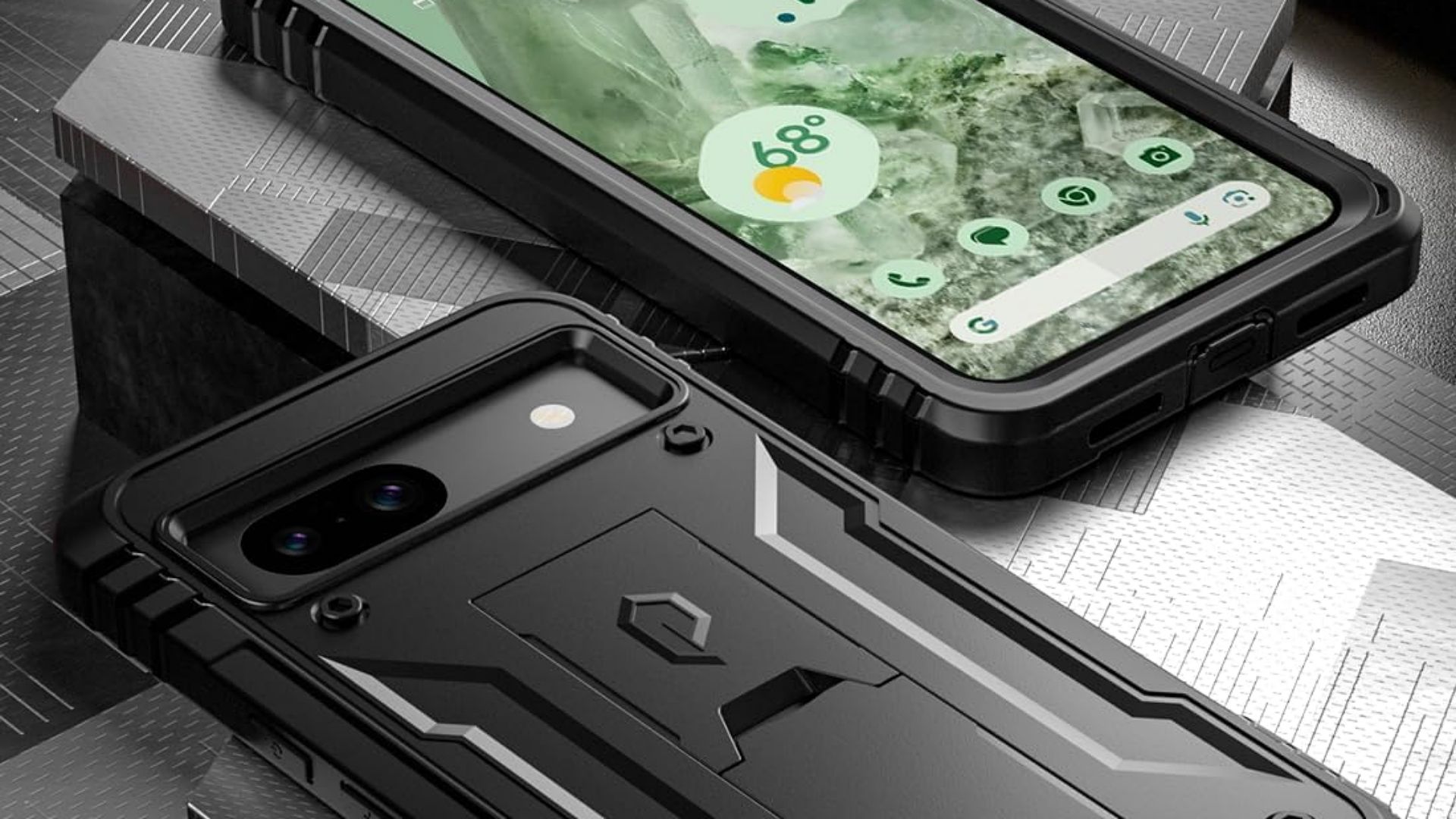
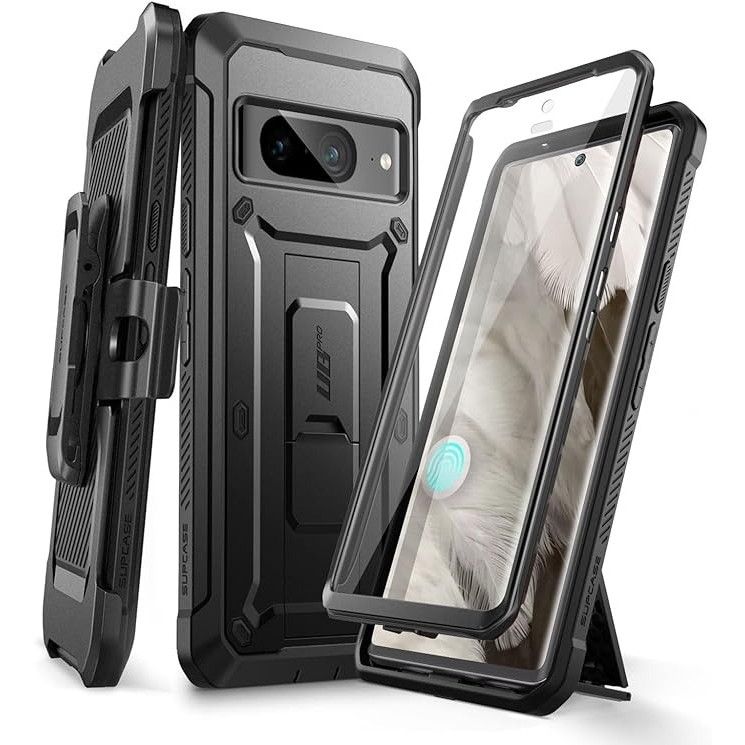
Mous offers a more premium, ultra-thin design, while other brands like Supcase or Poetic offer toughened, rugged cases for extra protection. And honestly, just from digging through the listings, I quite like the look of some of the lesser-known cases; this Kwmobile selection, for example, comes in a variety of colors for only $10. At that price, it sure looks like a good-enough alternative to Google’s disappointing offerings.
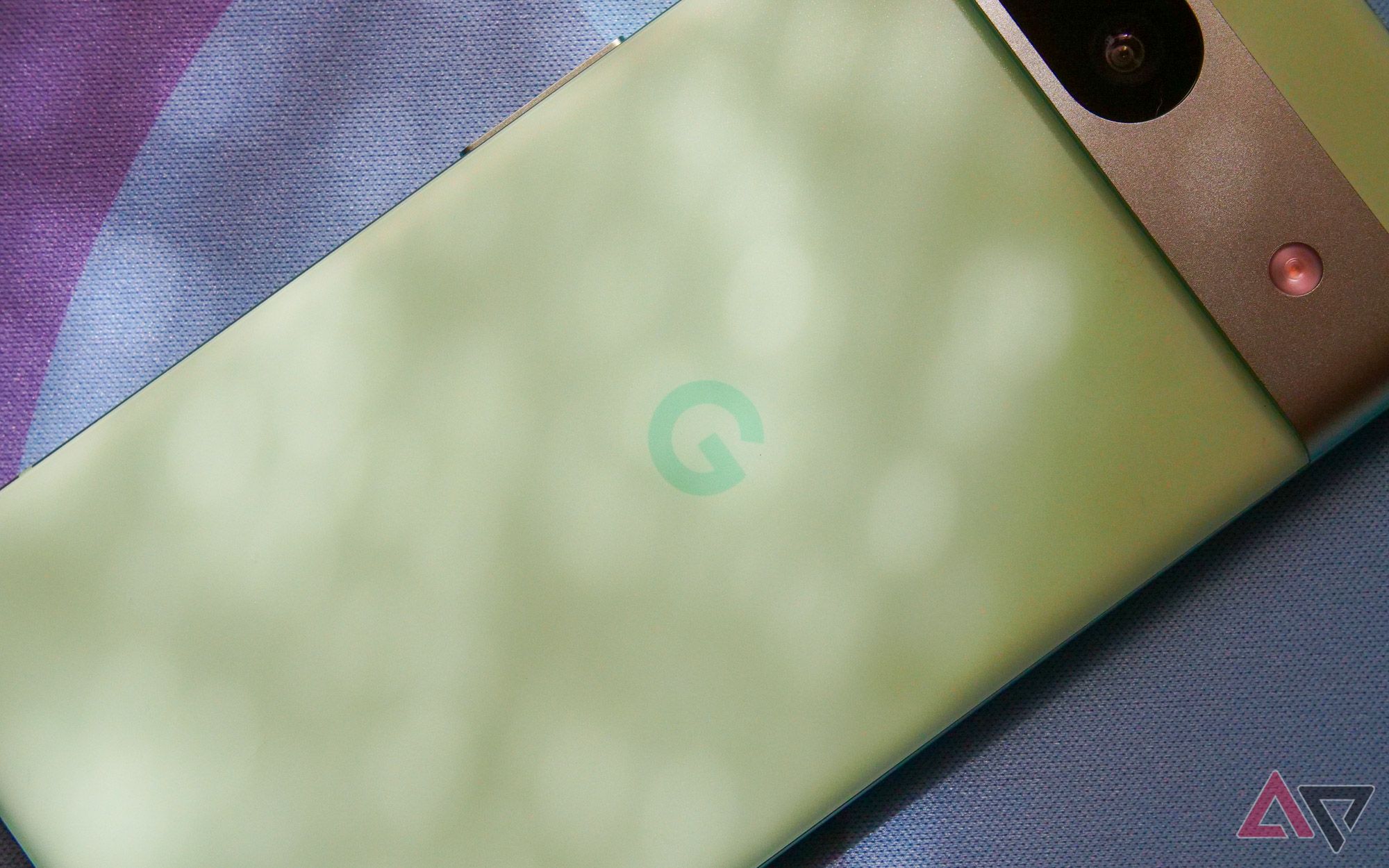
Of course, you can also choose to use the Pixel 8a caseless, as I have for most of my time with it. Sure, that flies in the face of my criticism of Google’s $30 accessory, but the matte plastic back used on this phone makes for one of the best-feeling Pixel devices in ages. Why let that go to waste with an overpowered piece of silicon?
Spend your money elsewhere
Or don’t — I’m not your boss
With so many third-party cases to pick from, I’m just not sure why Google opted to half-heartedly piece together such a lacking accessory — and for only $5 less than the much nicer variants made for the company’s flagship Pixels. Whether you opt for something from Amazon or follow my caseless lead, one thing’s for sure. Unless it’s marked down on a steep discount, Google’s first-party Pixel 8a case probably isn’t worth it.


