Summary
- The Google Meet section within the Gmail app is set to receive a redesign with a floating bar for controls.
- The design makes for a more consistent look across desktop and mobile.
- The floating bar is similar to what Gmail’s Chat section recently received, enhancing quick access and a more consistent UI.
Google is constantly tweaking and refining its Android apps. While full feature updates are far and few between these days, the same can’t be said for design tweaks that aim to improve the consistency and the design here and there to match Material Design 3. It looks like a redesign like this is headed for the Google Meet section within the Gmail app, which is slated to receive a design element Gmail first introduced for the Chat section.
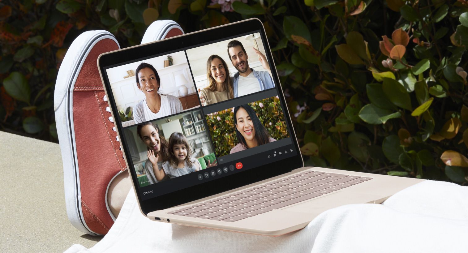
As spotted by AssembleDebug on X, the Google Meet call interface may replace the individual control buttons for microphone, camera, and more with a floating bar that houses all of the relevant controls. In the process, some of the options should get reordered, with the end call button now on the very left rather than on the right. The new design is more in line with the desktop version of Meet, which uses similar button shapes and also moves the buttons into a section of their own below the Meet tiles.
The redesign looks similar to what the Chat section recently received
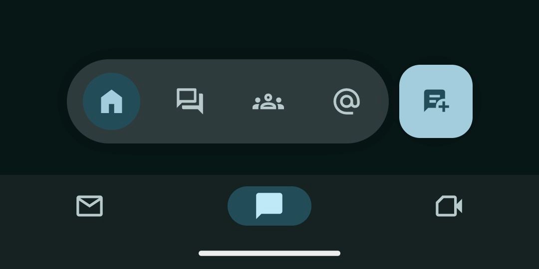
At the same time, the redesign reminds us a lot of the one that the Chat section within Meet recently received. When you navigate to the Chat bottom tab in Gmail, you will see a floating bar on top of the bottom tabs that lets you switch between the section’s own different tabs. This allows for quick access to spaces and direct conversations from the bottom. There is also a more classic floating action button right next to the bar that you can use to start a new conversation.
So far, AssembleDebug only spotted the new bottom bar for Meet in Gmail. It’s not clear when and if the dedicated Meet app will receive the same treatment, though given that the two methods to manage Meet calls are otherwise identical, we wouldn’t be surprised if it does come to it. We also need to remember that what we see here is only preliminary work that isn’t widely activated by default just yet. That means that Google could still finalize the design to look different, or scrap the experiment altogether. Given that the redesigned call buttons would make for a more consistent UI across desktop and mobile, that’s unlikely.


