My first analytics project involved predicting business from each sales agent and coming up with a targeted intervention for each agent.
I built my first linear regression model after devoting a good amount of time on data cleaning and variable preparation. Now was the time to access the predictive power of the model. I got a MAPE of 5%, Gini coefficient of 82% and a high R-square. Gini and MAPE are metrics to gauge the predictive power of linear regression model. Such Gini coefficient and MAPE for an insurance industry sales prediction are considered to be way better than average. To validate the overall prediction we found the aggregate business in an out of time sample. I was shocked to see that the total expected business was not even 80% of the actual business. With such high lift and concordant ratio, I failed to understand what was going wrong. I decided to read more on statistical details of the model. With a better understanding of the model, I started analyzing the model on different dimensions. After a close examination of residual plots, I found that one of the predictor variables had a square relationship with the output variable.
Since then, I validate all the assumptions of the model even before reading the predictive power of the model. This article will take you through all the assumptions in a linear regression and how to validate assumptions and diagnose relationship using residual plots.
[stextbox id=”section”]Assumptions of Linear Regression Model :[/stextbox]
There are number of assumptions of a linear regression model. In modeling, we normally check for five of the assumptions. These are as follows :
1. Relationship between the outcomes and the predictors is linear.
2. Error term has mean almost equal to zero for each value of outcome.
3. Error term has constant variance.
4. Errors are uncorrelated.
5. Errors are normally distributed or we have an adequate sample size to rely on large sample theory.
The point to be noted here is that none of these assumptions can be validated by R-square chart, F-statistics or any other model accuracy plots. On the other hand, if any of the assumptions are violated, chances are high that accuracy plot can give misleading results.
[stextbox id=”section”]How to use residual for diagnostics :[/stextbox]
Residual analysis is usually done graphically. Following are the two category of graphs we normally look at:
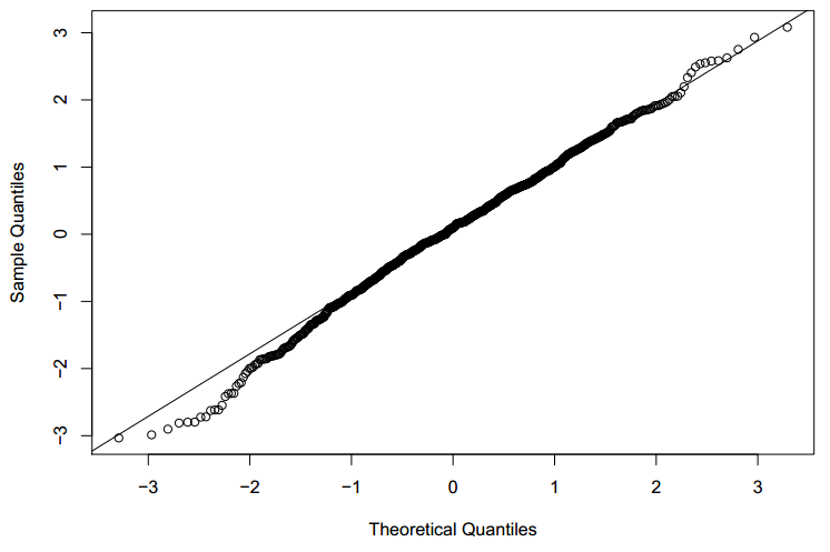
1. Quantile plots : This type of is to assess whether the distribution of the residual is normal or not. The graph is between the actual distribution of residual quantiles and a perfectly normal distribution residuals. If the graph is perfectly overlaying on the diagonal, the residual is normally distributed. Following is an illustrative graph of approximate normally distributed residual.
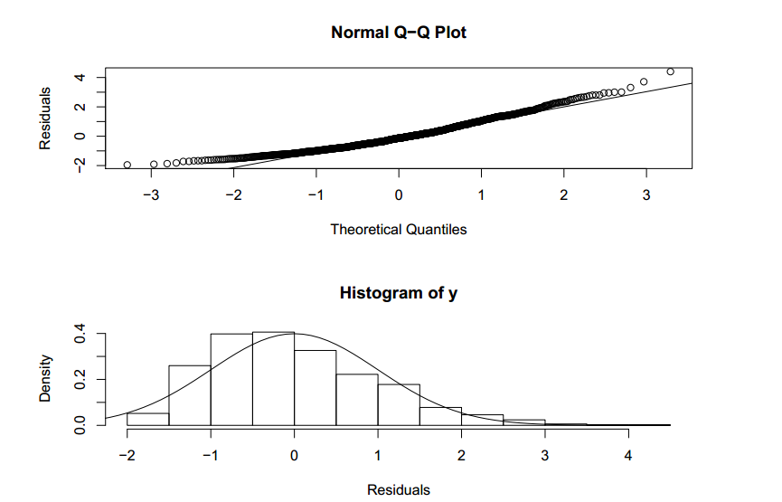
Let’s try to visualize a quantile plot of a biased residual distribution.
In the graph above, we see the assumption of the residual normal distribution being clearly violated.
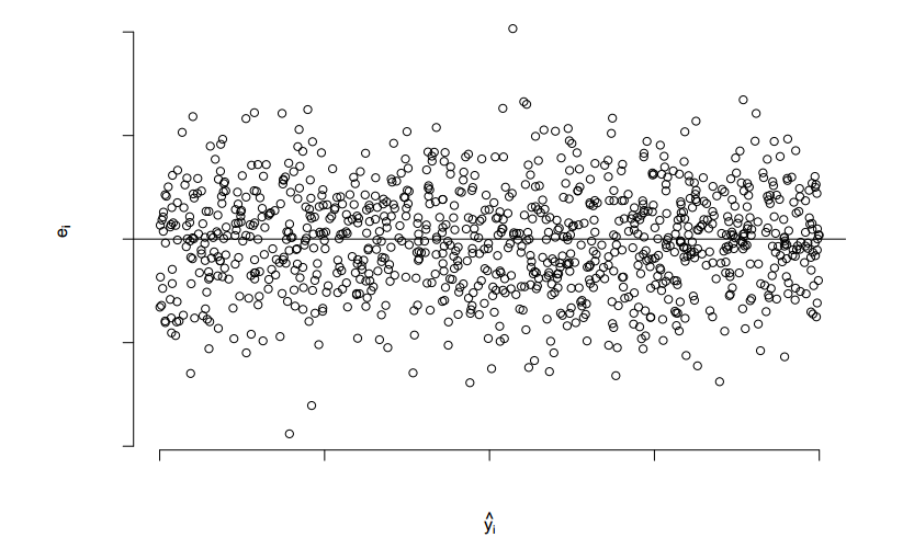
2. Scatter plots: This type of graph is used to assess model assumptions, such as constant variance and linearity, and to identify potential outliers. Following is a scatter plot of perfect residual distribution
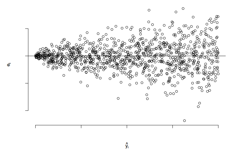
Let’s try to visualize a scatter plot of residual distribution which has unequal variance.
In the graph above, we see the assumption of the residual normal distribution being clearly violated.
[stextbox id=”section”]Example :[/stextbox]
For simplicity, I have taken an example of single variable regression model to analyze residual curves. Similar kind of approach is followed for multi-variable as well.
Say, the actual relation of the predictor and the output variable is as follows:
Ignorant of the type of relationship, we start the analysis with the following equation.
Can we diagnose this misfit using residual curves?
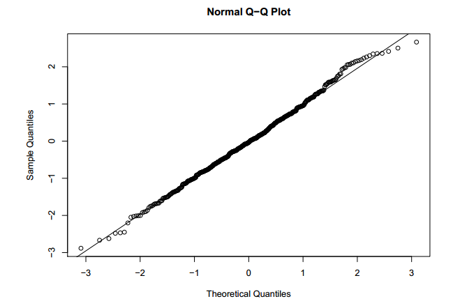
After making a comprehensive model, we check all the diagnostic curves. Following is the Q-Q plot for the residual of the final linear equation.
Q-Q plot looks slightly deviated from the baseline, but on both the sides of the baseline. This indicated residuals are distributed approximately in a normal fashion.
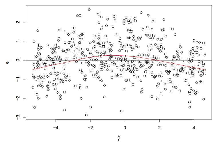
Following is the scatter plot of the residual :
Clearly, we see the mean of residual not restricting its value at zero. We also see a parabolic trend of the residual mean. This indicates the predictor variable is also present in squared form. Now, let’s modify the initial equation to the following equation :
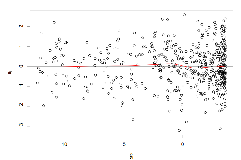
Following is the new scatter plot for the residual of the new equation :
We now clearly see a random distribution and a approximate zero residual mean.
[stextbox id=”section”]End Notes:[/stextbox]
Every linear regression model should be validated on all the residual plots . Such regression plots directionaly guides us to the right form of equations to start with. You might also be interested in the previous article on regression ( https://www.geeksforgeeks.org/blog/2013/10/trick-enhance-power-regression-model-2/ )
Do you think this provides a solution to any problem you face? Are there any other techniques you use to detect the right form of relationship between predictor and output variables ? Do let us know your thoughts in the comments below.


