


Overview
In this article, we will be predicting that whether the patient has diabetes or not on the basis of the features we will provide to our machine learning model, and for that, we will be using the famous Pima Indians Diabetes Database.

- Data analysis: Here one will get to know about how the data analysis part is done in a data science life cycle.
- Exploratory data analysis: EDA is one of the most important steps in the data science project life cycle and here one will need to know that how to make inferences from the visualizations and data analysis
- Model building: Here we will be using 4 ML models and then we will choose the best performing model.
- Saving model: Saving the best model using pickle to make the prediction from real data.
Importing Libraries
import numpy as np
import pandas as pd
import matplotlib.pyplot as plt
import seaborn as sns

sns.set()

from mlxtend.plotting import plot_decision_regions
import missingno as msno
from pandas.plotting import scatter_matrix
from sklearn.preprocessing import StandardScaler
from sklearn.model_selection import train_test_split
from sklearn.neighbors import KNeighborsClassifier

from sklearn.metrics import confusion_matrix
from sklearn import metrics
from sklearn.metrics import classification_report
import warnings
warnings.filterwarnings('ignore')
%matplotlib inline
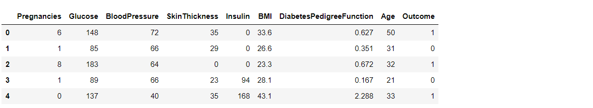
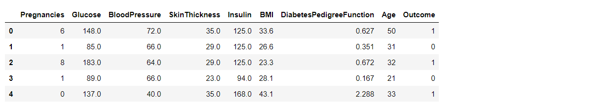
Here we will be reading the dataset which is in the CSV format
diabetes_df = pd.read_csv('diabetes.csv')
diabetes_df.head()
Output:
Exploratory Data Analysis (EDA)
Now let’ see that what are columns available in our dataset.
diabetes_df.columns
Output:
Index(['Pregnancies', 'Glucose', 'BloodPressure', 'SkinThickness', 'Insulin',
       'BMI', 'DiabetesPedigreeFunction', 'Age', 'Outcome'],
      dtype='object')
Information about the dataset
diabetes_df.info()
Output:
RangeIndex: 768 entries, 0 to 767
Data columns (total 9 columns):
 #   Column                    Non-Null Count  Dtype
---  ------                    --------------  -----
 0   Pregnancies               768 non-null    int64
 1   Glucose                   768 non-null    int64
 2   BloodPressure             768 non-null    int64
 3   SkinThickness             768 non-null    int64
 4   Insulin                   768 non-null    int64
 5   BMI                       768 non-null    float64
 6   DiabetesPedigreeFunction  768 non-null    float64
 7   Age                       768 non-null    int64
 8   Outcome                   768 non-null    int64
dtypes: float64(2), int64(7)
memory usage: 54.1 KB
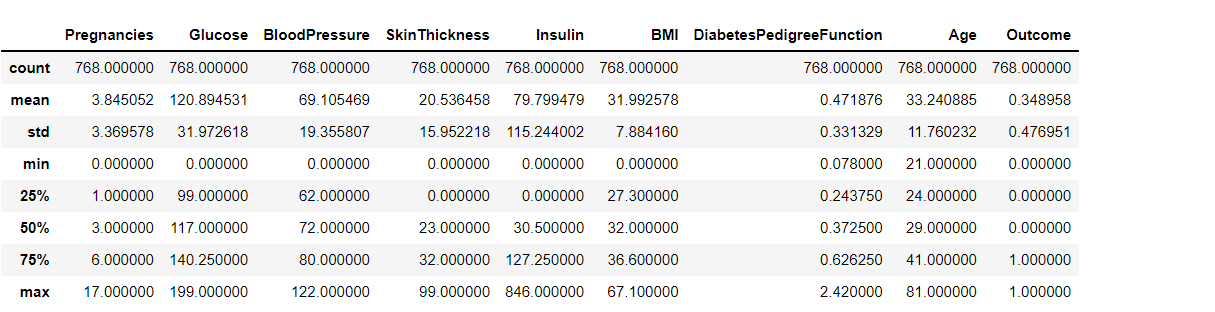
To know more about the dataset
diabetes_df.describe()
Output:
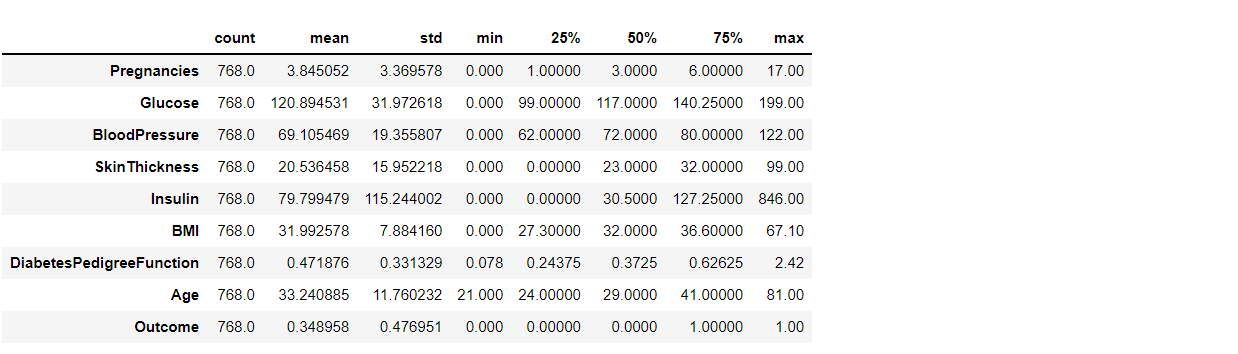
To know more about the dataset with transpose – here T is for the transpose
diabetes_df.describe().T
Output:
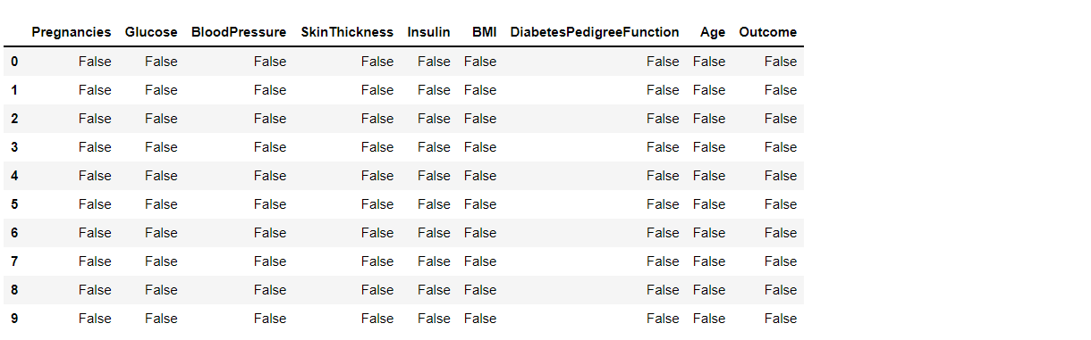
Now let’s check that if our dataset have null values or not
diabetes_df.isnull().head(10)
Output:
Now let’s check the number of null values our dataset has.
diabetes_df.isnull().sum()
Output:
Pregnancies                 0
Glucose                     0
BloodPressure               0
SkinThickness               0
Insulin                     0
BMI                         0
DiabetesPedigreeFunction    0
Age                         0
Outcome                     0
dtype: int64
Here from the above code we first checked that is there any null values from the IsNull() function then we are going to take the sum of all those missing values from the sum() function and the inference we now get is that there are no missing values but that is actually not a true story as in this particular dataset all the missing values were given the 0 as a value which is not good for the authenticity of the dataset. Hence we will first replace the 0 value with the NAN value then start the imputation process.
diabetes_df_copy = diabetes_df.copy(deep = True)
diabetes_df_copy[['Glucose','BloodPressure','SkinThickness','Insulin','BMI']] = diabetes_df_copy[['Glucose','BloodPressure','SkinThickness','Insulin','BMI']].replace(0,np.NaN)

# Showing the Count of NANs
print(diabetes_df_copy.isnull().sum())
Output:
Pregnancies                   0
Glucose                       5
BloodPressure                35
SkinThickness               227
Insulin                     374
BMI                          11
DiabetesPedigreeFunction      0
Age                           0
Outcome                       0
dtype: int64
As mentioned above that now we will be replacing the zeros with the NAN values so that we can impute it later to maintain the authenticity of the dataset as well as trying to have a better Imputation approach i.e to apply mean values of each column to the null values of the respective columns.
Data Visualization
Plotting the data distribution plots before removing null values
p = diabetes_df.hist(figsize = (20,20))
Output:
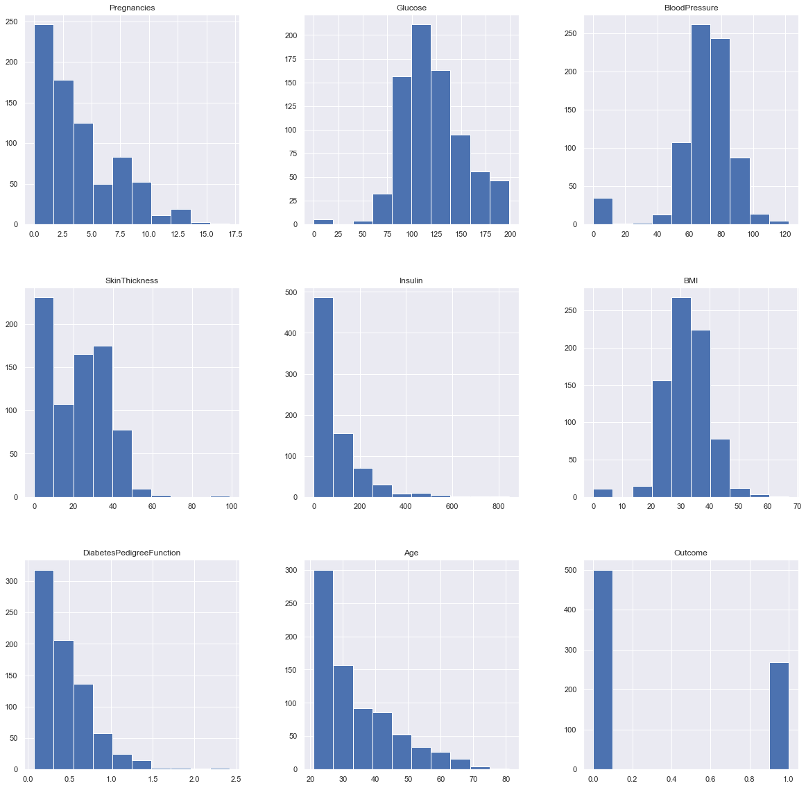
Inference: So here we have seen the distribution of each features whether it is dependent data or independent data and one thing which could always strike that why do we need to see the distribution of data? So the answer is simple it is the best way to start the analysis of the dataset as it shows the occurrence of every kind of value in the graphical structure which in turn lets us know the range of the data.
Now we will be imputing the mean value of the column to each missing value of that particular column.
diabetes_df_copy['Glucose'].fillna(diabetes_df_copy['Glucose'].mean(), inplace = True)
diabetes_df_copy['BloodPressure'].fillna(diabetes_df_copy['BloodPressure'].mean(), inplace = True)
diabetes_df_copy['SkinThickness'].fillna(diabetes_df_copy['SkinThickness'].median(), inplace = True)
diabetes_df_copy['Insulin'].fillna(diabetes_df_copy['Insulin'].median(), inplace = True)
diabetes_df_copy['BMI'].fillna(diabetes_df_copy['BMI'].median(), inplace = True)
Plotting the distributions after removing the NAN values.
p = diabetes_df_copy.hist(figsize = (20,20))
Output:
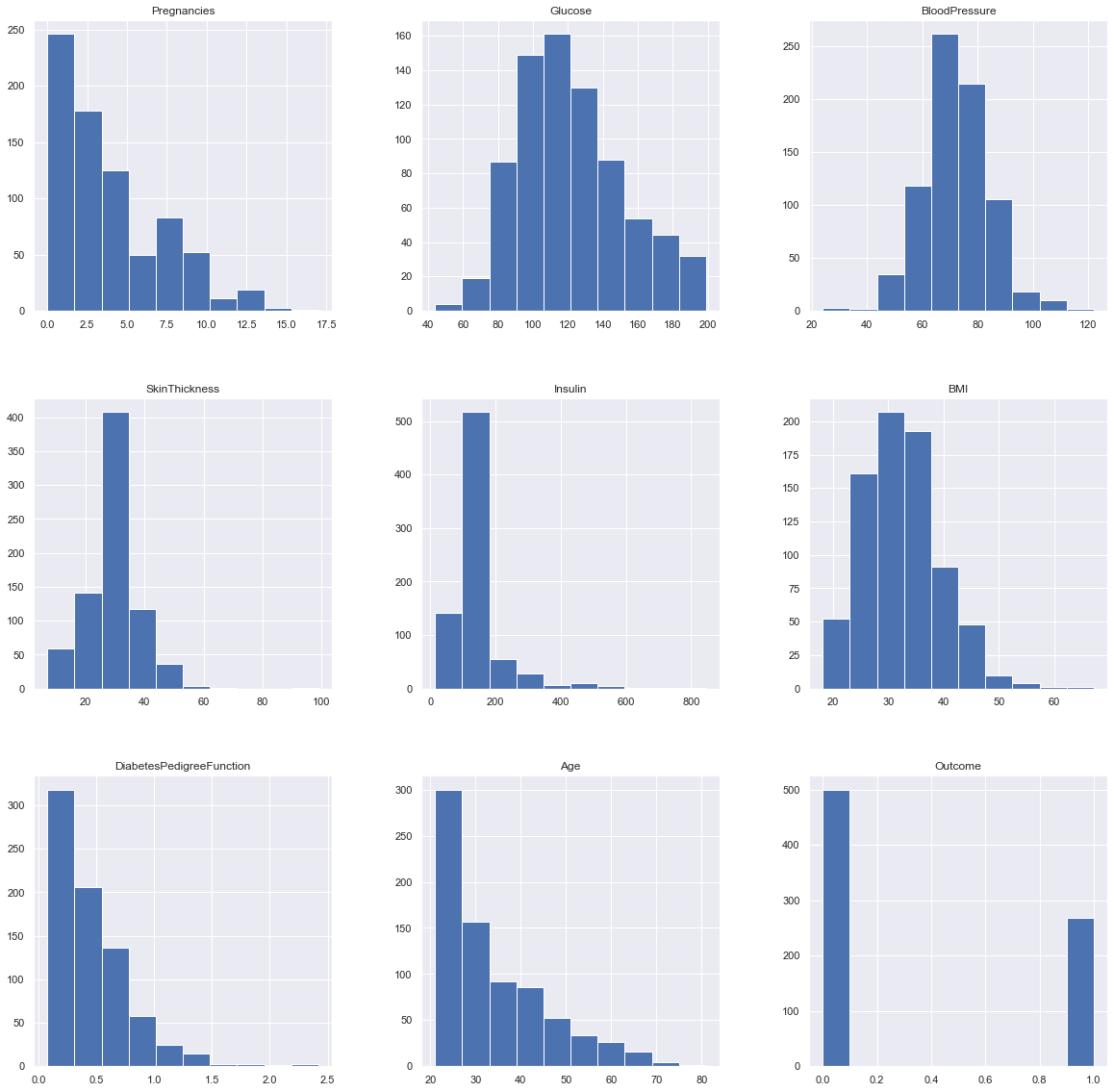
Inference: Here we are again using the hist plot to see the distribution of the dataset but this time we are using this visualization to see the changes that we can see after those null values are removed from the dataset and we can clearly see the difference for example – In age column after removal of the null values, we can see that there is a spike at the range of 50 to 100 which is quite logical as well.
Plotting Null Count Analysis Plot
p = msno.bar(diabetes_df)
Output:
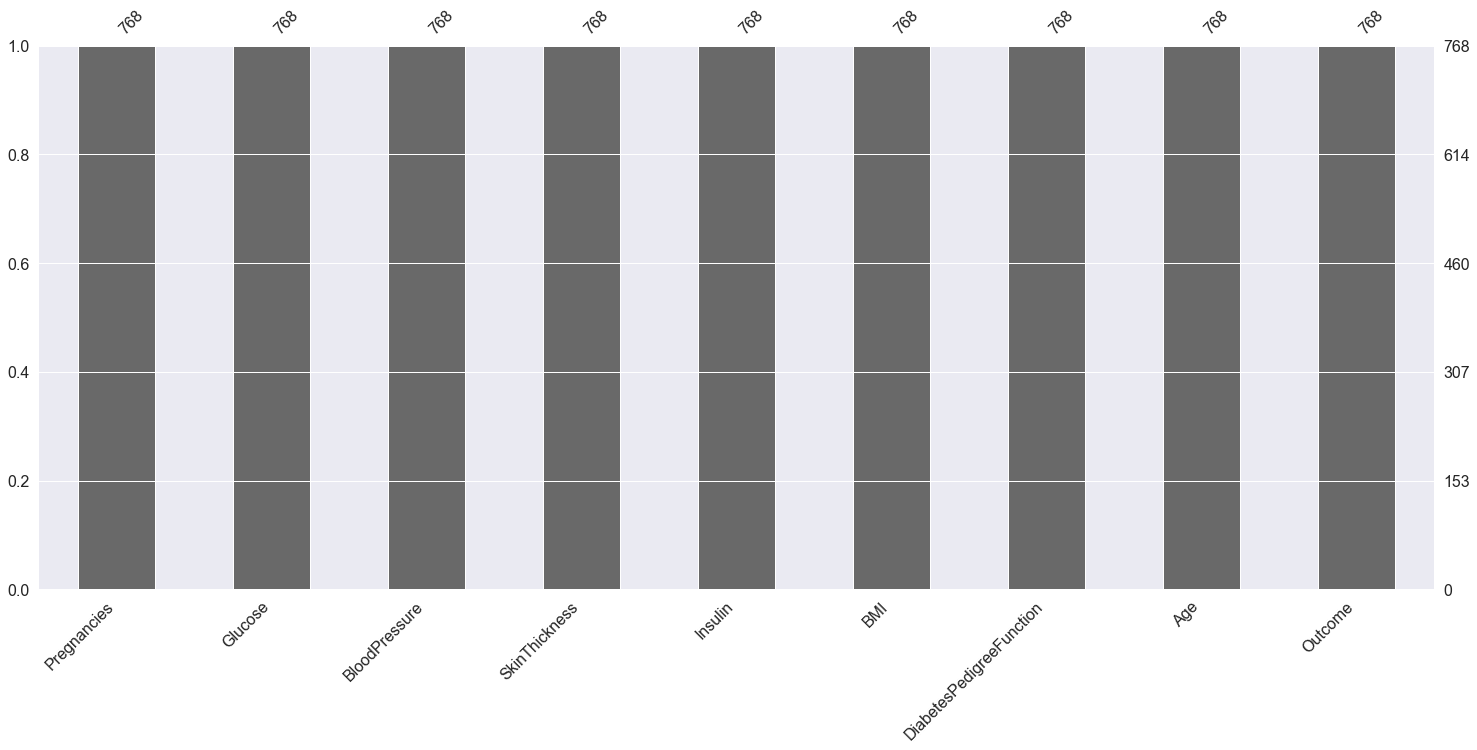
Inference: Now in the above graph also we can clearly see that there are no null values in the dataset.
Now, let’s check that how well our outcome column is balanced
color_wheel = {1: "#0392cf", 2: "#7bc043"}
colors = diabetes_df["Outcome"].map(lambda x: color_wheel.get(x + 1))
print(diabetes_df.Outcome.value_counts())
p=diabetes_df.Outcome.value_counts().plot(kind="bar")
Output:
0    500
1    268
Name: Outcome, dtype: int64
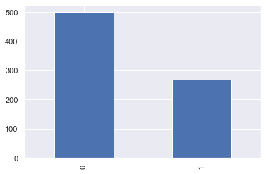
Inference: Here from the above visualization it is clearly visible that our dataset is completely imbalanced in fact the number of patients who are diabetic is half of the patients who are non-diabetic.
plt.subplot(121), sns.distplot(diabetes_df['Insulin'])
plt.subplot(122), diabetes_df['Insulin'].plot.box(figsize=(16,5))
plt.show()
Output:
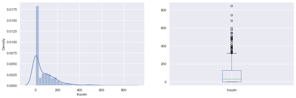
Inference: That’s how Distplot can be helpful where one will able to see the distribution of the data as well as with the help of boxplot one can see the outliers in that column and other information too which can be derived by the box and whiskers plot.
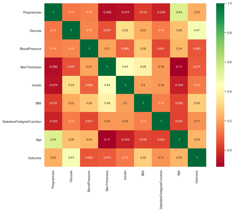
Correlation between all the features
Correlation between all the features before cleaning
plt.figure(figsize=(12,10))
# seaborn has an easy method to showcase heatmap
p = sns.heatmap(diabetes_df.corr(), annot=True,cmap ='RdYlGn')
Output:
Scaling the Data
Before scaling down the data let’s have a look into it
diabetes_df_copy.head()
Output:
After Standard scaling
sc_X = StandardScaler()
X =  pd.DataFrame(sc_X.fit_transform(diabetes_df_copy.drop(["Outcome"],axis = 1),), columns=['Pregnancies',
'Glucose', 'BloodPressure', 'SkinThickness', 'Insulin', 'BMI', 'DiabetesPedigreeFunction', 'Age'])
X.head()
Output:
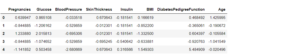
That’s how our dataset will be looking like when it is scaled down or we can see every value now is on the same scale which will help our ML model to give a better result.
Let’s explore our target column
y = diabetes_df_copy.Outcome
y
Output:
0      1
1      0
2      1
3      0
4      1
      ..
763    0
764    0
765    0
766    1
767    0
Name: Outcome, Length: 768, dtype: int64
Model Building
Splitting the dataset
X = diabetes_df.drop('Outcome', axis=1)
y = diabetes_df['Outcome']
Now we will split the data into training and testing data using the train_test_split function
from sklearn.model_selection import train_test_split

X_train, X_test, y_train, y_test = train_test_split(X,y, test_size=0.33,
                                                    random_state=7)
Random Forest
Building the model using RandomForest
from sklearn.ensemble import RandomForestClassifier

rfc = RandomForestClassifier(n_estimators=200)
rfc.fit(X_train, y_train)
Now after building the model let’s check the accuracy of the model on the training dataset.
rfc_train = rfc.predict(X_train)
from sklearn import metrics

print("Accuracy_Score =", format(metrics.accuracy_score(y_train, rfc_train)))
Output: Accuracy = 1.0
So here we can see that on the training dataset our model is overfitted.
Getting the accuracy score for Random Forest
from sklearn import metrics

predictions = rfc.predict(X_test)
print("Accuracy_Score =", format(metrics.accuracy_score(y_test, predictions)))
Output:
Accuracy_Score = 0.7677165354330708
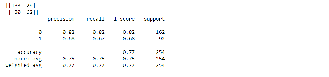
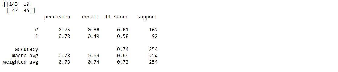
Classification report and confusion matrix of random forest model
from sklearn.metrics import classification_report, confusion_matrix

print(confusion_matrix(y_test, predictions))
print(classification_report(y_test,predictions))
Output:
Decision Tree
Building the model using DecisionTree
from sklearn.tree import DecisionTreeClassifier

dtree = DecisionTreeClassifier()
dtree.fit(X_train, y_train)
Now we will be making the predictions on the testing data directly as it is of more importance.
Getting the accuracy score for Decision Tree
from sklearn import metrics

predictions = dtree.predict(X_test)
print("Accuracy Score =", format(metrics.accuracy_score(y_test,predictions)))
Output:
Accuracy Score = 0.7322834645669292
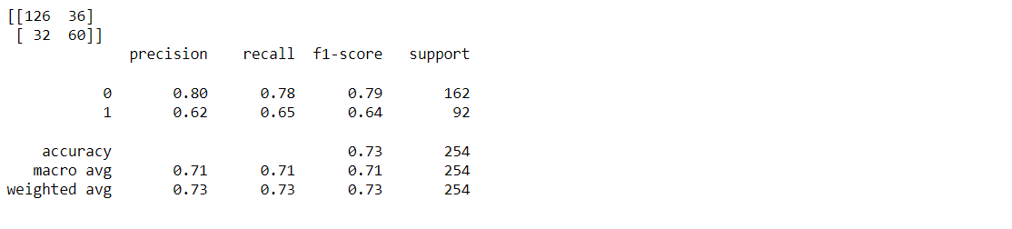
Classification report and confusion matrix of the decision tree model
from sklearn.metrics import classification_report, confusion_matrix

print(confusion_matrix(y_test, predictions))
print(classification_report(y_test,predictions))
Output:
XgBoost classifier
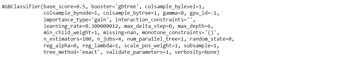
Building model using XGBoost
from xgboost import XGBClassifier

xgb_model = XGBClassifier(gamma=0)
xgb_model.fit(X_train, y_train)
Output:
Now we will be making the predictions on the testing data directly as it is of more importance.
Getting the accuracy score for the XgBoost classifier
from sklearn import metrics

xgb_pred = xgb_model.predict(X_test)
print("Accuracy Score =", format(metrics.accuracy_score(y_test, xgb_pred)))
Output:
Accuracy Score = 0.7401574803149606
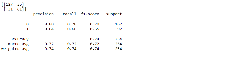
Classification report and confusion matrix of the XgBoost classifier
from sklearn.metrics import classification_report, confusion_matrix

print(confusion_matrix(y_test, xgb_pred))
print(classification_report(y_test,xgb_pred))
Output:
Support Vector Machine (SVM)
Building the model using Support Vector Machine (SVM)
from sklearn.svm import SVC

svc_model = SVC()
svc_model.fit(X_train, y_train)
Prediction from support vector machine model on the testing data
svc_pred = svc_model.predict(X_test)
Accuracy score for SVM
from sklearn import metrics

print("Accuracy Score =", format(metrics.accuracy_score(y_test, svc_pred)))
Output:
Accuracy Score = 0.7401574803149606
Classification report and confusion matrix of the SVM classifier
from sklearn.metrics import classification_report, confusion_matrix

print(confusion_matrix(y_test, svc_pred))
print(classification_report(y_test,svc_pred))
Output:
The Conclusion from Model Building
Therefore Random forest is the best model for this prediction since it has an accuracy_score of 0.76.
Feature Importance
Knowing about the feature importance is quite necessary as it shows that how much weightage each feature provides in the model building phase.
Getting feature importances
rfc.feature_importances_
Output:
array([0.07684946, 0.25643635, 0.08952599, 0.08437176, 0.08552636,
       0.14911634, 0.11751284, 0.1406609 ])
From the above output, it is not much clear that which feature is important for that reason we will now make a visualization of the same.
Plotting feature importances
(pd.Series(rfc.feature_importances_, index=X.columns).plot(kind='barh'))
Output:
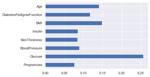
Here from the above graph, it is clearly visible that Glucose as a feature is the most important in this dataset.
Saving Model – Random Forest
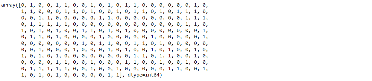
import pickle

# Firstly we will be using the dump() function to save the model using pickle
saved_model = pickle.dumps(rfc)

# Then we will be loading that saved model
rfc_from_pickle = pickle.loads(saved_model)

# lastly, after loading that model we will use this to make predictions
rfc_from_pickle.predict(X_test)
Output:
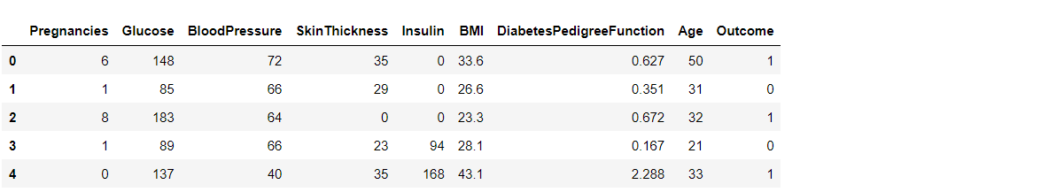
Now for the last time, I’ll be looking at the head and tail of the dataset so that we can take any random set of features from both the head and tail of the data to test that if our model is good enough to give the right prediction.
diabetes_df.head()
Output:
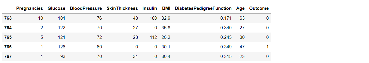
diabetes_df.tail()
Output:
Putting data points in the model will either return 0 or 1 i.e. person suffering from diabetes or not.
rfc.predict([[0,137,40,35,168,43.1,2.228,33]]) #4th patient
Output:
array([1], dtype=int64)
Another one
rfc.predict([[10,101,76,48,180,32.9,0.171,63]]) # 763 th patient
Output:
array([0], dtype=int64)
Conclusion
After using all these patient records, we are able to build a machine learning model (random forest – best one) to accurately predict whether or not the patients in the dataset have diabetes or not along with that we were able to draw some insights from the data via data analysis and visualization.
Here’s the repo link to this article.
About Me
Greeting to everyone, I’m currently working in TCS and previously, I worked as a Data Science Analyst in Zorba Consulting India. Along with full-time work, I’ve got an immense interest in the same field, i.e. Data Science, along with its other subsets of Artificial Intelligence such as Computer Vision, Machine learning, and Deep learning; feel free to collaborate with me on any project on the domains mentioned above (LinkedIn).
Here you can access my other articles, which are published on Analytics Vidhya as a part of the Blogathon (link)
The media shown in this article is not owned by Analytics Vidhya and are used at the Author’s discretion.