This article was published as a part of the Data Science Blogathon.
Introduction

Every data scientist has to build domain knowledge in every field because we have to tackle each problem that is probably faced by the world. If you don’t know what domain knowledge is? it is the knowledge of a specific field or having specialization in any field. we can also say that it is a piece of general knowledge, so as a data scientist we probably solve the real-world problems which were based on machine learning with the domain knowledge of the specific problem.
As a data scientist, we generally faced many real-life problems, like- some social issue, construction, etc.. we have to solve this type of problem using machine learning techniques, let’s we take an example of construction, what will you refer the word construction? it is the art and science to form objects, systems, or organizations. what will you imagine from the word construction is that mega buildings, machines, material, etc… but you know that what is used to build these mega buildings, for construction we use material, cement, iron rods, etc.. where the material is a most important part of building making.
” Use the best possible materials, and reveal the quality of those materials and the craftsmanship of their assembly “
The meaning of these beautiful words is that if we use the best quality material then you probably be the quality constructor. We can relate this quote with our example, we discuss above that certain things are used for making mega buildings but the material is most important. Material which is nature and man mad we will talk about man-mad material, in this concrete is most important man-mad material for building. concrete is made up of three basic components Water, aggregate, and portland cement. We know quality is the most important property for material used in building, if the quality of concrete is less then the build can’t stable but if we use the best quality concrete then the building is stable.
How we know that this concrete is quality proof or not, that we generally check the strength of concrete. In easy words the Compressive Strength of Concrete determines the quality of Concrete, we check it by standard crushing test on a concrete cylinder. Concrete strength is also considered a key factor in obtaining the desired durability. For testing strength it will take 28 days this is a large time, So what we will do now? By use of Data Science, we reduce this lot’s of effort we will predict that in how much quantity we have to use which raw material for good compressive strength.
So, we are going to analyze the Concrete Compressive Strength dataset and build a Machine Learning model to predict the quality:
Table of Contents
- Dataset
- Dataset knowledge
- Importing modules
- Reading data
- Study dataset
- Handling null values
- Exploratory data analysis
- Dividing independent and dependent variables
- Splitting the data
- Feature scaling
- Applying model
- Predicted values vs original values
- Saving the model
Dataset
We will use a concrete compressive strength dataset which was retrieved from the Kaggle, you can click here for the dataset.
Dataset knowledge
If you download this dataset, you see that several features affect the quality of concrete. So we discuss brief of each feature:
cement: a substance used for construction that hardens to other materials to bind them together.
slag: Mixture of metal oxides and silicon dioxide.
Flyash: coal combustion product that is composed of the particulates that are driven out of coal-fired boilers together with the flue gases.
Water: It is used to form a thick paste.
Superplasticizer: used in making high-strength concrete.
Coaseseaggregate: prices of rocks obtain from ground deposits.
fineaggregate: the size of aggregate small than 4.75mm.
age: Rate of gain of strength is faster to start with and the rate gets reduced with age.
csMPa: Measurement unit of concrete strength.
Now, we will import some important modules:
Importing Modules
For further process we have to import some important modules present in python:
# importing pandas
import pandas as pd
#importing numpy
import numpy as np
#importing matplotlib
import matplotlib.pyplot as plt
#importing seaborn
import seaborn as sb
So, we import pandas for data analysis, NumPy for calculating N-dimensional array, seaborn, and matplotlib to visualize the data.
Reading data
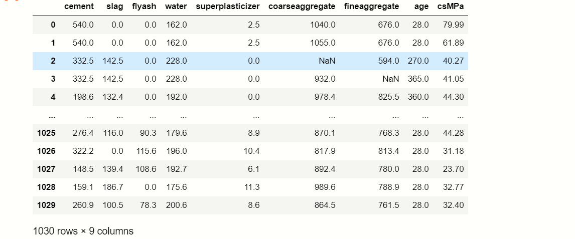
Generally, we use a dataset in the form of a CSV file, for reading this CSV file we will use the panda’s library, let’s see:
df = pd.read_csv(' Concrete_data.csv ')
df
Study Dataset
After reading the dataset we have to extract information from the data, for that we use the certain function:
df.info()
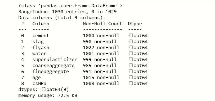
Here we notice that the count of null values in each feature and see what is the data type of features present in the dataset.
df.describe()

describe() method calculate the various calculation of each data point in the feature.
Handling Null values
Now, we handle the null values that are present in the dataset for better accuracy,
df.isnull().sum()
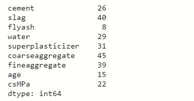
you can see that there are certain numbers of null values present in each feature, So we have to impute any other value to fill null values,
num= df.select_dtypes(include=['int64','float64']).keys()
from sklearn.impute import SimpleImputer
impute=SimpleImputer(strategy='mean')
impute_fit= impute.fit(df[num])
df[num]= impute_fit.transform(df[num])
df
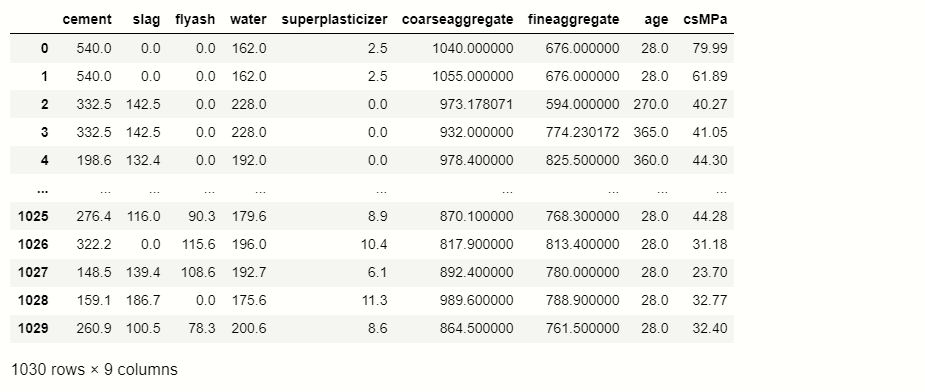
Here we use a method of transformer which is known as SimpleImputer, this is used to impute mean, median, and mode in the null values.
Exploratory Data Analysis(EDA)
EDA is an important step to build any machine learning project, it is an approach of analyzing datasets to summarize their main characteristics. With the help of EDA, we can able to take knowledge of features by just observing the plots and graphs.
So, here we will use some frequently used visualization techniques for observing data:
Pair plot:
It plots a pairwise relationship in the dataset, it will create a grid of axis where the y-axis belongs to row and the x-axis belongs to columns.
# pairplot of dataframe
sb.pairplot( df )
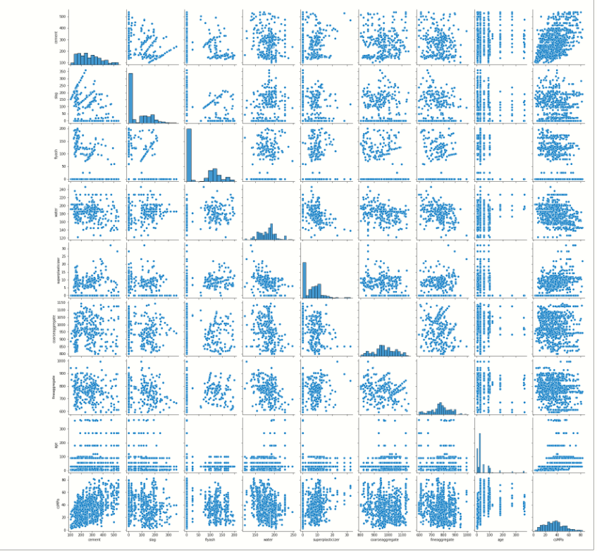
As you can see it plots the correlation between each feature.
Scatter Plot
This plot displays the relationship between any two sets of data.
# scatter plot of Water and Cement
plt.figure(figsize=[17,9])
plt.scatter(y='csMPa',x='cement',edgecolors='red',data=df)
plt.ylabel('csMPa')
plt.xlabel('cement')
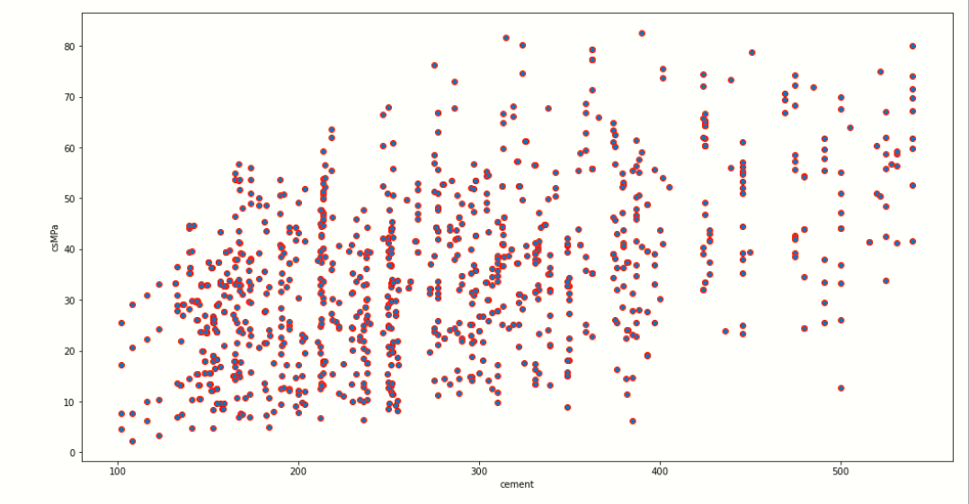
We use matplotlib to plot to scatter plot, in this image you can clearly see that the x-axis contains the cement data points which may vary from 100 to 500, and the y-axis presents the dependent variable csMPa where its data point vary from 0 to 80.
As we increase the amount of cement in the concrete then, the quality of concrete may also increase as shown in the scatter plot.
As per this, we can also plot the relationship between any other two features contain in the dataset. let us plot a scatter plot between csMPa and flyash.
plt.figure(figsize=[17,9])
plt.scatter(y='csMPa',x='flyash',edgecolors='blue',data=df)
plt.ylabel('csMPa')
plt.xlabel('flyash')
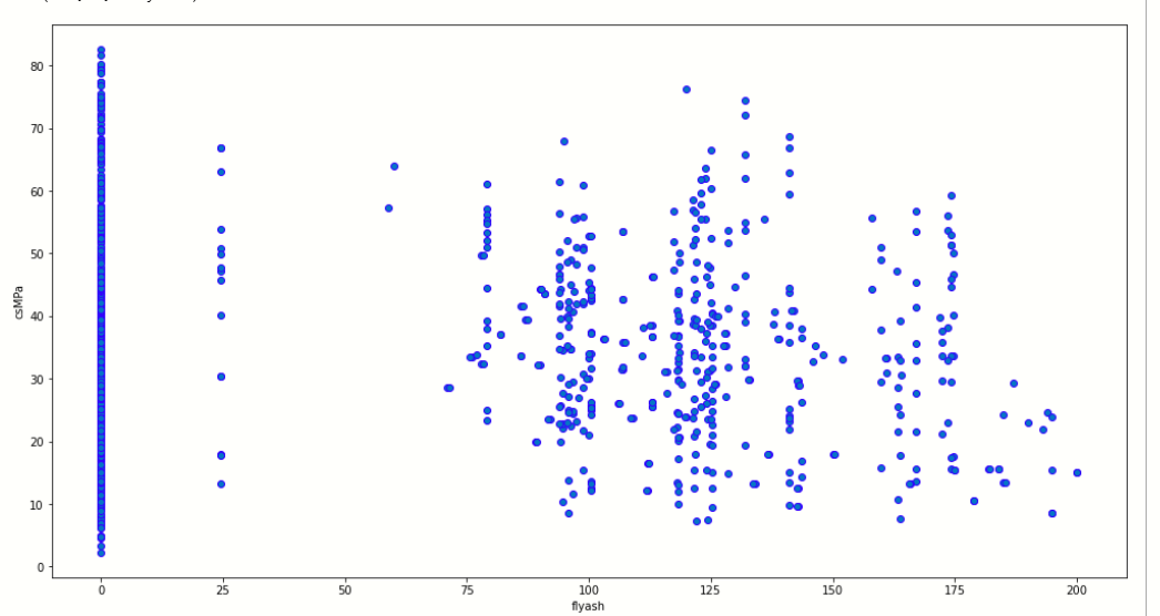
Now, we plot the correlation plot:
Correlation plot
The correlation plot shows the correlation coefficient between variables. This plot contains the correlation matrix-like table.
Now we visualize the correlation between variables by plotting plot:
plt.figure(figsize=[17,8])
#ploting correlation plot
sb.heatmap(df.corr(),annot=True)
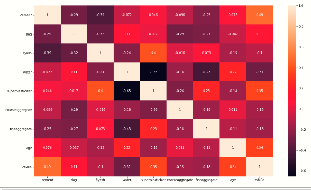
We use the seaborn library to plot the correlation plot between variables, here you see that there is one to one relationship between variable. Every variable is showing a relationship with another variable.
If we take observations from the heatmap then we find that cement has a strong correlation with water.
Now, we plot the outlier that is present inside the dataset:
Box plot
l=['cement','slag','flyash','water','superplasticizer','coarseaggregate','fineaggregate','age','csMPa']
for i in l:
    sb.boxplot(x=df[i])]' ]
    plt.show()
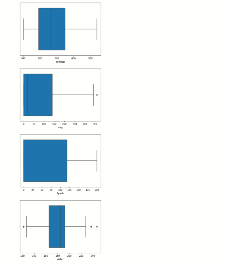
See in the water boxplot you notice that black dots present on the left and right sides of the lines, these dots are outlier than are present in a specific feature.
Dividing Dependent And Independent Variables
Before starting model building we have to divide the dataset into two parts,
- Independent variables contain a list of those variables in which concrete quality is dependent.
- The dependent variable is that variable that is dependent on other variables’ values.
# independent variables
x = df.drop(['csMPa'],axis=1)
# dependent variables
y = df['csMPa']
In this program, x contains the list of independent variables, and y contains the dependent variable in this case:
1. Independent variables are cement, flyash, water, superplasticizer, coaseseaggregate, fineaggregate, age.
2. dependent variable is the only csMPa
Splitting the data
Now we use the scikit-learn module train_test_split, which is used for splitting the training and testing parts.
# importing train_test_split
from sklearn.model_selection import train_test_split
xtrain,xtest,ytrain,ytest= train_test_split(x,y,test_size=0.3,random_state=42)
Feature Scaling
We do scaling of data for balancing the data points.
from sklearn.preprocessing import StandardScaler
stand= StandardScaler()
Fit = stand.fit(xtrain)
xtrain_scl = Fit.transform(xtrain)
xtest_scl = Fit.transform(xtest)
In this program first, we import train_test_split from scikit-learn then create StandardScaler() class object, after creating the object we fit train data into StandardScaler for scaling the data and then we transform the train and test data into an array.
Applying model
Machine learning consists of algorithms that can automate analytical model building. Using algorithms that iteratively learn from data. In this step, we applying several machine learning algorithms to training data.
Let’s see below:
Linear regression
# import linear regression models
from sklearn.linear_model import LinearRegression
from sklearn.metrics import mean_squared_error
lr=LinearRegression()
fit=lr.fit(xtrain_scl,ytrain)
score = lr.score(xtest_scl,ytest)
print('predcted score is : {}'.formate(score))
print('..................................')
y_predict = lr.predict(xtest_scl)
print('mean_sqrd_error is ==',mean_squared_error(ytest,y_predict))
rms = np.sqrt(mean_squared_error(ytest,y_predict))
print('root mean squared error is == {}'.format(rms))

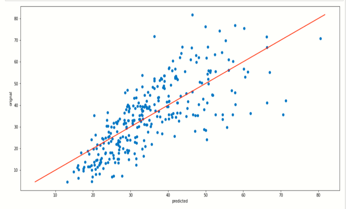
Now, we plot a scatter plot and fit the line for checking the prediction values,
plt.figure(figsize=[17,8])
plt.scatter(y_predict,ytest)
plt.plot([ytest.min(), ytest.max()], [ytest.min(), ytest.max()], color='red')
plt.xlabel('predicted')
plt.ylabel('orignal')
plt.show()

You can see how the line is partially fit our predicted data points.
Lasso and rigid regression
# import rigd and lasso regresion
from sklearn.linear_model import Ridge,Lasso
from sklearn.metrics import mean_squared_error
rd= Ridge(alpha=0.4)
ls= Lasso(alpha=0.3)
fit_rd=rd.fit(xtrain_scl,ytrain)
fit_ls = ls.fit(xtrain_scl,ytrain)
print('score od ridge regression is:-',rd.score(xtest_scl,ytest))
print('.......................................................')
print('score of lasso is:-',ls.score(xtest_scl,ytest))
print('mean_sqrd_roor of ridig is==',mean_squared_error(ytest,rd.predict(xtest_scl)))
print('mean_sqrd_roor of lasso is==',mean_squared_error(ytest,ls.predict(xtest_scl)))
print('root_mean_squared error of ridge is==',np.sqrt(mean_squared_error(ytest,rd.predict(xtest_scl))))
print('root_mean_squared error of lasso is==',np.sqrt(mean_squared_error(ytest,lr.predict(xtest_scl))))

This two regression algorithm gives a little bit different score of prediction from the linear regression.
Now, we plot a scatter plot of predicted data and plot a line,
the plot of ridge regression:-
plt.figure(figsize=[17,8])
plt.scatter(y_predict,ytest)
plt.plot([ytest.min(), ytest.max()], [ytest.min(), ytest.max()], color='red')
plt.xlabel('predicted')
plt.ylabel('orignal')
plt.show()
the plot of lasso regression:-
plt.figure(figsize=[17,8])
plt.scatter(y_predict,ytest)
plt.plot([ytest.min(), ytest.max()], [ytest.min(), ytest.max()], color='red')
plt.xlabel('predicted')
plt.ylabel('orignal')
plt.show()
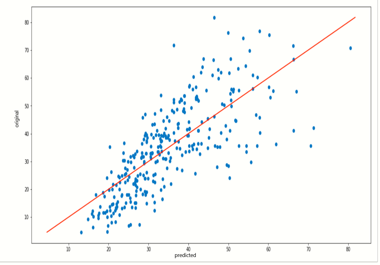
When we notice on these two plots they are quite similar because the prediction score or both algorithms is a little bit similar.
RandomForestRegressor
# import random forest regression
from sklearn.ensemble import RandomForestRegressor
from sklearn.metrics import mean_squared_error
rnd= RandomForestRegressor(ccp_alpha=0.0)
fit_rnd= rnd.fit(xtrain_scl,ytrain)
print('score is:-',rnd.score(xtest_scl,ytest))
print('........................................')
print('mean_sqrd_error is==',mean_squared_error(ytest,rnd.predict(xtest_scl)))
print('root_mean_squared error of is==',np.sqrt(mean_squared_error(ytest,rnd.predict(xtest_scl))))

The accuracy score of RandomForestRegressor is highest among linear, lasso, and ridge regression, so we use the RandomForestRegressor model, Here the highest accuracy means it predicts the quality of concert by using training, which contains independent variables, and also it gives less error rate.
Predicted Values vs Original Values
Now, we take a compression between the predicted values of the dependent variable csMPa and the original values of variable csMPa.
x_predict = list(rnd.predict(xtest))
predicted_df = {'predicted_values': x_predict, 'original_values': ytest}
#creating new dataframe
pd.DataFrame(predicted_df).head(20)
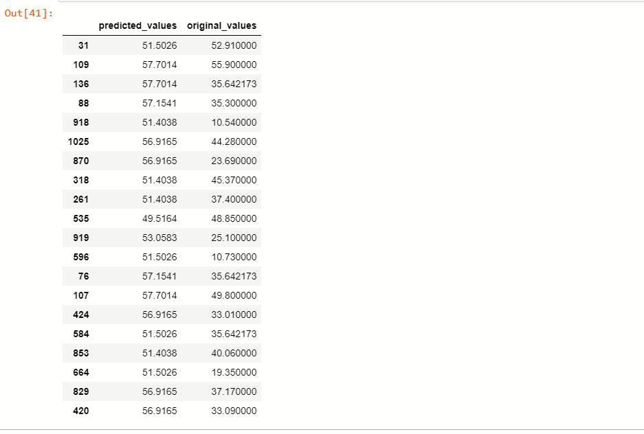
You can see that by applying the RandomForestRegressor model, the predicting values are quite similar to our original values.
Saving the Model
Now, we save our machine learning model using pickle.
import pickle
file = 'concrete_strength'
save = pickle.dump(rnd,open(file,'wb'))
End Notes
This article interacts with some of the algorithms that are used for predicting the values, as here we apply several models on data and find the best fit model. You as a beginner this article is very helpful for you, I hope you like this article.
Connect with me on LinkedIn: www.linkedin.com/in/mayur-badole-189221199
If you enjoyed it, check out other posts:
Wine Quality Prediction Using Machine Learning
BeautifulSoup Exception Handling
Thank You.


