This article was published as a part of the Data Science Blogathon
Introduction
Today, we have Agriculture data set with us for better understanding and we’ll be focused on how to think about these projects, rather than their implementation as many of us getting trouble in initiating and doing the ending of projects.
In this article, we do simple classification modeling and trying to get good accuracy.
You can download the dataset from here.
Aim :
To determine the outcome of the harvest season, i.e. whether the crop would be healthy (alive), damaged by pesticides, or damaged by other reasons.
Data Description:
We have two datasets given to train and test.
ID: UniqueID Estimated_Insects_Count: Estimated insects count per square meter Crop_Type: Category of Crop(0,1) Soil_Type: Category of Soil (0,1) Pesticide_Use_Category: Type of pesticides uses (1- Never, 2-Previously Used, 3-Currently Using) Number_Doses_Week: Number of doses per week Number_Weeks_Used: Number of weeks used Number_Weeks_Quit: Number of weeks quit Season: Season Category (1,2,3) Crop_Damage: Crop Damage Category (0=alive, 1=Damage due to other causes, 2=Damage due to Pesticides)
1. Importing Libraries and Dataset
The first step is importing the necessary libraries like NumPy, pandas, matplotlib, and seaborn in our notebook.
Then we move on to load the dataset from CSV format and convert it into panda DataFrame and check the top five rows to analyze the data.

2. Cleaning Dataset
1. Checking Null Values: By using dataset isnull().sum() we check that there were 9000 missing values present in the dataset i.e. in the Number_Weeks_Used variable.
2. Checking Datatypes: We checked Datatypes of all columns, to see any inconsistencies in the data.
3. Checking Unique Values: Now we have to understand unique values if present in columns, which will help to reduce dimensionality in future processing.
4. Replacing missing values: As there are 9000 missing values in the Number_Weeks_Used column so we can replace them by mode of the data. And again if we check null values we saw that there are no null values present in our dataset.
3. Exploratory Data Analysis :
In this part, we will be conducting EDA to gain insights into the data and get familiar with it.
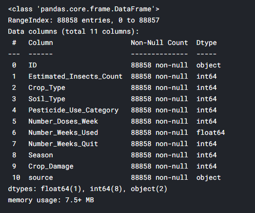
First, we will get information by using info() method.
- Correlation:
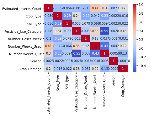
Checking correlation with sns.heatmap() .
Inferences drawn from heatmap:
1.Estimated_Insects_count,Pesticide_use_category and Number_weeks_used are positively correlated with Crop damage.
2.Number_weeks_used is positively correlated with Estimated_Insects_count and Pesticide_use_category.
3.Number_weeks_Quit is highly negatively correlated with Pesticide_use_category and Number_weeks_used.
- Data Visualization:
For gathering insights, data visualization is a must.
a. Univariate Analysis:
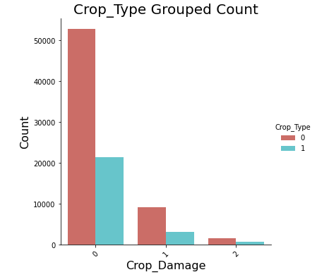
For univariate, I plotted countplot of Crop_Damage.
Observations:
- Crop damage due to pesticides is less in comparison to damage due to other causes.
- Crop type 0 has a higher chance of survival compared to crop type 1.
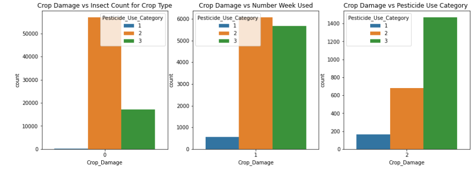
Now I plotted countplot for Crop_Damage vs Insect count for Crop Type.
Observations:
1.Type 2 pesticide is much safer to use as compared to Type 3 pesticide.
2.Type 3 pesticide shows most pesticide-related damage to crops.
Another plot in univariate analysis for gathering more insights.

Observations:
b. Bivariate Analysis:
Plotted barplot between Crop_Damage vs Estimated_Insects_Count.
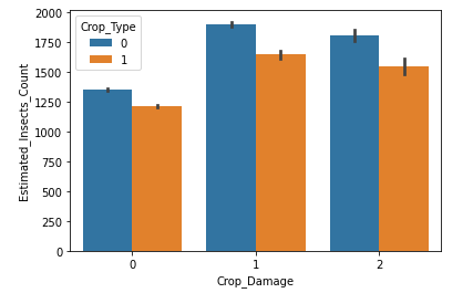
Clearly observed from the above plot that Most insect attacks are done on crop type 0.
Barplot between Crop_Type vs Number_Weeks_Used.
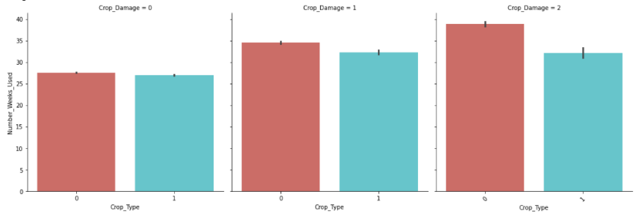
Observations:
1.Crop Type 0 is more vulnerable to pesticide-related and other damages as compared to Type1.
2.Avg. duration of pesticide-related damage is lower for Crop type 1.
4. Data Pre-processing :
-
Outliers Analysis :
Now we will check for outliers using Boxplot.
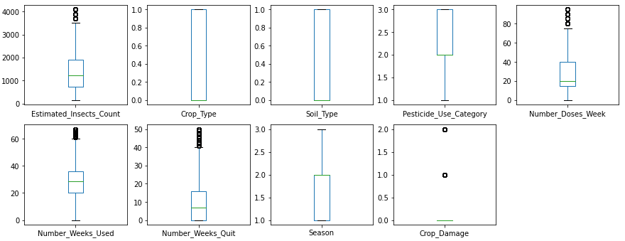
Clearly, some outliers are present in Insect_Count, doses_week, and number_weeks_quit columns.
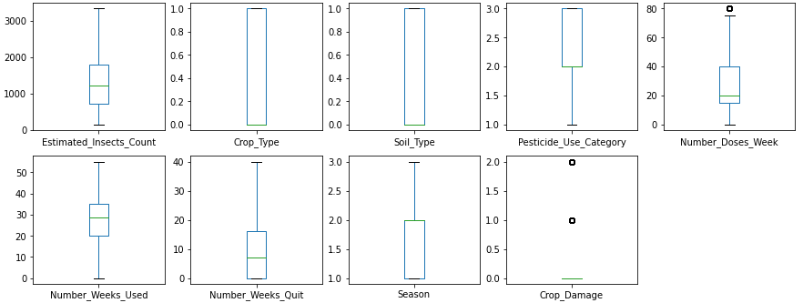
Now for removing these outliers I simply find the mean value of each column and replace it with an outlier value.
After removing outliers,
-
Skew Analysis :
Checking skewness of our data using histplot and observed that all the data is normally distributed.
Now, our dataset is ready to be put into the machine learning model for classification analysis.
5. Building Machine Learning Model:
Scaling Dataset:
As usual, the first step is to drop the target variable and then scaling the dataset by using Standard Scaler to make the data normally distributed.
Splitting Dataset:
After preprocessing, we now split the data into training/testing subsets.
Evaluating Models:
We now checked various classification models and calculated metrics such as the precision, recall, and F1 score.
The models we will run here are:
- Random Forest
- K Nearest Neighbor(KNN)
- Decision Tree Classifier
- Gaussian NB

From initial model accuracy values, we see that KNN is performing better than others with 83% accuracy. It has a maximum accuracy score and minimum standard deviations.
Now I find best parameter i.e. n_neighbors using GridSearchCV taking ‘n_neighbors’ range = (2,30) , cv = 5 and scoring = ‘accuracy’ for our KNN model and found n_neighbor = 22.
Again running the KNN model with its best parameters i.e. n_neighbor = 22.
Result :

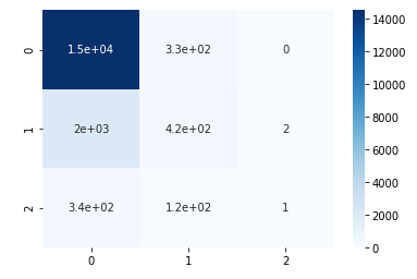
To check model performance, we will now plot different performance metrics.
a. Confusion Matrix:
b. Precision and Recall :
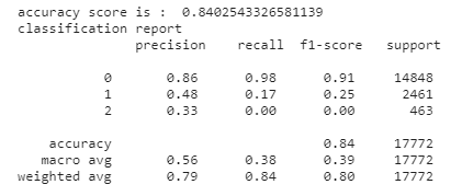
From observation, we found decent accuracy ( ~0.84), precision, and recall for the model. This indicates that the model is a good fit for the prediction.
For better results, one can do hyperparameter tuning which will help in increasing the accuracy of the model.
But overall KNN gives good accuracy among all the models so we save it as our final model.
For your reference you can check my complete solution and dataset used from this link:
https://github.com/priyalagarwal27/Crop-Detection-and-Prediction-using-Classification-
Hope this would be helpful for you. Please share what’s your results and suggestions on this down below in the comment section. Hope you liked the article as well. For more reading check out my other articles also:
https://github.com/priyalagarwal27/Regression-on-ELECTION-dataset
https://github.com/priyalagarwal27/Classification—SLOAN-Space-Dataset
Thanks for reading !!! Cheers!
About the author:
Priyal Agarwal
Please feel free to contact me on Linkedin, Email.
The media shown in this article are not owned by Analytics Vidhya and are used at the Author’s discretion.


