Summary
- Google TV is now getting a makeover with a focus on cleaning up the home screen and organizing the
Your apps
section. - Circular icons now allow more apps to fit in the
Your apps
section, making it easier to personalize and access your favorite streaming platforms. - A new icon for free channels gives instant access to live streaming without a subscription, saving users time and hassle in finding favorites.
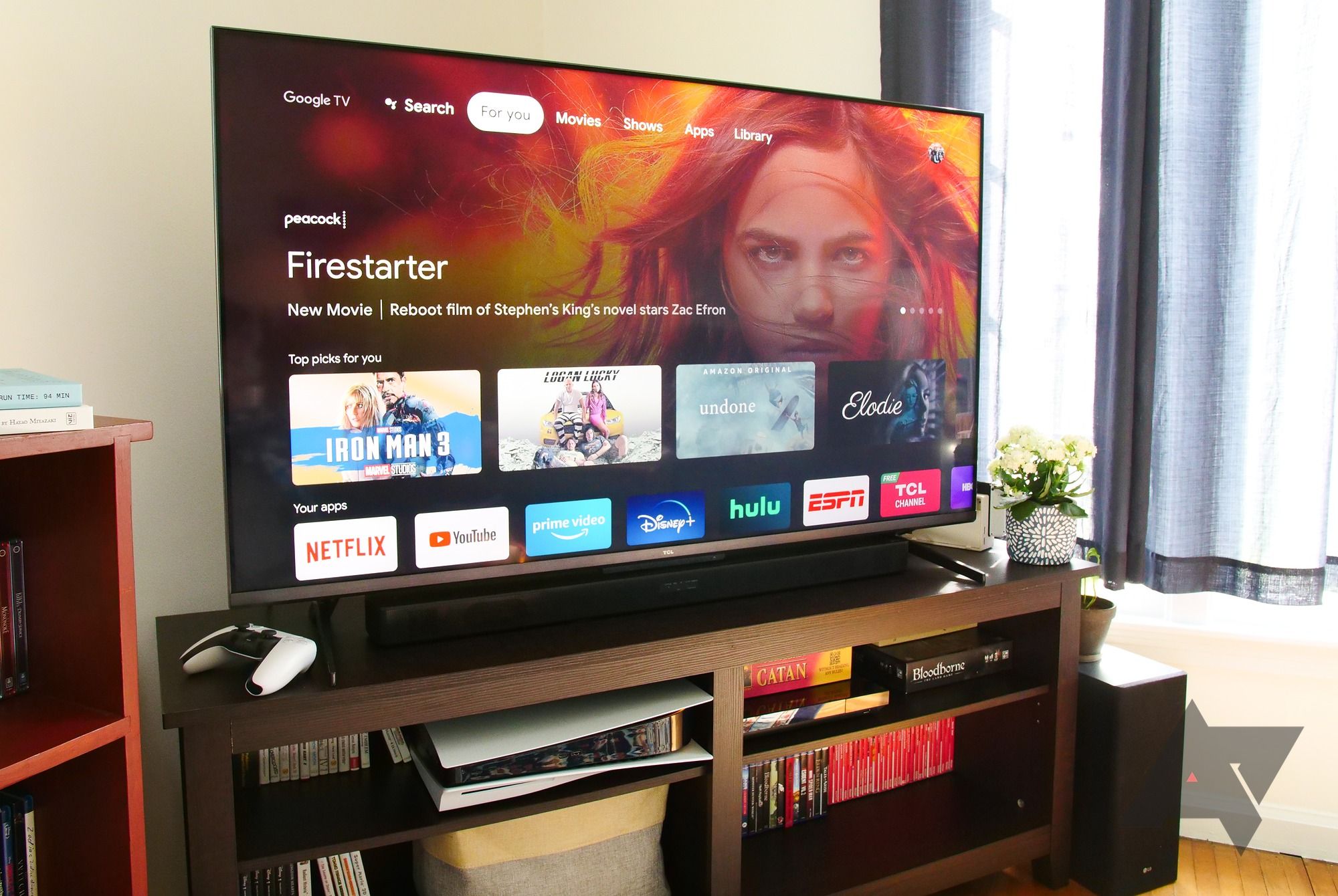
Smart TV setups can sometimes get a bit messy with their cluttered home screens. So, it’s good news that Google is giving Google TV a makeover, cleaning up the home screen, and putting more emphasis on organizing the Your apps row. This update was announced last month, and now it’s making its way to Chromecast with Google TV devices.
As spotted by 9to5Google, the update is rolling out in the United States. If you own a Chromecast (HD or 4K) that’s got the green light for this redesign, make sure you’ve installed the latest software update.
What changes have been made to the Google TV home screen?
The standout change in this update is a makeover of the icons in the Your apps section; they’ve gone from rectangle to circular. This means more apps can squeeze into the horizontal row, making scrolling less of a workout. Plus, Google TV has thrown in the “Reorder” and “Add apps” buttons, making it a breeze to personalize. Now you can easily put your favorite streaming platforms upfront for quick and easy access.

The top 7 Google TV tips and tricks you must try today
There are a ton of things to play with on your new Chromecast with Google TV
Additionally, there’s a shiny new icon for free channels from Google TV right in the Your apps section. Just tap, and you’ve got instant access to all the live streaming channels without needing a subscription, including news, movies, and sports coverage. Plus, with the revamped design, you’ll find more of your go-to apps in the lineup, saving you the hassle of searching for your favorites.
If you’re using a Chromecast with Google TV, you’re probably soaking in the update as we speak. But Google says this redesign will be rolling out to all the compatible devices over the “next few months.” That said, if your TV comes with Google TV pre-installed, you might need to keep an eye out for the update from your TV manufacturer.
Switching to circular icons is Google’s way of saying goodbye to the old and embracing something new for its TV platform. It’s part of the search giant’s ongoing effort to spruce up how users interact with their smart TVs. While it might seem like a tiny tweak, it’s a welcomed one for sure. Despite Google TV still serving up plenty of recommendations and ads, this update brings a smoother navigation experience and a cleaner overall look—definitely a win for Google TV enthusiasts.


