Overview
In this article, we will detail the need for data scientists to quickly develop a Data Science App, with the objective of presenting to their users and customers, the results of Machine Learning experiments.
We have detailed a roadmap for the implementation of the app on the Web, which extracts data from the stock exchange through the InvestPy Python Library, with the resources of the Python Pandas library, we process this data and make them available in interactive candlestick format through the Python’s Plotly library.
In this way, the Data Scientist will be able to customize the new Data Science App for new business models, using this article as a basis.
For more complex environments, we offer alternatives to Streamlit.io, which can be used for more robust business solutions.
Table of Contents
- 1. Introduction
- 2. Traditional Frontend Application
- 3. StreamLit Frontend Application
- 4 InvestPy Investment Library
- 5. Notebook Monitor Shares Stock Exchange
- 6. Application Frontend Monitor Shares Stock Exchange
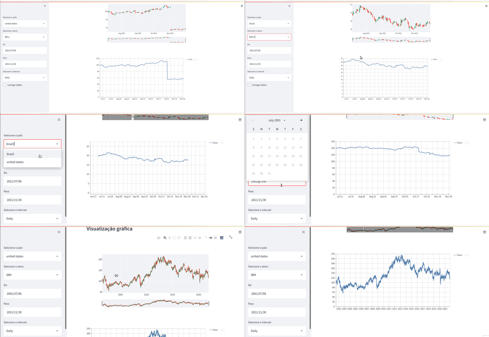
- 7. Demo Frontend Monitor Shares Stock Exchange
- 8. Alternatives to StreamLit
- 9. Conclusions
- 10. References
Introduction
This article aims to be a guide for the Junior Data Scientist, for the implementation of a Data Science App in an agile way, it can be extended to an app of greater complexity.
For simpler and less complex data views, I recommend Streamlit.io, for more complex applications that need user authentication, data sharing via API, using the HTTP get, put and post methods, I recommend Flask and Django.
We have Voilà an extension of the jupyter notebook, easy to implement and very flexible for data visualization through the app on web.
Traditional Frontend Application
Any application based on web frontend technology runs scripts based on JavaScript, HTML, and CSS in the browser.
JavaScript is the language, responsible for the logic and user flow within the web page. HTML is responsible for the content of information and CSS is the language responsible for the styling.
Many Data Scientists do not master these frontend technologies, so alternatives to Python Frameworks are emerging to implement a Data Science App frontend, without the need for additional knowledge in JavaScript, HTML, and CSS.
We can mention four Python Frameworks alternatives, for creating a Data Science App, we have:
- StreamLit
- Django
- Flask
- Voila
StreamLit Frontend Data Science App
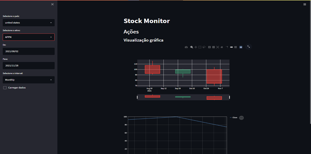
This experiment is for the Data Scientist, to see the potential of Streamlit, for a quick demonstration of the feasibility of a Data Science application.
We start by extracting data from the stock exchange through the Python InvestPy library, where we can choose which stock exchange to query in the United States or Brazil, we select the Asset to perform the query, such as Google, Apple, Facebook.
We inform the start date of the analysis and the end date for data analysis, and the frequency of data analyzed, which can be: daily, weekly, or monthly. The frequency of the data directly affects the visualization of the data, through candlesticks, which present information on the median, minimum, maximum, and 25% and 75% quartiles.
How to Execute the App in Streamlit :
 streamlit run app.py
 2021-11-30 18:17:37.002 INFO
 numexpr.utils: NumExpr defaulting to 4 threads.
  You can now view your Streamlit app in your browser.
  Local URL: http://localhost:8501
  Network URL: http://172.31.10.3:8501
Features Data Science App:
- Country Selection
- U.S
- Brazil
- First period
- Final Period
- Analysis Type
- Daily
- Weekly
- Monthly
https://github.com/DataScience-2021/Analytics-Vidhya/blob/main/Web-App-Streamlit/Web-App-Article-Analytics/Slide3.PNG
Demonstration Data Science App, based on Streamlit.io:

InvestPy Financial Market Library
InvestPy is a library developed by the investing.com portal, which retrieves real-time data from approximately 40,000 shares from various stock exchanges and 80,000 investment funds, indices, bonds, commodities, and cryptocurrencies.
Through this Python library, the Data Scientist has access to a vast collection of the main markets in the world.
investing.com
Import from libraries
import streamlit as st
import investpy as ip
from datetime import datetime, timedelta
import plotly.graph_objs as go

Market definition:
countries = ['brazil', 'united states']
intervals = ['Daily', 'Weekly', 'Monthly']
start_date = datetime.today()-timedelta(days=30)
end_date = datetime.today()
CandleStick definition:
def plotCandleStick(df, acao='ticket'):
    trace1 = {
        'x': df.index,
        'open': df.Open,
        'close': df.Close,
        'high': df.High,
        'low': df.Low,
        'type': 'candlestick',
        'name': acao,
        'showlegend': False
    }
Notebook Monitor Shares Stock Exchange for Data Science App
Web Application with Streamlit
Financial Market Dashboard
Countries USA & Brazil
!pip install investpy
!pip install streamlit
import investpy as ip
import pandas as pd
Get Financial Assets
countries = ['brazil', 'united states']
acoes_br = ip.get_stocks_list(country='brazil')
acoes_us = ip.get_stocks_list(country='united states')
acoes_in = ip.get_stocks_list(country='india')
# Set Default Exchange Stock
acoes = acoes_br
acoes = acoes_us
Stock Query
Plot CandleStick
import plotly.graph_objs as go
def plotCandleStick(df, acao='ticket'):
    tracel = {
        'x': df.index,
        'open': df.Open,
        'close': df.Close,
        'high': df.High,
        'low':df.Low,
        'type': 'candlestick',
        'name': acao,
        'showlegend': False
    }
    data = [tracel]
    layout = go.Layout()
    fig = go.Figure(data=data, layout=layout)
    return fig
#fig = plotCandleStick(df)
fig = plotCandleStick(df)
fig #ENGIE BR
fig #IBM US
Data Science App Frontend Monitor Shares Stock Exchange
Below is the code in Python language, based on the StreamLit Framework, when running the App we have a web application available efficiently.
import streamlit as st
import investpy as ip
from datetime import datetime, timedelta
import plotly.graph_objs as go


countries = ['brazil', 'united states']
intervals = ['Daily', 'Weekly', 'Monthly']

start_date = datetime.today()-timedelta(days=30)
end_date = datetime.today()


@st.cache(allow_output_mutation=True)
def consultar_acao(stock, country, from_date, to_date, interval):
    df = ip.get_stock_historical_data(
        stock=stock, country=country, from_date=from_date,
        to_date=to_date, interval=interval)
    return df


def format_date(dt, format='%d/%m/%Y'):
    return dt.strftime(format)


def plotCandleStick(df, acao='ticket'):
    trace1 = {
        'x': df.index,
        'open': df.Open,
        'close': df.Close,
        'high': df.High,
        'low': df.Low,
        'type': 'candlestick',
        'name': acao,
        'showlegend': False
    }

    data = [trace1]
    layout = go.Layout()

    fig = go.Figure(data=data, layout=layout)
    return fig


# CRIANDO UMA BARRA LATERAL
barra_lateral = st.sidebar.empty()
country_select = st.sidebar.selectbox("Selecione o país:", countries)
acoes = ip.get_stocks_list(country=country_select)
stock_select = st.sidebar.selectbox("Selecione o ativo:", acoes)
from_date = st.sidebar.date_input('De:', start_date)
to_date = st.sidebar.date_input('Para:', end_date)
interval_select = st.sidebar.selectbox("Selecione o interval:", intervals)
carregar_dados = st.sidebar.checkbox('Carregar dados')


grafico_line = st.empty()
grafico_candle = st.empty()

# elementos centrais da página
st.title('Stock Monitor')

st.header('Ações')

st.subheader('Visualização gráfica')


if from_date > to_date:
    st.sidebar.error('Data de ínicio maior do que data final')
else:
    df = consultar_acao(stock_select, country_select, format_date(
        from_date), format_date(to_date), interval_select)
    try:
        fig = plotCandleStick(df)
        grafico_candle = st.plotly_chart(fig)
        grafico_line = st.line_chart(df.Close)
        if carregar_dados:
            st.subheader('Dados')
            dados = st.dataframe(df)
            stock_select = st.sidebar.selectbox
    except Exception as e:
        st.error(e)


