Introduction
Finding underlying patterns and taking decisions is very critical in Stock market. The same skill can be applied to many parallel domains. For example, I met some one who was doing the same thing with Cryptocurrency recently. Risk & Unemployment prediction in banks, customer churn in telecom and spend analysis are all examples of similar problems.
That is why I decided to create this series of articles. By following this series, you will understand some of the techniques used in stock market. You can also apply them to the parallel domains I mentioned before.
In the last article (Part I) , we started with descriptive analysis for comparison on stocks. In this post, we will emphasize on identifying patterns in order to know how a stock behaves. This behavior, as you will see later on, is very important for stock trading. In the latter part of the article, I will show how to predict stock prices using the conventional ARIMA (Auto-Regressive intensive Moving Average Method) methodology from Time Series Analysis and Regression Model.
So lets get on with it!
Table of Contents
- Setting up the System
- Trading with Bollinger Bands
- Analyzing the Volatility of Bank Stocks
- Prediction of Stock Prices using ARIMA
Setting up the System
I will mention below the packages necessary to get on hands on in this article. Make sure you have them set up in your system before you continue.
- Quandl Data Download
- tidyverse Use of tibble to group and perform single operation on multiple groups
- tidyquant for Time Series and Financial functions to perform the analysis
Trading with Bollinger Bands
Perhaps the most important thing when you get into stock market trading is to know what Bollinger Bands are. In this section, I will mention what they are and how they were discovered.
What are Bollinger Bands?
The Bollinger Band was introduce by John Bollinger in 1980s. These Bands depict the volatility of stock as it increases or decreases. The bands are placed above and below the moving average line of the stocks. The wider the gap between the bands, higher is the degree of volatility.
On the other hand, as the width within the band decreases, lower is the degree of volatility of the stock. At times, the width within the band is constant over a period of time, which shows the constant behavior of a certain stock over that period of time.
There are three lines in the Bollinger Band,
- The middle line with N-period moving average (MA); 20-day SMA
- An upper band at K times an N-period standard deviation above the moving average; 20-day SMA + (20-day standard deviation of price x 2)
- A lower band at K times an N-period standard deviation below the moving average; 20-day SMA – (20-day standard deviation of price x 2)
Note: SMA is Simple Moving Average, Standard Deviation, K and N period is usually set at 20 days. The upper and lower band are placed 2 units above and below respectively.
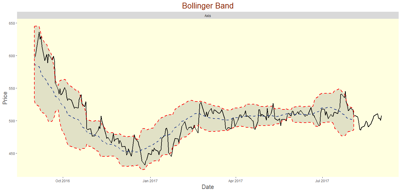
Below image is the typical example for Bollinger Band. This shows the volatility of Axis Bank stock for the period of 1 year from 1st September, 2016 to 1st September, 2017. The gap was higher in the months of September till December.
Aspects of Bollinger Bands
In this section, we will discuss few aspects of Bollinger Band. This information can be used in different stock trading.
- If an uptrend is strong, then stock touches the upper band on regular basis and remains above the middle line.This signals the strong movement towards North.
- If downtrend is strong, then stong touches the lower band on regular basis and remains below the middle line. This signals strong southward movement.
- During the upward trend the price should not be below the lower band otherwise it is signalling the reverse movement.
- During the downward trend, if the price move above the upper band then it signals Northward movement.
The study will discuss the above points along with the identification of popular patterns like “W – Bottoms” & “M – Tops” in Bollinger band.
Keep it Clean!
We will keep the data clean with tidyverse. In this section we will first download the data with the help of Quandl package and then manipulate the dataframe with tidyverse to get our desired dataset,
## Required Packages
library(Quandl)
library(tidyverse)
library(tidyquant)
library(timetk)
library(forecast)
library(gridExtra)
Code Break up for Quandl and Quandl API key,
If you haven’t gone through this in my previous post on Comparative Stock Analysis Vol-I , lets setup up the Quandl API
## Setup the Quandl Free Acount and API Key, Please copy and paste the API key in order to #authinticate

Quandl.api_key("<Your-API-Key>")

## Download the data Set
ICICI = Quandl("NSE/ICICIBANK",collapse="daily",start_date="2016-09-01",type="raw")
PNB= Quandl("NSE/PNB",collapse="daily",start_date="2016-09-01",type="raw")
Axis=Quandl("NSE/AXISBANK",collapse="daily",start_date="2016-09-01",type="raw")
Canara=Quandl("NSE/CANBK",collapse="daily",start_date="2016-09-01",type="raw")
BOB=Quandl("NSE/BANKBARODA",collapse="daily",start_date="2016-09-01",type="raw")
SBI=Quandl("NSE/SBIN",collapse="daily",start_date="2016-09-01",type="raw")

## Add another ("Stock") coloumn in Datasets using cbind command

ICICI<-cbind(ICICI,Stock="")
PNB<-cbind(PNB,Stock="")
Axis<-cbind(Axis,Stock="")
SBI<-cbind(SBI,Stock="")
Canara<-cbind(Canara,Stock="")
BOB<-cbind(BOB,Stock="")

## Paste the stock name in stock coloumn

ICICI$Stock<-paste(ICICI$Stock,"ICICI",sep="")
PNB$Stock<-paste(PNB$Stock,"PNB",sep="")
Axis$Stock<-paste(Axis$Stock,"Axis",sep="")
SBI$Stock<-paste(SBI$Stock,"SBI",sep="")
Canara$Stock<-paste(Canara$Stock,"Canara",sep="")
BOB$Stock<-paste(BOB$Stock,"BOB",sep="")

## Consolidate under one dataset

Master_Data<-rbind(ICICI,PNB,Axis,SBI,Canara,BOB)

## Coerce the Date variable into as.Date from character

Master_Data$Date<-as.Date(Master_Data$Date)

end<-ymd("2017-09-01")
start<-ymd("2016-09-01")

Master_Data<-Master_Data%>%
  tibble::as_tibble() %>%
group_by(Stock)
Identification of Patterns
There are patterns which are usualy seen in stock market data. These patterns (or signals) help us identify the behavior of stocks. Let us quickly understand the two most popular ones (W-Bottoms and M-Tops)
1. Signal: W – Bottoms
A “W-Bottom” forms in a downtrend and involves two reaction lows. In particular, Bollinger looks for W-Bottoms where the second low is lower than the first but holds above the lower band. There are four steps to confirm Bollinger “W – Bottoms”,
- First, a reaction low forms. This low is usually,below the lower band (Not Always).
- Secondly, there is a bounce towards the middle band.
- Thirdly, there is a new price low in the security. This low holds above the lower band.
- Fourth, the pattern is confirmed with a strong move off the second low and a resistance break.
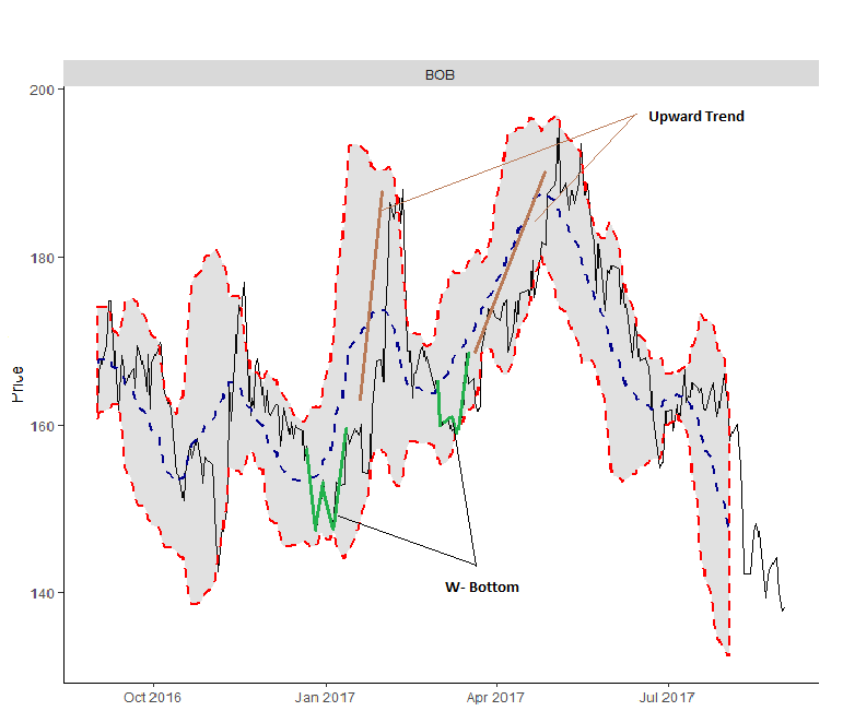
Below image is the “W-Bottoms” identification for BOB (Bank of Baroda). Both of the W-Bottoms are followed by strong northward move in February and May, 2017 respectively.
2. Signal: M-Tops
An M-Top is similar to a double top. M-Tops are reversal signals from upward trend into a downward trend. The first high can be higher or lower than the second high. Initially there is a wave higher, which gets close to or move above the upper band. Then price will move downward to middle band and then continues northward journey, might or might not touch the upper band (at times it goes above the previous high) and then does not close above the upper band.
Bollinger suggests looking for signs of non-confirmation when a security is making new highs.A non-confirmation occurs with three steps.
- First, a security creates a reaction high above the upper band.
- Second, there is a pullback towards the middle band.
- Third, prices move above the prior high but fail to reach the upper band. This is a warning sign. The inability of the second reaction high to reach the upper band shows waning momentum, which can foreshadow a trend reversal. Final confirmation comes with a support break or bearish indicator signal.
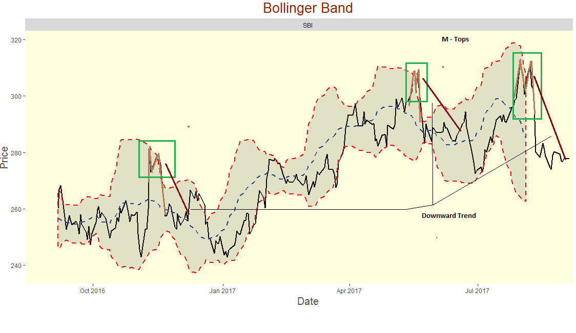
Below is the image for MTOPS signal for SBI (State Bank Of India) stock in NSE over the period of one year starting from 1st sept, 2016 to 1st sept, 2017. Each of the MTops are followed by decline in prices in the months of Nov-Dec, May and August.
If you want to get more information on the Bollinger Band and related identification patterns. Below are the links to the resources,
Analyzing the Volatility of Bank Stocks
Let us visualize the volatility (gap between the upper and lower band) and also try to identify the patterns / signals in our six selected bank stocks.
 ## Visualisation of BBand in ggplot2

 Master_Data%>%filter(Stock=="ICICI"|Stock=="PNB")%>%ggplot(aes(x=Date,y=Close))+
    geom_line(size=1)+
    geom_bbands(aes(high = High, low = Low, close = Close), ma_fun = SMA, sd=2,n = 20,size=0.75,
        color_ma = "royalblue4", color_bands = "red1")+
    coord_x_date(xlim = c(start, end), expand = TRUE)+
    facet_wrap(~ Stock, scales = "free_y")+
    labs(title = "Bollinger Band", x = "Date",y="Price") +
  theme(text = element_text(family = 'Gill Sans', color = "#444444",hjust=0.5)
        ,panel.background = element_rect(fill = 'lightyellow')
        ,panel.grid.minor = element_blank(),
        ,panel.grid.major = element_blank()
        ,plot.title = element_text(size = 20,hjust=0.5,colour="orangered4")
        ,axis.title = element_text(size = 18, color = '#555555')
        ,axis.title.y = element_text(hjust=0.5,size=15)
        ,axis.title.x = element_text(hjust = 0.5,size=15)
        ) +
theme(legend.position="none")- MTOP formed in Nov (Signalling downward trending).Prices declined to a new low till January 2017.
- Volatility for the ICICI stock over the epriod of 1 year was very high in october, 2016. It was constant for the month of 3 months (march to may,2017) when the prices were in the range of Rs 265 to Rs 285.
- PNB Stock shows mutiple MTOPS over the period of 1 year followed by strong downward trend.
- PNB has high volatility, it shows erratic upward and downward movement through out the year.It touches to a new low below RS 120 in Jan 2017 and reaches a new high RS 175 in the month of May, 2017.
Master_Data%>%filter(Stock=="Axis"|Stock=="SBI")%>%ggplot(aes(x=Date,y=Close))+
    geom_line(size=1)+
    geom_bbands(aes(high = High, low = Low, close = Close), ma_fun = SMA, sd=2,n = 20,size=0.75,
        color_ma = "royalblue4", color_bands = "red1")+
    coord_x_date(xlim = c(start, end), expand = TRUE)+
    facet_wrap(~ Stock, scales = "free_y")+
    labs(title = "Bollinger Band", x = "Date",y="Price") +
  theme(text = element_text(family = 'Gill Sans', color = "#444444",hjust=0.5)
        ,panel.background = element_rect(fill = 'lightyellow')
        ,panel.grid.minor = element_blank(),
        ,panel.grid.major = element_blank()
        ,plot.title = element_text(size = 20,hjust=0.5,colour="orangered4")
        ,axis.title = element_text(size = 18, color = '#555555')
        ,axis.title.y = element_text(hjust=0.5,size=15)
        ,axis.title.x = element_text(hjust = 0.5,size=15)
        ) +
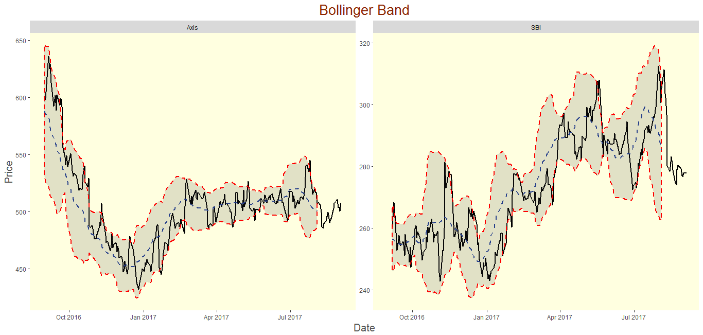
theme(legend.position="none")- MTOP formed in Oct,2016(Signalling downward trending).Prices declined to a new low til January 2017 to RS 420 from a previous high of Rs650 in sept, 2016. In 4 months time prices declined by Rs 230.
- Volatility for the ICICI stock was higher for 6 months till March,2017. But after March, Prices were ranging from Rs 470 to Rs 520 for the later part of the year. Here it was almost constant and seems to converge.
- SBI Stock shows mutiple MTOPS over the period of 1 year followed by strong downward trend.
- SBI has high volatility, it shows erratic upward and downward movement through out the year.
Master_Data%>%filter(Stock=="Canara"|Stock=="BOB")%>%ggplot(aes(x=Date,y=Close))+
    geom_line(size=1)+
    geom_bbands(aes(high = High, low = Low, close = Close), ma_fun = SMA, sd=2,n = 20,size=0.75,
        color_ma = "royalblue4", color_bands = "red1")+
    coord_x_date(xlim = c(start, end), expand = TRUE)+
    facet_wrap(~ Stock, scales = "free_y")+
    labs(title = "Bollinger Band", x = "Date",y="Price") +
  theme(text = element_text(family = 'Gill Sans', color = "#444444",hjust=0.5)
        ,panel.background = element_rect(fill = 'lightyellow')
        ,panel.grid.minor = element_blank(),
        ,panel.grid.major = element_blank()
        ,plot.title = element_text(size = 20,hjust=0.5,colour="orangered4")
        ,axis.title = element_text(size = 18, color = '#555555')
        ,axis.title.y = element_text(hjust=0.5,size=15)
        ,axis.title.x = element_text(hjust = 0.5,size=15)
        ) +
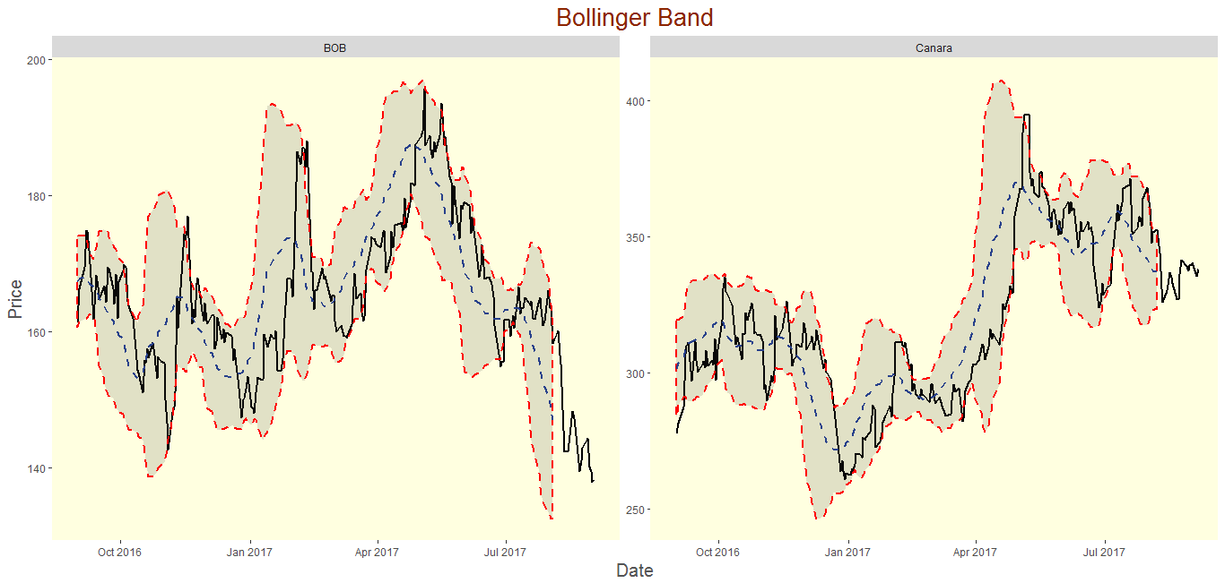
theme(legend.position="none")- Both the Stocks BOB and Canara shows similar price movement through out the year. both of them declined from oct 2016 to mid of Jan 2017 and then shown improvement till April. But After April both the stocks were on opposite directions. Canara went northwards, where as BOB went southward.
- BOB shows W Bottoms in Jan 2017 and April followed with strong upward movement.
Prediction of Stock Prices
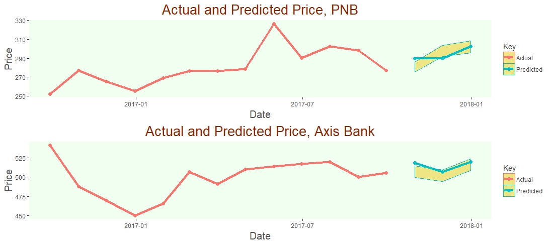
In this section, we will predict the prices for two selected bank PNB and Axis Bank. In stock market, generally the prices are dynamic and depends on various factors like news, weather, public policy, interest rate. It is difficult to predict the stock price behavior as it depends on lots of factor. In order to get more accuracy in prediction, we’ve used two different approach to come to prediction.
- Regression Approach
- ARIMA (Auto Regressive Intensive Moving Average)
In the last post, we have seen that the stock prices is also dependent on the traded quantity, but direction can be either ways. In our analysis, we will take consideration of these movements. We will also analyze the random part of the stock price movement, so called white noise and will include in our prediction model.
There is also available study on white noise on Analytics Vidhya by Tavish Srivastava.
The following points are the steps to arrive at Predictions
- Download the dataset in mothly format from Quandl
- Build the regresssion Model “m1” & “m3”
- Build the ARIMA model “p2.df” & “p4.df”
- Combine the regression and Arima model together “p1.df” & “p3.df”
- Prediction dataset has parameter like Close Price, Confidence intervals (“lwr(lower)” & “upr(Upper)”, Key (Prediciton/Actual)
- Add Date variable in the predcition dataset for three months “October”, “November” & “December”.
- Reorder the columns of Prediction Datasets.
- Modification of the Actual Datasets for Axis and PNB; keep only Date and Close price by using dplyr package.
- Add the variables like Confidence interval (“lwr” & “upr”), “Key”
- Combine Both the dataset Prediction and Actual into new dataframe like “Axis_com”
- Apply ggplot for the both the dataset
- use gridExtra package to arrange the plots.
Note: ggplot shows the prediction and actual prices. Predcition prices has the band for lower and upper limit.
    ## Download the data Set
PNB = Quandl("NSE/ICICIBANK",collapse="monthly",start_date="2016-09-01",type="raw")
Axis=Quandl("NSE/AXISBANK",collapse="monthly",start_date="2016-09-01",type="raw")

## Convert the PNB & Axis Data Set into df for regression model

PNB_df=PNB
Axis_df=Axis
colnames(PNB_df)<-c("Date","Open","High","Low","Last","Close","TTQ","Turnover")
colnames(Axis_df)<-c("Date","Open","High","Low","Last","Close","TTQ","Turnover")

## Change the scale of Trade quantity

PNB_df$TTQ<-PNB_df$TTQ/100000
Axis_df$TTQ<-Axis_df$TTQ/100000

## Regression models

m1=lm(PNB_df$Close~PNB_df$High+PNB_df$Low+PNB_df$TTQ)

p1.df=as.data.frame(predict(m1,interval="predict"))

m3=lm(Axis_df$Close~Axis_df$High+Axis_df$Low+Axis_df$TTQ)

p3.df=as.data.frame(predict(m3, interval="predict"))

## Forecast using ARIMA to take out the seasonality and cyclic part of the stock

m2=arima(diff(PNB_df$Close),order=c(1,0,0))
m4=arima(diff(Axis_df$Close),order=c(1,0,0))
p2.df=as.data.frame(predict(m2,n.ahead=3))
p4.df=as.data.frame(predict(m4,n.ahead=3))

## Combining the Random and Stock  together

p1.df=p1.df[1:3,]
p1.df$fit=p1.df$fit+p2.df$pred
p3.df=p3.df[1:3,]
p3.df$fit=p3.df$fit+p4.df$pred

## Create the date df for next three months

date<-as.data.frame(as.Date(c("2017-10-31","2017-11-30","2017-12-31")))
colnames(date)=c("date")

## Modify the predict dataset and add "key" variable for PNB

p1.df<-cbind(p1.df,date)
p1.df["Key"]<-"Predicted"
p1.df<-p1.df[,c("date","fit","lwr","upr","Key")]

## Modify the predict dataset for Axis and add variable "Key"

p3.df<-cbind(p3.df,date)
p3.df["Key"]<-"Predicted"
p3.df<-p3.df[,c("date","fit","lwr","upr","Key")]


## Rename the columns
colnames(p1.df)<-c("Date","Close","lwr","upr","Key")
colnames(p3.df)<-c("Date","Close","lwr","upr","Key")

## Modify the PNB_df dataset

PNB_df<-PNB%>%select("Date","Close")
Axis_df<-Axis%>%select("Date","Close")

## Add two variable for confidence interval "lwr" and "upr"
var<-c("lwr","upr")

PNB_df[var]<-NA
Axis_df[var]<-NA

## Add the Key variable for Actual data

PNB_df["Key"]<-"Actual"
Axis_df["Key"]<-"Actual"

## Rbind the predicted and actual value for both of the Stocks

PNB_com=rbind(PNB_df,p1.df)
PNB_com$Date<-as.Date(PNB_com$Date)

Axis_com=rbind(Axis_df,p3.df)
Axis_com$Date<-as.Date(Axis_com$Date)

## Visualisation

PNB_Plot<-ggplot(data=PNB_com,aes(x= Date, y = Close,color=Key,label=Close)) +
  # Prediction intervals
  geom_ribbon(aes(ymin = lwr, ymax = upr, fill = Key),
              fill = "khaki2", size = 0)+
  geom_line(size = 1.7) +
  geom_point(size = 2)+
  labs(title = "Actual and Predicted Price, PNB", x = "Date",y="Price") +
  theme(text = element_text(family = 'Gill Sans', color = "#444444",hjust=0.5)
        ,panel.background = element_rect(fill = "honeydew")
        ,panel.grid.minor = element_blank()
        ,panel.grid.major = element_blank()
        ,plot.title = element_text(size = 20,hjust=0.5,colour="orangered4")
        ,axis.title = element_text(size = 18, color = '#555555')
        ,axis.title.y = element_text(hjust=0.5,size=15)
        ,axis.title.x = element_text(hjust = 0.5,size=15))

Axis_Plot<- ggplot(data=Axis_com,aes(x= Date, y = Close,color=Key,label=Close)) +
  # Prediction intervals
  geom_ribbon(aes(ymin = lwr, ymax = upr, fill = Key),
              fill = "khaki2", size = 0)+
  geom_line(size = 1.7) +
  geom_point(size = 2)+
  labs(title = "Actual and Predicted Price, Axis Bank", x = "Date",y="Price") +
  theme(text = element_text(family = 'Gill Sans', color = "#444444",hjust=0.5)
        ,panel.background = element_rect(fill = "honeydew")
        ,panel.grid.minor = element_blank()
        ,panel.grid.major = element_blank()
        ,plot.title = element_text(size = 20,hjust=0.5,colour="orangered4")
        ,axis.title = element_text(size = 18, color = '#555555')
        ,axis.title.y = element_text(hjust=0.5,size=15)
        ,axis.title.x = element_text(hjust = 0.5,size=15))

## Plots

grid.arrange(PNB_Plot,Axis_Plot,ncol = 1, nrow = 2)
End Notes
In this article, I have focused on Predictive Analysis of bank stocks. I have summarized a bit on Bollinger Bands, which probably is the most important topic in stock analysis. I have also walked you through the volatility of bank stocks and ways to see through this volatility.
This ends our journey of comparative analysis of stock market data. I hope it will help you to make your mark in the world of stocks. Good Luck!

Aritra Chatterjee is a professional in the field of Data Science and Operation Management having experience of more than 5 years. He aspires to develop skill in the field of Automation, Data Science and Machine Learning.


