This article was published as a part of the Data Science Blogathon.
Introduction
Many times we wonder if predictive analytics has the power to predict stock prices and end up using deep neural nets to make predictions. I too had tried my hands but the drawback of this approach is that stock prices are closer to each other in consecutive periods until a huge crash is there. For that too stock exchanges generally have upper and lower circuits.
Therefore if you use let’s say LSTM on stock price data on day level, it would turn out to be nothing more than a lagging indicator.
Let me explain what a lagging indicator is. A lagging indicator as the name suggests lags the current stock price, which means it’s a look back indicator. The most common example is the Simple Moving Average.
Simple Enough!
Many trading strategies use the lagging indicators as well as leading indicators to make Buy and Sell decisions.
Let’s talk about a few of them and see their implementation in python. I would leave the ML part on the user as the target variable varies by the use-case. If you want to do swing trading you might look at a 7-10 day profit or a return to risk ratio i.e. max profit/max loss etc.
Lagging Indicator: Bollinger Band
Bollinger band is essentially an average price of a security and its 95% confidence interval which means 95% of the times the security price remains inside this band.
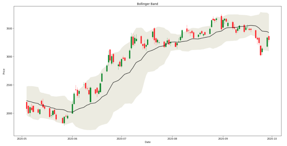
The figure above shows the stock prices of BAJAJ FINANCE (NSE) in the form of a candlestick chart. The body of the candle denotes “Open” and “Close” prices and the wicks represent the day’s “Low” and “High”. One candle represents one day. A green candle means the stock price has gone up after Open. This means the closing price is more than the opening price on that day.
The black line is the 20-day average price and the band is the 95% confidence interval also known as Bollinger Band.
Bollinger Band Trading Strategy:
– Traders believe that when stock price touches or hugs or cuts lower Bollinger limit there is a “Buy” signal.
– Similarly, when the price touches the upper limit there is a SELL signal
– There is another strategy which says when the band squeezes (stock price is less volatile) or we can say the Standard Deviation of 20-day price reduces there is a possible breakout in either direction coming up. Traders make BUY or SELL decisions immediately after UP or DOWN breakout respectively.
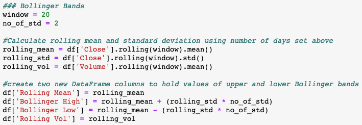
Python Implementation:
Plotting Bollinger Band in Python:
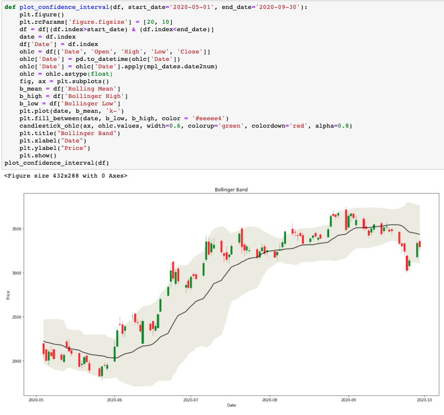
Complete python code on this indicator can be found here
Leading Indicator: RSI (Relative Strength Index)
The relative strength index (RSI) is a momentum indicator used in technical analysis that measures the magnitude of recent price changes to find overbought or oversold scenarios in stock, currency, or commodity prices. The RSI is an oscillator (a line chart that moves between two extremes) and can have a value between 0 and 100. The indicator was originally introduced in the seminal 1978 book, “New Concepts in Technical Trading Systems” written by J. Welles Wilder Jr.
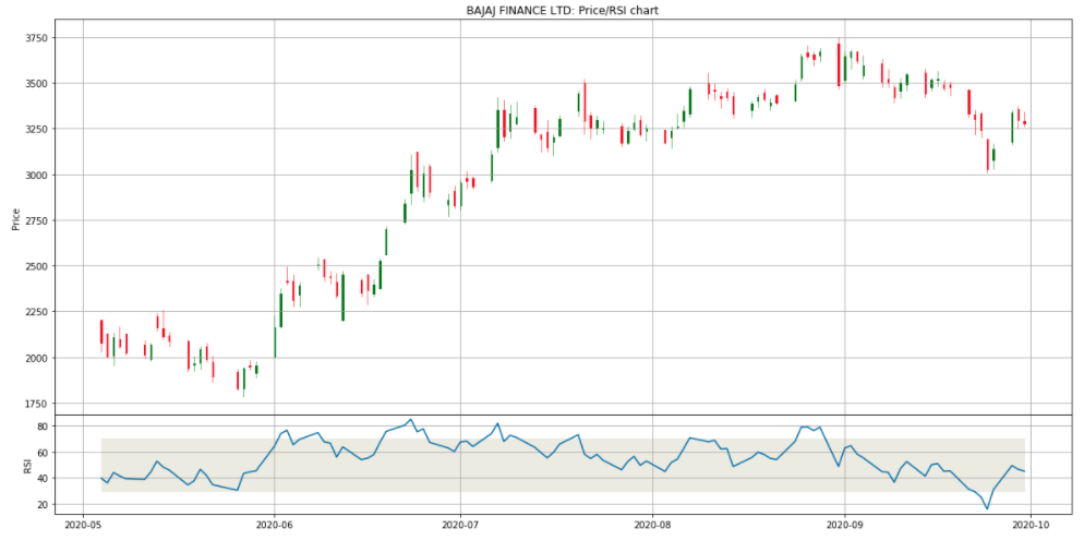
The figure shows the price using a candlestick chart and RSI with a line chart just below that.
RSI Trading Strategy:
The traditional interpretation of the RSI is that values of 70 or above indicate that a security is becoming overvalued or overbought and may be due for a trend reversal or correction in price. An RSI value of 30 or below indicates an undervalued or oversold scenario.
Python Implementation:
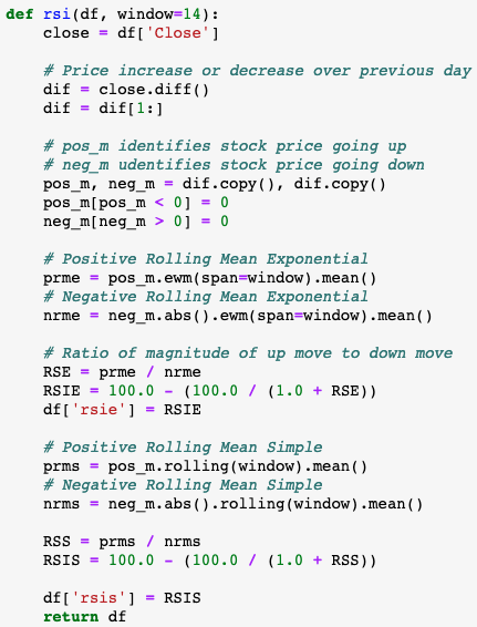
Plotting RSI in Python:
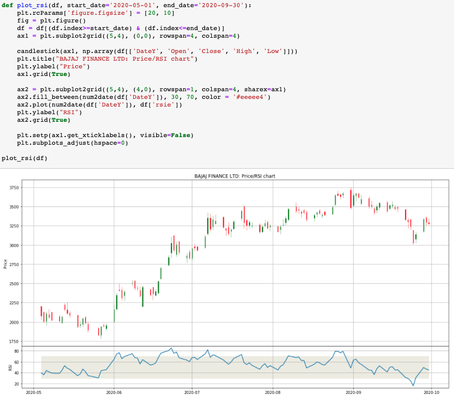
Complete python code on this indicator can be found here
Now we can use the knowledge of these indicators and the strategies we discussed so far to create a feature set. An example is shared below:
Define your target metric as per your objectives/appetite for profit and train/test an ML model using this feature set.
Stay tuned for more indicators and a sample working model.
Thanks for reading, have a great day!
The media shown in this article are not owned by Analytics Vidhya and is used at the Author’s discretion.


