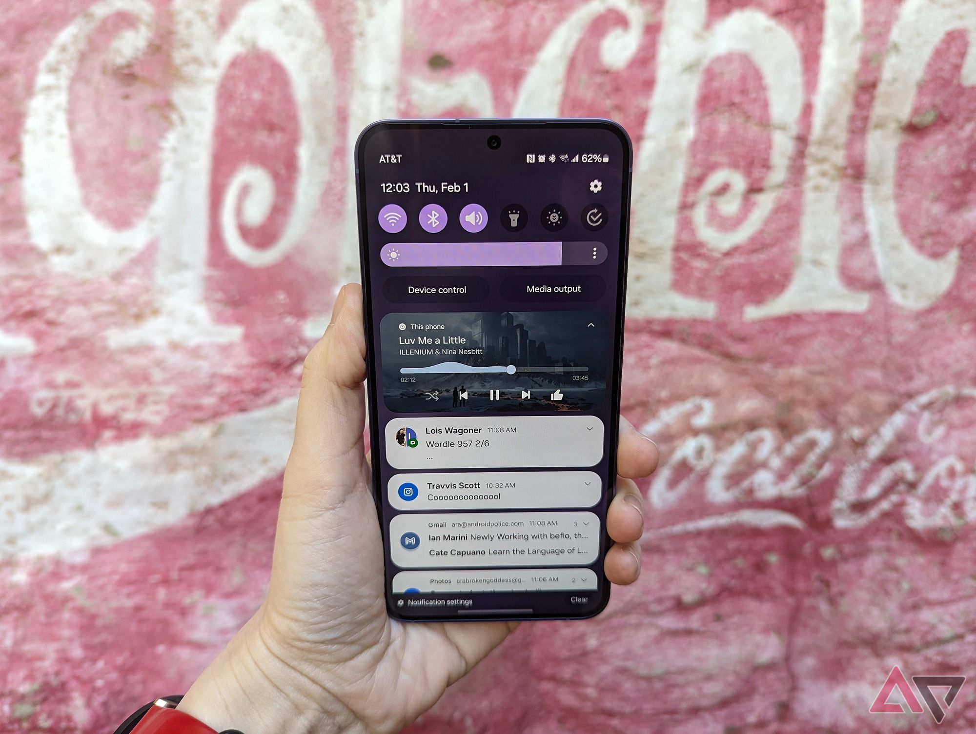
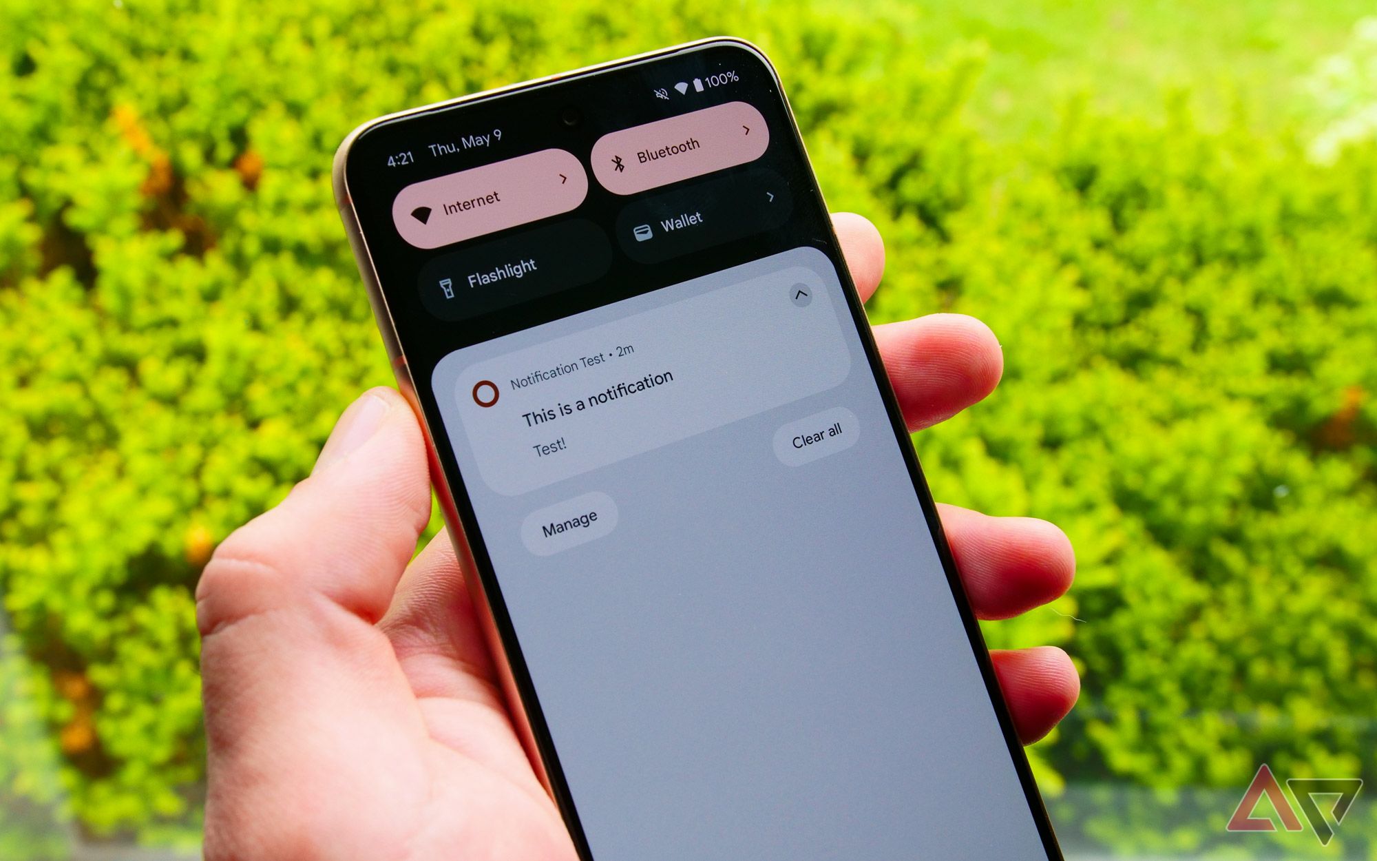
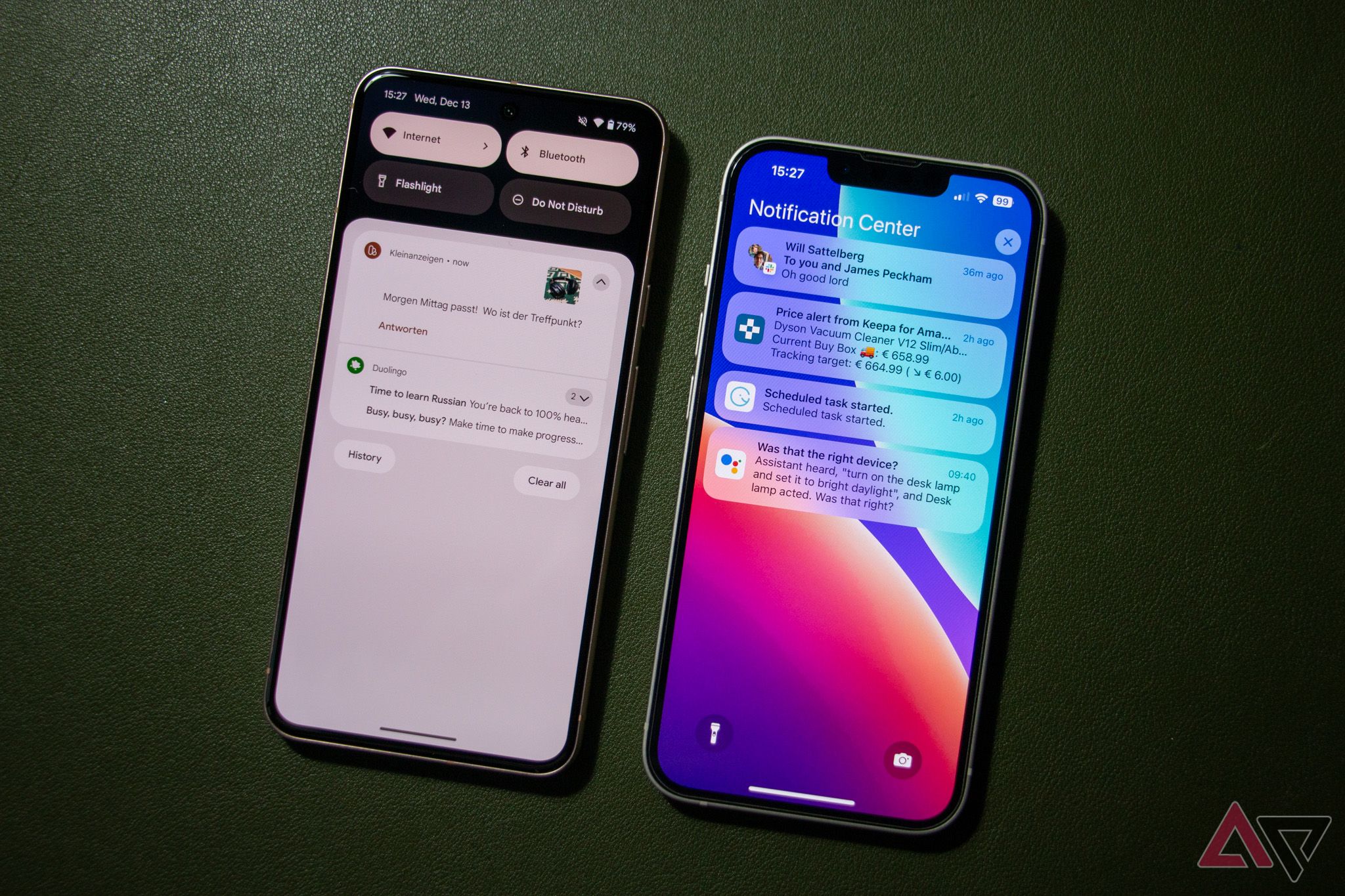
Android and iOS have a lot in common these days, but notifications are not one of them. And while both approaches to notifications may be capable, Android is clearly better in almost every regard. Android gives users a feature suite to streamline how we interact with our notifications, from gestures to replies to customization and even the icons at the top of the home screen. As for iOS? Well, it leaves a lot to be desired.
1 Notification channels
Categorize your notifications by app or type
Android’s notification channels allow you to fine-tune alerts within individual apps. You can prioritize urgent messages, mute some notifications from within an app while allowing others, and customize when and how you receive notifications. Developers can determine how their notifications get delivered, right down to customizing the notification colors.
iOS doesn’t have that. You can only control your notifications from the app level, meaning you either get all the notifications or none. Meanwhile, Apple retains strict control over how developers handle notifications. Android’s channels are a much more efficient way to tailor notifications to each individual.
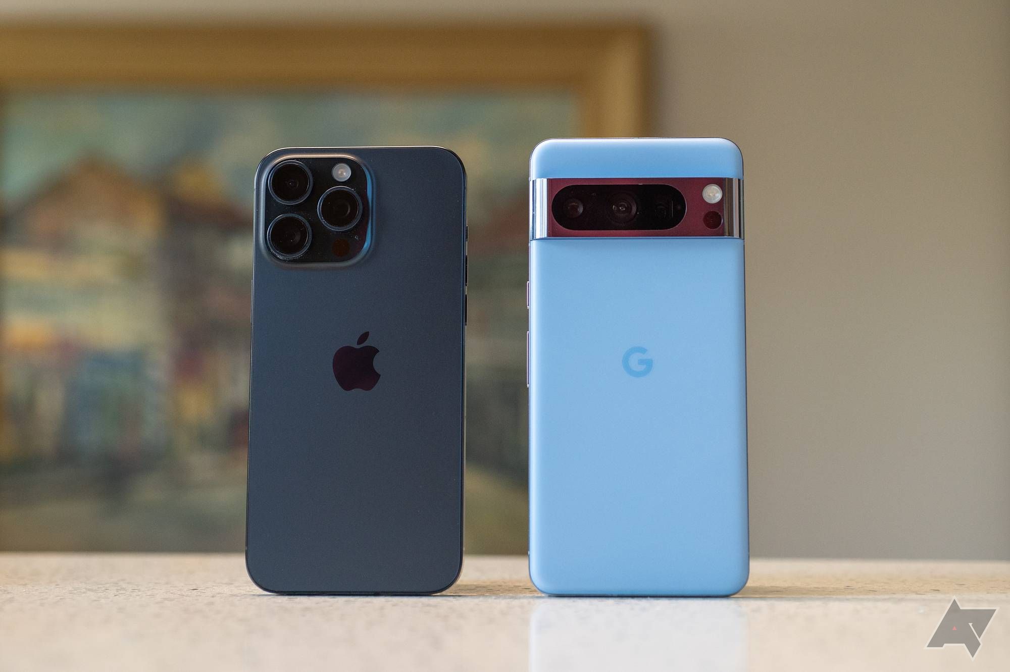
Android needs to copy these 2 iOS notification features
Apple’s notification system is a lot less in your face than Android’s, and that’s sometimes nice
2 Notification history
Android’s got your back if you accidentally swipe away a notification
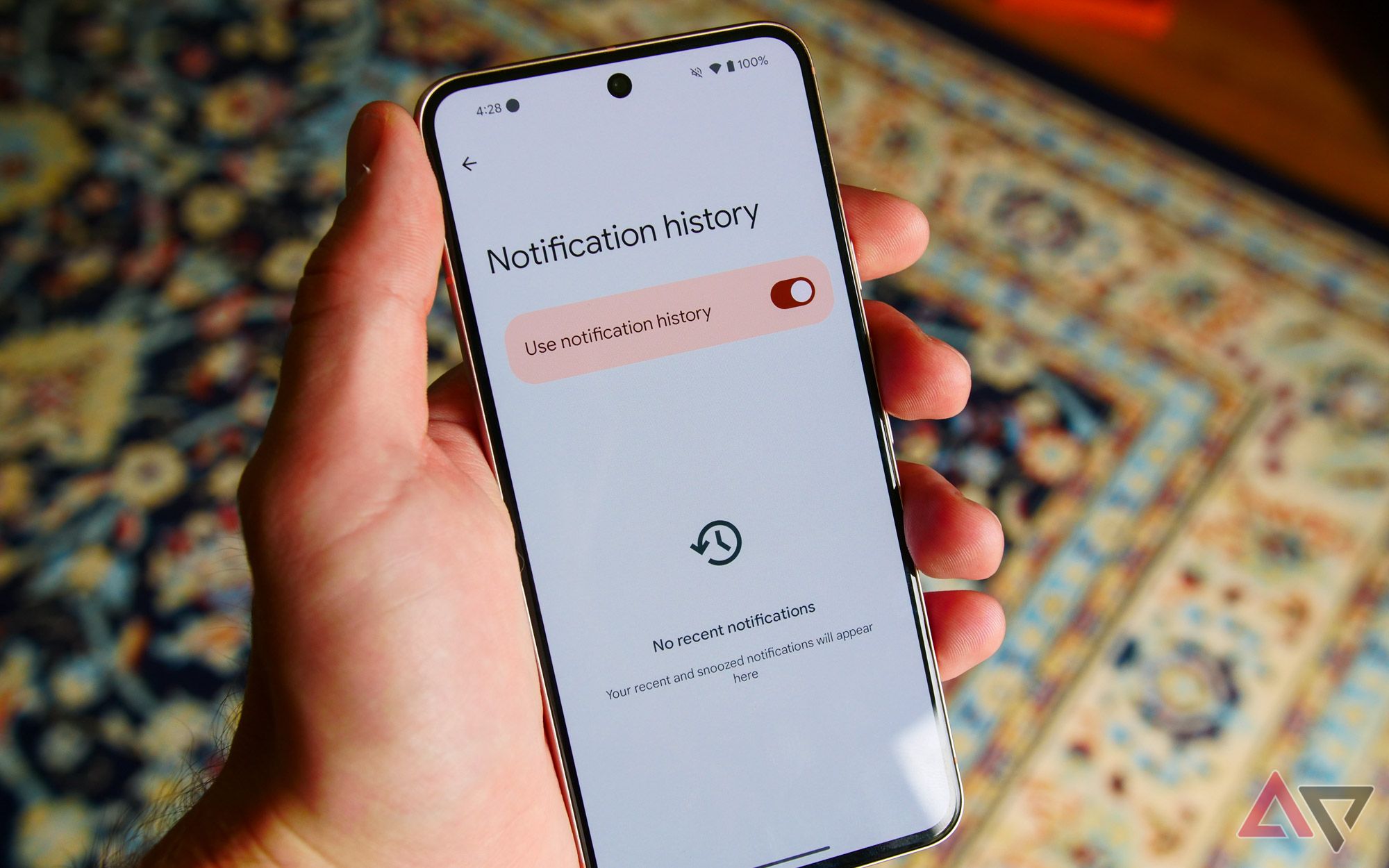
Notification history is a convenient log of all your most recently dismissed notifications. If you cleared a message too quickly or forgot where a particular message came from, a copy will be waiting in the Notification history menu.
iOS lacks anything like this. Once you dismiss a message on an iPhone, it is gone forever. Android is much better for the moments you need to recall an address or tiny detail.
You need to turn on Notification history for it to work. Head to Settings, tap Notifications, then Notification history. Slide the Use notification history toggle to the right to turn on the feature.
3 Swipe gestures
A cluttered notification shade is a distraction
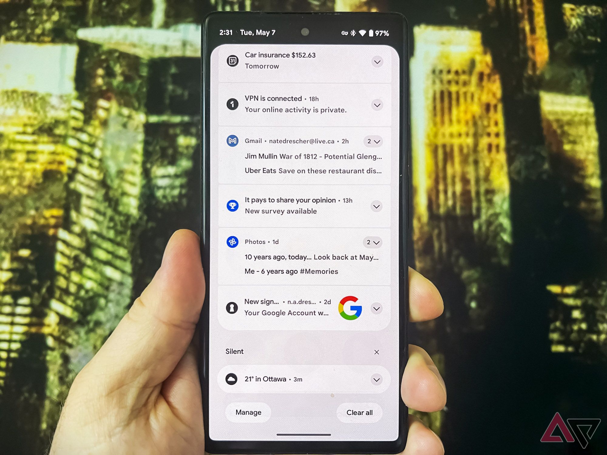
Android’s swipe gestures for handling notifications are probably the best part of owning an Android over an iPhone. You can quickly discard notifications with a swipe and keep your notification shade clean. A single swipe can clear an entire notification stack. The “Clear all” button at the bottom is also extremely useful, although the iPhone does have the “x” button to nuke your entire notification stack.
iOS stumbles in this area. It can take several taps to triage and clear the notifications from an iPhone’s screen. This is especially true with a backlog of alerts, which is why Android is so much further ahead in this department.
4 Persistent icons
A quick glance is all you need
Android’s persistent notification icons on the status bar provide easy-to-see reminders about messages, events, and tasks. You can see vital information about downloads, alarms, or messages without interrupting your current task to fumble with a random notification.
iOS is much less advanced in the way it handles persistent notifications. The annoying red dot on the corner of the offending app is the most you’ll get from an iPhone. Android is much clearer and more accessible.
5 Quick replies
Reply right from the notification shade
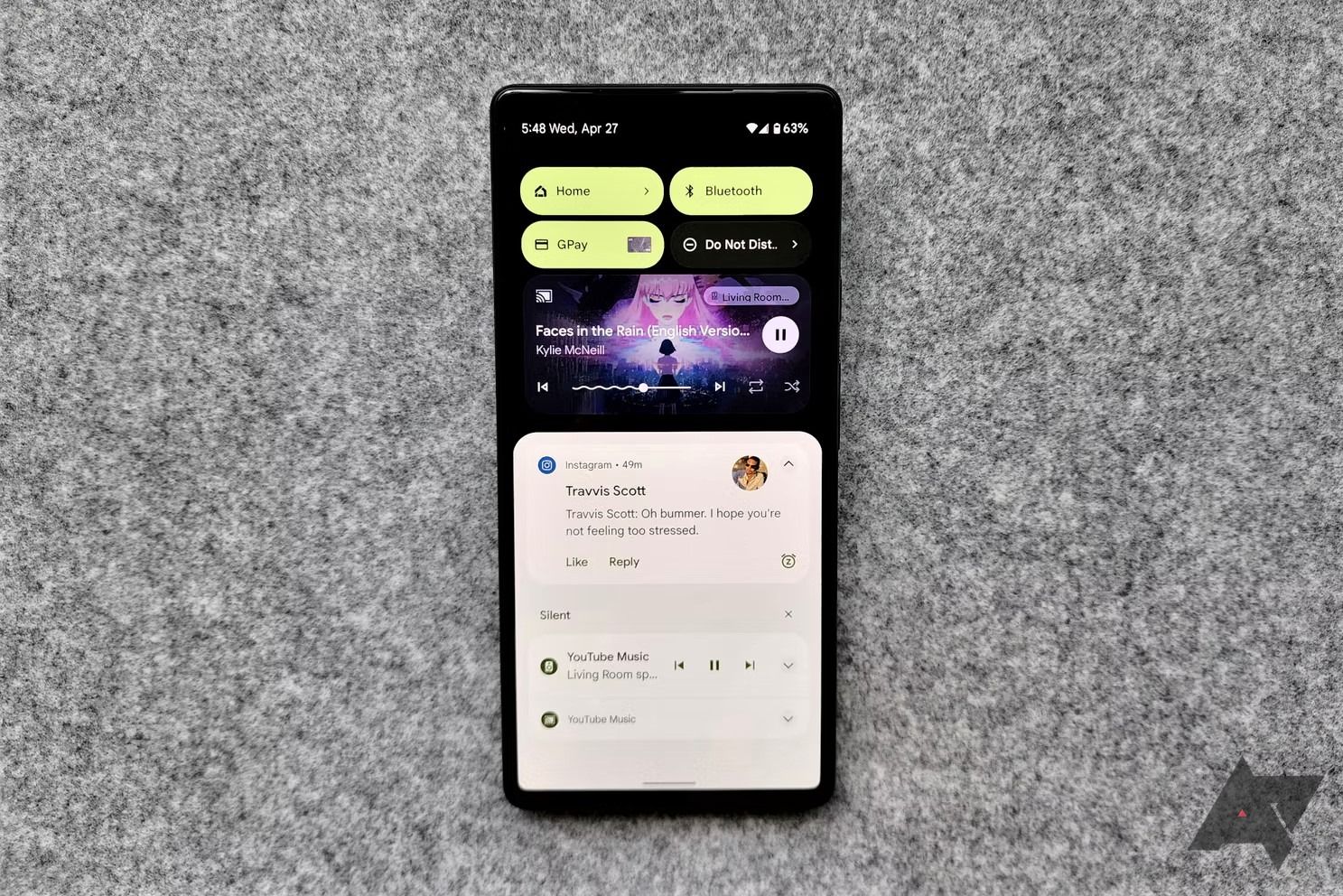
Android’s ability to reply to a message directly from the notification shade is another of the system’s greatest features. You can quickly type out a reply message without opening the app, or tap on one of Google’s premade responses.
iOS has a much more clumsy quick reply system that requires long-pressing on the app and then choosing “reply” from among a drop-down menu. Android has much less friction.
6 Customizable lock screen notifications
Keep those private messages off your lock screen
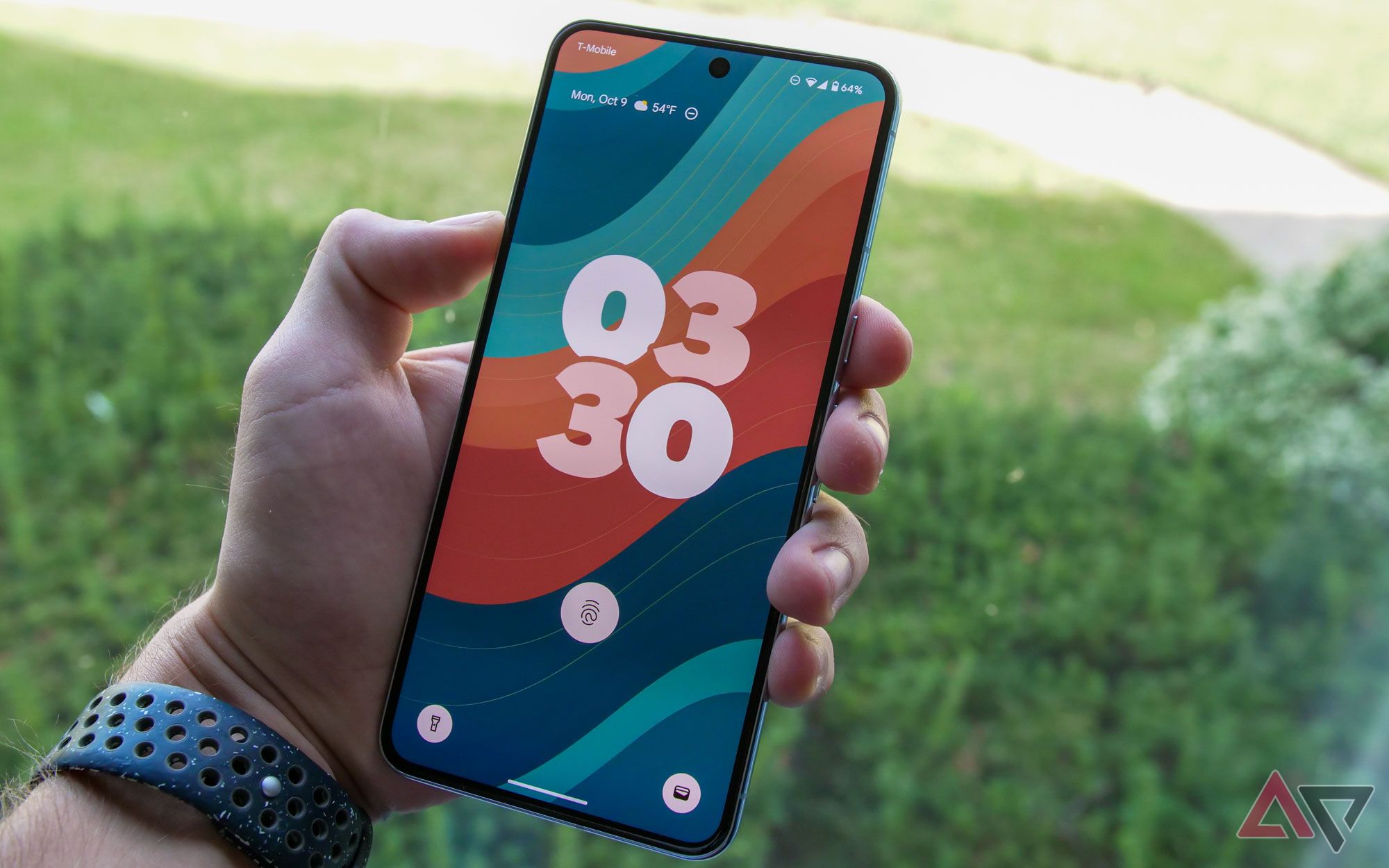
The level of information you want to show up on your lock screen is a highly personal choice. Android understands this. That’s why it grants you control over what notifications show up, how much detail shows up there, how long it stays there, and other options. You can even choose to display only part of a message and customize how each app delivers messages to your lock screen.
iOS offers some control, but it’s only at the app level. It’s mostly either turn on all notifications or turn them all off. Android’s granular approach is the better way.
7 Snooze notifications
Come back later, alarm; I’m sleeping
Android’s notification snooze feature temporarily silences reminders and notifications. Snoozing these notifications is perfect when you’re watching a movie or in an intense discussion. You can even set Tasker to auto-snooze notifications when you’re driving.
16 common Android notification problems and how to fix them
Stay informed on your Android phone
iOS offers very limited snooze capabilities for only a handful of app notifications. And, again, it requires swiping to the left and tapping “More” to reveal a hidden option menu. There’s just so much less friction with Android.
8 Bundled notifications
Android was first and still does it better
Android keeps your notification shade organized by bundling notifications from the same app. You won’t receive an onslaught of alerts thanks to this simple trick of technological magic. Instead, your emails, WhatsApp chats, RCS chats, and everything else get neatly grouped.
iOS offers a similar bundling feature (it took Apple until 2017 to offer it), and although it’s practically the same as Android’s, it just feels less refined. Long-presses are required to see what is hiding in the notification stack; Android lets you manage many notifications with a single swipe.
A user-first approach to notifications
Android’s superior notification handling might seem like a small matter, but these tiny details shape our daily lives. Android’s approach to streamlined organization, customizable privacy, and convenient features caters to the individual.
iOS, on the other hand, handles notifications much like it handles everything else. There’s only one way and everything else feels like an afterthought. Android is great if you value personalized control of your notifications right down to the system level. If you don’t care for any of that, there’s always iOS.


