


Chrome has become so popular, that it’s practically synonymous with the web browser — it’s already common for us to call a browser search “Googling it” in casual conversation. While Google’s search engine has more than earned its popularity, its ever-growing feature list has started to make things overly complicated, especially for a service whose appeal lies in casual use.
That’s not to say these features aren’t useful or that they make the service worse; the problem concerns how some of Chrome’s mechanics hamper the experience with needless convolutions. These are a few of the main examples of Google Chrome bloat, as well as how it can negatively impact your web surfing.

Google Chrome releases: What’s new in every version
A central hub for all the things that have changed in Chrome
1 Overcomplicated sidebar
It needs a trim
First things first, Chrome’s sidebar has a lot of features that don’t operate efficiently, and bloat the browser with unnecessary duplications. Bookmarks, for example, can be managed both in the sidebar and in a section below the omnibox. Most of said options are duplicated across both places, with the ‘bookmark this page’ option taking the crown. The same button exists in both the sidebar and in the address bar, added in both places presumably for added user convenience. But why have it in both places, when one only exists because it serves the same purpose more efficiently?
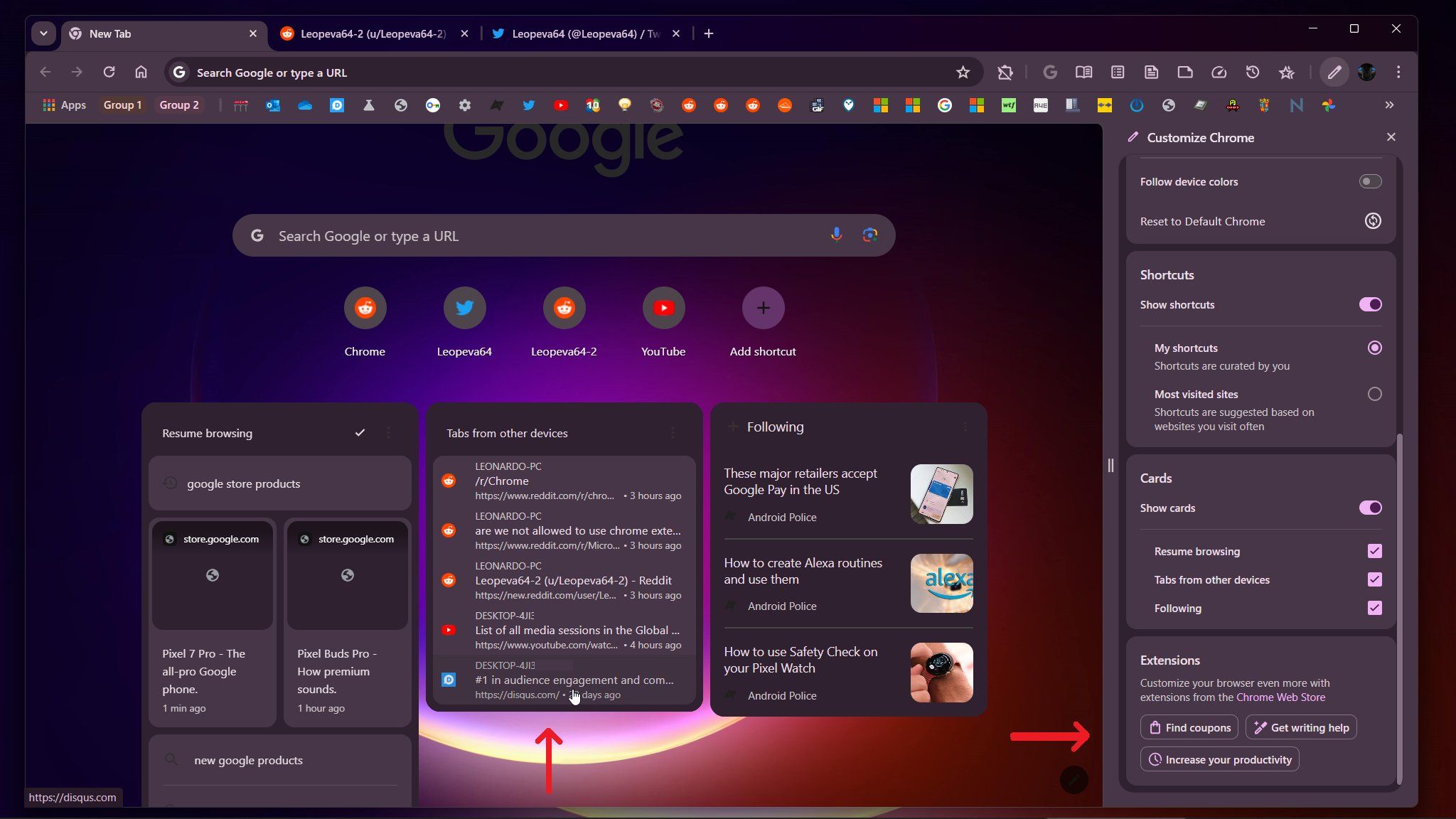
These extra items benefit no one and wouldn’t damage anything if they were removed from the sidebar menu, or consolidated into it completely. It feels like the sidebar is a new way to interact with existing features, making the same sets of options accessible in multiple places. While the sidebar may be prettier or easier to work with for some people, Google should make up its mind which interface it wants to stock with.
2 Tab grouping
An unnecessary inclusion
Tab grouping is a perfect example of Chrome’s unnecessary features, allowing users to organize their tabs in a manner only slightly different from the way they were doing it previously. Tab groups bind several separate tabs under one renameable tab, with options to personalize its color and name. But this process requires more clicks than creating a new Chrome window, which provides the same organization level while still exploiting the web browser’s traditional visual design. Tab grouping is a cool idea, but is ultimately just an overcomplicated way of achieving something we could already do.
3 Image features
Handy but inelegant
Google Chrome’s image features are very impressive and often genuinely useful, letting users discover the image origins with Google Lens and convert existing images into QR codes for distribution. However, these image features can be clunky and unintuitive to use. Using Google Lens opens up a side menu that’s poorly optimized for space, meaning you have to awkwardly scroll down through several image origins that are unhelpful, more often than not.
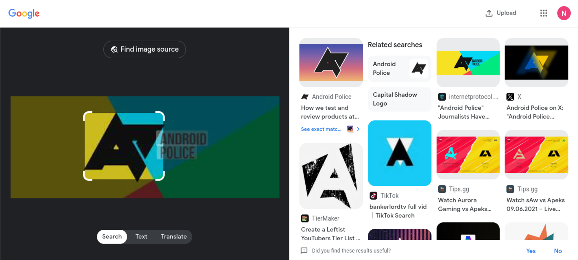
Admittedly, this is mostly a problem on desktop as said UI takes up your full screen on your phone. So, what’s Google’s excuse for having a better interface on a smaller screen? Implementing a larger side window or fullscreen interface in a separate tab would be a possible fix, making Google Lens less of a pain to use.
4 Media controls
A poorly integrated feature
Chrome’s media controls exist to give users more convenient control over music and video activity in the browser via a corner widget with basic commands like pause and skip. The feature’s existence is sound in principle but fails to take the Chrome UI design into account, more specifically, how users can navigate the app extremely quickly. Having the corner widget for skipping or pausing a YouTube video does save users some time, but nowhere near enough to be worthwhile, since clicking on the YouTube tab and inputting the commands manually is just as fast and synergetic as the default method of navigating the browser.
Chrome could simplify exiting full screen mode on desktops
Just press and hold the Esc key rather than a convoluted key combination
Admittedly, this feature does provide some cool perks to access from anywhere on the app like screencasting and live captions; although, it doesn’t provide anything you couldn’t already access with minimal effort. Media controls need something more distinctive and complimentary for the environment they’re living in. More controls and features for running video content would be a great addition but maybe work on integrating media consumption into regular work or play that feels more at home in the browser space.
5 Discover
It needs to stay out of the way
While exclusive to mobile at the time of writing, the Discover feed is a useful way to browse articles tailored to your interests. However, it’s clear that Google uses Discover as a way to lure you into spending more time in Chrome, ideally on websites that happen to be monetized by Google ads. Google is rumored to bring the Discover feed to desktops, too, and we would want the company to stop right there before it does so.

In its current state, Chrome’s Discover feed serves as a mediocre news feed that only distracts even further from what Chrome is supposed to be. While you may be more inclined to just browse on your phone to pass the time, you might find yourself distracted from more important work on desktop. To keep with the theme of this article, Chrome needs fewer features rather than more, and Discover is one it shouldn’t introduce on desktop in the first place — even if it was possible to disable it, just like on mobile.
Let’s simplify Chrome
To be fair, a lot of Chrome’s functions are pretty essential for a quality browsing experience, and none of us would dream of doing away with cross-device history, password syncing, or bookmarks; even Chrome’s unflexible pop-up blocker is vital. Bloat issues like these will never drive people away entirely, but that doesn’t mean Google shouldn’t refine Chrome to restore its efficiency without losing what makes it stand out. I think we can all agree that Chrome needs to get back to basics with how it approaches web browsing and cut through the red tape weighing its quality features down.